
100 Exercises / Probability Statistics / 100 Exercise Points in Probability & Statistical Marketing Applications
Practice Quality Control in Manufacturing with Python | Defect Rate, Cp/Cpk, and 10 Control Charts Exerciseed
Turning Quality Data into “Judgment”: 10 Exercises on Manufacturing Probability and Statistics
This article is a practical notebook that connects From understanding defect rates to process capability, control charts, certification, reliability, and future risk simulations with a single imaginary data set, focusing on quality control in manufacturing. Rather than simply calculating formulas, statistics are linked to decisions such as “when to stop the process,” “where to allocate improvement resources,” and “how to explain customer risks.”
This 100-exercise section covers quality control, equipment maintenance, demand forecasting, inventory optimization, production planning, marketing science, machine learning, decision science, simulation, and Mathematical Laboratory DI practice, in that order. The first ten are the foundation Quality control for it. We aim to create analyses reproducible in Python, enabling the field, quality assurance, and management to discuss based on the same numbers.
[!NOTE] This material is a notebook previously used by Surikoubo (or personally by the representative, Kazuyama), and has been reconstructed, edited, and published with the company’s permission.
All data listed is fictional and has no relation whatsoever to real companies, factories, or figures.
1. Introduction: Practical Challenges in Manufacturing Covered in This Article
In a fictional precision parts factory, three lines produce the same part. The critical dimension standard is 49.5〜50.5 mm, measuring 50 pieces per lot and inspecting 200 pieces per lot for visual inspection. Recently, customers have asked us to explain, “Is the defect rate stable?” “Is there a difference between lines?” and “How much loss could be next month?”
What is needed here is not a single KPI. Even if the average defect rate is low, sudden abnormalities may be missed, and even if the cost-performance ratio is high, if the center is off-center from the standard, defects will occur. In this article, we will observe the Levels, variation, time variation, estimation errors, economic impacts separately and finally integrate them.
2. Common Situations on Site
- Only the monthly defect rate is reported, and it’s unclear when or where the situation worsened.
- Cp and Cpk are confused, overlooking the state of ‘having equipment capacity but misaligned core’
- Treating management limits and specification limits as the same
- Identify the difference in a small sample as a process difference as it is.
- Thresholds for anomaly detection and sampling inspection conditions are not linked to customer risk.
- Planning is based solely on point estimates, without reflecting estimation errors or fluctuations in the next month in the budget.
3. Why is this issue difficult to judge?
Quality indicators have different roles. specification limit refers to the acceptable range required by customers and designers, while management limit refers to the range of fluctuations that typically occur during the stabilization process. Also, defect rates are estimates from finite samples and are not the true defect rates themselves. Therefore, it is necessary not only to choose between “exceeding the standard or not exceeding” but also to clearly state the data generation process, sample size, chronological order, and false positive costs.
4. The overall picture of exercise covered this time
| No. | Theme | Key Decisions |
|---|---|---|
| 001 | Non-performing Rate Estimation | Priority of improvement targets |
| 002 | Engineering Capability Index cp | The Need to Reduce Variation |
| 003 | Engineering Capability Index Cpk | Distinguishing between centering and equipment improvement |
| 004 | control chart | Identification of Normal Fluctuations and Special Causes |
| 005 | anomaly detection | Narrowing down the lot size to be investigated |
| 006 | sampling inspection | Designing inspection costs and leakage risks |
| 007 | Quality Evaluation Using Confidence Intervals | Explanation including uncertainty in the estimate |
| 008 | Process Comparative Certification | Statistical Confirmation of Line Difference |
| 009 | Failure rate estimation | Conservation and Spare Parts Plan |
| 010 | Quality Simulation | Probabilistic budgeting of losses for the following month |
5. Preparing the Python environment
Handle data with numpy and pandas, use scipy for statistics and matplotlib for visualization. Because it fixes random number seeds, the same result can be reproduced every time you run. To avoid font differences in execution environments, the notation within the graph is unified to English.
%matplotlib inline
import sys
import numpy as np
import pandas as pd
import matplotlib
import matplotlib.pyplot as plt
from scipy import stats
from IPython.display import display

SEED = 20260711
rng = np.random.default_rng(SEED)
pd.set_option("display.precision", 4)

print(f"Python     : {sys.version.split()[0]}")
print(f"numpy      : {np.__version__}")
print(f"pandas     : {pd.__version__}")
print(f"matplotlib : {matplotlib.__version__}")
Python : 3.13.1
numpy : 2.5.1
pandas : 3.0.3
matplotlib : 3.11.06. Creation of Fictional Data
For 120 lots (3 lines × 40 lots), we generate dimensional measurements, visual inspections, equipment operating hours, and the number of failures. For each line, the average, standard deviation, basic defect probability, and failure rate are slightly adjusted, and dimensional shifts due to special causes are added to some lots. This is a hypothetical setting to check the behavior of the analysis method.
| variable | Meaning |
|---|---|
dimension_mm | Actual measurements of important dimensions (50 pieces per lot) |
inspected / defects | Number of Visual Inspections / Number of Defects |
exposure_hours / failures | Equipment Operating Hours / Number of Failures |
LSL, USL | Dimensions Standard Lower and Upper Limits |
LSL, TARGET, USL = 49.5, 50.0, 50.5
n_lots, sample_per_lot, inspected_per_lot = 120, 50, 200
lines = np.tile(["A", "B", "C"], n_lots // 3)
dates = pd.date_range("2026-01-05", periods=n_lots, freq="D")

line_mean = {"A": 50.00, "B": 50.12, "C": 49.94}
line_sigma = {"A": 0.12, "B": 0.16, "C": 0.10}
base_defect_p = {"A": 0.007, "B": 0.015, "C": 0.009}
failure_rate = {"A": 1 / 1400, "B": 1 / 650, "C": 1 / 2200}
special_shift = {41: 0.32, 76: -0.28, 102: 0.35}  # Lot position starting from 0

lot_rows, measurement_rows = [], []
for i, (date, line) in enumerate(zip(dates, lines)):
    mu = line_mean[line] + special_shift.get(i, 0.0)
    values = rng.normal(mu, line_sigma[line], sample_per_lot)
    p = min(base_defect_p[line] + 0.035 * abs(mu - TARGET) + (0.03 if i in special_shift else 0), 0.20)
    defects = rng.binomial(inspected_per_lot, p)
    exposure = int(rng.integers(650, 951))
    failures = rng.poisson(exposure * failure_rate[line])
    lot_id = f"L{i + 1:03d}"
    lot_rows.append((lot_id, date, line, inspected_per_lot, defects, exposure, failures,
                     values.mean(), values.std(ddof=1)))
    measurement_rows.extend((lot_id, date, line, x) for x in values)

lot_df = pd.DataFrame(lot_rows, columns=[
    "lot_id", "date", "line", "inspected", "defects", "exposure_hours",
    "failures", "dimension_mean", "dimension_std"
])
measurements = pd.DataFrame(measurement_rows, columns=["lot_id", "date", "line", "dimension_mm"])
lot_df["defect_rate"] = lot_df["defects"] / lot_df["inspected"]

print(f"lot_size: {len(lot_df):,} / Dimensional measurement quantity: {len(measurements):,}")
display(lot_df.head())
Lot size: 120 / Dimensions: 6,000| lot_id | date | line | inspected | defects | exposure_hours | failures | dimension_mean | dimension_std | defect_rate | |
|---|---|---|---|---|---|---|---|---|---|---|
| 0 | L001 | 2026-01-05 | A | 200 | 1 | 887 | 1 | 49.9851 | 0.1170 | 0.005 |
| 1 | L002 | 2026-01-06 | B | 200 | 6 | 874 | 1 | 50.1248 | 0.1722 | 0.030 |
| 2 | L003 | 2026-01-07 | C | 200 | 2 | 798 | 1 | 49.9519 | 0.1064 | 0.010 |
| 3 | L004 | 2026-01-08 | A | 200 | 4 | 779 | 1 | 49.9892 | 0.1213 | 0.020 |
| 4 | L005 | 2026-01-09 | B | 200 | 1 | 720 | 2 | 50.1023 | 0.1498 | 0.005 |
7. No.001: Defect Rate Estimation
Meaning in Practice
The defect rate is the entry point for quality cost, shipment evaluation, and selection of improvement themes. However, if you simply average the defect rates by line, the number of inspections may be incorrect if the number of inspections differs. The basic calculation is based on “total defects ÷ total number of inspections.”
Approach to Analysis and Modeling
If the probability of each product being defective is , the number of inspections is , and the number of defects is , then under the approximate approximation that it is independent and under identical conditions, it can be considered . The maximum likelihood estimator is
That’s right. First, we estimate points by line and examine the number of contributing defects to identify factors worsening the overall KPI.
Check with Python
defect_summary = lot_df.groupby("line").agg(
    lots=("lot_id", "count"), inspected=("inspected", "sum"), defects=("defects", "sum")
)
defect_summary["defect_rate_pct"] = 100 * defect_summary["defects"] / defect_summary["inspected"]
defect_summary["defect_share_pct"] = 100 * defect_summary["defects"] / defect_summary["defects"].sum()
display(defect_summary)

ax = defect_summary["defect_rate_pct"].plot(kind="bar", color=["#4C78A8", "#F58518", "#54A24B"], legend=False)
ax.set_title("Estimated Defect Rate by Line")
ax.set_xlabel("Line")
ax.set_ylabel("Defect rate (%)")
ax.grid(axis="y", alpha=0.3)
plt.tight_layout()
plt.show()| lots | inspected | defects | defect_rate_pct | defect_share_pct | |
|---|---|---|---|---|---|
| line | |||||
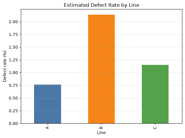
| A | 40 | 8000 | 61 | 0.7625 | 18.8272 |
| B | 40 | 8000 | 171 | 2.1375 | 52.7778 |
| C | 40 | 8000 | 92 | 1.1500 | 28.3951 |
Reading the results
Line B contributes significantly to both defect rates and defect numbers, making it the top candidate for improvement. However, point estimation alone cannot distinguish between accidental fluctuations. Combine the confidence interval No.007 and the test of No.008 to verify the certainty of the difference.
8. No.002: Engineering Capability Index Cp
Meaning in Practice
Cp indicates whether the process can be processed with sufficiently small variation relative to the standard width. These are the criteria for making decisions on investments that reduce variation, such as equipment upgrades, jig improvements, and standardization of conditions.
Approach to Analysis and Modeling
When the process is stable and the dimensions generally follow a normal distribution,
This is how it will be evaluated. is the process width that spreads around the average perimeter. Since CP does not consider the average position, it is interpreted as an indicator of potential ability. Here, we calculate by line using the reference data excluding the three lots of special causes.
Check with Python
special_lots = {"L042", "L077", "L103"}
baseline = measurements.loc[~measurements["lot_id"].isin(special_lots)].copy()
capability = baseline.groupby("line")["dimension_mm"].agg(mean="mean", std="std")
capability["Cp"] = (USL - LSL) / (6 * capability["std"])
display(capability)

ax = capability["Cp"].plot(kind="bar", color="#4C78A8", legend=False)
ax.axhline(1.33, color="#E45756", linestyle="--", label="Reference 1.33")
ax.set_title("Potential Process Capability (Cp)")
ax.set_xlabel("Line")
ax.set_ylabel("Cp")
ax.grid(axis="y", alpha=0.3)
ax.legend()
plt.tight_layout()
plt.show()| mean | std | Cp | |
|---|---|---|---|
| line | |||
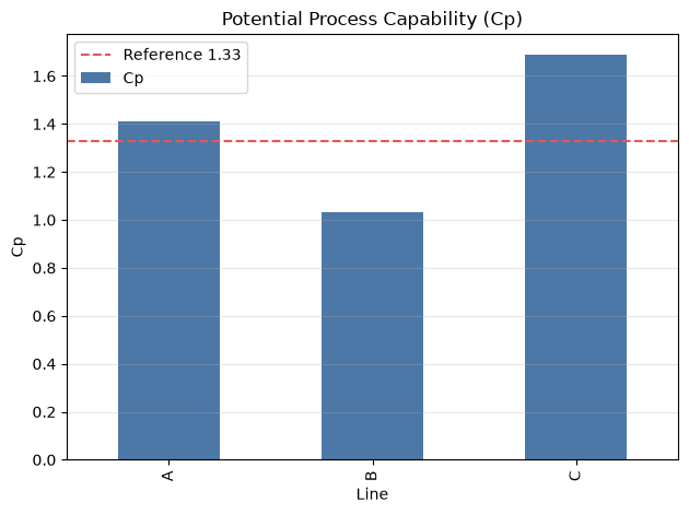
| A | 50.0002 | 0.1182 | 1.4100 |
| B | 50.1127 | 0.1612 | 1.0341 |
| C | 49.9389 | 0.0986 | 1.6895 |
Reading the results
Line B has a larger standard deviation than other lines, indicating a lower potential process capability. The commonly used 1.33 is only a reference line, and the adoption criteria are set according to product risks and customer requirements. The next challenge is that CP alone cannot assess center deviation.
9. No.003: Engineering Capability Index Cpk
Meaning in Practice
Cpk expresses how much margin there is to the specification limit on the closer side of the process average, in addition to variation. If the Cp is good but the Cpk is low, you can prioritize suspicion of center misalignment due to set values, correction values, and tool wear rather than the equipment capacity itself.
Approach to Analysis and Modeling
The difference between Cp and Cpk contains information about the center of the center. However, since both indicators assume process stability, we evaluate the steady period after excluding special causes on the control chart.
Check with Python
capability["Cpu"] = (USL - capability["mean"]) / (3 * capability["std"])
capability["Cpl"] = (capability["mean"] - LSL) / (3 * capability["std"])
capability["Cpk"] = capability[["Cpu", "Cpl"]].min(axis=1)
capability["Cp_minus_Cpk"] = capability["Cp"] - capability["Cpk"]
display(capability[["mean", "std", "Cp", "Cpk", "Cp_minus_Cpk"]])

ax = capability[["Cp", "Cpk"]].plot(kind="bar", color=["#4C78A8", "#F58518"])
ax.set_title("Cp and Cpk by Line")
ax.set_xlabel("Line")
ax.set_ylabel("Capability index")
ax.grid(axis="y", alpha=0.3)
plt.tight_layout()
plt.show()| mean | std | Cp | Cpk | Cp_minus_Cpk | |
|---|---|---|---|---|---|
| line | |||||
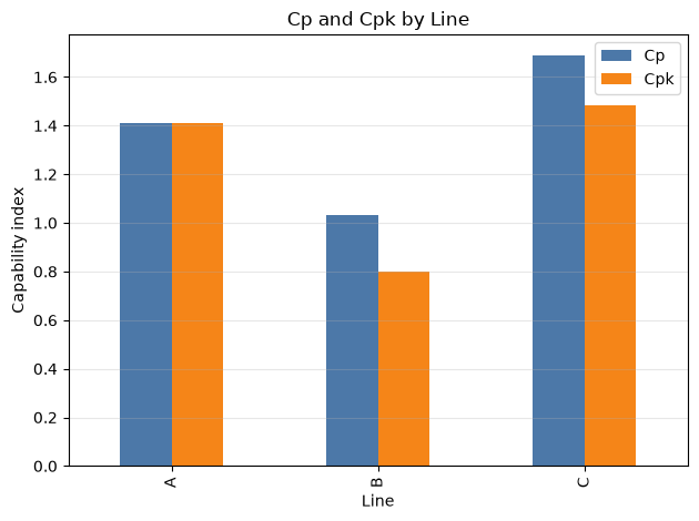
| A | 50.0002 | 0.1182 | 1.4100 | 1.4094 | 0.0006 |
| B | 50.1127 | 0.1612 | 1.0341 | 0.8010 | 0.2331 |
| C | 49.9389 | 0.0986 | 1.6895 | 1.4830 | 0.2065 |
Reading the results
At line B, the Cpk is even lower than Cp, with both deviation and upward center deviation. Line C also has its center shifting downward, so reporting only Cp underestimates the risk. In the short term, you can break down measures such as centering and analyzing the variation factors in line B as a permanent countermeasure.
10. No.004: Control Chart
Meaning in Practice
A control chart is a tool that distinguishes between ‘normal fluctuations inherent in the process’ and ‘special causes that need to be investigated’ based on the time-series changes in defect rates. Starting from lots exceeding control limits, we examine the history of changes in materials, equipment, operations, measurements, and environments.
Approach to Analysis and Modeling
In a p-control chart with a constant number of inspections, the pool defect rate over the entire period is
LCL=\max\left(0,\bar{p}-3\sqrt{\frac{\bar{p}(1-\bar{p})}{n}}\right)$$ We use it. It is important that the control limit is calculated not from standard values but from process variations over the reference period. ### Check with Python ```python p_bar = lot_df["defects"].sum() / lot_df["inspected"].sum() sigma_p = np.sqrt(p_bar * (1 - p_bar) / inspected_per_lot) ucl_p, lcl_p = p_bar + 3 * sigma_p, max(0, p_bar - 3 * sigma_p) lot_df["p_chart_signal"] = (lot_df["defect_rate"] > ucl_p) | (lot_df["defect_rate"] < lcl_p) fig, ax = plt.subplots(figsize=(11, 4)) ax.plot(lot_df["date"], 100 * lot_df["defect_rate"], marker="o", markersize=3, linewidth=1) ax.axhline(100 * p_bar, color="#54A24B", label="Center line") ax.axhline(100 * ucl_p, color="#E45756", linestyle="--", label="UCL") ax.axhline(100 * lcl_p, color="#E45756", linestyle="--", label="LCL") signals = lot_df[lot_df["p_chart_signal"]] ax.scatter(signals["date"], 100 * signals["defect_rate"], color="red", s=45, zorder=3, label="Signal") ax.set_title("p-Chart for Lot Defect Rate") ax.set_xlabel("Production date") ax.set_ylabel("Defect rate (%)") ax.grid(alpha=0.3) ax.legend(ncol=4) plt.tight_layout() plt.show() display(signals[["lot_id", "date", "line", "defects", "defect_rate"]]) ``` 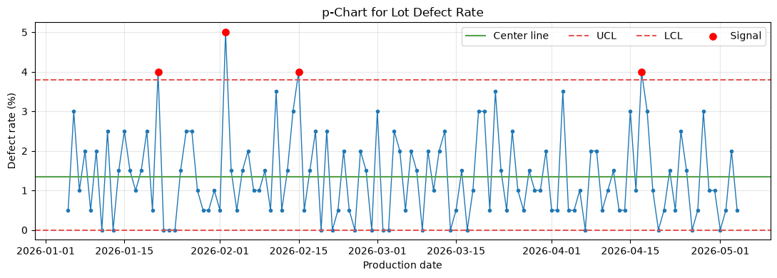 <style scoped> .dataframe tbody tr th:only-of-type { vertical-align: middle; } .dataframe tbody tr th { vertical-align: top; } .dataframe thead th { text-align: right; } </style> <table border="1" class="dataframe"> <thead> <tr style="text-align: right;"> <th></th> <th>lot_id</th> <th>date</th> <th>line</th> <th>defects</th> <th>defect_rate</th> </tr> </thead> <tbody> <tr> <th>16</th> <td>L017</td> <td>2026-01-21</td> <td>B</td> <td>8</td> <td>0.04</td> </tr> <tr> <th>28</th> <td>L029</td> <td>2026-02-02</td> <td>B</td> <td>10</td> <td>0.05</td> </tr> <tr> <th>41</th> <td>L042</td> <td>2026-02-15</td> <td>C</td> <td>8</td> <td>0.04</td> </tr> <tr> <th>102</th> <td>L103</td> <td>2026-04-17</td> <td>A</td> <td>8</td> <td>0.04</td> </tr> </tbody> </table> ### Reading the results Defective points are candidates that are difficult to explain purely by chance from the perspective of the standard process. Exceeding the control limit is not a "defective product confirmation" but a "signal to investigate a special cause." Conversely, even within management, customer standards cannot be guaranteed, so control charts and process capabilities are used together. ## 11. No.005: Anomaly Detection ### Meaning in Practice When monitoring numerous sensors and quality characteristics, it is difficult to manually monitor all changes. By narrowing down investigation candidates with abnormality scores, quality personnel can focus on identifying the cause. ### Approach to Analysis and Modeling Here, explainability is prioritized, and the lot average is standardized to the overall median $m$ and a robust Z-score standardized by MAD. $$z_i^{(robust)}=\frac{0.6745(x_i-m)}{\mathrm{median}(|x_i-m|)}$$ This method is less affected by outliers than the Z-Score based on the mean or standard deviation. $|z|>3.5$ is considered a candidate for primary investigation, but the threshold is designed based on missed and false alarm response costs. ### Check with Python ```python def within_line_robust_z(series): median = series.median() mad = np.median(np.abs(series - median)) return 0.6745 * (series - median) / mad lot_df["robust_z"] = lot_df.groupby("line")["dimension_mean"].transform(within_line_robust_z) anomalies = lot_df.loc[lot_df["robust_z"].abs() > 3.5] fig, ax = plt.subplots(figsize=(11, 4)) ax.plot(lot_df["date"], lot_df["robust_z"], color="#4C78A8", linewidth=1) ax.axhline(3.5, color="#E45756", linestyle="--") ax.axhline(-3.5, color="#E45756", linestyle="--") ax.scatter(anomalies["date"], anomalies["robust_z"], color="red", s=45, zorder=3) ax.set_title("Robust Anomaly Score for Lot Mean") ax.set_xlabel("Production date") ax.set_ylabel("Robust z-score") ax.grid(alpha=0.3) plt.tight_layout() plt.show() display(anomalies[["lot_id", "date", "line", "dimension_mean", "robust_z"]]) ``` 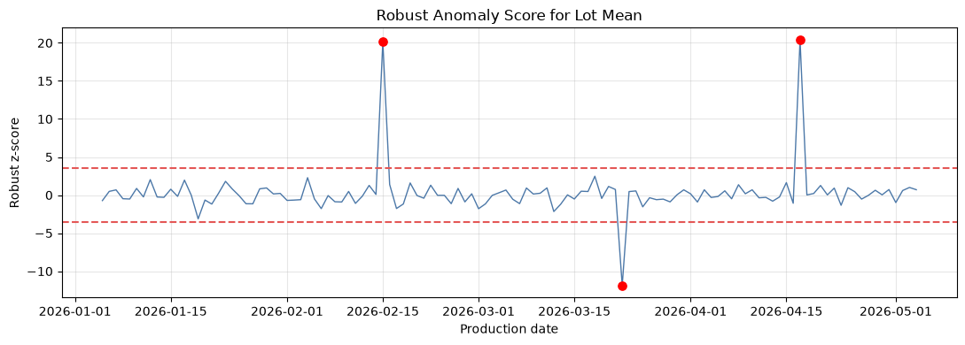 <style scoped> .dataframe tbody tr th:only-of-type { vertical-align: middle; } .dataframe tbody tr th { vertical-align: top; } .dataframe thead th { text-align: right; } </style> <table border="1" class="dataframe"> <thead> <tr style="text-align: right;"> <th></th> <th>lot_id</th> <th>date</th> <th>line</th> <th>dimension_mean</th> <th>robust_z</th> </tr> </thead> <tbody> <tr> <th>41</th> <td>L042</td> <td>2026-02-15</td> <td>C</td> <td>50.2693</td> <td>20.1432</td> </tr> <tr> <th>76</th> <td>L077</td> <td>2026-03-22</td> <td>B</td> <td>49.8470</td> <td>-11.8641</td> </tr> <tr> <th>102</th> <td>L103</td> <td>2026-04-17</td> <td>A</td> <td>50.3314</td> <td>20.3775</td> </tr> </tbody> </table> ### Reading the results Lots with special shifts are extracted as the highest score. In actual operation, after detection, the history of raw material lots, tool changes, temperature and humidity, workers, and instrument calibration is automatically linked, and alerts lead to identifying the cause. The model shows not the cause, but the priority of the investigation. ## 12. No.006: Spot Examination ### Meaning in Practice If the full inspection is expensive or destructive, a portion is removed from the lot to determine whether it passes or fails. The number of samples $n$ and the number of passing $c$ determine not only inspection man-hours but also the producer risk of rejecting good lots and the consumer risk of passing through bad lots. ### Approach to Analysis and Modeling When the lot is sufficiently large, the probability of selecting $n$ pieces from lots with a defect rate of $p$ and passing if there are fewer than $c$ defects is $$P(\mathrm{accept}\mid p)=\sum_{x=0}^{c}{n\choose x}p^x(1-p)^{n-x}$$ That's right. The OC curve is the representation of this pass probability relative to the defect rate. In finite lots, a hypergeometric distribution reflecting non-reconstructive extraction is used. ### Check with Python ```python plans = [(50, 1), (80, 1), (80, 2)] p_grid = np.linspace(0, 0.10, 201) fig, ax = plt.subplots(figsize=(8, 4.5)) for n, c in plans: accept_prob = stats.binom.cdf(c, n, p_grid) ax.plot(100 * p_grid, 100 * accept_prob, label=f"n={n}, c={c}") ax.axvline(1, color="gray", linestyle=":", label="AQL example: 1%") ax.axvline(5, color="black", linestyle=":", label="LQ example: 5%") ax.set_title("Operating Characteristic Curves") ax.set_xlabel("Lot defect rate (%)") ax.set_ylabel("Probability of acceptance (%)") ax.grid(alpha=0.3) ax.legend() plt.tight_layout() plt.show() plan_table = pd.DataFrame([ {"n": n, "c": c, "P_accept_at_1%": stats.binom.cdf(c, n, 0.01), "P_accept_at_5%": stats.binom.cdf(c, n, 0.05)} for n, c in plans ]) display(plan_table) ``` 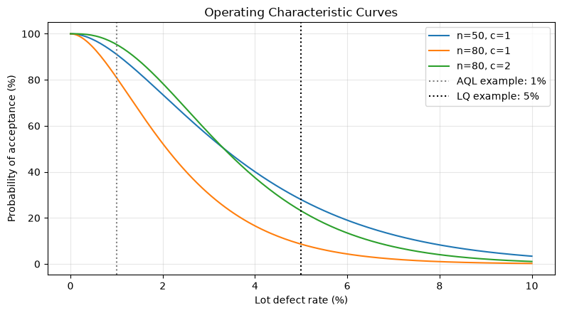 <style scoped> .dataframe tbody tr th:only-of-type { vertical-align: middle; } .dataframe tbody tr th { vertical-align: top; } .dataframe thead th { text-align: right; } </style> <table border="1" class="dataframe"> <thead> <tr style="text-align: right;"> <th></th> <th>n</th> <th>c</th> <th>P_accept_at_1%</th> <th>P_accept_at_5%</th> </tr> </thead> <tbody> <tr> <th>0</th> <td>50</td> <td>1</td> <td>0.9106</td> <td>0.2794</td> </tr> <tr> <th>1</th> <td>80</td> <td>1</td> <td>0.8092</td> <td>0.0861</td> </tr> <tr> <th>2</th> <td>80</td> <td>2</td> <td>0.9534</td> <td>0.2306</td> </tr> </tbody> </table> ### Reading the results If you increase the number of samples and make the pass judgment stricter, the probability of passing a bad lot decreases, but the chances of rejecting good lots and the cost of testing increase. AQL and LQ need to be aligned with contracts, usage, and loss amounts, making the OC curve a common language for both customers and suppliers. ## 13. No.007: Quality Evaluation Using Confidence Intervals ### Meaning in Practice The estimation of a "defect rate of 1%" has different meanings between 200 inspections and 20,000 inspections. Including confidence intervals helps determine whether additional inspections are needed and how wide you should explain to customers. ### Approach to Analysis and Modeling There are several methods for interval estimation of binomial ratios. Simple normal approximations are unstable when the number of defects is low, so here we use the Wilson interval. $z=z_{1-\alpha/2}$ If we set this to the center, we correct the center and half-width to obtain a relatively stable interval within the range 0 to 1. A 95% confidence interval does not mean "the true value is 95% likely to be in this interval," but rather a procedural property where 95% of the intervals cover the true value when the same procedure is repeated. ### Check with Python ```python def wilson_interval(x, n, alpha=0.05): z = stats.norm.ppf(1 - alpha / 2) phat = x / n denom = 1 + z**2 / n center = (phat + z**2 / (2 * n)) / denom half = z * np.sqrt(phat * (1 - phat) / n + z**2 / (4 * n**2)) / denom return center - half, center + half ci_rows = [] for line, row in defect_summary.iterrows(): low, high = wilson_interval(int(row["defects"]), int(row["inspected"])) ci_rows.append((line, row["defects"] / row["inspected"], low, high)) ci_df = pd.DataFrame(ci_rows, columns=["line", "estimate", "ci_low", "ci_high"]).set_index("line") display(100 * ci_df) fig, ax = plt.subplots(figsize=(7, 4)) y = np.arange(len(ci_df)) ax.errorbar(100 * ci_df["estimate"], y, xerr=[100 * (ci_df["estimate"] - ci_df["ci_low"]), 100 * (ci_df["ci_high"] - ci_df["estimate"])], fmt="o", capsize=4, color="#4C78A8") ax.set_yticks(y, ci_df.index) ax.set_title("Defect Rate with 95% Wilson Interval") ax.set_xlabel("Defect rate (%)") ax.set_ylabel("Line") ax.grid(axis="x", alpha=0.3) plt.tight_layout() plt.show() ``` <style scoped> .dataframe tbody tr th:only-of-type { vertical-align: middle; } .dataframe tbody tr th { vertical-align: top; } .dataframe thead th { text-align: right; } </style> <table border="1" class="dataframe"> <thead> <tr style="text-align: right;"> <th></th> <th>estimate</th> <th>ci_low</th> <th>ci_high</th> </tr> <tr> <th>line</th> <th></th> <th></th> <th></th> </tr> </thead> <tbody> <tr> <th>A</th> <td>0.7625</td> <td>0.5941</td> <td>0.9782</td> </tr> <tr> <th>B</th> <td>2.1375</td> <td>1.8428</td> <td>2.4782</td> </tr> <tr> <th>C</th> <td>1.1500</td> <td>0.9387</td> <td>1.4082</td> </tr> </tbody> </table> 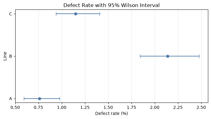 ### Reading the results The horizontal lines at each point indicate the estimated error. If the range is wide, it is risky to decide on large investments based solely on the estimated ranking of points. On the other hand, if the section of Line B is located on the higher side than the others, suspicion of a process difference increases. Next, explicitly test whether the difference can be explained by chance. ## 14. No.008: Comparative Process Certification ### Meaning in Practice When assessing the effects of line changes, equipment upgrades, or supplier switching, it is necessary to distinguish between observed and reproducible differences. The test evaluates how unlikely it is that such a difference is possible under the hypothesis of "no difference." ### Approach to Analysis and Modeling For the defect rates of lines A and B, a two-sample ratio z-test is conducted for null hypothesis $H_0:p_A=p_B$ and controversial hypothesis $H_1:p_A\ne p_B$. The statistics using pool ratio $\hat p$ are $$z=\frac{\hat p_A-\hat p_B}{\sqrt{\hat p(1-\hat p)(1/n_A+1/n_B)}}$$ That's right. The p-value is not about the magnitude of the difference or the business value itself. Defect rate differences and relative risk are also recorded as effect sizes, and judged at a predetermined significance level of 5%. ### Check with Python ```python a = defect_summary.loc["A"] b = defect_summary.loc["B"] p_a, p_b = a["defects"] / a["inspected"], b["defects"] / b["inspected"] p_pool = (a["defects"] + b["defects"]) / (a["inspected"] + b["inspected"]) se = np.sqrt(p_pool * (1 - p_pool) * (1 / a["inspected"] + 1 / b["inspected"])) z_stat = (p_a - p_b) / se p_value = 2 * stats.norm.sf(abs(z_stat)) comparison = pd.DataFrame({ "metric": ["A defect rate", "B defect rate", "B - A (percentage points)", "B/A relative risk", "z statistic", "two-sided p-value"], "value": [p_a, p_b, 100 * (p_b - p_a), p_b / p_a, z_stat, p_value] }) display(comparison) print("5%Level Determination:", "There are statistical differences between the lines." if p_value < 0.05 else "We cannot conclude that there is a difference.") ``` <style scoped> .dataframe tbody tr th:only-of-type { vertical-align: middle; } .dataframe tbody tr th { vertical-align: top; } .dataframe thead th { text-align: right; } </style> <table border="1" class="dataframe"> <thead> <tr style="text-align: right;"> <th></th> <th>metric</th> <th>value</th> </tr> </thead> <tbody> <tr> <th>0</th> <td>A defect rate</td> <td>7.6250e-03</td> </tr> <tr> <th>1</th> <td>B defect rate</td> <td>2.1375e-02</td> </tr> <tr> <th>2</th> <td>B - A (percentage points)</td> <td>1.3750e+00</td> </tr> <tr> <th>3</th> <td>B/A relative risk</td> <td>2.8033e+00</td> </tr> <tr> <th>4</th> <td>z statistic</td> <td>-7.2748e+00</td> </tr> <tr> <th>5</th> <td>two-sided p-value</td> <td>3.4696e-13</td> </tr> </tbody> </table> 5% Level Judgment: Statistical Differences Between Lines ### Reading the results If the p-value is less than 5%, it is unlikely that the current difference occurred from processes with the same defect rate. However, if the line, materials, product types, or working conditions are mixed, it cannot be definitively determined that the line itself is the cause. Add stratified aggregation and planned comparative trials, prioritizing both statistically significant differences and the monetary effect of improvements. ## 15. No.009: Failure Rate Estimation ### Meaning in Practice Equipment failures simultaneously cause quality fluctuations, downtime losses, and delivery delays. By using the failure rate divided not only by the number of failures but also by operating hours, you can compare lines with different operating volumes and connect to spare parts, maintenance personnel, and renewal plans. ### Approach to Analysis and Modeling Assuming a Poisson process with a constant failure rate of $\lambda$, the most likely estimator of the number of failures $K$ over total operating time $T$ is $$\hat\lambda=\frac{K}{T},\qquad \widehat{MTBF}=\frac{1}{\hat\lambda}=\frac{T}{K}$$ That's right. Since the estimation error is large when the number of failures is small, we also show a 95% confidence interval for the failure rate based on the chi-square distribution. For wear failures where the failure rate changes over time, it is necessary to use methods such as Weibull analysis rather than a constant rate model. ### Check with Python ```python reliability = lot_df.groupby("line").agg( exposure_hours=("exposure_hours", "sum"), failures=("failures", "sum") ) reliability["failures_per_1000h"] = 1000 * reliability["failures"] / reliability["exposure_hours"] reliability["estimated_MTBF_h"] = reliability["exposure_hours"] / reliability["failures"] alpha = 0.05 reliability["rate_ci_low_per_1000h"] = [ 1000 * (0 if k == 0 else stats.chi2.ppf(alpha / 2, 2 * k) / (2 * t)) for k, t in zip(reliability["failures"], reliability["exposure_hours"]) ] reliability["rate_ci_high_per_1000h"] = [ 1000 * stats.chi2.ppf(1 - alpha / 2, 2 * (k + 1)) / (2 * t) for k, t in zip(reliability["failures"], reliability["exposure_hours"]) ] display(reliability) ax = reliability["failures_per_1000h"].plot(kind="bar", color="#B279A2", legend=False) ax.set_title("Estimated Equipment Failure Rate") ax.set_xlabel("Line") ax.set_ylabel("Failures per 1,000 hours") ax.grid(axis="y", alpha=0.3) plt.tight_layout() plt.show() ``` <style scoped> .dataframe tbody tr th:only-of-type { vertical-align: middle; } .dataframe tbody tr th { vertical-align: top; } .dataframe thead th { text-align: right; } </style> <table border="1" class="dataframe"> <thead> <tr style="text-align: right;"> <th></th> <th>exposure_hours</th> <th>failures</th> <th>failures_per_1000h</th> <th>estimated_MTBF_h</th> <th>rate_ci_low_per_1000h</th> <th>rate_ci_high_per_1000h</th> </tr> <tr> <th>line</th> <th></th> <th></th> <th></th> <th></th> <th></th> <th></th> </tr> </thead> <tbody> <tr> <th>A</th> <td>32204</td> <td>23</td> <td>0.7142</td> <td>1400.1739</td> <td>0.4527</td> <td>1.0716</td> </tr> <tr> <th>B</th> <td>31725</td> <td>58</td> <td>1.8282</td> <td>546.9828</td> <td>1.3882</td> <td>2.3634</td> </tr> <tr> <th>C</th> <td>32193</td> <td>17</td> <td>0.5281</td> <td>1893.7059</td> <td>0.3076</td> <td>0.8455</td> </tr> </tbody> </table> 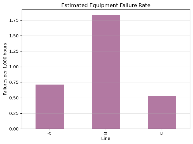 ### Reading the results Line B also has a high failure rate, and both poor quality and equipment condition may be poor at the same time. However, if confidence intervals overlap, you should not conclude renewal investments based solely on short-term transaction counts. Failure modes, downtime, repair costs, and impact on quality are accumulated at the equipment ID level, advancing toward risk-based maintenance. ## 16. No.010: Quality Simulation ### Meaning in Practice A plan based solely on average values cannot secure sorting personnel, disposal costs, or customer service costs during upward swings. By using Monte Carlo simulations to distribute defects and losses for the following month, you can link your budget with your risk tolerance. ### Approach to Analysis and Modeling We predict using the Beta binomial type, which represents the estimation error of the defect rate using the Beta distribution and the number of defects at a given defect rate as a binomial distribution. From a uniform pre-distribution $p\sim\mathrm{Beta}(1,1)$, the number of defects $x$, and the number of good products $n-x$ $$p\mid x,n\sim\mathrm{Beta}(1+x,1+n-x)$$ You will get it. Subtract $p$ from each trial to generate the number of defects for the next month's production $N$. This is a scenario assuming that process conditions remain the same as the current state and does not guarantee the future. ### Check with Python ```python sim_rng = np.random.default_rng(SEED + 10) observed_x = int(lot_df["defects"].sum()) observed_n = int(lot_df["inspected"].sum()) next_month_units = 300_000 unit_loss_yen = 4_500 n_sim = 20_000 sim_p = sim_rng.beta(1 + observed_x, 1 + observed_n - observed_x, n_sim) sim_defects = sim_rng.binomial(next_month_units, sim_p) sim_loss_yen = sim_defects * unit_loss_yen simulation_summary = pd.Series({ "expected_defects": sim_defects.mean(), "median_defects": np.median(sim_defects), "P90_defects": np.quantile(sim_defects, 0.90), "P95_defects": np.quantile(sim_defects, 0.95), "expected_loss_yen": sim_loss_yen.mean(), "P95_loss_yen": np.quantile(sim_loss_yen, 0.95), }) display(simulation_summary.to_frame("value")) fig, ax = plt.subplots(figsize=(8, 4.5)) ax.hist(sim_loss_yen / 1_000_000, bins=40, color="#4C78A8", edgecolor="white") ax.axvline(np.quantile(sim_loss_yen, 0.95) / 1_000_000, color="#E45756", linestyle="--", label="95th percentile") ax.set_title("Simulated Monthly Quality Loss") ax.set_xlabel("Quality loss (million JPY)") ax.set_ylabel("Simulation count") ax.grid(axis="y", alpha=0.3) ax.legend() plt.tight_layout() plt.show() ``` <style scoped> .dataframe tbody tr th:only-of-type { vertical-align: middle; } .dataframe tbody tr th { vertical-align: top; } .dataframe thead th { text-align: right; } </style> <table border="1" class="dataframe"> <thead> <tr style="text-align: right;"> <th></th> <th>value</th> </tr> </thead> <tbody> <tr> <th>expected_defects</th> <td>4.0601e+03</td> </tr> <tr> <th>median_defects</th> <td>4.0570e+03</td> </tr> <tr> <th>P90_defects</th> <td>4.3660e+03</td> </tr> <tr> <th>P95_defects</th> <td>4.4520e+03</td> </tr> <tr> <th>expected_loss_yen</th> <td>1.8270e+07</td> </tr> <tr> <th>P95_loss_yen</th> <td>2.0034e+07</td> </tr> </tbody> </table> 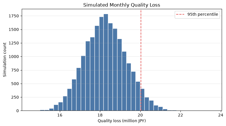 ### Reading the results Average loss is the budget standard, and the 95th percentile can be used for stricter resource planning. The post-countermeasure defect rate scenario is calculated using the same framework, and by comparing the reduction loss against the countermeasure cost, it becomes an investment valuation. Note that if there is correlation between lots or sudden process changes, the simple model underestimates the risk of hemming, so backtesting against actual results is necessary. ## 17. Practical Insights Seen Through Target Exercise Throughout the 10 points, the key is not to use metrics in isolation. 1. **Defect Rate and Confidence Intervals**, grasp current levels and estimated errors 2. **Control charts and anomaly detection**, find special causes in time 3. **CpAndCpk** to separate variation and deviation 4. **Certification**, check if the line difference can be explained purely by chance. 5. **sampling inspection** to clearly define testing load and leakage risk 6. Connect quality and equipment maintenance data with **failure rate** 7. **Simulation** translates quality KPIs into loss amounts and required resources. In this order, decisions proceed from the point that "Line B is at fault" to "Center correction, variation reduction, and equipment inspection—at what cost, and to what risk level?" ## 18. What is necessary for practical implementation - **Definition unification**: Deficiencies and aggregation granularity for defects, rework, disposal, inspection parameters, and stoppages - **traceability**: Connect products, lots, equipment, tools, materials, working conditions, and measuring instruments with keys - **Measurement Reliability**: Check Gage R&R and calibration history to avoid confusing measurement errors with process variations. - **Managing the Reference Period**: After process changes, review the control limits and capability index reference periods - **Alert Operation**: Streamline the workflow from post-detection assignment, deadline, cause classification, corrective actions, to effectiveness confirmation - **Decision-making criteria**: Quantify the costs associated with false alarms, missed alerts, spills, stoppages, and inspections. - **Model Monitoring**: Regularly verify distribution assumptions, independence, and coverage rates of forecast intervals ## 19. Summary Quality control statistics are not meant to explain numbers neatly, but to choose actions in uncertain situations. By operating point estimation, process capability, time-series monitoring, hypothesis testing, reliability, and simulation on the same data platform, it becomes possible to provide consistent explanations from on-site anomaly response to management investment decisions. Although this notebook's hypothetical example is small-scale, in practice its value increases by connecting product hierarchies, process paths, equipment status, costs, and customer impact. It is practical to start by selecting one important quality characteristic, refine the definition and data granularity, and begin with small-scale operations of control charts and improvement actions. ## 20. Consultations for Corporations At Suri Kobo, we support each company's data and decision-making processes, covering everything from quality KPI design, process capability evaluation, anomaly detection, equipment maintenance, quality loss simulation, to implementation of analytical platforms. In addition to training, you can also consult about analysis and operational design that can be continuously used on-site. > 📩 **Contact Us**: [surikobo.co.jp/contact](https://surikobo.co.jp/contact) > Please feel free to consult us first.