
100 Exercises / Probability Statistics / 100 Exercise Points in Probability & Statistical Marketing Applications
Hands-on Machine Learning in Manufacturing with Python | 10 Exercise-Down Prediction, Causal Inference, and Optimization
From Prediction to On-Site Action: 10 Key Exercises on Machine Learning in Manufacturing
This article uses a fictional industrial equipment manufacturer as a subject to connect Regression, classification, clustering, dimensionality reduction, anomaly detection, time series prediction, causal inference, Bayesian optimization, reinforcement learning, graph machine learning to decision-making in manufacturing.
The goal is not to compete in model accuracy. We specify which data to use, which metrics to use, and which metrics to use, and to support whose decisions are supported, including labor estimates, quality assessments, customer interactions, equipment monitoring, demand planning, improvement measures, processing conditions, maintenance policies, and supplier risks. All data is generated in Python and does not depend on external data.
[!NOTE] This material is a notebook previously used by Surikoubo (or personally by the representative, Kazuyama), and has been reconstructed, edited, and published with the company’s permission. All data listed is fictional and has no relation whatsoever to real companies, factories, or figures.
Introduction: Practical Challenges in Manufacturing Covered in This Article
Target companies process and assemble pump parts according to order specifications and sell them both domestically and internationally. On-site challenges include errors in machining time estimates, missed defects, equipment downtime, demand fluctuations, overestimation of improvement effects, and the spread of supplier disruptions.
Machine learning is not magic that automatically solves these problems. Value is created only by converting forecasts into decisions such as “approve overtime,” “add inspections,” or “implement maintenance,” and only by monitoring the gap with actual results can value be realized. This article explains the outputs of each model in pairs with the tasks that use those outputs.
Common situations on site
- Standard man-hours are only averages by product group, and delivery deadlines are missed for high-difficulty items.
- We created a defect prediction model but did not compare the costs of missed or over-tested
- There are many sensor items, and it’s unclear which changes to indicate to equipment personnel.
- Simply comparing the average before and after improvements can confuse project difficulty and equipment differences with improvement effects.
- Prediction and optimization results do not connect to existing work standards, approval permissions, or exception handling
Why is this issue so difficult to judge?
Manufacturing data depends on the time series, equipment, product types, workers, and business partners. With random partitioning, future information is mixed into the learning side, and average accuracy alone can hide missed major defects. Also, even if the correlation is high, it does not necessarily mean the effect is due to changing conditions.
Therefore, the objective variable, the explanatory variables available at the time of forecasting, evaluation units, misjudgment costs, and scope of application are defined first. The choice of model is the next step.
Overview of Exercise covered this time
| No. | Theme | Key Challenges in Manufacturing | Main Evaluations and Outputs |
|---|---|---|---|
| 061 | Return | How many minutes should you estimate the processing time? | MAE, residual |
| 062 | Categories | Should we conduct additional inspections for defective risk products? | Recall rate, mixed lineup |
| 063 | clustering | How to Divide Customers into Support Policies | Segment Characteristics |
| 064 | Dimension reduction | How to summarize numerous sensor changes | Contribution Rate and Principal Component Scores |
| 065 | anomaly detection | How to pick up equipment abnormalities with few correct labels | Abnormal scores, top candidates |
| 066 | Time Series Forecast | Here are some of the order volumes and required capabilities for next month. | Time-Series MAE, Forecast Trends |
| 067 | causal inference | Did the new jig really shorten processing time? | ATE by IPW |
| 068 | Bayesian optimization | How to find machining conditions with minimal prototyping | Acquired Function, Best Condition |
| 069 | Reinforcement Learning | Whether to preserve or continue for each deterioration condition | Strategies, cumulative rewards |
| 070 | Graph Machine Learning | How to view supply risk from the perspective of the trading network | Proximity Features, Risk Probability |
Preparing the Python environment
NumPy and pandas are used for data generation and aggregation, scikit-learn for preprocessing and machine learning, SciPy for earning functions, NetworkX for transaction networks, and matplotlib for visualization. Use default_rng(42) to rerun it so that the same fictitious data is used.
%matplotlib inline
%config InlineBackend.figure_format = 'svg'

import warnings
warnings.filterwarnings("ignore")

import numpy as np
import pandas as pd
import matplotlib
import matplotlib.pyplot as plt
import japanize_matplotlib
import networkx as nx
import sklearn

from IPython.display import display
from scipy.stats import norm
from sklearn.cluster import KMeans
from sklearn.compose import ColumnTransformer
from sklearn.decomposition import PCA
from sklearn.ensemble import IsolationForest
from sklearn.gaussian_process import GaussianProcessRegressor
from sklearn.gaussian_process.kernels import ConstantKernel, Matern, WhiteKernel
from sklearn.linear_model import LinearRegression, LogisticRegression
from sklearn.metrics import (ConfusionMatrixDisplay, RocCurveDisplay, accuracy_score,
                             classification_report, mean_absolute_error, r2_score,
                             roc_auc_score)
from sklearn.model_selection import train_test_split
from sklearn.pipeline import make_pipeline
from sklearn.preprocessing import OneHotEncoder, StandardScaler

rng = np.random.default_rng(42)
print("numpy      :", np.__version__)
print("pandas     :", pd.__version__)
print("matplotlib :", matplotlib.__version__)
print("sklearn    :", sklearn.__version__)
print("networkx   :", nx.__version__)
numpy : 2.5.1
pandas : 3.0.3
matplotlib : 3.11.0
sklearn : 1.9.0
networkx : 3.6.1Creation of Fictional Data
We assume 420 recent processing cases. In addition to materials that can be identified at the time of order, product line, lot size, complexity, equipment, and number of setups, we also provide vibration, temperature, dimensional deviations, and defect flags that can be identified after processing. event_date are arranged in chronological order so they can be used for chronological evaluation.
What matters is the “timing of prediction.” For example, when estimating labor hours at the time of order, vibration or dimensional deviations measured after processing cannot be used. Ignoring availability results in data leaks with high verification accuracy.
n = 420
event_date = pd.date_range("2025-01-01", periods=n, freq="D")
material = rng.choice(["Steel", "Aluminum", "Resin"], n, p=[0.50, 0.30, 0.20])
product = rng.choice(["Pump-A", "Pump-B", "Pump-C"], n, p=[0.45, 0.35, 0.20])
machine = rng.choice(["MC-1", "MC-2", "MC-3"], n, p=[0.40, 0.35, 0.25])
lot_size = rng.integers(20, 151, n)
complexity = np.clip(rng.normal(5.0, 1.8, n), 1, 10)
setup_count = rng.integers(1, 5, n)

mat_effect = pd.Series(material).map({"Steel": 18, "Aluminum": 8, "Resin": 3}).to_numpy()
prod_effect = pd.Series(product).map({"Pump-A": 0, "Pump-B": 12, "Pump-C": 25}).to_numpy()
machine_effect = pd.Series(machine).map({"MC-1": 2, "MC-2": -4, "MC-3": 6}).to_numpy()
cycle_time = (35 + 0.48 * lot_size + 7.2 * complexity + 5.5 * setup_count
              + mat_effect + prod_effect + machine_effect + rng.normal(0, 8, n))
vibration = np.clip(1.6 + 0.12 * complexity + 0.003 * lot_size
                    + (machine == "MC-3") * 0.35 + rng.normal(0, 0.22, n), 0.5, None)
temperature = 53 + 1.7 * complexity + (machine == "MC-1") * 3 + rng.normal(0, 3.2, n)
dim_error = rng.normal(0, 0.018 + 0.003 * complexity, n) + (vibration - 2.4) * 0.012
logit = -5.0 + 0.75 * complexity + 0.85 * (vibration - 2.2) + 18 * np.abs(dim_error)
defect_prob = 1 / (1 + np.exp(-logit))
defect = rng.binomial(1, defect_prob)

production = pd.DataFrame({
    "event_date": event_date, "material": material, "product": product,
    "machine": machine, "lot_size": lot_size, "complexity": complexity.round(2),
    "setup_count": setup_count, "cycle_time_min": cycle_time.round(1),
    "vibration_mm_s": vibration.round(3), "temperature_c": temperature.round(2),
    "dimension_error_mm": dim_error.round(4), "defect": defect,
})
display(production.head())
print(f"Number of lines: {len(production):,} / non_performing_rate: {production['defect'].mean():.1%}")| event_date | material | product | machine | lot_size | complexity | setup_count | cycle_time_min | vibration_mm_s | temperature_c | dimension_error_mm | defect | |
|---|---|---|---|---|---|---|---|---|---|---|---|---|
| 0 | 2025-01-01 | Aluminum | Pump-B | MC-1 | 77 | 4.51 | 1 | 127.1 | 2.540 | 60.91 | 0.0375 | 0 |
| 1 | 2025-01-02 | Steel | Pump-A | MC-3 | 25 | 3.33 | 1 | 91.7 | 2.363 | 61.24 | 0.0212 | 0 |
| 2 | 2025-01-03 | Resin | Pump-A | MC-2 | 47 | 3.44 | 2 | 80.7 | 2.553 | 57.05 | -0.0436 | 0 |
| 3 | 2025-01-04 | Aluminum | Pump-A | MC-2 | 72 | 2.06 | 3 | 118.6 | 1.869 | 51.99 | -0.0139 | 0 |
| 4 | 2025-01-05 | Steel | Pump-B | MC-1 | 28 | 5.43 | 4 | 143.7 | 2.383 | 68.49 | 0.0055 | 0 |
Number of lines: 420 / Defect rate: 36.9%No.061: Regression — Estimating machining time based on order specifications
Meaning in Practice
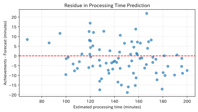
Forecasting machining time is a common input for estimated cost, delivery date response, equipment load, and overtime judgment. By reflecting not only the average standard time but also materials, types, equipment, and difficulty, you can reduce underestimation of high-difficulty projects.
Approach to Analysis and Modeling
Linear regression is used to predict continuous values .
Category variables are one-hot, learning 80% of the first half of the time series and evaluating the second 20%. Errors are checked by the mean absolute error of , which is easy to interpret on site, and the , which represents the rate of explanation.
Check with Python
features_061 = ["material", "product", "machine", "lot_size", "complexity", "setup_count"]
cat_061 = ["material", "product", "machine"]
num_061 = ["lot_size", "complexity", "setup_count"]
split = int(len(production) * 0.8)
X_train, X_test = production.loc[:split-1, features_061], production.loc[split:, features_061]
y_train, y_test = production.loc[:split-1, "cycle_time_min"], production.loc[split:, "cycle_time_min"]

prep_061 = ColumnTransformer([
    ("category", OneHotEncoder(handle_unknown="ignore"), cat_061),
    ("numeric", StandardScaler(), num_061),
])
model_061 = make_pipeline(prep_061, LinearRegression()).fit(X_train, y_train)
pred_061 = model_061.predict(X_test)
metrics_061 = pd.DataFrame({
    "indicator": ["MAE(minutes)", "R²"],
    "value": [mean_absolute_error(y_test, pred_061), r2_score(y_test, pred_061)],
})
display(metrics_061.round(3))

fig, ax = plt.subplots(figsize=(7, 4))
ax.scatter(pred_061, y_test - pred_061, alpha=0.65)
ax.axhline(0, color="red", linestyle="--")
ax.set_title("Residue in Processing Time Prediction")
ax.set_xlabel("Estimated processing time (minutes)")
ax.set_ylabel("Achievements - Forecast (minutes)")
ax.grid(True, alpha=0.3)
plt.tight_layout()
plt.show()| indicator | value | |
|---|---|---|
| 0 | MAE(minutes) | 6.898 |
| 1 | R² | 0.902 |
Reading the results
MAE shows how many minutes the estimate deviates on average. If the residuals are scattered around zero, there is no large systematic error, but if the residuals widen over the long term, it is necessary to subdivide the difficulty classification and predict sections. In practice, instead of using MAE as a delivery buffer, we check the underestimation rate by product group and the costs that underestimation results in overtime and delivery times.
No.062: Classification — Assigning Additional Tests Based on Defect Risk
Meaning in Practice
While full inspection is easier to maintain quality, it consumes inspection capacity and lead time. The classification model assigns lots with a high defect probability to key inspections, serving as a criterion for balancing oversight and inspection load.
Approach to Analysis and Modeling
Estimate the defect probability using logistic regression.
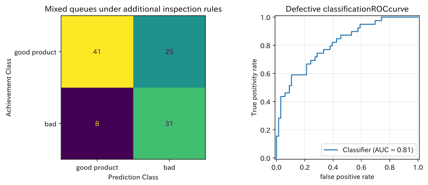
Since defective classes are minor, use class_weight="balanced". Not only ROC-AUC but also mixed sequences are checked, and false negatives that are judged as normal are managed in particular. This time, assuming a quality gate after processing, vibration, temperature, and dimensional deviations are included in the input.
Check with Python
features_062 = ["complexity", "vibration_mm_s", "temperature_c", "dimension_error_mm"]
X_062 = production[features_062]
y_062 = production["defect"]
X_train, X_test, y_train, y_test = train_test_split(
    X_062, y_062, test_size=0.25, random_state=42, stratify=y_062
)
model_062 = make_pipeline(
    StandardScaler(), LogisticRegression(class_weight="balanced", random_state=42)
).fit(X_train, y_train)
prob_062 = model_062.predict_proba(X_test)[:, 1]
pred_062 = (prob_062 >= 0.45).astype(int)
print(f"ROC-AUC: {roc_auc_score(y_test, prob_062):.3f}")
print(classification_report(y_test, pred_062, target_names=["good product", "bad"], digits=3))

fig, axes = plt.subplots(1, 2, figsize=(10, 4))
ConfusionMatrixDisplay.from_predictions(y_test, pred_062, display_labels=["good product", "bad"], ax=axes[0], colorbar=False)
axes[0].set_title("Mixed queues under additional inspection rules")
axes[0].set_xlabel("Prediction Class")
axes[0].set_ylabel("Achievement Class")
axes[0].grid(False)
RocCurveDisplay.from_predictions(y_test, prob_062, ax=axes[1])
axes[1].set_title("Defective classificationROCcurve")
axes[1].set_xlabel("false positive rate")
axes[1].set_ylabel("True positivity rate")
axes[1].grid(True, alpha=0.3)
plt.tight_layout()
plt.show()
ROC-AUC: 0.811
precision recall f1-score support
Good product 0.837 0.621 0.713 66
Non-performing 0.554 0.795 0.653 39
accuracy 0.686 105
macro avg 0.695 0.708 0.683 105
weighted avg 0.732 0.686 0.691 105
Reading the results
The bottom right of the mixed queue indicates detected defects, while the bottom left indicates missed defects (horizontal axis is prediction, vertical axis is actual results). Lowering the threshold increases the reproduction rate of defects, but also increases additional inspections for good products. During implementation, Missed Fees × Number of false negatives + Additional Testing Costs × Number of Tests is compared by threshold and performance is monitored by product type.
No.063: Clustering — Segmenting Corporate Customers by Support Needs
Meaning in Practice
In industrial goods, when customer service is divided solely by sales scale, customers with high-frequency technical inquiries or those with large delivery times are overlooked. Clustering is a method to explore customer groups with similar purchasing and service characteristics.
Approach to Analysis and Modeling
K-means minimizes the sum of squared distances at each point and the center of the cluster of affiliation.
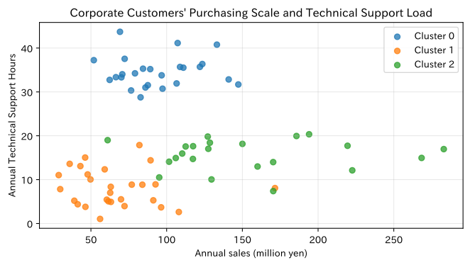
Standardize so that only large annual sales units do not dominate distance. There is no superiority or inferiority to cluster numbers themselves; you look at the summary table and add business names afterward.
Check with Python
n_customer = 75
base_segment = rng.choice(3, n_customer, p=[0.40, 0.35, 0.25])
annual_sales = np.exp(rng.normal(np.choose(base_segment, [4.0, 5.0, 4.5]), 0.35))
order_frequency = np.clip(rng.normal(np.choose(base_segment, [10, 28, 17]), 3.5), 3, None)
urgent_ratio = np.clip(rng.normal(np.choose(base_segment, [0.10, 0.18, 0.42]), 0.06), 0, 0.8)
support_hours = np.clip(rng.normal(np.choose(base_segment, [8, 16, 34]), 4), 1, None)
customers = pd.DataFrame({
    "customer_id": [f"C{i:03d}" for i in range(1, n_customer + 1)],
    "annual_sales_million_yen": annual_sales,
    "order_frequency": order_frequency,
    "urgent_order_ratio": urgent_ratio,
    "support_hours": support_hours,
})
cluster_features = customers.columns[1:]
X_scaled = StandardScaler().fit_transform(customers[cluster_features])
customers["cluster"] = KMeans(n_clusters=3, random_state=42, n_init=20).fit_predict(X_scaled)
profile_063 = customers.groupby("cluster")[cluster_features].mean()
profile_063["customers"] = customers.groupby("cluster").size()
display(profile_063.round(2))

fig, ax = plt.subplots(figsize=(7, 4))
for cluster, group in customers.groupby("cluster"):
    ax.scatter(group["annual_sales_million_yen"], group["support_hours"], label=f"Cluster {cluster}", alpha=0.75)
ax.set_title("Corporate Customers' Purchasing Scale and Technical Support Load")
ax.set_xlabel("Annual sales (million yen)")
ax.set_ylabel("Annual Technical Support Hours")
ax.grid(True, alpha=0.3)
ax.legend()
plt.tight_layout()
plt.show()| annual_sales_million_yen | order_frequency | urgent_order_ratio | support_hours | customers | |
|---|---|---|---|---|---|
| cluster | |||||
| 0 | 93.73 | 17.02 | 0.38 | 34.58 | 25 |
| 1 | 66.72 | 9.13 | 0.10 | 8.12 | 28 |
| 2 | 152.65 | 28.49 | 0.19 | 15.65 | 22 |
Reading the results
From the profile table, you can assign meanings such as “High Frequency/Large Volume,” “Emergency Response & High Support Load,” or “Standard Response.” Overlapping in scatter plots is natural, and clusters should not be treated as absolute customer classifications. It is practical for sales and service representatives to identify exception customers and track their movements every six months.
No.064: Dimensionality Reduction — Viewing Changes in Multivariable Sensors from Two Perspectives
Meaning in Practice
The equipment contains numerous signals such as temperature, vibration, current, and sound pressure. Since simply lining up individual graphs makes it difficult to capture simultaneous changes, principal component analysis (PCA) summarizes common variation into a few axes.
Approach to Analysis and Modeling
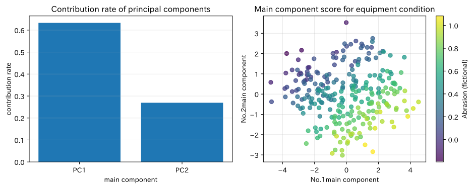
PCA determines the orthogonal direction in which the distribution of standardized data is maximized. The first principal component is , and is the unit vector that maximizes variance. The contribution rate is a guideline for the amount of information, but since there are local abnormalities not present in the main components, it does not mean discarding the original signal.
Check with Python
m = 260
load = rng.uniform(0.3, 1.0, m)
wear = np.linspace(0, 1, m) + rng.normal(0, 0.08, m)
sensors = pd.DataFrame({
    "temperature": 48 + 22 * load + 8 * wear + rng.normal(0, 1.5, m),
    "vibration": 1.0 + 1.2 * load + 1.5 * wear + rng.normal(0, 0.15, m),
    "current": 10 + 9 * load + rng.normal(0, 0.8, m),
    "sound": 62 + 8 * load + 5 * wear + rng.normal(0, 1.2, m),
    "oil_particles": 18 + 30 * wear + rng.normal(0, 3, m),
    "pressure": 4.0 + 2.8 * load - 0.5 * wear + rng.normal(0, 0.25, m),
})
pca_064 = PCA(n_components=2).fit(StandardScaler().fit_transform(sensors))
score_064 = pca_064.transform(StandardScaler().fit_transform(sensors))
loading_064 = pd.DataFrame(pca_064.components_.T, index=sensors.columns, columns=["PC1", "PC2"])
display(loading_064.round(3))
print("Cumulative contribution rate:", np.cumsum(pca_064.explained_variance_ratio_).round(3))

fig, axes = plt.subplots(1, 2, figsize=(10, 4))
axes[0].bar(["PC1", "PC2"], pca_064.explained_variance_ratio_)
axes[0].set_title("Contribution rate of principal components")
axes[0].set_xlabel("main component")
axes[0].set_ylabel("contribution rate")
axes[0].grid(True, axis="y", alpha=0.3)
sc = axes[1].scatter(score_064[:, 0], score_064[:, 1], c=wear, cmap="viridis", alpha=0.75)
axes[1].set_title("Main component score for equipment condition")
axes[1].set_xlabel("No.1main component")
axes[1].set_ylabel("No.2main component")
axes[1].grid(True, alpha=0.3)
fig.colorbar(sc, ax=axes[1], label="Abrasion (fictional)")
plt.tight_layout()
plt.show()| PC1 | PC2 | |
|---|---|---|
| temperature | 0.490 | 0.068 |
| vibration | 0.448 | -0.327 |
| current | 0.389 | 0.431 |
| sound | 0.466 | -0.101 |
| oil_particles | 0.323 | -0.575 |
| pressure | 0.296 | 0.601 |
Cumulative contribution rate: [0.633 0.902]
Reading the results
The contribution rate shows the extent of total variation across two axes, while the load scale shows which sensor is configured for each axis. If the score moves along the wear, it can be used as an auxiliary indicator for inspection triggers. However, the principal component code is arbitrary, and it is not fixed as “the higher the PC1, the more dangerous,” but interprets it in conjunction with the maintenance records.
No.065: Anomaly Detection — Monitoring Equipment with Few Failure Labels
Meaning in Practice
Major failures are usually rare, and it’s usually difficult to collect enough correct labels for supervised learning. Anomaly detection ranks observations that differ from the norm as candidates for inspection, supporting condition-based maintenance.
Approach to Analysis and Modeling
Isolation Forest isolates observations with random features and split points, and considers points with fewer fragments to be anomalies. contamination is the expected anomaly ratio, not the true failure rate itself. The score is not the probability of failure, but the relative deviation from the normal state.
Check with Python
monitor = sensors.copy()
monitor["timestamp"] = pd.date_range("2026-01-01", periods=len(monitor), freq="h")
anomaly_idx = np.array([68, 151, 218, 242])
monitor.loc[anomaly_idx, "vibration"] += [2.2, 2.5, 2.8, 2.4]
monitor.loc[anomaly_idx, "temperature"] += [12, 15, 11, 14]
features_065 = list(sensors.columns)
model_065 = IsolationForest(n_estimators=250, contamination=0.03, random_state=42)
monitor["anomaly_label"] = model_065.fit_predict(monitor[features_065])
monitor["anomaly_score"] = -model_065.score_samples(monitor[features_065])
display(monitor.nlargest(8, "anomaly_score")[["timestamp", "vibration", "temperature", "anomaly_score"]].round(3))

fig, ax = plt.subplots(figsize=(9, 4))
ax.plot(monitor["timestamp"], monitor["anomaly_score"], label="Abnormal Score")
flag = monitor["anomaly_label"] == -1
ax.scatter(monitor.loc[flag, "timestamp"], monitor.loc[flag, "anomaly_score"], color="red", label="inspection candidate", zorder=3)
ax.set_title("Abnormal Score Trends for Equipment Sensors")
ax.set_xlabel("time")
ax.set_ylabel("Anomaly score (the higher the abnormal score)")
ax.grid(True, alpha=0.3)
ax.legend()
plt.tight_layout()
plt.show()| timestamp | vibration | temperature | anomaly_score | |
|---|---|---|---|---|
| 242 | 2026-01-11 02:00:00 | 5.392 | 78.802 | 0.639 |
| 68 | 2026-01-03 20:00:00 | 4.714 | 81.011 | 0.633 |
| 218 | 2026-01-10 02:00:00 | 5.692 | 79.421 | 0.629 |
| 151 | 2026-01-07 07:00:00 | 5.178 | 78.464 | 0.615 |
| 16 | 2026-01-01 16:00:00 | 1.670 | 52.597 | 0.604 |
| 10 | 2026-01-01 10:00:00 | 1.299 | 53.733 | 0.589 |
| 1 | 2026-01-01 01:00:00 | 2.039 | 67.991 | 0.572 |
| 230 | 2026-01-10 14:00:00 | 3.797 | 74.965 | 0.567 |
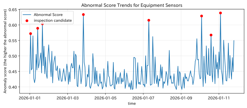
Reading the results
A red mark is not a stop order, but an inspection candidate where maintenance staff check the waveform, machining conditions, and the work before the work. If the same time period appears consecutively in the top table, it is grouped as a single event. It is necessary to accumulate false alarm records and actual failure histories, and update thresholds by equipment and operating mode.
No.066: Time Series Forecasting — Forecasting Replacement Parts Demand Including Seasonality
Meaning in Practice
Forecasting the demand for spare parts is fundamental to production slots, material orders, and safety stock. In random partitioning, future observations are mixed into learning, so evaluations follow the order from past to future.
Approach to Analysis and Modeling
Here, trends and weekly/monthly cycles are represented by Fourier characteristics, with linear regression.
The last 30 days are used as the test period, followed by 30 days to forecast the future. In practice, explanatory variables known at the time of forecasting, such as promotions, holidays, and large projects, are also added.
Check with Python
days = 240
t = np.arange(days)
demand = (82 + 0.09 * t + 13 * np.sin(2 * np.pi * t / 7)
          + 8 * np.sin(2 * np.pi * t / 30) + rng.normal(0, 6, days))
demand = np.clip(np.rint(demand), 0, None)
demand_df = pd.DataFrame({"date": pd.date_range("2025-09-01", periods=days, freq="D"), "demand": demand})

def calendar_features(index):
    index = np.asarray(index)
    return np.column_stack([
        index,
        np.sin(2 * np.pi * index / 7), np.cos(2 * np.pi * index / 7),
        np.sin(2 * np.pi * index / 30), np.cos(2 * np.pi * index / 30),
    ])

train_end = days - 30
model_066 = LinearRegression().fit(calendar_features(t[:train_end]), demand[:train_end])
test_pred = model_066.predict(calendar_features(t[train_end:]))
future_t = np.arange(days, days + 30)
future_pred = model_066.predict(calendar_features(future_t))
print(f"most recent30Day ChronologyMAE: {mean_absolute_error(demand[train_end:], test_pred):.2f} units/days")

fig, ax = plt.subplots(figsize=(10, 4))
ax.plot(demand_df["date"].iloc[-90:], demand[-90:], label="Achievements")
ax.plot(demand_df["date"].iloc[train_end:], test_pred, label="Test Prediction", linestyle="--")
future_date = pd.date_range(demand_df["date"].iloc[-1] + pd.Timedelta(days=1), periods=30, freq="D")
ax.plot(future_date, future_pred, label="future30Forecast for the day", color="red")
ax.set_title("Daily Demand Forecast for Replacement Parts")
ax.set_xlabel("Date")
ax.set_ylabel("Needs (number/Day)")
ax.grid(True, alpha=0.3)
ax.legend()
plt.tight_layout()
plt.show()
Time-series MAE over the past 30 days: 4.30 units/day
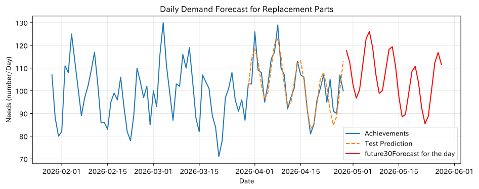
Reading the results
Time Series MAE is the error measured over the most recent 30 days as an unknown period. The future line is an average forecast and does not represent upside risk. For procurement and inventory, we create prediction intervals from the residual distribution and use the upper quantile according to out-of-stock costs and inventory costs. In case structural changes occur, we save the “forecast timeline, forecast value, and actual value” every month.
No.067: Causal Inference — Estimating the Pure Time-Saving Effect of the New Jig
Meaning in Practice
When improvement jigs are prioritized for difficult projects, the processing time of the introduced group appears to be high. The simple average difference before and after implementation, or between implementation and non-implementation, can be mistaken for differences in project composition (confusion) with the effectiveness of the initiative.
Approach to Analysis and Modeling
Estimate the propensity score and create a comparable pseudopopulation using inverse probability weighting (IPW).
The necessary assumptions are: if conditioned by measured confounding factors, the allocation is independent, both groups exist, and treatment definitions are consistent. Unobserved proficiency cannot be corrected.
Check with Python
n_067 = 700
complexity_067 = rng.uniform(1, 10, n_067)
lot_067 = rng.integers(30, 150, n_067)
assign_logit = -2.0 + 0.40 * complexity_067 + 0.004 * lot_067
prop_true = 1 / (1 + np.exp(-assign_logit))
treatment = rng.binomial(1, prop_true)
true_effect = -11.0
outcome = 45 + 8.0 * complexity_067 + 0.30 * lot_067 + true_effect * treatment + rng.normal(0, 8, n_067)
causal = pd.DataFrame({"complexity": complexity_067, "lot_size": lot_067, "new_jig": treatment, "cycle_time": outcome})

naive = causal.loc[causal.new_jig == 1, "cycle_time"].mean() - causal.loc[causal.new_jig == 0, "cycle_time"].mean()
ps_model = make_pipeline(StandardScaler(), LogisticRegression()).fit(causal[["complexity", "lot_size"]], treatment)
ps = np.clip(ps_model.predict_proba(causal[["complexity", "lot_size"]])[:, 1], 0.05, 0.95)
treated_mean = np.sum(treatment * outcome / ps) / np.sum(treatment / ps)
control_mean = np.sum((1-treatment) * outcome / (1-ps)) / np.sum((1-treatment) / (1-ps))
ipw_ate = treated_mean - control_mean
result_067 = pd.DataFrame({
    "Estimation method": ["simple mean deviation", "IPW", "True values for data generation"],
    "Time Reduction Effect (minutes)": [naive, ipw_ate, true_effect],
})
display(result_067.round(2))

fig, ax = plt.subplots(figsize=(7, 4))
ax.hist(ps[treatment == 0], bins=15, alpha=0.6, label="not introduced")
ax.hist(ps[treatment == 1], bins=15, alpha=0.6, label="Introduction")
ax.set_title("Distribution of Trend Scores for New Jig Introduction")
ax.set_xlabel("Probability of Introduction (Trend Score)")
ax.set_ylabel("Number of Cases")
ax.grid(True, alpha=0.3)
ax.legend()
plt.tight_layout()
plt.show()| Estimation method | Time Reduction Effect (minutes) | |
|---|---|---|
| 0 | simple mean deviation | 8.69 |
| 1 | IPW | -12.05 |
| 2 | True values for data generation | -11.00 |
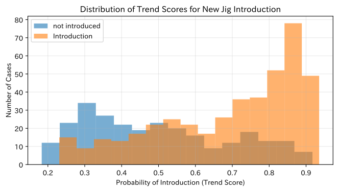
Reading the results
Since the more difficult the case, the more it is adopted, so simple comparisons tend to underestimate the true shortening effect, and IPW brings you closer to the true value. Areas with little overlap in the trend score distribution cannot be compared from the data. If possible, we design phased implementations or randomized comparisons, and simultaneously evaluate whether there are any adverse impacts on safety or quality.
No.068: Bayesian Optimization — Exploring Machining Conditions with Minimal Prototyping
Meaning in Practice
Searching for conditions such as cutting speed incurs material, equipment, time, and inspection costs for each prototype. Bayesian optimization estimates performance under unknown conditions from a small number of evaluation results, then tests the next “good” and “uncertain” conditions.
Approach to Analysis and Modeling
In the Gaussian process, the mean and standard deviation of the objective function are described, and candidates are selected to maximize Expected Improvement (EI).
Here, losses are minimized by combining surface roughness and cycle time. In practice, tool lifespan, quality standards, and equipment limits are clearly indicated as constraints.
Check with Python
def machining_loss(speed, feed):
    base = 1.2 + ((speed - 185) / 38) ** 2 + ((feed - 0.20) / 0.055) ** 2
    interaction = 0.35 * np.sin(speed / 18) * np.cos(feed * 30)
    return base + interaction

grid_speed = np.linspace(120, 240, 45)
grid_feed = np.linspace(0.10, 0.30, 45)
S, F = np.meshgrid(grid_speed, grid_feed)
grid_X = np.column_stack([S.ravel(), F.ravel()])
scale = np.array([120.0, 0.20])
X_obs = np.array([[130, 0.12], [155, 0.26], [205, 0.14], [230, 0.28]], dtype=float)
y_obs = np.array([machining_loss(*x) for x in X_obs]) + rng.normal(0, 0.04, len(X_obs))

for _ in range(10):
    kernel = ConstantKernel(1.0) * Matern(length_scale=[0.3, 0.3], nu=2.5) + WhiteKernel(0.002)
    gp = GaussianProcessRegressor(kernel=kernel, normalize_y=True, random_state=42, n_restarts_optimizer=1)
    gp.fit(X_obs / scale, y_obs)
    mu, sigma = gp.predict(grid_X / scale, return_std=True)
    improvement = y_obs.min() - mu
    z = improvement / np.maximum(sigma, 1e-9)
    ei = improvement * norm.cdf(z) + sigma * norm.pdf(z)
    next_x = grid_X[np.argmax(ei)]
    X_obs = np.vstack([X_obs, next_x])
    y_obs = np.append(y_obs, machining_loss(*next_x) + rng.normal(0, 0.04))

best_idx = np.argmin(y_obs)
best_068 = pd.DataFrame({"cutting speed": [X_obs[best_idx, 0]], "Delivery volume": [X_obs[best_idx, 1]], "Observation loss": [y_obs[best_idx]]})
display(best_068.round(3))

fig, ax = plt.subplots(figsize=(8, 5))
contour = ax.contourf(S, F, machining_loss(S, F), levels=18, cmap="viridis")
ax.scatter(X_obs[:4, 0], X_obs[:4, 1], color="white", edgecolor="black", label="initial condition")
ax.scatter(X_obs[4:, 0], X_obs[4:, 1], color="red", s=28, label="explore step by step")
ax.scatter(X_obs[best_idx, 0], X_obs[best_idx, 1], marker="*", s=180, color="gold", edgecolor="black", label="Best observation")
ax.set_title("Searching machining conditions through Bayesian optimization")
ax.set_xlabel("Cutting speed (m/min)")
ax.set_ylabel("Feed Amount (mm/rev)")
ax.grid(True, alpha=0.25)
ax.legend()
fig.colorbar(contour, ax=ax, label="Processing loss (less, better)")
plt.tight_layout()
plt.show()| cutting speed | Delivery volume | Observation loss | |
|---|---|---|---|
| 0 | 188.182 | 0.2 | 0.882 |
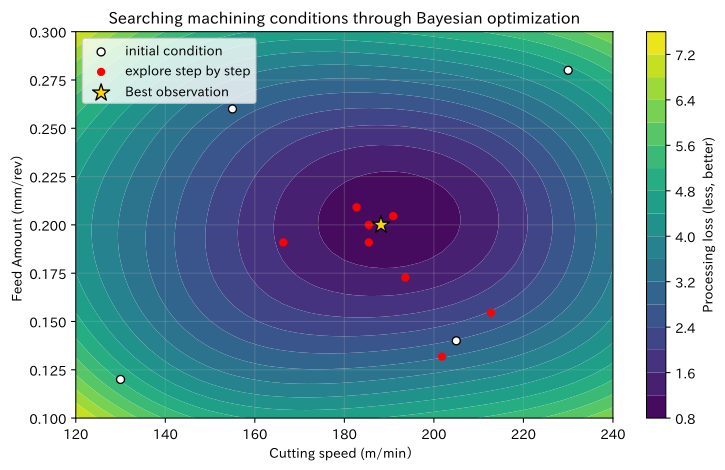
Reading the results
Red dots were successively selected as prototype conditions, and the star mark was the best observational condition. While the search points are gathering near the best possible points, you can also see that uncertain areas are being tested. It is important not to simply apply these results as standard conditions, but to verify replication tests, quality standards, tool wear, and safety limits, and not extrapolate beyond the scope of exploration.
No.069: Reinforcement Learning — Learning Conservation Policies According to Deterioration Conditions
Meaning in Practice
If preventive maintenance is performed too early, parts cannot be fully utilized; if delayed too long, failures and losses increase. Reinforcement learning repeatedly evaluates the current state of deterioration and behavior, as well as subsequent conditions and costs, and learns strategies that consider long-term costs.
Approach to Analysis and Modeling
Status is rated as healthy from 0 to 4, and actions are set as ‘Continue Driving’ and ‘Maintain.’ Q-learning updates behavioral value using the following formula.
Since compensation design determines the conclusion, maintenance costs, breakdown costs, and production profits must be defined in business figures. Instead of direct exploration at the actual facility, we first verify it using simulators and historical data.
Check with Python
n_states, n_actions = 5, 2
Q = np.zeros((n_states, n_actions))
alpha, gamma, epsilon = 0.12, 0.96, 0.15
episode_returns = []

def step_069(state, action, random_gen):
    if action == 1:  # preserve
        return 0, -18.0
    if state == 4:  # Continued in a malfunctioning state
        return 0, -85.0
    deteriorate_prob = 0.18 + 0.12 * state
    next_state = min(4, state + int(random_gen.random() < deteriorate_prob))
    reward = 8.0 - 1.5 * state
    if next_state == 4:
        reward -= 55.0
    return next_state, reward

for episode in range(5000):
    state, total = 0, 0.0
    for _ in range(80):
        if rng.random() < epsilon:
            action = rng.integers(n_actions)
        else:
            action = int(np.argmax(Q[state]))
        next_state, reward = step_069(state, action, rng)
        Q[state, action] += alpha * (reward + gamma * Q[next_state].max() - Q[state, action])
        state, total = next_state, total + reward
    episode_returns.append(total)

policy = np.argmax(Q, axis=1)
policy_069 = pd.DataFrame({
    "state of deterioration": np.arange(n_states),
    "ContinuationQvalue": Q[:, 0], "preserveQvalue": Q[:, 1],
    "Recommended Actions": np.where(policy == 0, "Continued operation", "preserve"),
})
display(policy_069.round(2))

rolling = pd.Series(episode_returns).rolling(200).mean()
fig, ax = plt.subplots(figsize=(8, 4))
ax.plot(rolling, color="tab:blue")
ax.set_title("Average cumulative reward for conservation policy learning")
ax.set_xlabel("Learning Episodes")
ax.set_ylabel("most recent200Average cumulative rewards per session")
ax.grid(True, alpha=0.3)
plt.tight_layout()
plt.show()| state of deterioration | ContinuationQvalue | preserveQvalue | Recommended Actions | |
|---|---|---|---|---|
| 0 | 0 | 125.80 | 105.74 | Continued operation |
| 1 | 1 | 112.67 | 104.70 | Continued operation |
| 2 | 2 | 106.98 | 105.37 | Continued operation |
| 3 | 3 | 64.38 | 105.16 | preserve |
| 4 | 4 | 37.63 | 105.25 | preserve |
Reading the results
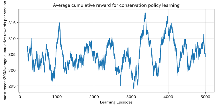
The Q value table shows the long-term value and recommended behavior for each condition, and switches to conservation as deterioration progresses. The transition point depends on the set failure cost, maintenance cost, and transition probability. On-site deployment starts with decision support by offline comparison of existing rules and simulation measures, presenting only actions permitted by safety constraints.
No.070: Graph Machine Learning — Aggregating Nearby Risks in Supplier Networks
Meaning in Practice
Supply suspension risks ripple not only through each company’s finances and quality, but also through dependence on the same logistics hubs and secondary suppliers. The basic aspect of graph machine learning is to add features to ‘who is connected to,’ which is lost in table formats.
Approach to Analysis and Modeling
Aggregate the average features of adjacent nodes into feature of each node .
This is a simplified step of message passing in graph neural networks. Risk is estimated using logistic regression and compared to cases where individual characteristics are used alone. It is necessary to distinguish between no transactions and data loss.
Check with Python
n_nodes = 90
rng_070 = np.random.default_rng(42)
G = nx.stochastic_block_model([30, 30, 30], [[0.20, 0.02, 0.01], [0.02, 0.18, 0.03], [0.01, 0.03, 0.22]], seed=42)
community = np.repeat(np.arange(3), 30)
quality_issue = np.clip(rng_070.beta(2, 8, n_nodes) + 0.12 * (community == 2), 0, 1)
delivery_delay = np.clip(rng_070.beta(2, 7, n_nodes) + 0.12 * (community == 1), 0, 1)
financial_stress = np.clip(rng_070.beta(2, 6, n_nodes), 0, 1)
base_risk = 1.4 * quality_issue + 1.2 * delivery_delay + 1.0 * financial_stress
neighbor_base = np.array([np.mean([base_risk[u] for u in G.neighbors(v)]) for v in G.nodes])
risk_prob = 1 / (1 + np.exp(-(-2.0 + 0.3 * base_risk + 2.2 * neighbor_base)))
risk_label = rng_070.binomial(1, risk_prob)

own_X = np.column_stack([quality_issue, delivery_delay, financial_stress])
neighbor_X = np.array([own_X[list(G.neighbors(v))].mean(axis=0) for v in G.nodes])
graph_X = np.column_stack([own_X, neighbor_X])
train_idx, test_idx = train_test_split(np.arange(n_nodes), test_size=0.35, random_state=42, stratify=risk_label)
own_model = make_pipeline(StandardScaler(), LogisticRegression(class_weight="balanced", random_state=42)).fit(own_X[train_idx], risk_label[train_idx])
graph_model = make_pipeline(StandardScaler(), LogisticRegression(class_weight="balanced", random_state=42)).fit(graph_X[train_idx], risk_label[train_idx])
own_prob = own_model.predict_proba(own_X[test_idx])[:, 1]
graph_prob = graph_model.predict_proba(graph_X[test_idx])[:, 1]
comparison_070 = pd.DataFrame({
    "Model": ["Individual Company Features Only", "Individual company + Neighborhood aggregation"],
    "TestROC-AUC": [roc_auc_score(risk_label[test_idx], own_prob), roc_auc_score(risk_label[test_idx], graph_prob)],
})
display(comparison_070.round(3))

all_graph_prob = graph_model.predict_proba(graph_X)[:, 1]
pos = nx.spring_layout(G, seed=42)
fig, ax = plt.subplots(figsize=(8, 6))
nodes = nx.draw_networkx_nodes(G, pos, node_color=all_graph_prob, cmap="Reds", node_size=110, ax=ax)
nx.draw_networkx_edges(G, pos, alpha=0.22, ax=ax)
ax.set_title("Supplier trading networks and estimated supply risks")
ax.set_xlabel("Network Layout X(For display purposes)")
ax.set_ylabel("Network Layout Y(For display purposes)")
ax.grid(True, alpha=0.15)
fig.colorbar(nodes, ax=ax, label="Estimated risk probability")
plt.tight_layout()
plt.show()| Model | TestROC-AUC | |
|---|---|---|
| 0 | Individual Company Features Only | 0.496 |
| 1 | Individual company + Neighborhood aggregation | 0.609 |
Reading the results
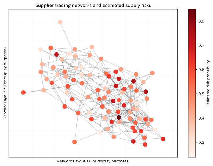
Models with neighborhood aggregation do not always win, and differences in test AUC serve as evidence to verify the added value of network information. In areas with concentrated red nodes, we check not only individual company audits but also common logistics, secondary business partners, and alternative procurement. Orders are not stopped based solely on predicted probabilities; instead, explainable risk factors are combined with confirmation by procurement staff.
Practical Implications Seen Through Target Exercise
- Decisions are made before the targets of prediction: For workload forecasting, we define delivery responses; for defect classification, we define additional inspections, users, timing, and options.
- Tailoring splitting methods and evaluation metrics to business operations: Time series tests the future, while imbalance classification looks at recall and false detection costs. Average accuracy alone is not enough.
- Distinguishing Correlation, Prediction, and Causality: Even if prediction accuracy is high, the effects of changing conditions are unknown. Improvement effects require experimental design or contamination adjustment.
- Dealing with relationships and time, not points: Time series, reinforcement learning, and graphs introduce dependencies into the model that are difficult to represent in a standalone, single-row table.
- Output that allows human intervention: Set thresholds, rationales, exception handling, and final permissions for probability, anomaly scores, and recommended measures.
What is necessary for practical implementation
1. Business Definition and Baseline
Before introducing the model, record current rules, decision frequency, responsible personnel, and misjudgment costs. In addition to advanced models, we measure added value by comparing with “category averages,” “previous week’s values,” and “current inspection standards.”
2. Data Quality and Timing Alignment
Equipment, product types, lots, and supplier IDs are unified, and the reason for the loss and sensor calibration history are recorded. Check whether features are available at the time of prediction and whether any later adjusted actual values are mixed in.
3. Verification, Safety, and Responsibility Separation
During shadow operations, we compare recommendations with actual judgments and check performance by type, equipment, and period. Safety and quality decisions prioritize constraint rules, clearly specifying automation scope, approvers, and stop/manual return procedures.
4. Continuous Monitoring
Monitor input distribution, prediction accuracy, intervention rate, and business KPIs to detect discrepancies between training data and actual data. Not only the retraining cycle, but also the conditions under which the model is left or stopped are determined.
Conclusion
Topics No.061 to No.070 covered machining time and defect prediction, structural understanding of customer and equipment conditions, temporal monitoring of demand and anomalies, causal estimation of improvement effects, sequential decision-making for prototyping and maintenance, and risk assessment of transaction networks.
The key to establishing machine learning in manufacturing is not the complex model itself, but the Timely forecasted data, cost-based evaluation, on-site constraints, final human decisions, and performance feedback. First, a baseline is established in the limited process, and while measuring whether the quality of decision-making has improved, the scope of application is expanded.
Consultations for Corporations
At Surikoubo, we offer consultations ranging from selecting machine learning and statistical analysis themes in manufacturing, to PoC, data infrastructure, business implementation, continuous monitoring of accuracy and effectiveness, and support for in-house production.
- Design and Verification of Quality Forecasting, Equipment Anomaly Detection, and Demand Forecasting
- Experimental design and causal effect evaluation of improvement measures
- Processing Condition Exploration, Conservation Measures, and Supply Chain Risk Analysis
- Design of on-site operational KPIs, explanatory screens, and approval workflows
📩 Contact Us: surikobo.co.jp/contact Please feel free to consult us first.