
100 Exercises / numerical calculation / Numerical Calculation: 100 Exercises
Introduction to Interpolation and Approximations in Manufacturing | Estimating Quality Curves Using Python from Loose Process Measurements
Deriving Safe Condition Setting from Loose Process Measurements: Interpolation and Approximate Numerical Calculation with 10 Exercises (No.051–No.060)
In this article, we connect ‘interpolation and approximation’—which estimate continuous process characteristics from limited experimental and sensor points—to the Temperature setting, quality forecasting, control objectives, validation planning in a hypothetical heat treatment process. By comparing the differences from Lagrange interpolation to regression, we clarify the points that lie between being able to draw curves and those that can be used for decision-making.
[!NOTE] This material is a notebook previously used by Surikoubo (or personally by the representative, Kazuyama), and has been reconstructed, edited, and published with the company’s permission.
All data listed is fictional and has no relation whatsoever to real companies, factories, or figures.
Introduction: Practical Challenges in Manufacturing Covered in This Article
When determining heat treatment conditions, it is not possible to test at all temperatures. There are constraints on test specimens, equipment time, and inspection costs, with only a few temperature and strength points at hand. On the other hand, the field requires quality of unmeasured temperatures, operating ranges that meet the minimum standards, and smooth target trajectories delivered to the controller.
Therefore, this article addresses “how to fill in the gaps between measurement points,” “how to extract trends from point clouds containing noise,” and “how to reflect uncertainty in estimated results in judgment.”
Common situations on site
- The temperature measured in the experimental design is limited to levels 5–8
- Sensor values have measurement errors, and quality can vary even under the same conditions.
- PLCs and simulators require reference tables for continuous values.
- Extending the curve beyond the measurement range and making weakly supported extrapolation
- Mistakenly Mistaking Smooth Graphs for the ‘Correct Process Model’
Why is this issue so difficult to judge?
Interpolation generally passes through known points but does not guarantee the true value between points. Approximate does not always pass through points; instead, it averages out noise to represent the overall trend. Furthermore, even within the same point group, the curve changes depending on the method, degree, node placement, and boundary conditions. Therefore, it is necessary to first decide whether to place the objective on “display,” “control,” “prediction,” or “cause explanation.”
Overview of Exercise covered this time
| No. | Theme | Main Applications in Manufacturing |
|---|---|---|
| 051 | Lagrange interpolation | Reference curve passing through a small number of calibration points |
| 052 | Newton interpolation | Continuous updates when adding measurement points |
| 053 | spline interpolation | Localized and smooth process curves |
| 054 | least squares approximation | Extracting overall trends from variability |
| 055 | Chebyshev Approximation | Suppresses maximum error across the entire section |
| 056 | Bézier curve | Design of transport and robot trajectories |
| 057 | Fourier approximation | Representation of periodic equipment fluctuations |
| 058 | polynomial approximation | Comparison of Order and Generalization Performance |
| 059 | interpolation error | Determining the placement of additional measurement points |
| 060 | Differences from Regression | Distinguishing between interpolation, approximation, and regression |
Preparing the Python environment
NumPy performs numerical calculations, pandas tables, SciPy interpolate, and matplotlib visualization. Random seed is fixed so that the same result can be reproduced.
%matplotlib inline
import platform
import numpy as np
import pandas as pd
import matplotlib
import matplotlib.pyplot as plt
import japanize_matplotlib
from scipy.interpolate import lagrange, BarycentricInterpolator, CubicSpline

rng = np.random.default_rng(20260712)
pd.set_option("display.precision", 3)
print(f"Python: {platform.python_version()}")
print(f"NumPy: {np.__version__}, pandas: {pd.__version__}, matplotlib: {matplotlib.__version__}")
Python: 3.13.1
NumPy: 2.5.1, pandas: 3.0.3, matplotlib: 3.11.0Creation of Fictional Data
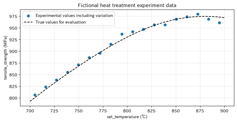
A relationship is established between the set temperature of the heat treatment furnace and the tensile strength after treatment. Please note that true relationships are used only for explanation and error evaluation, and are unknown in practice. The calibration data is scored as 5 points without noise, and the experimental data includes 18 points including measurements and individual differences. We also provide examples of periodic variations and transport trajectories.
def true_strength(temp):
    x = (np.asarray(temp) - 800.0) / 100.0
    return 930 + 85*x - 48*x**2 + 8*np.sin(2.5*x)

temp_cal = np.array([700, 750, 800, 850, 900], dtype=float)
strength_cal = true_strength(temp_cal)
temp_dense = np.linspace(700, 900, 401)

temp_exp = np.linspace(705, 895, 18)
strength_exp = true_strength(temp_exp) + rng.normal(0, 8, len(temp_exp))
data_df = pd.DataFrame({"set_temperature_℃": temp_exp, "tensile_strength_mpa": strength_exp})
display(data_df.head(8))

plt.figure(figsize=(8, 4.2))
plt.scatter(temp_exp, strength_exp, label="Experimental values including variation", color="tab:blue")
plt.plot(temp_dense, true_strength(temp_dense), label="True values for evaluation", color="black", linestyle="--")
plt.title("Fictional heat treatment experiment data")
plt.xlabel("set_temperature (℃)"); plt.ylabel("tensile_strength (MPa)")
plt.grid(True, alpha=0.3); plt.legend(); plt.tight_layout(); plt.show()| set_temperature_℃ | tensile_strength_MPa | |
|---|---|---|
| 0 | 705.000 | 806.289 |
| 1 | 716.176 | 823.553 |
| 2 | 727.353 | 838.499 |
| 3 | 738.529 | 854.902 |
| 4 | 749.706 | 870.813 |
| 5 | 760.882 | 886.412 |
| 6 | 772.059 | 895.513 |
| 7 | 783.235 | 915.293 |
No.051: Lagrange Interpolation
Meaning in Practice
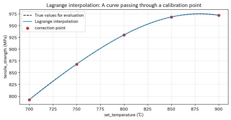
When a reference value that passes through the calibration point is required, Lagrange interpolation clearly outlines the basics of interpolation. It is useful for understanding simple tables that reference the intensity between test sites.
Approach to Analysis and Modeling
For nodes , the interpolated polynomial is
That’s right. satisfies the requirements, but at higher levels, vibrations tend to occur at the edges, making it especially vulnerable to extrapolation, which is important.
Check with Python
lag_poly = lagrange(temp_cal, strength_cal)
lag_pred = lag_poly(temp_dense)
check_051 = pd.DataFrame({"temperature_℃": temp_cal, "measured_mpa": strength_cal,
                          "interpolation_mpa": lag_poly(temp_cal),
                          "mpa_difference": lag_poly(temp_cal) - strength_cal})
display(check_051.round(6))
plt.figure(figsize=(8, 4.2))
plt.plot(temp_dense, true_strength(temp_dense), "k--", label="True values for evaluation")
plt.plot(temp_dense, lag_pred, label="Lagrange interpolation")
plt.scatter(temp_cal, strength_cal, color="tab:red", label="correction point")
plt.title("Lagrange interpolation: A curve passing through a calibration point")
plt.xlabel("set_temperature (℃)"); plt.ylabel("tensile_strength (MPa)")
plt.grid(True, alpha=0.3); plt.legend(); plt.tight_layout(); plt.show()
/var/folders/3y/fmw40k0x78xblvb3gkcyvy1h0000gn/T/ipykernel_3921/1114524623.py:1: DeprecationWarning: `lagrange` is deprecated and will be removed in SciPy 1.20.0. Use `scipy.interpolate.BarycentricInterpolator` instead.
lag_poly = lagrange(temp_cal, strength_cal)| temperature_℃ | measured_MPa | interpolation_MPa | poor_MPa | |
|---|---|---|---|---|
| 0 | 700.0 | 792.212 | 792.212 | -0.0 |
| 1 | 750.0 | 867.908 | 867.908 | -0.0 |
| 2 | 800.0 | 930.000 | 930.000 | -0.0 |
| 3 | 850.0 | 968.092 | 968.092 | -0.0 |
| 4 | 900.0 | 971.788 | 971.788 | -0.0 |
Reading the results
The difference in calibration points is almost zero, confirming that the conditions are met. However, passing through a point does not mean that the physical phenomena between points are correct. When adopted, the maximum error is limited to the measurement range, and the maximum error is evaluated with additional verification points.
No.052: Newton Interpolation
Meaning in Practice
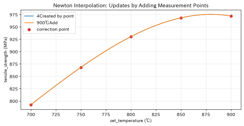
In the development process where experimental points are added sequentially, Newton’s format is convenient because you can add new difference coefficients without rebuilding the entire formula.
Approach to Analysis and Modeling
Using the split difference ,
This is how it is expressed. It is the same interpolated polynomial as Lagrange format, but the update structure when adding points differs.
Check with Python
def divided_differences(x, y):
    coef = np.array(y, dtype=float).copy()
    for j in range(1, len(x)):
        coef[j:] = (coef[j:] - coef[j-1:-1]) / (x[j:] - x[:-j])
    return coef

def newton_eval(x_eval, x_nodes, coef):
    value = np.zeros_like(np.asarray(x_eval), dtype=float) + coef[-1]
    for k in range(len(coef)-2, -1, -1):
        value = coef[k] + (np.asarray(x_eval) - x_nodes[k]) * value
    return value

coef4 = divided_differences(temp_cal[:4], strength_cal[:4])
coef5 = divided_differences(temp_cal, strength_cal)
display(pd.DataFrame({"number of times": range(5), "5Difference factor for a point": coef5}).round(6))
plt.figure(figsize=(8, 4.2))
plt.plot(temp_dense, newton_eval(temp_dense, temp_cal[:4], coef4), label="4Created by point")
plt.plot(temp_dense, newton_eval(temp_dense, temp_cal, coef5), label="900℃Add")
plt.scatter(temp_cal, strength_cal, color="tab:red", label="correction point")
plt.title("Newton Interpolation: Updates by Adding Measurement Points")
plt.xlabel("set_temperature (℃)"); plt.ylabel("tensile_strength (MPa)")
plt.grid(True, alpha=0.3); plt.legend(); plt.tight_layout(); plt.show()| number of times | 5Difference factor for a point | |
|---|---|---|
| 0 | 0 | 7.922e+02 |
| 1 | 1 | 1.514e+00 |
| 2 | 2 | -2.721e-03 |
| 3 | 3 | -1.400e-05 |
| 4 | 4 | 0.000e+00 |
Reading the results
When a point of 900°C is added, a term containing that point is added, especially updating the estimation for the high-temperature side. Continuous updates are convenient, but if you do not confirm that the measurement systems under the old and new measurement conditions are equivalent, changes in the measurement system will be mixed into the difference factor.
No.053: Spline Interpolation
Meaning in Practice
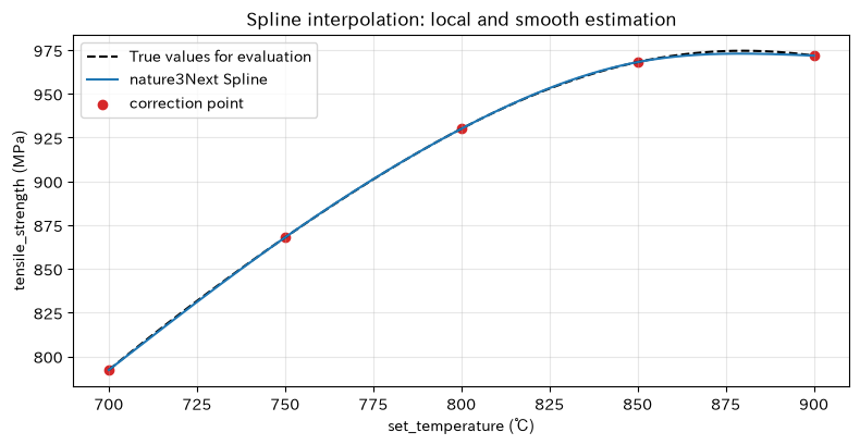
If you want to smoothly connect while maintaining localized shapes for each temperature range, tertiary splines are a strong choice. Suitable for generating calibration tables and smooth set values.
Approach to Analysis and Modeling
Place cubic polynomials for each interval, and at nodes, sequence function values, first-order derivatives, and second-order derivatives. In a natural spline, the second-order derivative at both ends is set to zero. Because the entire interval is not represented by a single higher-degree polynomial, the impact of a single point change on distant areas is minimized.
Check with Python
spline = CubicSpline(temp_cal, strength_cal, bc_type="natural")
spline_pred = spline(temp_dense)
compare_053 = pd.DataFrame({
    "technique": ["Lagrange", "nature3Next Spline"],
    "maximum_absolute_error_within_the_section_mpa": [np.max(np.abs(lag_pred-true_strength(temp_dense))),
                                np.max(np.abs(spline_pred-true_strength(temp_dense)))]})
display(compare_053.round(3))
plt.figure(figsize=(8, 4.2))
plt.plot(temp_dense, true_strength(temp_dense), "k--", label="True values for evaluation")
plt.plot(temp_dense, spline_pred, label="nature3Next Spline")
plt.scatter(temp_cal, strength_cal, color="tab:red", label="correction point")
plt.title("Spline interpolation: local and smooth estimation")
plt.xlabel("set_temperature (℃)"); plt.ylabel("tensile_strength (MPa)")
plt.grid(True, alpha=0.3); plt.legend(); plt.tight_layout(); plt.show()| technique | maximum_absolute_error_within_the_section_MPa | |
|---|---|---|
| 0 | Lagrange | 0.551 |
| 1 | nature3Next Spline | 1.646 |
Reading the results
In this hypothetical example, the maximum error within the natural spline section can be quantitatively compared. Since boundary conditions influence the slope of the edge, if there is a known gradient at the edge, that knowledge is reflected in the boundary condition. We do not choose techniques based solely on smoothness, but judge based on error and physical consistency.
No.054: Least Squares Approximation
Meaning in Practice
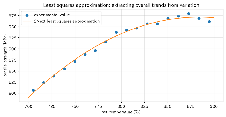
When experimental values variety, interpolation through all points reproduces noise down to the source. Least squares approximation can be used for quality trends, management baselines, and sensitivity estimates.
Approach to Analysis and Modeling
For model , the sum of squares of the residual
Minimize it. Here, temperature is centered and scaled to enhance numerical stability, and quadratic formulas are applied. When interpreting coefficients, I keep unit conversion in mind.
Check with Python
x_exp = (temp_exp - 800) / 100
coef_ls = np.polyfit(x_exp, strength_exp, deg=2)
ls_pred = np.polyval(coef_ls, (temp_dense-800)/100)
resid = strength_exp - np.polyval(coef_ls, x_exp)
metrics_054 = pd.DataFrame({"indicator": ["RMSE", "mean residual", "Maximum absolute residual"],
                            "value_mpa": [np.sqrt(np.mean(resid**2)), np.mean(resid), np.max(np.abs(resid))]})
display(metrics_054.round(3))
plt.figure(figsize=(8, 4.2))
plt.scatter(temp_exp, strength_exp, label="experimental value", color="tab:blue")
plt.plot(temp_dense, ls_pred, label="2Next-least squares approximation", color="tab:orange")
plt.title("Least squares approximation: extracting overall trends from variation")
plt.xlabel("set_temperature (℃)"); plt.ylabel("tensile_strength (MPa)")
plt.grid(True, alpha=0.3); plt.legend(); plt.tight_layout(); plt.show()| indicator | value_MPa | |
|---|---|---|
| 0 | RMSE | 5.247 |
| 1 | mean residual | -0.000 |
| 2 | Maximum absolute residual | 9.420 |
Reading the results
The approximate curve does not pass through each point, but the average residual is almost zero, representing the overall trend. RMSE is a guideline for “typical deviation.” When determining conditions near the lower limit of the standard, not only average forecasts but also forecast zones and safety margins are established.
No.055: Chebyshev Approximation
Meaning in Practice
For calibration and embedded calculations where you want to avoid extremely poor errors over the entire interval, the Chebyshev polynomial is effective. It also has the advantage of being higher-order and more numerically manageable than the standard shoulderal basis.
Approach to Analysis and Modeling
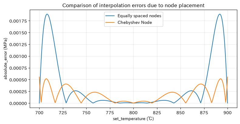
Chebyshev polynomials on are defined by . By placing nodes closely at the ends, end vibration in polynomial interpolation is suppressed. Here, we compare the equal number of evenly spaced nodes with Chebyshev nodes.
Check with Python
n_nodes = 8
z_equal = np.linspace(-1, 1, n_nodes)
z_cheb = np.cos((2*np.arange(n_nodes)+1)*np.pi/(2*n_nodes))
t_equal = 800 + 100*z_equal
t_cheb = 800 + 100*z_cheb
p_equal = BarycentricInterpolator(t_equal, true_strength(t_equal))(temp_dense)
p_cheb = BarycentricInterpolator(t_cheb, true_strength(t_cheb))(temp_dense)
err_055 = pd.DataFrame({"node": ["Evenly spaced", "Chebyshev"],
                        "maximum_absolute_error_mpa": [np.max(np.abs(p_equal-true_strength(temp_dense))),
                                           np.max(np.abs(p_cheb-true_strength(temp_dense)))]})
display(err_055.round(4))
plt.figure(figsize=(8, 4.2))
plt.plot(temp_dense, np.abs(p_equal-true_strength(temp_dense)), label="Equally spaced nodes")
plt.plot(temp_dense, np.abs(p_cheb-true_strength(temp_dense)), label="Chebyshev Node")
plt.title("Comparison of interpolation errors due to node placement")
plt.xlabel("set_temperature (℃)"); plt.ylabel("absolute_error (MPa)")
plt.grid(True, alpha=0.3); plt.legend(); plt.tight_layout(); plt.show()| node | maximum_absolute_error_MPa | |
|---|---|---|
| 0 | Evenly spaced | 1.900e-03 |
| 1 | Chebyshev | 6.000e-04 |
Reading the results
By comparing with maximum error, you can identify the worst areas that cannot be seen by the average error alone. If the experimental temperature can be freely arranged, it becomes a candidate for improving accuracy, including at the ends. However, you must not demand a temperature that cannot be chosen solely by mathematical nodes due to safety or equipment constraints.
No.056: Bézier Curve
Meaning in Practice
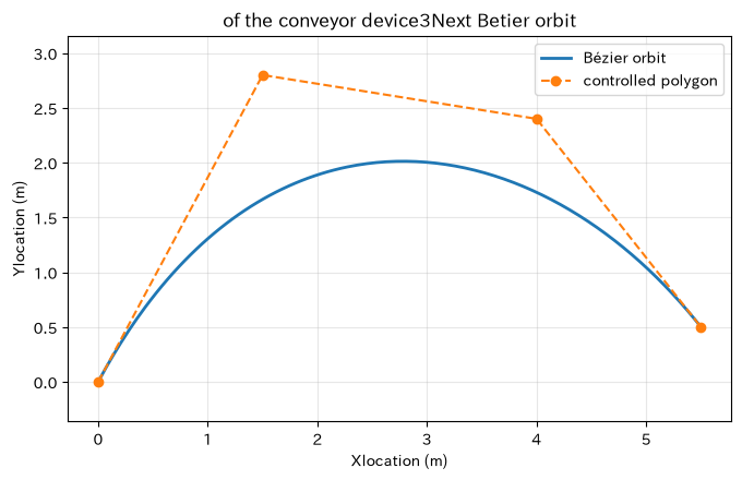
The Bézier curve is a concept that intuitively designs the paths of robots and transport devices at control points. It is suitable for controlling the tangent direction between the start and end points, rather than passing point interpolation.
Approach to Analysis and Modeling
The cubic Bézier curve uses control point
That’s right. Curves generally do not pass through intermediate control points. The property of the control point being contained within the bump helps with rough confirmation of the safety area.
Check with Python
P = np.array([[0.0, 0.0], [1.5, 2.8], [4.0, 2.4], [5.5, 0.5]])
tau = np.linspace(0, 1, 201)
B = ((1-tau)**3)[:,None]*P[0] + (3*(1-tau)**2*tau)[:,None]*P[1] +     (3*(1-tau)*tau**2)[:,None]*P[2] + (tau**3)[:,None]*P[3]
path_length = np.sum(np.linalg.norm(np.diff(B, axis=0), axis=1))
display(pd.DataFrame({"indicator": ["Approximate Route Length"], "value_m": [path_length]}).round(3))
plt.figure(figsize=(7, 4.5))
plt.plot(B[:,0], B[:,1], label="Bézier orbit", linewidth=2)
plt.plot(P[:,0], P[:,1], "o--", label="controlled polygon")
plt.title("of the conveyor device3Next Betier orbit")
plt.xlabel("Xlocation (m)"); plt.ylabel("Ylocation (m)")
plt.grid(True, alpha=0.3); plt.axis("equal"); plt.legend(); plt.tight_layout(); plt.show()| indicator | value_m | |
|---|---|---|
| 0 | Approximate Route Length | 6.831 |
Reading the results
By moving the intermediate control point, you can adjust the curvature and approach direction without changing the starting and ending points. However, this figure alone cannot guarantee speed, acceleration, jerk, obstacle margin, or mechanical limits. For actual machine installation, time parameter analysis and collision verification are performed separately.
No.057: Fourier Approximation
Meaning in Practice
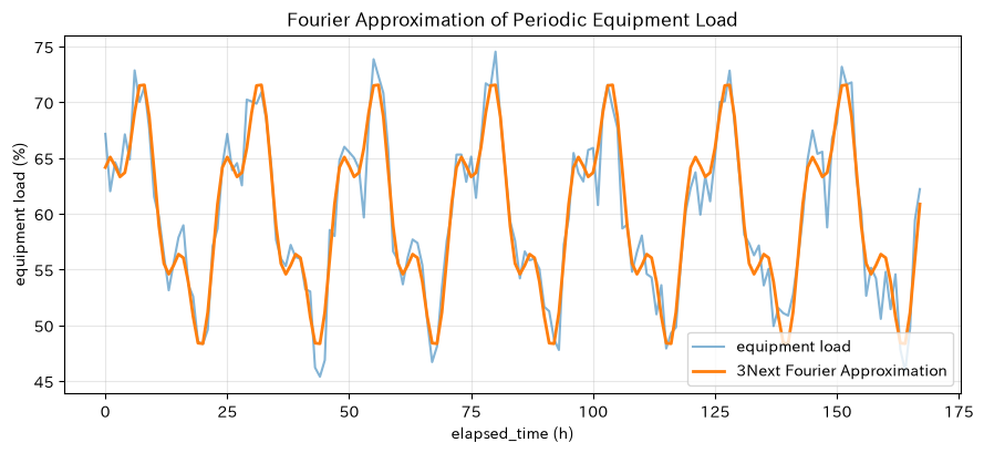
Periodic fluctuations such as equipment load, ambient temperature, and electricity consumption can be expressed as the sum of sine and cosine. Separating periodic components makes it easier to distinguish between baseline and anomalous fluctuations.
Approach to Analysis and Modeling
Signal from period
It is similar to this. The more you increase the , the more it follows, but it also picks up noise. Here, signals containing 24-hour and 8-hour components are estimated with least squares.
Check with Python
hour = np.arange(0, 7*24)
load = 60 + 9*np.sin(2*np.pi*hour/24) + 4*np.cos(2*np.pi*hour/8) + rng.normal(0, 2, len(hour))
Xf = np.column_stack([np.ones(len(hour))] +
                     [f(2*np.pi*k*hour/24) for k in range(1, 4) for f in (np.cos, np.sin)])
beta_f, *_ = np.linalg.lstsq(Xf, load, rcond=None)
load_fit = Xf @ beta_f
display(pd.DataFrame({"indicator": ["standard deviation of the original signal", "residual standard deviation"],
                      "value": [np.std(load), np.std(load-load_fit)]}).round(3))
plt.figure(figsize=(9, 4.2))
plt.plot(hour, load, label="equipment load", alpha=0.55)
plt.plot(hour, load_fit, label="3Next Fourier Approximation", linewidth=2)
plt.title("Fourier Approximation of Periodic Equipment Load")
plt.xlabel("elapsed_time (h)"); plt.ylabel("equipment load (%)")
plt.grid(True, alpha=0.3); plt.legend(); plt.tight_layout(); plt.show()| indicator | value | |
|---|---|---|
| 0 | standard deviation of the original signal | 7.191 |
| 1 | residual standard deviation | 1.974 |
Reading the results
If the residual standard deviation decreases, it can explain periodic reference variations. When using residuals for anomaly monitoring, it is important to separate non-cyclical factors such as days of the week, operating calendars, and product changeovers, and not to mix downtime with normal operation.
No.058: Polynomial Approximation
Meaning in Practice
While polynomials are easy to implement, simply increasing their degree does not always mean the answer is sufficient. When selecting process condition formulas, evaluation is conducted separately by matching training data and reproducibility on unused data.
Approach to Analysis and Modeling
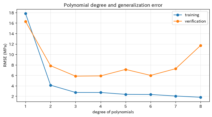
Data is divided into training and validation, and RMSE is compared for every degree. At higher orders, even if the training error decreases, the validation error may increase, which is a sign of overlearning. Centralization and scaling reduce the negative conditioning of coefficient calculations.
Check with Python
train_idx = np.arange(len(temp_exp)) % 3 != 0
x_scaled = (temp_exp-800)/100
rows = []
for degree in range(1, 9):
    c = np.polyfit(x_scaled[train_idx], strength_exp[train_idx], degree)
    pred_train = np.polyval(c, x_scaled[train_idx])
    pred_valid = np.polyval(c, x_scaled[~train_idx])
    rows.append([degree,
                 np.sqrt(np.mean((strength_exp[train_idx]-pred_train)**2)),
                 np.sqrt(np.mean((strength_exp[~train_idx]-pred_valid)**2))])
degree_df = pd.DataFrame(rows, columns=["number of times", "trainingRMSE", "verificationRMSE"])
display(degree_df.round(3))
plt.figure(figsize=(7.5, 4.2))
plt.plot(degree_df["number of times"], degree_df["trainingRMSE"], "o-", label="training")
plt.plot(degree_df["number of times"], degree_df["verificationRMSE"], "o-", label="verification")
plt.title("Polynomial degree and generalization error")
plt.xlabel("degree of polynomials"); plt.ylabel("RMSE (MPa)")
plt.grid(True, alpha=0.3); plt.legend(); plt.tight_layout(); plt.show()| number of times | trainingRMSE | verificationRMSE | |
|---|---|---|---|
| 0 | 1 | 17.850 | 16.309 |
| 1 | 2 | 4.106 | 7.834 |
| 2 | 3 | 2.713 | 5.832 |
| 3 | 4 | 2.707 | 5.878 |
| 4 | 5 | 2.350 | 7.120 |
| 5 | 6 | 2.328 | 5.974 |
| 6 | 7 | 2.030 | 7.261 |
| 7 | 8 | 1.795 | 11.717 |
Reading the results
Candidates for hire are not the smallest levels of training error, but rather those with low verification errors and are easy to explain and maintain. Because data splitting is accidental, in production we also perform cross-verification, residual diagnosis, and confirmation of monotony and upper limits based on process knowledge.
No.059: Interpolation Error
Meaning in Practice
To use interpolation curves to determine operating conditions, it is necessary to measure “where and to what extent the curve deviates.” The error distribution serves as the basis for selecting the temperature for additional experiments.
Approach to Analysis and Modeling
The error of the next interpolation, if the function is smooth enough,
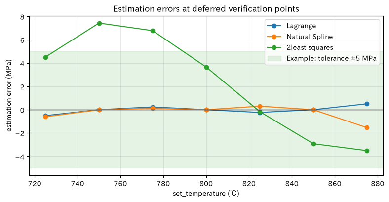
It can be expressed as such. In practice, higher-order differentiations are often unknown, so errors are directly measured at reserved verification points and compared with maximum absolute error and permissible errors for different applications.
Check with Python
validation_temp = np.arange(725, 900, 25, dtype=float)
validation_true = true_strength(validation_temp)
methods = {
    "Lagrange": lag_poly(validation_temp),
    "Natural Spline": spline(validation_temp),
    "2least squares": np.polyval(coef_ls, (validation_temp-800)/100),
}
error_df = pd.DataFrame({"temperature_℃": validation_temp, **{
    name: pred-validation_true for name, pred in methods.items()}})
display(error_df.round(3))
plt.figure(figsize=(8, 4.2))
for name in methods:
    plt.plot(validation_temp, error_df[name], "o-", label=name)
plt.axhline(0, color="black", linewidth=1)
plt.axhspan(-5, 5, color="tab:green", alpha=0.12, label="Example: tolerance ±5 MPa")
plt.title("Estimation errors at deferred verification points")
plt.xlabel("set_temperature (℃)"); plt.ylabel("estimation error (MPa)")
plt.grid(True, alpha=0.3); plt.legend(); plt.tight_layout(); plt.show()| temperature_℃ | Lagrange | Natural Spline | 2least squares | |
|---|---|---|---|---|
| 0 | 725.0 | -0.506 | -0.603 | 4.521 |
| 1 | 750.0 | -0.000 | 0.000 | 7.441 |
| 2 | 775.0 | 0.235 | 0.125 | 6.789 |
| 3 | 800.0 | -0.000 | 0.000 | 3.665 |
| 4 | 825.0 | -0.235 | 0.304 | -0.162 |
| 5 | 850.0 | -0.000 | 0.000 | -2.921 |
| 6 | 875.0 | 0.506 | -1.540 | -3.511 |
Reading the results
Temperature ranges with large errors are preferred candidates for additional measurements. Even if the overall RMSE is small, if the error is large only near the standard boundary, it is inappropriate for decision-making. Tolerances are not arbitrarily determined by analysts, but are set based on quality risk, measurement errors, and customer requirements.
No.060: Difference from Regression
Meaning in Practice
Interpolation, approximation, and regression are similar in that they draw curves, but their purposes differ. Incorrect use can change the conclusions of sensor calibration, process condition exploration, and quality explanation.
Approach to Analysis and Modeling
- interpolation: Pass through the observation point and form the values between points. Suitable for reference tables with small measurement errors.
- similar: Expresses complex functions and point clouds with easy-to-handle formulas. It emphasizes computational power, maximum error, and smoothness.
- Return: Estimate the relationship between the objective variable and the explanatory variable, including probabilistic variation. Deals with coefficients, uncertainty, and forecasting.
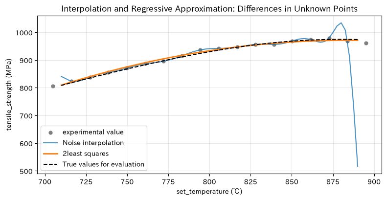
Here, interpolation and regressive least squares are applied to experimental values including variation, and comparisons are made at unknown evaluation points.
Check with Python
interp_noisy = BarycentricInterpolator(temp_exp, strength_exp)
test_temp = np.linspace(710, 890, 73)
test_true = true_strength(test_temp)
test_interp = interp_noisy(test_temp)
test_reg = np.polyval(coef_ls, (test_temp-800)/100)
comparison_060 = pd.DataFrame({
    "Methods": ["Interpolation passing through all experimental points", "2Least squares (regressive use)"],
    "rmse_mpa_at_the_experimental_site": [0.0, np.sqrt(np.mean(resid**2))],
    "rmse_mpa_in_the_unknown": [np.sqrt(np.mean((test_interp-test_true)**2)),
                           np.sqrt(np.mean((test_reg-test_true)**2))]})
display(comparison_060.round(3))
plt.figure(figsize=(8, 4.2))
plt.scatter(temp_exp, strength_exp, s=24, label="experimental value", color="tab:gray")
plt.plot(test_temp, test_interp, label="Noise interpolation", alpha=0.8)
plt.plot(test_temp, test_reg, label="2least squares", linewidth=2)
plt.plot(test_temp, test_true, "k--", label="True values for evaluation")
plt.title("Interpolation and Regressive Approximation: Differences in Unknown Points")
plt.xlabel("set_temperature (℃)"); plt.ylabel("tensile_strength (MPa)")
plt.grid(True, alpha=0.3); plt.legend(); plt.tight_layout(); plt.show()| Methods | At the experimental siteRMSE_MPa | at an unknown pointRMSE_MPa | |
|---|---|---|---|
| 0 | Interpolation passing through all experimental points | 0.000 | 61.922 |
| 1 | 2Least squares (regressive use) | 5.247 | 4.625 |
Reading the results
Even if the error is zero at the experimental point, interpolation can extend to the noise, so the unknown error can be large. While the least squares have residuals at the experimental points, they can remain stable in trend estimation. To assert causality, not only curve fitting but also experimental design, confounding management, residual assumptions, and reproducibility testing are required.
Practical Implications Seen Through Target Exercise
- Choose methods based on your objectives: If you want to pass through reference points precisely, interpolation; if you want to get trends from noise, least squares and regression; for periodicity, Fourier approximation; and for orbital shapes, Bézier curves.
- Smoothness and correctness are two different things.: Even a visually appealing curve does not guarantee the validity of interdots, ends, or extrapolations.
- Don’t look only at the mean error: Check the maximum error at the specification boundary and edge, as well as errors in the pending data.
- Placement of measurement points is also a decision-making: Allocate additional tests to sections with large errors, large curvature, or high quality risks.
- Applying physical constraints to mathematical models: It is important not to ignore monotonicity, upper and lower limits, speed and acceleration, and operable range.
What is necessary for practical implementation
- Definition of Uses and Losses: Clearly define whether for display, control, or standard determination, and define losses caused by errors.
- Measurement system guarantee: Check gauge R&R, calibration history, and sampling conditions
- Verification Design: Conditions not used for learning or interpolation are withheld, and evaluation is performed not only by RMSE but also by maximum error and specification boundaries.
- Fixing the scope of application: Clearly indicate the interpolation range and implement warnings or computational stops when extrapolating
- Change management: Re-examine when equipment, ingredients, recipes, or measuring instruments are changed
- Operational Monitoring: Monitor input distribution and residuals, and establish criteria for relearning and recalibration.
Conclusion
From No.051 to No.060, we covered interpolation passing through decimal points, approximation to normalize variation, dedicated basis representing periods and orbits, error verification, and differences from regression. In practice, what’s important is not creating the most complex curves, but designing the decision-making purpose, tolerance for error, scope of application, and verification methods as a set.
Consultations for Corporations
At Surikoubo, we support in-house production for experimental planning, sensor calibration, process condition modeling, quality prediction, and numerical calculations in manufacturing. You can consult on everything from method selection to data design, verification standards, and on-site operations.
📩 Contact Us: surikobo.co.jp/contact
Please feel free to consult us first.