
100 Exercises / Python / 100 Python Exercises for Data Analysis
Understand the basic flow of data analysis
Create an annual strategy report by aggregating and visualizing sales results by product and month.
100 Exercises Chapter 10 (No.091-No.100): Aggregation/Visualization/Mini analysis
This article is the final chapter (Chapter 10) of the “100 Introduction to Python for Data Analysis” series.
In Chapter 9 (No.081-090), we learned data processing (filtering, column addition, missing processing) using Polars.
In this chapter, Aggregation/Visualization/Mini-analysis includes aggregation, date processing, and matplotlib usinggroup_by. Learn the entire flow of Python data analysis, including graph creation, correlation analysis, and comprehensive report output.
[!NOTE] This material is a notebook that has been used by Surikobo (or its representative, Hiroshi Wayama) in corporate training in the past. Reorganized and edited with permission from the company and published.
All published data is fictitious and has no relation to actual companies, factories, or numbers.
Introduction: Practical issues in the manufacturing industry covered in this article
This is year-end work for Mr. M, a corporate planning team of an industrial sensor manufacturer.
Regular work at the end of the year
  1. Export all transaction data for 2024 from the sales system as CSV (approximately 280 items)
  2. Total annual sales by product category (temperature, pressure, flow rate, vibration, current sensors)
  3. Create a monthly sales trend graph and report it to the board of directors
  4. Check the correlation between unit price and quantity and consider next year's pricing strategy
  5. Output all of the above as one analysis report
If you use Python’s Polars + matplotlib,
Insights directly linked to product strategy from 280 items x 9 columns of data
Batch output can be done with dozens of lines of code.
In this chapter (the final chapter), we will use all the Python skills we have learned so far.
Common situations in the field
| Scene | Task |
|---|---|
| Category aggregation | Manual aggregation of sales by product category using Excel pivot (more than 1 hour each month) |
| Monthly trends | Manually updating monthly sales graphs in Excel (many copy and paste errors) |
| Check the distribution | Understand the dispersion of transaction amounts just by intuition (overlooking outliers) |
| Correlation analysis | Judging by intuition that “It seems that products with high unit prices will not sell in quantity” |
| Report creation | Manage totals, graphs, and comments in separate files (inconsistency) |
This time’s goal: Aggregation with Python → Visualization → Correlation analysis → Report output Build a reproducible annual analysis pipeline in a single notebook.
Why is this problem difficult to judge?
We will sort out the pitfalls of aggregation, visualization, and correlation analysis.
-
Choosing an aggregate function for group_by
sum(total) andmean(average) have completely different meanings.
If you confuse “Total Sales by Category” and “Average Transaction Price by Category”, This leads to incorrect product strategies. -
Date type conversion missing If you tally it up by month as a character string, the order of “2024-1” and “2024-10” will be The order will be in dictionary order (character string order), and the time series graph will be corrupted.
It must be converted toDatetype before aggregation and sorting. -
Histogram bin number selection If the number of bins is too small, the shape of the distribution will be overlooked. If there is too much, you will be dragged down by the noise.
Sturges’ formula, which uses the square root of the number of data items () as a guide, can be used as a reference. -
Confusing correlation and causation Even if there is a negative correlation between unit price and quantity, It cannot be said that “lowering the unit price will increase the quantity.”
Correlation only indicates strength of association and does not prove causation. -
Misreading of graph due to difference in scale Two-axis graphs and bar graphs with different units can be used as impression operations.
Be sure to clearly indicate the units and scales of the axes and visualize them in a comparable format.
Overall picture of the exercises covered in this chapter
| No. | Title | Usage in manufacturing industry |
|---|---|---|
| 091 | Aggregation by category using group_by | Aggregation of annual sales by product category and customer type |
| 092 | Aggregating sales by product | Identifying main products by sales ranking by product name |
| 093 | Converting a date column to Datetime type | Type conversion for accurate time series aggregation of year and month |
| 094 | Totaling monthly sales | Understanding monthly sales trends and seasonality |
| 095 | Draw a line graph with matplotlib | Visualize monthly sales trends |
| 096 | Visualize sales by category with a bar graph | Composition ratio by product category and customer type |
| 097 | View the distribution of numbers with a histogram | Detect outliers and bias from the transaction amount and unit price distribution |
| 098 | View the relationship between two variables with a scatter plot | Consider pricing strategies with a scatter plot of unit price vs. quantity |
| 099 | Check the correlation coefficient | Factor analysis using the correlation coefficient matrix between sales KPIs |
| 100 | Load sales data and create an analysis report | Output totals, graphs, and summaries all at once with one script |
Preparing the Python environment
import subprocess, sys

res = subprocess.run(["sw_vers", "-productVersion"], capture_output=True, text=True)
print(f"macOS : {res.stdout.strip()}")
print(f"Python: {sys.version}")
macOS : 26.3
Python: 3.13.1 (main, Dec  3 2024, 17:59:52) [Clang 16.0.0 (clang-1600.0.26.4)]
import numpy as np
import polars as pl
import matplotlib
import matplotlib.pyplot as plt
import csv, os, datetime
matplotlib.rcParams['font.family'] = 'Hiragino Maru Gothic Pro'
%config InlineBackend.figure_format = 'svg'
np.random.seed(42)
print("Library loading completed")
print(f" NumPy : {np.__version__}")
print(f" Polars : {pl.__version__}")
print(f" Matplotlib: {matplotlib.__version__}")
Library loading completed NumPy: 2.5.1 Polars: 1.42.1 Matplotlib: 3.11.0
Creation of fictitious data
Assumed scenario: Industrial sensor manufacturer/management planning team
Period: January to December 2024 (total 12 months)
Product: 5 categories (temperature, pressure, flow rate, vibration, current sensor)
Customer: 5 types (automobile, food, semiconductor, medical, general industry)
Output: Annual sales performance CSV (sensor_sales_2024.csv)
np.random.seed(42)

# Product category settings
PRODUCTS = {
    "temperature sensor": {"prefix": "TS", "price_lo": 8_000,  "price_hi": 25_000, "base_qty": 50, "weight": 0.28},
    "pressure sensor": {"prefix": "PS", "price_lo": 12_000, "price_hi": 45_000, "base_qty": 32, "weight": 0.22},
    "flow sensor": {"prefix": "FS", "price_lo": 18_000, "price_hi": 62_000, "base_qty": 24, "weight": 0.18},
    "vibration sensor": {"prefix": "VS", "price_lo": 22_000, "price_hi": 80_000, "base_qty": 18, "weight": 0.14},
    "current sensor": {"prefix": "CS", "price_lo": 5_000,  "price_hi": 18_000, "base_qty": 60, "weight": 0.18},
}
CAT_NAMES  = list(PRODUCTS.keys())
CAT_WEIGHTS = [v["weight"] for v in PRODUCTS.values()]

CUST_TYPES   = ["automobile", "food", "semiconductor", "medical", "General industry"]
CUST_WEIGHTS = [0.32, 0.22, 0.24, 0.14, 0.08]

# Monthly seasonality (1.0 = average)
SEASONALITY = [0.85, 0.80, 0.95, 1.00, 1.05, 1.10,
               0.92, 0.88, 1.10, 1.15, 1.22, 0.98]

records = []
for month in range(1, 13):
    s = SEASONALITY[month - 1]
    n = max(18, min(38, int(np.random.normal(26, 5))))
    for _ in range(n):
        cat  = np.random.choice(CAT_NAMES, p=CAT_WEIGHTS)
        info = PRODUCTS[cat]
        model = np.random.choice(["A", "B", "C", "S"])
        product_name = f"{info['prefix']}-{model}"

        cust_type = np.random.choice(CUST_TYPES, p=CUST_WEIGHTS)
        cust_id   = f"{cust_type[:2]}-{np.random.randint(1000, 9999):04d}"

        # Unit price: Category-specific range × seasonal variation
        unit_price = int(np.random.uniform(info['price_lo'], info['price_hi']))
        # Quantity: The higher the unit price, the lower the quantity (create an inverse correlation)
        price_mid  = (info['price_lo'] + info['price_hi']) / 2
        qty_factor = 1.5 - (unit_price / price_mid) * 0.5
        quantity   = max(1, int(np.random.normal(info['base_qty'] * s * qty_factor,
                                                  info['base_qty'] * 0.25)))
        sales_amount = unit_price * quantity

        # Return flag (slightly higher for higher unit prices)
        ret_prob = 0.02 + (unit_price - info['price_lo']) / (info['price_hi'] - info['price_lo']) * 0.04
        is_returned = 1 if np.random.random() < ret_prob else 0

        day = np.random.randint(1, 29)
        date_str = f"2024-{month:02d}-{day:02d}"

        records.append({
            "date": date_str,
            "product_category": cat,
            "product_name": product_name,
            "customer_type": cust_type,
            "customer_id": cust_id,
            "quantity": quantity,
            "unit_price": unit_price,
            "sales_amount": sales_amount,
            "is_returned": is_returned,
        })

CSV_PATH = "sensor_sales_2024.csv"
with open(CSV_PATH, "w", newline="", encoding="utf-8") as f:
    writer = csv.DictWriter(f, fieldnames=records[0].keys())
    writer.writeheader()
    writer.writerows(records)

print(f"Generation completed: {CSV_PATH}")
print(f"  Number of records  : {len(records):,} records")
print(f"  number of columns        : {len(records[0])} columns")
print(f"  period        : 2024-01-01 ~ 2024-12-28")
print(f"  Total sales amount  : {sum(r['sales_amount'] for r in records):,} JPY")
print(f"  Number of returned items    : {sum(r['is_returned'] for r in records)} records")
Generation completed: sensor_sales_2024.csv Number of records: 301 Number of columns: 9 columns Period: 2024-01-01 ~ 2024-12-28 Total sales amount: 239,354,914 yen Number of returns: 10
No.091: Aggregate by category with group_by
Practical meaning
group_by is the core of aggregation operations in the manufacturing industry.
”Aggregating annual sales by product category” “Understanding the number of transactions by customer type”
These operations are equivalent to Excel’s pivot table, but
With Python/Polars, this can be achieved with one line of code, and the speed will not decrease even as the amount of data increases.
Main uses in manufacturing industry:
- Monthly count of defects by line and product
- Understand the number of orders and sales amount by customer type
- Aggregation of average cycle time by process
Concept of analysis and modeling
Basic syntax of group_by:
df.group_by("category column").agg([
    pl.col("numeric string").sum().alias("Total"),
    pl.col("numeric string").mean().alias("average"),
    pl.len().alias("Number of cases"),
])
The choice of aggregation function is important. sum (total) is used to understand the overall scale.
mean (average) is used to compare performance per unit.
By calculating both simultaneously, you can evaluate scale and efficiency side by side.
Check with Python
# Load CSV (reuse for subsequent exercises)
df_raw = pl.read_csv(CSV_PATH, try_parse_dates=False)

# Summary by product category
cat_summary = (
    df_raw.group_by("product_category")
    .agg([
        pl.col("sales_amount").sum().alias("total_sales"),
        pl.col("quantity").sum().alias("total_qty"),
        pl.col("unit_price").mean().alias("avg_unit_price"),
        pl.len().alias("transaction_count"),
    ])
    .sort("total_sales", descending=True)
)
print("Aggregation by product category:")
print(cat_summary)
print()

# Aggregation by customer type
cust_summary = (
    df_raw.group_by("customer_type")
    .agg([
        pl.col("sales_amount").sum().alias("total_sales"),
        pl.len().alias("transaction_count"),
        pl.col("is_returned").mean().alias("return_rate"),
    ])
    .sort("total_sales", descending=True)
)
print("Aggregation by customer type:")
print(cust_summary)
Aggregation by product category: shape: (5, 5) ┌──────────────────┬──────────────┬────────────┬────────────────┬────────────────────┐ │ product_category ┆ total_sales ┆ total_qty ┆ avg_unit_price ┆ transaction_count │ │ --- ┆ --- ┆ --- ┆ --- ┆ --- │ │ str ┆ i64 ┆ i64 ┆ f64 ┆ u32 │ ╞══════════════════╪ ═════════════╪═══════ ════╪════════════════ ╪═══════════════════╡ │ Flow rate sensor ┆ 64369428 ┆ 1658 ┆ 40617.757143 ┆ 70 │ │ Temperature sensor ┆ 60772674 ┆ 4166 ┆ 15267.060241 ┆ 83 │ │ Vibration sensor ┆ 41410765 ┆ 781 ┆ 55833.916667 ┆ 48 │ │ Pressure sensor ┆ 41210887 ┆ 1610 ┆ 27255.176471 ┆ 51 │ │ Current sensor ┆ 31591160 ┆ 2833 ┆ 11778.877551 ┆ 49 │ └──────────────────┴──────────────┴────────────┴────────────────┴────────────────────┘
Aggregation by customer type:
shape: (5, 4)
┌────────────────┬──────────────┬────────────────────┬────────────────┐
│ customer_type ┆ total_sales ┆ transaction_count ┆ return_rate │
│ --- ┆ --- ┆ --- ┆ --- │
│ str ┆ i64 ┆ u32 ┆ f64 │
╞═══════════════╪═════════════╪═ ══════════════════╪═════════════╡
│ Car ┆ 84512570 ┆ 105 ┆ 0.028571 │
│ Semiconductor ┆ 53920928 ┆ 70 ┆ 0.071429 │
│ Food ┆ 48413908 ┆ 60 ┆ 0.0 │
│ Medical ┆ 36645931 ┆ 47 ┆ 0.021277 │
│ General industry ┆ 15861577 ┆ 19 ┆ 0.052632 │
└────────────────┴──────────────┴────────────────────┴────────────────┘
Reading the results
- By product category, by arranging
total_sales(total sales) andavg_unit_price(average unit price), You can see the characteristics ofproducts with high unit prices but few sales'' vs.products with low unit prices but sold in large quantities.” - By customer type, if
return_rate(return rate) differs by customer type, Quality improvement and specification confirmation for specific customers will be a priority issue. group_bycan be combined withsortto Sales ranking format summary table can be created instantly.
No.092: Aggregate sales by product
Practical meaning
Aggregation by product name (model), which is more detailed than product category, is
This is basic data for determining which models are the mainstay models and which models are candidates for discontinuation.
In the manufacturing industry, sales management by SKU (Stock Keeping Unit) is directly linked to inventory planning and production planning.
Concept of analysis and modeling
Sales rankings by product are the starting point for ABC analysis (Pareto analysis).
Here, is the sales amount of the top selling product , and is the total number of products.
The “Pareto Principle (80:20 Rule)” states that the top 20% of products account for 80% of total sales.
It is frequently observed in manufacturing industries. Use this to narrow down the priority management products.
Check with Python
# Sales ranking by product name
product_ranking = (
    df_raw.group_by("product_name")
    .agg([
        pl.col("sales_amount").sum().alias("total_sales"),
        pl.col("quantity").sum().alias("total_qty"),
        pl.col("unit_price").mean().alias("avg_price"),
        pl.len().alias("count"),
    ])
    .sort("total_sales", descending=True)
)

# Cumulative sales ratio (preparation for ABC analysis)
total = product_ranking["total_sales"].sum()
cumsum = product_ranking["total_sales"].cum_sum()
product_ranking = product_ranking.with_columns(
    (cumsum / total * 100).round(1).alias("cumulative_pct")
)

print("Sales ranking by product name (top 10):")
print(product_ranking.head(10))
print()

# ABC classification
a_products = product_ranking.filter(pl.col("cumulative_pct") <= 70)
b_products = product_ranking.filter((pl.col("cumulative_pct") > 70) & (pl.col("cumulative_pct") <= 90))
c_products = product_ranking.filter(pl.col("cumulative_pct") > 90)

print(f"ABC Analysis results:")
print(f"  A Rank (cumulative 0~70%) : {len(a_products)} product")
print(f"  B Rank (cumulative 70~90%): {len(b_products)} product")
print(f"  C Rank (cumulative 90~100%): {len(c_products)} product")
print(f"  Total number of products: {len(product_ranking)} product")
Sales ranking by product name (top 10): shape: (10, 6) ┌──────────────┬──────────────┬────────────┬──────────────┬────────┬────────────────┐ │ product_name ┆ total_sales ┆ total_qty ┆ avg_price ┆ count ┆ cumulative_pct │ │ --- ┆ --- ┆ --- ┆ --- ┆ --- ┆ --- │ │ str ┆ i64 ┆ i64 ┆ f64 ┆ u32 ┆ f64 │ ╞══════════════╪════ ═════════╪═══════════ ╪══════════════╪════ ═══╪════════════════╡ │ TS-A ┆ 20271994 ┆ 1427 ┆ 14894.714286 ┆ 28 ┆ 8.5 │ │ FS-S ┆ 19761553 ┆ 556 ┆ 37514.227273 ┆ 22 ┆ 16.7 │ │ FS-A ┆ 19456558 ┆ 461 ┆ 43442.75 ┆ 20 ┆ 24.9 │ │ TS-S ┆ 16905889 ┆ 1089 ┆ 16451.045455 ┆ 22 ┆ 31.9 │ │ FS-B ┆ 15942962 ┆ 425 ┆ 39620.166667 ┆ 18 ┆ 38.6 │ │ VS-C ┆ 12852436 ┆ 278 ┆ 48262.533333 ┆ 15 ┆ 43.9 │ │ PS-C ┆ 12773479 ┆ 418 ┆ 31347.071429 ┆ 14 ┆ 49.3 │ │ TS-C ┆ 12341172 ┆ 774 ┆ 16469.6875 ┆ 16 ┆ 54.4 │ │ VS-A ┆ 11598360 ┆ 216 ┆ 57092.923077 ┆ 13 ┆ 59.3 │ │ TS-B ┆ 11253619 ┆ 876 ┆ 13216.235294 ┆ 17 ┆ 64.0 │ └──────────────┴──────────────┴────────────┴──────────────┴────────┴────────────────┘
ABC analysis results:
  A rank (cumulative 0-70%): 11 products
  B rank (cumulative 70-90%): 5 products
  C rank (cumulative 90-100%): 4 products
  Total number of products: 20 products
Reading the results
- By checking the cumulative sales ratio (
cumulative_pct), Instantly identify A-rated products that account for 70% of your sales. - We have a large inventory of A-rank products, which serves as the basis for decisions to prioritize production.
- C-rank products can be presented to the management board as candidates for discontinuation, price revision, or product integration.
- Calculation of cumulative ratio using
cum_sum()can be written in one line in Polars.
No.093: Convert date column to Datetime type
Practical meaning
Date type conversion is a prerequisite for time series analysis.
If the string is left as is, the lexicographical comparison will be “2024-9 < 2024-10”,
The time series axis of the graph will collapse.
In the manufacturing industry, “monthly production volume trends,” “weekly defect rate trends,” “quarterly sales,” etc.
Since there is a lot of aggregation and visualization in time series, handling date types is an essential skill.
Concept of analysis and modeling
Flow of date type conversion in Polars:
| Steps | Operations | Polars Code |
|---|---|---|
| ① String → Date type | Convert with str.to_date | pl.col("date").str.to_date("%Y-%m-%d") |
| ② Extract the year | dt.year | pl.col("date").dt.year() |
| ③ Extract the month | dt.month | pl.col("date").dt.month() |
| ④ Generate year and month string | dt.to_string | pl.col("date").dt.to_string("%Y-%m") |
| ⑤ Sort by date | sort("date") | Sort by date instead of string |
Check with Python
# Convert date column to Date type
df = df_raw.with_columns(
    pl.col("date").str.to_date("%Y-%m-%d")
)

# Add year/month/year/month columns
df = df.with_columns([
    pl.col("date").dt.year().alias("year"),
    pl.col("date").dt.month().alias("month"),
    pl.col("date").dt.to_string("%Y-%m").alias("year_month"),
])

print("Schema after date type conversion:")
for col, dtype in df.schema.items():
    print(f"  {col:22s}: {dtype}")
print()

print("First 3 lines (confirm date column, year, month, year_month):")
print(df.select(["date", "year", "month", "year_month"]).head(3))
print()

# Comparison before and after type conversion
print("Check type conversion:")
print(f"  Before conversion: {df_raw['date'].dtype}  example: {df_raw['date'][0]}")
print(f"  After conversion: {df['date'].dtype}    example: {df['date'][0]}")
print()

# Confirm the list of months (sorting is by date, not by string)
months_sorted = df["year_month"].unique().sort()
print("List of years and months (sort confirmation):")
print(months_sorted.to_list())
Schema after date type conversion: date: Date product_category : String product_name : String customer_type : String customer_id : String quantity: Int64 unit_price : Int64 sales_amount : Int64 is_returned : Int64 year : Int32 month : Int8 year_month : String
First 3 lines (confirm date column, year, month, year_month):
shape: (3, 4)
┌────────────┬──────┬───────┬────────────┐
│ date ┆ year ┆ month ┆ year_month │
│ --- ┆ --- ┆ --- ┆ --- │
│ date ┆ i32 ┆ i8 ┆ str │
╞════════════╪══════╪ ═══════╪════════════╡
│ 2024-01-24 ┆ 2024 ┆ 1 ┆ 2024-01 │
│ 2024-01-28 ┆ 2024 ┆ 1 ┆ 2024-01 │
│ 2024-01-27 ┆ 2024 ┆ 1 ┆ 2024-01 │
└────────────┴──────┴───────┴────────────┘

Check type conversion:
  Before conversion: String Example: 2024-01-24
  After conversion: Date Example: 2024-01-24

List of years and months (sort confirmation):
['2024-01', '2024-02', '2024-03', '2024-04', '2024-05', '2024-06', '2024-07', '2024-08', '2024-09', '2024-10', '2024-11', '2024-12']
Reading the results
str.to_date("%Y-%m-%d")converts the string to typeDate, Time series information can be extracted withdt.year(),dt.month(),dt.to_string().- You can confirm that the list of years and months is arranged in the correct chronological order from
2024-01→2024-12.
If it is a string,2024-1→2024-10→2024-11→2024-12→2024-2… This is the dictionary order. - For subsequent exercises, use this
df(date type converted).
No.094: Summarize monthly sales
Practical meaning
Monthly sales trends is the KPI most frequently reported at management meetings and board of directors meetings.
The starting point for analysis is This month is +5% compared to last month'' or Q4 is +12% compared to the same period last year.”
Monthly tally. Instantly create monthly summary tables with Polars’ group_by + sort.
Concept of analysis and modeling
In addition to monthly aggregation, by calculating month-on-month growth rate You can understand acceleration and deceleration of trends.
Month-on-month growth rate:
Here, is the monthly sales amount of .
Because the manufacturing industry is affected by seasonality (busy season/off season),
In addition to month-on-month changes, year-on-year change (YoY) is also important.
In this chapter, we will focus on the month-on-month comparison.
Check with Python
# Monthly sales summary
monthly = (
    df.group_by("year_month")
    .agg([
        pl.col("sales_amount").sum().alias("monthly_sales"),
        pl.col("quantity").sum().alias("monthly_qty"),
        pl.col("unit_price").mean().alias("avg_unit_price"),
        pl.len().alias("transaction_count"),
        pl.col("is_returned").sum().alias("return_count"),
    ])
    .sort("year_month")
)

# Added month-on-month growth rate
sales_list = monthly["monthly_sales"].to_list()
mom_list = [None] + [
    round((sales_list[i] - sales_list[i-1]) / sales_list[i-1] * 100, 1)
    for i in range(1, len(sales_list))
]
monthly = monthly.with_columns(
    pl.Series("mom_growth_pct", mom_list, dtype=pl.Float64)
)

print("Monthly sales summary (with growth rate compared to previous month):")
print(monthly)
print()

# Quarterly summary
q_map = {"Q1": [1,2,3], "Q2": [4,5,6], "Q3": [7,8,9], "Q4": [10,11,12]}
print("Total sales by quarter:")
for q, months_in_q in q_map.items():
    q_sales = df.filter(pl.col("month").is_in(months_in_q))["sales_amount"].sum()
    print(f"  {q}: {q_sales:>12,} JPY")
print(f"  yearly: {df['sales_amount'].sum():>12,} JPY")
Monthly sales summary (with growth rate compared to previous month): shape: (12, 7) ┌────────────┬──────────────┬──────────────┬──────────────┬──────────────┬────────────┬────────────────┐ │ year_month ┆ monthly_sale ┆ monthly_qty ┆ avg_unit_pri ┆ transaction ┆ return_coun ┆ mom_growth_ │ │ --- ┆ s ┆ --- ┆ ce ┆ _count ┆ t ┆ pct │ │ str ┆ --- ┆ i64 ┆ --- ┆ --- ┆ --- ┆ --- │ │ ┆ i64 ┆ ┆ f64 ┆ u32 ┆ i64 ┆ f64 │ ╞════════════╪═══════════ ═══╪═════════════╪═══════ ═══════╪═════════════╪═══ ══════════╪═════════════╡ │ 2024-01 ┆ 19526168 ┆ 862 ┆ 27905.642857 ┆ 28 ┆ 3 ┆ null │ │ 2024-02 ┆ 17564379 ┆ 795 ┆ 28723.214286 ┆ 28 ┆ 1 ┆ -10.0 │ │ 2024-03 ┆ 22823593 ┆ 917 ┆ 33778.551724 ┆ 29 ┆ 0 ┆ 29.9 │ │ 2024-04 ┆ 15582567 ┆ 729 ┆ 28245.157895 ┆ 19 ┆ 0 ┆ -31.7 │ │ 2024-05 ┆ 22778096 ┆ 987 ┆ 30078.125 ┆ 24 ┆ 1 ┆ 46.2 │ │ … ┆ … ┆ … ┆ … ┆ … ┆ … ┆ … │ │ 2024-08 ┆ 20222658 ┆ 774 ┆ 33197.814815 ┆ 27 ┆ 2 ┆ 13.8 │ │ 2024-09 ┆ 25273346 ┆ 1271 ┆ 25750.896552 ┆ 29 ┆ 1 ┆ 25.0 │ │ 2024-10 ┆ 21004719 ┆ 1095 ┆ 26097.48 ┆ 25 ┆ 0 ┆ -16.9 │ │ 2024-11 ┆ 22322934 ┆ 1083 ┆ 28648.75 ┆ 24 ┆ 0 ┆ 6.3 │ │ 2024-12 ┆ 16845974 ┆ 770 ┆ 28388.434783 ┆ 23 ┆ 0 ┆ -24.5 │ └────────────┴──────────────┴──────────────┴──────────────┴──────────────┴──────────────┴────────────────┘
Total sales by quarter:
  Q1: 59,914,140 yen
  Q2: 56,000,968 yen
  Q3: 63,266,179 yen
  Q4: 60,173,627 yen
  Annual: 239,354,914 yen
Reading the results
- You can read the seasonality of sales from the monthly summary table.
Strategically interpret months with positive growth rates as periods of expansion, and months with negative growth rates as periods of deceleration. - If Q4 (October-December) has a high sales composition ratio in quarterly aggregation, You can plan in advance for the risk of concentrated orders at the end of the year (tight production/inventory).
- In the month in which
mom_growth_pct(growth rate compared to the previous month) turned negative, It can be used as a trigger for interviews with sales teams and research on competitive trends.
No.095: Draw a line graph with matplotlib
Practical meaning
Line graphs are a great way to visualize trends in time series data.
By expressing monthly sales trends in a line graph,
In which month did it sharply increase or decrease sharply?'' Is it going to increase towards Q4?”
This will be communicated to management at a glance. Graphs are better than tables of numbers.
Speed of decision making is greatly increased.
Concept of analysis and modeling
Important setting items when creating a time series graph:
| Setting | Meaning | Code |
|---|---|---|
marker="o" | Display each data point as a circle | plt.plot(..., marker="o") |
grid=True | Easy to read with grid lines | ax.grid(alpha=0.3) |
xlabel/ylabel | Axis label (specify unit) | ax.set_xlabel("moon") |
title | Graph title | ax.set_title(...) |
tight_layout | Automatically adjust margins | plt.tight_layout() |
In a manufacturing report, adjust the lower limit of the y-axis if you want to emphasize vertical variation, Care must be taken not to excessively exaggerate fluctuations.
Check with Python
months_str = monthly["year_month"].to_list()      # ["2024-01", ..., "2024-12"]
sales_vals = monthly["monthly_sales"].to_list()
qty_vals   = monthly["monthly_qty"].to_list()
x_idx      = list(range(len(months_str)))

fig, axes = plt.subplots(2, 1, figsize=(11, 8), sharex=True)

# ── Upper row: Monthly sales amount trends ──
ax1 = axes[0]
ax1.plot(x_idx, sales_vals, marker="o", linewidth=2, color="#4878CF",
         markersize=6, label="Monthly sales amount")
ax1.fill_between(x_idx, sales_vals, alpha=0.12, color="#4878CF")

# Highlight the maximum and minimum months
max_i = sales_vals.index(max(sales_vals))
min_i = sales_vals.index(min(sales_vals))
ax1.scatter([max_i], [sales_vals[max_i]], color="#D65F5F", s=100, zorder=5, label=f"maximum: {months_str[max_i]}")
ax1.scatter([min_i], [sales_vals[min_i]], color="#6ACC65", s=100, zorder=5, label=f"minimum: {months_str[min_i]}")

ax1.set_title("Monthly sales trends in 2024", fontsize=13, pad=12)
ax1.set_ylabel("Sales amount (yen)", fontsize=10)
ax1.yaxis.set_major_formatter(plt.FuncFormatter(lambda x, _: f"{x/1e6:.1f}M"))
ax1.grid(axis="y", alpha=0.3)
ax1.legend(fontsize=9)

# ── Bottom row: Monthly sales volume trends ──
ax2 = axes[1]
ax2.plot(x_idx, qty_vals, marker="s", linewidth=2, color="#6ACC65",
         markersize=6, linestyle="--", label="Monthly sales volume")
ax2.set_title("2024 Monthly Sales Volume Trend", fontsize=13, pad=12)
ax2.set_xlabel("moon", fontsize=10)
ax2.set_ylabel("Sales quantity (pieces)", fontsize=10)
ax2.set_xticks(x_idx)
ax2.set_xticklabels([m[5:] for m in months_str], fontsize=9)  # "01"~"12"
ax2.grid(axis="y", alpha=0.3)
ax2.legend(fontsize=9)

plt.tight_layout()
plt.savefig("no095_monthly_trend.svg", format="svg", bbox_inches="tight")
plt.show()
print("Saved: no095_monthly_trend.svg")
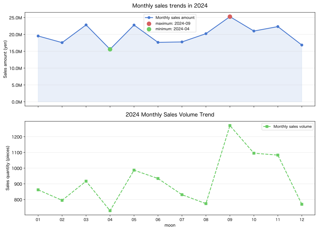
Saved: no095_monthly_trend.svg
Reading the results
- From the upper graph (sales amount), you can see at a glance the peak and bottom months of annual sales trends.
The maximum and minimum months highlighted with markers are the parts of the management report that require the most explanation. - Compared to the lower graph (sales volume), it is a month in which sales are not increasing even though sales are increasing. unit prices may be declining, indicating a discount trend or a change in product mix.
- By painting the area with
fill_between, you can visually emphasize the magnitude of the change. sharex=Trueshares the x-axis and aligns the two graphs vertically for easier comparison.
No.096: Visualize sales by category with bar graphs
Practical meaning
Bar graphs are great for comparisons between categories.
By visualizing sales by product category and customer type in bar graphs,
“Which product should we focus our management resources on?” “Which customer segment should we prioritize?”
Supports decision-making with numbers and graphs.
Concept of analysis and modeling
Stacked bar charts are also useful for comparing multiple categories.
When sales by customer type are accumulated by product category,
You can see a 2D breakdown such as “Which products are selling the most for automobiles?”
Also, if you add numeric labels to the bar chart, Communicate graphs and numbers at the same time:
for bar in bars:
    ax.text(bar.get_x() + bar.get_width()/2, bar.get_height(),
            f"{bar.get_height():,.0f}", ha='center', va='bottom')
Check with Python
# Total by category
cat_sales = (
    df.group_by("product_category")
    .agg(pl.col("sales_amount").sum().alias("total_sales"))
    .sort("total_sales", descending=True)
)
cust_sales = (
    df.group_by("customer_type")
    .agg(pl.col("sales_amount").sum().alias("total_sales"))
    .sort("total_sales", descending=True)
)

fig, axes = plt.subplots(1, 2, figsize=(13, 6))
COLORS = ["#4878CF", "#6ACC65", "#D65F5F", "#B47CC7", "#C4AD66"]

# ── Left: Sales by product category ──
ax1 = axes[0]
cats  = cat_sales["product_category"].to_list()
csales = cat_sales["total_sales"].to_list()
bars1 = ax1.bar(cats, csales, color=COLORS[:len(cats)], alpha=0.85, edgecolor="black", linewidth=0.4)
for bar in bars1:
    ax1.text(bar.get_x() + bar.get_width() / 2,
             bar.get_height() + max(csales) * 0.01,
             f"{bar.get_height()/1e6:.1f}M", ha="center", va="bottom", fontsize=8)
ax1.set_title("Annual sales by product category", fontsize=12, pad=12)
ax1.set_xlabel("Product category", fontsize=10)
ax1.set_ylabel("Sales amount (yen)", fontsize=10)
ax1.yaxis.set_major_formatter(plt.FuncFormatter(lambda x, _: f"{x/1e6:.0f}M"))
ax1.grid(axis="y", alpha=0.3)
ax1.tick_params(axis="x", labelsize=8)

# ── Right: Sales by customer type ──
ax2 = axes[1]
custs   = cust_sales["customer_type"].to_list()
cssales = cust_sales["total_sales"].to_list()
bars2 = ax2.bar(custs, cssales, color=COLORS[:len(custs)], alpha=0.85, edgecolor="black", linewidth=0.4)
for bar in bars2:
    ax2.text(bar.get_x() + bar.get_width() / 2,
             bar.get_height() + max(cssales) * 0.01,
             f"{bar.get_height()/1e6:.1f}M", ha="center", va="bottom", fontsize=8)
ax2.set_title("Annual sales by customer type", fontsize=12, pad=12)
ax2.set_xlabel("customer type", fontsize=10)
ax2.set_ylabel("Sales amount (yen)", fontsize=10)
ax2.yaxis.set_major_formatter(plt.FuncFormatter(lambda x, _: f"{x/1e6:.0f}M"))
ax2.grid(axis="y", alpha=0.3)
ax2.tick_params(axis="x", labelsize=8)

plt.tight_layout()
plt.savefig("no096_category_bar.svg", format="svg", bbox_inches="tight")
plt.show()
print("Saved: no096_category_bar.svg")
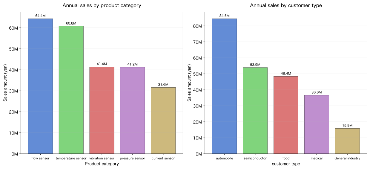
Saved: no096_category_bar.svg
Reading the results
- By product category From the graph, you can see at a glance which category is driving sales.
This is the basis for concentrating production and inventory investment on top-selling products. - By Customer Type Graphs show you which customer segments are your biggest revenue source.
Fluctuations in demand in the largest segment are directly linked to business performance and should be reported to management as a risk. - By adding a numerical label in units of
M(million yen)above the bar graph, You can convey graphs and numbers at the same time during presentations.
No.097: View the distribution of numbers with a histogram
Practical meaning
A histogram is a graph used to understand the distribution (dispersion and bias) of numerical data.
Utilization in manufacturing industry:
- Distribution of transaction amount → “Are there many small transactions or mainly large transactions?”
- Product unit price distribution → “Where is the price range concentration zone?”
- Distribution of defective numbers → “Where is the boundary between normal and abnormal times?”
Finding outliers in a histogram is It can also be applied to detect fraudulent transactions and provide early warning of production abnormalities.
Concept of analysis and modeling
Criteria for selecting the number of bins (number of intervals) for the histogram:
| Method | Formula | Features |
|---|---|---|
| Sturges formula | For simple/small data | |
| Scott’s formula | Considering data variation | |
| Friedman-Diaconis | Robust to outliers |
In practice, matplotlib automatically selects bins="auto", or
Adjust manually using as a guide.
Check with Python
sales_arr    = df["sales_amount"].to_numpy()
unit_pr_arr  = df["unit_price"].to_numpy()
n = len(sales_arr)

# Recommended number of bins according to Sturges formula
sturges_bins = int(1 + np.log2(n))
print(f"Number of data items n = {n}")
print(f"Recommended by Sturges formula bin number: k = 1 + log2({n}) = {sturges_bins}")
print()

fig, axes = plt.subplots(1, 2, figsize=(13, 5))

# ── Left: Distribution of transaction unit sales amount ──
ax1 = axes[0]
ax1.hist(sales_arr, bins=sturges_bins, color="#4878CF", edgecolor="white",
         alpha=0.85, linewidth=0.5)
ax1.axvline(np.mean(sales_arr), color="#D65F5F", linestyle="--", linewidth=1.5,
            label=f"average: {np.mean(sales_arr):,.0f} JPY")
ax1.axvline(np.median(sales_arr), color="#6ACC65", linestyle="-.", linewidth=1.5,
            label=f"median: {np.median(sales_arr):,.0f} JPY")
ax1.set_title("Distribution of transaction unit sales amount", fontsize=12, pad=12)
ax1.set_xlabel("Sales amount (yen)", fontsize=10)
ax1.set_ylabel("Number of cases", fontsize=10)
ax1.xaxis.set_major_formatter(plt.FuncFormatter(lambda x, _: f"{x/1e6:.1f}M"))
ax1.grid(axis="y", alpha=0.3)
ax1.legend(fontsize=9)

# ── Right: Product unit price distribution ──
ax2 = axes[1]
ax2.hist(unit_pr_arr, bins=sturges_bins, color="#6ACC65", edgecolor="white",
         alpha=0.85, linewidth=0.5)
ax2.axvline(np.mean(unit_pr_arr), color="#D65F5F", linestyle="--", linewidth=1.5,
            label=f"average: {np.mean(unit_pr_arr):,.0f} JPY")
ax2.axvline(np.median(unit_pr_arr), color="#4878CF", linestyle="-.", linewidth=1.5,
            label=f"median: {np.median(unit_pr_arr):,.0f} JPY")
ax2.set_title("Product unit price distribution", fontsize=12, pad=12)
ax2.set_xlabel("Unit price (yen)", fontsize=10)
ax2.set_ylabel("Number of cases", fontsize=10)
ax2.xaxis.set_major_formatter(plt.FuncFormatter(lambda x, _: f"{x/1e3:.0f}K"))
ax2.grid(axis="y", alpha=0.3)
ax2.legend(fontsize=9)

plt.tight_layout()
plt.savefig("no097_histogram.svg", format="svg", bbox_inches="tight")
plt.show()
print("Saved: no097_histogram.svg")
print()
# Distribution summary statistics
print("Sales amount distribution statistics:")
for label, val in [
    ("average",   np.mean(sales_arr)),
    ("median", np.median(sales_arr)),
    ("standard deviation", np.std(sales_arr)),
    ("minimum value", np.min(sales_arr)),
    ("maximum value", np.max(sales_arr)),
]:
    print(f"  {label:8s}: {val:>12,.0f} JPY")
Number of data items n = 301 Recommended number of bins according to Sturges formula: k = 1 + log2(301) = 9
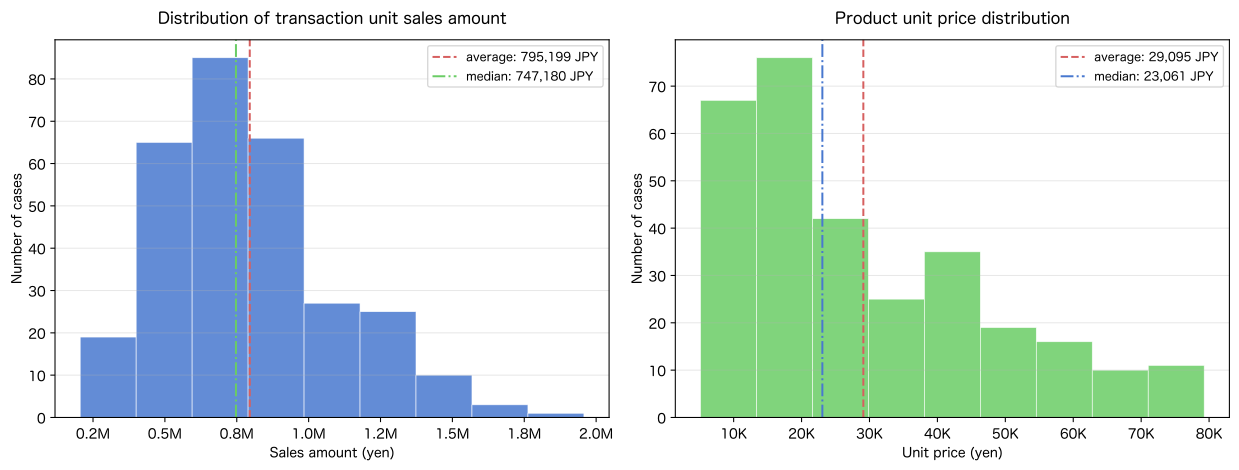
Saved: no097_histogram.svg
Sales amount distribution statistics:
  Average: 795,199 yen
  Median price: 747,180 yen
  Standard deviation: 298,746 yen
  Minimum value: 205,403 yen
  Maximum value: 1,957,462 yen
Reading the results
- You can check the shape of the distribution in the Sales amount histogram.
- A distribution with a long right tail (right-skewed) means there are a small number of large trades.
- If mean > median, it is right skewed, meaning the mean is being pushed up by large trades.
The median value then more accurately represents the “typical transaction amount”.
- If the unit price distribution is multimodal (multiple peaks), There is a mix of products at different price points, creating a natural separation of product segments.
- The number of bins calculated using Sturges’ formula () is Provides appropriate resolution for data scale.
No.098: View the relationship between two variables with a scatter plot
Practical meaning
A scatter diagram is a graph that allows you to visually understand the relationship between two variables (correlation, clusters, outliers).
Utilization in manufacturing industry:
- Unit price vs. sales volume → Understand price elasticity (planning price strategy)
- Number of production vs. number of defectives → Confirmation of consistency of defect rate
- Operation time vs. production volume → Evaluation of line production efficiency
By color-coding by product category, Differences in trends by segment can be expressed in a single graph.
Concept of analysis and modeling
Three patterns to see in a scatter plot:
- Positive correlation: Upward pattern (as increases, also increases)
- Negative correlation: downward-sloping pattern (as increases, decreases)
- Uncorrelated: Randomly distributed (no relation to and )
Unit price vs. quantity tends to vary by product.
High unit price products are mainly handled in small quantities and large transactions, while low unit price products are mainly sold in large quantities and small quantities.
Clustering by product type can be seen in the scatter plot.
Check with Python
# Create a scatter plot by category
cat_colors = dict(zip(CAT_NAMES, ["#4878CF", "#6ACC65", "#D65F5F", "#B47CC7", "#C4AD66"]))

fig, axes = plt.subplots(1, 2, figsize=(13, 6))

# ── Left: Unit price vs. sales quantity (by product category) ──
ax1 = axes[0]
for cat in CAT_NAMES:
    sub = df.filter(pl.col("product_category") == cat)
    ax1.scatter(
        sub["unit_price"].to_numpy(),
        sub["quantity"].to_numpy(),
        label=cat, color=cat_colors[cat],
        alpha=0.55, s=35, edgecolors="none"
    )
# Regression line (all data)
up_all = df["unit_price"].to_numpy()
qty_all = df["quantity"].to_numpy()
coef = np.polyfit(up_all, qty_all, 1)
x_line = np.linspace(up_all.min(), up_all.max(), 200)
ax1.plot(x_line, np.polyval(coef, x_line), color="black", linewidth=1.2,
         linestyle="--", label=f"regression line (inclination={coef[0]:.4f})")
ax1.set_title("Unit price vs. sales quantity (by product category)", fontsize=12, pad=12)
ax1.set_xlabel("Unit price (yen)", fontsize=10)
ax1.set_ylabel("Sales quantity (pieces)", fontsize=10)
ax1.xaxis.set_major_formatter(plt.FuncFormatter(lambda x, _: f"{x/1e3:.0f}K"))
ax1.legend(fontsize=8, loc="upper right")
ax1.grid(alpha=0.25)

# ── Right: Sales amount vs. quantity ──
ax2 = axes[1]
for cat in CAT_NAMES:
    sub = df.filter(pl.col("product_category") == cat)
    ax2.scatter(
        sub["sales_amount"].to_numpy(),
        sub["quantity"].to_numpy(),
        label=cat, color=cat_colors[cat],
        alpha=0.55, s=35, edgecolors="none"
    )
ax2.set_title("Sales amount vs. sales volume (by product category)", fontsize=12, pad=12)
ax2.set_xlabel("Sales amount (yen)", fontsize=10)
ax2.set_ylabel("Sales quantity (pieces)", fontsize=10)
ax2.xaxis.set_major_formatter(plt.FuncFormatter(lambda x, _: f"{x/1e6:.1f}M"))
ax2.legend(fontsize=8, loc="upper right")
ax2.grid(alpha=0.25)

plt.tight_layout()
plt.savefig("no098_scatter.svg", format="svg", bbox_inches="tight")
plt.show()
print(f"Save completed: no098_scatter.svg")
print(f"Slope of regression line (unit price→quantity): {coef[0]:.4f} units/JPY")
print(f"  → unit price 1,000JPY When it goes up, the quantity {coef[0]*1000:.2f} units change")
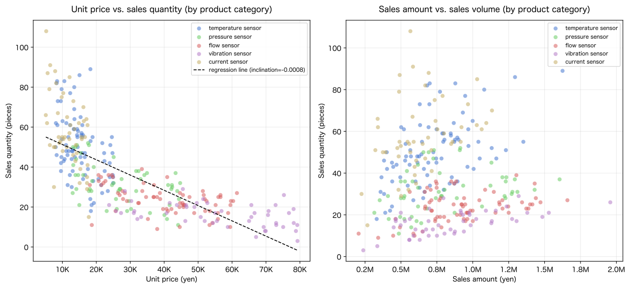
Saved: no098_scatter.svg Slope of regression line (unit price → quantity): -0.0008 pieces/yen → If the unit price increases by 1,000 yen, the quantity will change by -0.76 pieces.
Reading the results
- Unit price vs. quantity scatter plot allows you to see clusters by product category.
- Low unit price category (current sensor): distributed in the upper left (low unit price/high quantity)
- High unit price category (vibration sensor): distributed in the bottom right (high unit price/low volume)
- A negative slope of the regression line indicates that price elasticity exists.
The steeper the slope, the more price changes affect quantity (higher price elasticity). - The regression line is a all-category mixture trend, and trends within categories may vary.
It is important to analyze your pricing strategy by category.
No.099: Check the correlation coefficient
Practical meaning
The correlation coefficient represents the strength and direction of the linear relationship between two variables as a number from to .
Utilization in manufacturing industry:
- Correlation between unit price and quantity → Quantification of price elasticity
- Correlation between sales amount and return flag → Return risk assessment for high sales transactions
- Correlation between monthly sales and seasonal dummy → Quantification of seasonality
Visualizing the correlation coefficient matrix with a heat map, You can list the relationships between multiple variables (an expression equivalent to seaborn’s heatmap is implemented in matplotlib).
Concept of analysis and modeling
Pearson product moment correlation coefficient:
Interpretation criteria for (general guide):
| Range of | Strength of relationship | |------------|------------| | | Strong correlation | | | Moderate correlation | | | Weak correlation | | | Almost uncorrelated |
Note: Correlation coefficients are sensitive to outliers; Nonlinear relationships cannot be detected. As a general rule, it should be used in conjunction with a scatter diagram.
Check with Python
# Correlation coefficient matrix for numeric sequences
num_cols = ["quantity", "unit_price", "sales_amount", "is_returned"]
col_labels = ["quantity", "unit price", "Sales amount", "Return"]

data_mat = np.column_stack([df[c].to_numpy() for c in num_cols])
corr_mat = np.corrcoef(data_mat, rowvar=False)

print("Correlation coefficient matrix:")
header = f"{'':>8s}" + "".join(f"{lb:>8s}" for lb in col_labels)
print(header)
for i, lbl in enumerate(col_labels):
    row = f"{lbl:>8s}" + "".join(f"{corr_mat[i,j]:>8.3f}" for j in range(len(col_labels)))
    print(row)
print()

# ── Correlation coefficient heat map (matplotlib implementation) ──
fig, ax = plt.subplots(figsize=(7, 6))
n_vars = len(col_labels)
im = ax.imshow(corr_mat, cmap="RdBu_r", vmin=-1, vmax=1, aspect="auto")
plt.colorbar(im, ax=ax, shrink=0.8, label="correlation coefficient")

# Display numbers in cells
for i in range(n_vars):
    for j in range(n_vars):
        color = "white" if abs(corr_mat[i, j]) > 0.6 else "black"
        ax.text(j, i, f"{corr_mat[i, j]:.3f}",
                ha="center", va="center", fontsize=11, color=color, fontweight="bold")

ax.set_xticks(range(n_vars))
ax.set_yticks(range(n_vars))
ax.set_xticklabels(col_labels, fontsize=11)
ax.set_yticklabels(col_labels, fontsize=11)
ax.set_title("Sales KPI correlation coefficient heat map", fontsize=13, pad=12)
ax.grid(False)
plt.tight_layout()
plt.savefig("no099_correlation_heatmap.svg", format="svg", bbox_inches="tight")
plt.show()
print("Saved: no099_correlation_heatmap.svg")
print()

# Noteworthy correlated pairs
pairs = [(i, j) for i in range(n_vars) for j in range(i+1, n_vars)]
print("Correlation coefficients of notable pairs (in descending order of strength):")
sorted_pairs = sorted(pairs, key=lambda p: abs(corr_mat[p[0], p[1]]), reverse=True)
for (i, j) in sorted_pairs:
    r = corr_mat[i, j]
    strength = "Strong" if abs(r) >= 0.7 else "Medium" if abs(r) >= 0.4 else "Weak"
    print(f"  {col_labels[i]:>5s} × {col_labels[j]:>5s}: r = {r:+.3f}  [{strength}]")
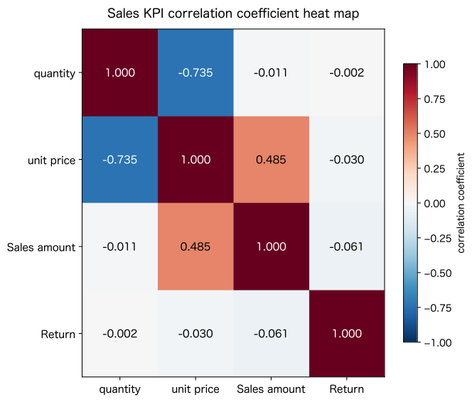
findfont: Failed to find font weight bold, now using 400.Correlation coefficient matrix: Quantity Unit price Sales amount Returns Quantity 1.000 -0.735 -0.011 -0.002 Unit price -0.735 1.000 0.485 -0.030 Sales amount -0.011 0.485 1.000 -0.061 Returns -0.002 -0.030 -0.061 1.000
Saved: no099_correlation_heatmap.svg
Correlation coefficients of notable pairs (in descending order of strength):
     Quantity × unit price: r = -0.735 [strong]
     Unit price × sales amount: r = +0.485 [medium]
   Sales amount × returned goods: r = -0.061 [weak]
     Unit price × returned goods: r = -0.030 [weak]
     Quantity × sales amount: r = -0.011 [weak]
     Quantity × Return: r = -0.002 [weak]
Reading the results
- If unit price × quantity correlation is negative (), The tendency that “the higher the unit price of a product, the lower the number of orders per order” is quantitatively confirmed.
- If correlation between unit price and sales amount is positive, This means that the increase in unit price is contributing to the increase in sales amount.
- If the correlation between returns × each variable is weak, returns are not biased towards a particular price range or quantity.
There is a high possibility that the cause of the return is due to other factors (quality issues, specification errors, customer attributes). - Heatmap can be implemented without using seaborn with
plt.imshow+Colorbar.
Adding numerical text to cells supports quantitative reading.
No.100: Load sales data and create an analysis report
Practical meaning
**No.100 is the final exercise of the series. ** What you have learned so far: CSV loading → type conversion → aggregation → visualization → correlation analysis Consolidate into one script and create reproducible annual analysis reports.
“Analysis reproducibility” is extremely important in DX in the manufacturing industry.
Even if the person in charge changes, the analysis can be performed using the same procedure the next year.
Python notebook = living document is the goal.
Concept of analysis and modeling
Components of one analysis pipeline:
① Read data: pl.read_csv()
② Preprocessing: Type conversion, column addition, missing check
③ Aggregation: group_by() × multiple axes
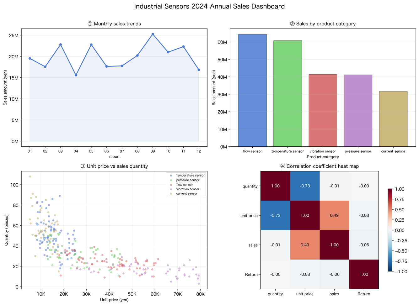
④ Visualization: 2×2 dashboard
⑤ Text report: KPI summary with print()
This structure is the minimum unit of “ETL (Extract→Transform→Load) + analysis report”, It is the foundation for practical BI dashboards and automated reporting systems.
Check with Python
# ════════════════════════════════════════════════════════════
# No.100 Mini analysis report: Industrial sensors 2024 annual sales analysis
# ════════════════════════════════════════════════════════════

# ── Step 1: Data loading & preprocessing ──
df100 = pl.read_csv(CSV_PATH, try_parse_dates=False)
df100 = df100.with_columns(
    pl.col("date").str.to_date("%Y-%m-%d")
).with_columns([
    pl.col("date").dt.month().alias("month"),
    pl.col("date").dt.to_string("%Y-%m").alias("year_month"),
])

n_rows, n_cols = df100.shape
total_sales    = df100["sales_amount"].sum()
total_qty      = df100["quantity"].sum()
return_rate    = df100["is_returned"].mean() * 100

# ── Step 2: Aggregation ──
# monthly
monthly100 = (
    df100.group_by("year_month")
    .agg(pl.col("sales_amount").sum().alias("monthly_sales"))
    .sort("year_month")
)
# By category
cat100 = (
    df100.group_by("product_category")
    .agg(pl.col("sales_amount").sum().alias("cat_sales"))
    .sort("cat_sales", descending=True)
)
# By customer type
cust100 = (
    df100.group_by("customer_type")
    .agg(pl.col("sales_amount").sum().alias("cust_sales"))
    .sort("cust_sales", descending=True)
)
# TOP3 products
top3_products = (
    df100.group_by("product_name")
    .agg(pl.col("sales_amount").sum().alias("prod_sales"))
    .sort("prod_sales", descending=True)
    .head(3)
)

# ── Step 3: 2×2 dashboard ──
fig, axes = plt.subplots(2, 2, figsize=(14, 10))
fig.suptitle("Industrial Sensors 2024 Annual Sales Dashboard", fontsize=15, fontweight="bold", y=1.01)
COLORS = ["#4878CF", "#6ACC65", "#D65F5F", "#B47CC7", "#C4AD66"]

# [0,0] Monthly sales trends
ax00 = axes[0, 0]
m_idx = list(range(12))
m_sales = monthly100["monthly_sales"].to_list()
m_labels = [m[5:] for m in monthly100["year_month"].to_list()]
ax00.plot(m_idx, m_sales, marker="o", linewidth=2, color="#4878CF", markersize=5)
ax00.fill_between(m_idx, m_sales, alpha=0.1, color="#4878CF")
ax00.set_title("① Monthly sales trends", fontsize=11, pad=8)
ax00.set_xlabel("moon", fontsize=9)
ax00.set_ylabel("Sales amount (yen)", fontsize=9)
ax00.set_xticks(m_idx)
ax00.set_xticklabels(m_labels, fontsize=8)
ax00.yaxis.set_major_formatter(plt.FuncFormatter(lambda x, _: f"{x/1e6:.0f}M"))
ax00.grid(axis="y", alpha=0.3)

# [0,1] Sales by product category Bar graph
ax01 = axes[0, 1]
c_cats  = cat100["product_category"].to_list()
c_sales = cat100["cat_sales"].to_list()
ax01.bar(c_cats, c_sales, color=COLORS[:len(c_cats)], alpha=0.85, edgecolor="black", linewidth=0.4)
ax01.set_title("② Sales by product category", fontsize=11, pad=8)
ax01.set_xlabel("Product category", fontsize=9)
ax01.set_ylabel("Sales amount (yen)", fontsize=9)
ax01.yaxis.set_major_formatter(plt.FuncFormatter(lambda x, _: f"{x/1e6:.0f}M"))
ax01.grid(axis="y", alpha=0.3)
ax01.tick_params(axis="x", labelsize=8)

# [1,0] Scatter plot: unit price vs quantity
ax10 = axes[1, 0]
for cat, clr in zip(CAT_NAMES, COLORS):
    sub = df100.filter(pl.col("product_category") == cat)
    ax10.scatter(sub["unit_price"].to_numpy(), sub["quantity"].to_numpy(),
                 label=cat, color=clr, alpha=0.5, s=25, edgecolors="none")
ax10.set_title("③ Unit price vs sales quantity", fontsize=11, pad=8)
ax10.set_xlabel("Unit price (yen)", fontsize=9)
ax10.set_ylabel("Quantity (pieces)", fontsize=9)
ax10.xaxis.set_major_formatter(plt.FuncFormatter(lambda x, _: f"{x/1e3:.0f}K"))
ax10.legend(fontsize=7, loc="upper right")
ax10.grid(alpha=0.2)

# [1,1] Correlation coefficient heat map (4 variables)
ax11 = axes[1, 1]
num_cols100 = ["quantity", "unit_price", "sales_amount", "is_returned"]
col_lbl100  = ["quantity", "unit price", "sales", "Return"]
mat100 = np.column_stack([df100[c].to_numpy() for c in num_cols100])
c100   = np.corrcoef(mat100, rowvar=False)
im100  = ax11.imshow(c100, cmap="RdBu_r", vmin=-1, vmax=1)
for i in range(4):
    for j in range(4):
        fc = "white" if abs(c100[i, j]) > 0.6 else "black"
        ax11.text(j, i, f"{c100[i,j]:.2f}", ha="center", va="center",
                  fontsize=9, color=fc, fontweight="bold")
ax11.set_xticks(range(4)); ax11.set_xticklabels(col_lbl100, fontsize=9)
ax11.set_yticks(range(4)); ax11.set_yticklabels(col_lbl100, fontsize=9)
ax11.set_title("④ Correlation coefficient heat map", fontsize=11, pad=8)
plt.colorbar(im100, ax=ax11, shrink=0.7)

plt.tight_layout()
plt.savefig("no100_annual_dashboard.svg", format="svg", bbox_inches="tight")
plt.show()
print("Saved: no100_annual_dashboard.svg")
findfont: Failed to find font weight bold, now using 400.


findfont: Failed to find font weight bold, now using 400.
Saved: no100_annual_dashboard.svg
# ── Step 4: Text report output ──
divider = "=" * 54
print(divider)
print("Industrial Sensors 2024 Annual Sales Analysis Report")
print(divider)
print(f"  Analysis period: 2024year1moon ~ 2024year12moon")
print(f"  Total number of transactions  : {n_rows:>8,} records")
print(f"  Total sales amount  : {total_sales:>12,} JPY")
print(f"  Total sales quantity  : {total_qty:>8,} units")
print(f"  Overall return rate  : {return_rate:>8.2f} %")
print(divider)
print()
print("[Sales ranking by product category]")
for rank, (cat, sales) in enumerate(zip(
        cat100["product_category"].to_list(),
        cat100["cat_sales"].to_list()), 1):
    pct = sales / total_sales * 100
    print(f"  {rank}rank {cat:10s}: {sales:>12,} JPY  ({pct:.1f}%)")
print()
print("[Sales ranking by customer type]")
for rank, (cust, sales) in enumerate(zip(
        cust100["customer_type"].to_list(),
        cust100["cust_sales"].to_list()), 1):
    pct = sales / total_sales * 100
    print(f"  {rank}rank {cust:8s}: {sales:>12,} JPY  ({pct:.1f}%)")
print()
print("[TOP 3 product models]")
for rank, (prod, sales) in enumerate(zip(
        top3_products["product_name"].to_list(),
        top3_products["prod_sales"].to_list()), 1):
    print(f"  {rank}rank {prod:6s}: {sales:>12,} JPY")
print()
best_month = monthly100.sort("monthly_sales", descending=True).head(1)
worst_month = monthly100.sort("monthly_sales").head(1)
print(f"[Monthly sales highlights]")
print(f"  maximum month: {best_month['year_month'][0]}  {best_month['monthly_sales'][0]:>12,} JPY")
print(f"  minimum month: {worst_month['year_month'][0]}  {worst_month['monthly_sales'][0]:>12,} JPY")
print(f"  maximum/minimum ratio: {best_month['monthly_sales'][0] / worst_month['monthly_sales'][0]:.2f} times")
print()
print(divider)
print("That's all")
print(divider)
======================================================= Industrial Sensors 2024 Annual Sales Analysis Report ======================================================= Analysis period: January 2024 - December 2024 Total number of transactions: 301 Total sales amount: 239,354,914 yen Total sales quantity: 11,048 pieces Overall return rate: 3.32% =======================================================
[Sales ranking by product category]
  1st place Flow sensor: 64,369,428 yen (26.9%)
  2nd place Temperature sensor: 60,772,674 yen (25.4%)
  3rd place Vibration sensor: 41,410,765 yen (17.3%)
  4th place Pressure sensor: 41,210,887 yen (17.2%)
  5th place Current sensor: 31,591,160 yen (13.2%)

[Sales ranking by customer type]
  1st car: 84,512,570 yen (35.3%)
  2nd place Semiconductor: 53,920,928 yen (22.5%)
  3rd place Food: 48,413,908 yen (20.2%)
  4th place Medical: 36,645,931 yen (15.3%)
  5th place General industry: 15,861,577 yen (6.6%)

[TOP 3 product models]
  1st place TS-A: 20,271,994 yen
  2nd place FS-S: 19,761,553 yen
  3rd place FS-A: 19,456,558 yen

[Monthly sales highlights]
  Maximum month: 2024-09 25,273,346 yen
  Minimum month: 2024-04 15,582,567 yen
  Max/Min ratio: 1.62x

=======================================================
  That's all
=======================================================
Reading the results
Suggestions for the manufacturing industry from No.100 Mini Analysis Report:
-
Monthly distribution of annual sales (Dashboard ①) The larger the multiplier between the maximum month and the minimum month, the stronger the seasonality; Production, inventory, and procurement plans must be made in detail on a monthly basis.
-
Sales composition by product category (Dashboard ②) If the top two categories account for the majority of sales (Pareto principle), There is a risk that fluctuations in demand for the product will have a direct impact on overall business performance.
-
Scatter plot of unit price vs. quantity (Dashboard ③) Clusters between categories are clearly separated; This indicates that different product types require different pricing strategies.
-
Correlation coefficient heat map (Dashboard ④) If the correlation between unit price and quantity is clear, the impact of price revisions can be quantified in advance.
If the correlation with returns is weak, you should investigate factors other than quality (misspecifications, incorrect orders).
**🎉 Congratulations on completing the 100 Exercises series! ** From No.001 to No.100, from the basics of Python to data analysis and visualization using Polars, I learned a complete set of Python data analysis skills based on practical issues in the manufacturing industry.
Practical implications seen through target exerciseing
Through the final chapters No.091-100, the following suggestions for manufacturing data analysis can be obtained.
1. Granular design of aggregation determines the quality of decision-making
The axis to be summarized in group_by depends on the question design itself.
For the question “Which products are selling?”
“Which customers are the most valuable?” requires aggregation by customer.
The starting point for data analysis is to clarify what you want to know.
2. Normalization of date type is a prerequisite for all time series analysis
If you neglect to convert the date type, the aggregation results will be sorted in string order.
Graphs and tables become corrupted as time series.
Make it a golden rule to always perform type conversion immediately after loading CSV.
3. Select visualization based on “who sees it”
- Line graph: Time series trend (monthly report for managers)
- Bar graph: Category comparison (ranking by product/customer)
- Histogram: Check distribution (quality control/anomaly detection)
- Scatter chart: Relationship between two variables (evaluation of pricing strategy/equipment efficiency)
4. Correlation is not causation
Even with (strong negative correlation),
The conclusion that “lowering the price will always increase the quantity” is incorrect.
Correlation analysis presents “candidate hypotheses to be investigated”,
Confirming causal relationships requires knowledge of A/B tests, quasi-experiments, and business processes.
5. Analysis reproducibility is the foundation of DX
By fixing the random number with np.random.seed(42) and recording the code in a notebook,
You can rerun the analysis using the same steps after one year.
This is the starting point for DX, in which “work does not stop even if the person in charge changes.”
What you need to implement in practice
Checklist for fully utilizing Python data analysis at manufacturing sites
1. Environmental improvement
- Unified Python environment (venv or conda) on all personnel’s PCs
- Fix the versions of Polars, NumPy, and Matplotlib with
requirements.txt - Version control notebooks with Git (track change history)
2. Data pipeline design
- Confirm and standardize CSV export format from production management system
- Unify the representation of column names, data types, and missing values within the company (create a data dictionary)
- Prepare monthly/yearly execution scripts (eliminating copy-paste work)
3. Standardization of visualization and reporting
- Unified color palette and font for graphs for internal reports
- Document KPI definitions (sales amount, return rate, growth rate calculation formula)
- Create notebook template for dashboard
4. Deployment to the team
- Use this series (No.001-100) as an in-house Python training text
- Introducing Polars + matplotlib as a common language for analysts and engineers
- Add interpretation of analysis results and decision-making rules to business procedures manual
Summary
In this chapter (No.091-100), we will introduce aggregation, visualization, and correlation analysis using Polars + matplotlib. I learned from the annual sales performance data of an industrial sensor manufacturer.
| No. | What I learned | Application in the manufacturing industry |
|---|---|---|
| 091 | group_by aggregate | Annual sales aggregate by product category and customer type |
| 092 | Aggregation by product | Identification of main products and candidates for discontinuation by ABC analysis |
| 093 | Date type conversion | Prerequisites for monthly aggregation and time series analysis |
| 094 | Monthly summary | Monthly trends, month-on-month growth rate, quarterly summary |
| 095 | Line graph | Visualization of monthly sales and quantity trends |
| 096 | Bar graph | Comparison of sales by category and customer |
| 097 | Histogram | Distribution of transaction amount/unit price and outlier detection |
| 098 | Scatter plot | Visualizing price elasticity of unit price vs. quantity |
| 099 | Correlation coefficient | Quantifying the strength of the relationship between KPIs with a correlation coefficient matrix |
| 100 | Mini analysis report | Bulk output pipeline of totals, graphs, and text |
Summary of completing all chapters of 100 Exercises:
| Chapter | Scope | Theme |
|---|---|---|
| Chapter 1 | No.001~010 | Python preparation and basics |
| Chapter 2 | No.011-020 | Variables, types, and operations |
| Chapter 3 | No.021-030 | Character strings, lists, and dictionaries |
| Chapter 4 | No.031~040 | Conditional branching and repetition |
| Chapter 5 | No.041-050 | Functions/Modules/Exception Handling |
| Chapter 6 | No.051~060 | File operations and CSV |
| Chapter 7 | No.061~070 | Introduction to NumPy |
| Chapter 8 | No.071~080 | Introduction to Polars |
| Chapter 9 | No.081-090 | Data processing using Polars |
| Chapter 10 | No.091-100 | Aggregation/Visualization/Mini-analysis |
Consultation for corporations
For information on promoting DX in the manufacturing industry, building data analysis infrastructure, and in-house Python training, please contact: Please feel free to contact the Surikobo.
📩 Contact: surikobo.co.jp/contact Please feel free to contact us first.
*This article is the final article of the “100 Introduction to Python for Data Analysis” series. * *Please check the table of contents for the entire series from here. *