
100 Exercises / Mathematical modeling / Mathematical Modeling 100 Exercises
Turning Waiting for Inspections into Staffing Decisions: Modeling Queues and Congestion Learned in Final Factory Inspection Processes
Turning the backlog of waiting for inspections into decision-making decisions about staffing
Modeling Queues and Congestion Learned in the Final Factory Inspection Process No.051–No.060
In this article, we will organize the final inspection process at a fictional precision parts factory as a mathematical model, covering arrival rates, processing rates, waiting times, operating rates, number of counters, and in-process congestion. Scenarios for technical support and parts reception are also compared, and finally, the number of staff is evaluated based on waiting time losses and personnel costs.
What matters is not just average processing power. Considering Demand spikes, processing time variation, and nonlinear increases in wait times due to rising utilization rates, we determine the balance between delivery dates and personnel costs.
[!NOTE] This material is a notebook previously used by Surikoubo (or personally by the representative, Kazuyama), and has been reconstructed, edited, and published with the company’s permission. All data listed is fictional and has no relation whatsoever to real companies, factories, or figures.
Introduction: Practical Challenges in Manufacturing Covered in This Article
In the fictional factory, the processed lot arrives for final inspection. There are two inspectors, but lots are concentrated between the morning and early afternoon, causing the waiting time for inspections to increase before the shipping deadline. Managers want to decide whether to increase the number of inspectors or to level out arrivals.
Generate arrival times and inspection times for 20 working days and 8 hours per day, recreating the current two-person system. We check not only averages but also 90th and 95th percentiles, peak hours, backlog in progress, and costs.
Common situations on site
- Looking only at the daily total number of arrivals and overlooking the concentration of arrivals by time slot
- Calculate capabilities based solely on average inspection time, ignoring the impact of long-term projects.
- While 90% utilization is considered efficient, wait times are rapidly increasing
- The effect of adding one staff member cannot be converted into wait times or on-time delivery rates.
- The number of work in progress and lead time are managed as separate KPIs.
- Congestion measures are only about increasing staff, without comparing reservations, standardization, or standard work.
The queue model is a tool that clearly shows the relationship between arrivals, processing, and the number of counters, and allows for comparison of improvement proposals on the same scale.
Why is this issue so difficult to judge?
Even if the average arrival rate is below average processing capacity, if there is a variation in arrival and processing time, we wait. As the uptime approaches 1, there is no room to absorb even slight delays, and wait times increase nonlinearly.
Also, even if the average waiting time is short, some lots will be delayed if they wait for a long time. Average percentiles, waiting rates, and maximum retention are listed together to check not only costs but also delivery constraints.
Overview of Exercise covered this time
| No. | Theme | Practical Questions |
|---|---|---|
| 051 | Arrival rate | How many items arrive and when |
| 052 | processing rate | How many cases can one person process per hour? |
| 053 | waiting time | Measuring the average and what percentage of waiting is for the top group. |
| 054 | Utilization rate | When is there no time for extra ability? |
| 055 | Number of counters | How does waiting change if you increase the number of inspectors? |
| 056 | Single Counter | What is the basic structure of M/M/1? |
| 057 | Technical Support | How to measure congestion at the inquiry desk |
| 058 | reception | Will Equalizing Reservations Replace Increasing Capacity? |
| 059 | Production line congestion | How to connect the number of tasks and lead time |
| 060 | staffing | How to compare waiting losses and personnel costs |
Preparing the Python environment
No external data is used. Fix random seed numbers with NumPy, aggregate event data with pandas, and visualize it with matplotlib.
%matplotlib inline
%config InlineBackend.figure_format = 'svg'
import math
import platform, sys
import matplotlib
import matplotlib.pyplot as plt
from matplotlib import font_manager
import numpy as np
import pandas as pd
from IPython.display import display

SEED = 42
rng = np.random.default_rng(SEED)
fonts = {f.name for f in font_manager.fontManager.ttflist}
plot_font = next((f for f in ["Hiragino Sans", "Yu Gothic", "Noto Sans CJK JP"] if f in fonts), "sans-serif")
plt.rcParams["font.family"] = plot_font
plt.rcParams["axes.unicode_minus"] = False
plt.rcParams["figure.figsize"] = (9, 4.8)
print(f"Python: {sys.version.split()[0]} / NumPy: {np.__version__} / pandas: {pd.__version__}")
print(f"matplotlib: {matplotlib.__version__} / font: {plot_font} / seed: {SEED}")
print(f"platform: {platform.platform()}")
Python: 3.13.1 / NumPy: 2.5.1 / pandas: 3.0.3
matplotlib: 3.11.0 / font: Hiragino Sans / seed: 42
platform: macOS-26.3-arm64-arm-64bit-Mach-OCreation of Fictional Data
For 20 days × 8 hours, the hourly arrival rate is [5, 7, 10, 12, 11, 9, 7, 5] per hour, generating Poisson arrivals. The examination time is based on an average gamma distribution of 8 minutes, and the examiner who opens first among the two is assigned to the tester.
Each row has one lot and includes arrival, inspection start, end, waiting time, process stay time, and assigned inspector.
def simulate_queue(arrival_minutes, service_minutes, servers):
    available = np.zeros(servers)
    rows = []
    for arrival, service in zip(arrival_minutes, service_minutes):
        server = int(np.argmin(available))
        start = max(arrival, available[server])
        end = start + service
        available[server] = end
        rows.append((arrival, service, start, end, start - arrival, end - arrival, server + 1))
    return pd.DataFrame(rows, columns=["arrival_min", "service_min", "start_min", "end_min", "wait_min", "flow_min", "server"])

hourly_rates = np.array([5, 7, 10, 12, 11, 9, 7, 5])
arrivals = []
for day in range(20):
    for hour, rate in enumerate(hourly_rates):
        count = rng.poisson(rate)
        for minute in np.sort(rng.uniform(0, 60, count)):
            arrivals.append(day * 480 + hour * 60 + minute)
arrivals = np.array(sorted(arrivals))
service_times = rng.gamma(shape=4, scale=2, size=len(arrivals))
events = simulate_queue(arrivals, service_times, servers=2)
events["day"] = (events["arrival_min"] // 480).astype(int) + 1
events["hour"] = ((events["arrival_min"] % 480) // 60).astype(int) + 9
events["waited"] = events["wait_min"] > 0

print(f"Number of Inspection Lots: {len(events):,}records / Operating Days: {events['day'].nunique()}days / Current Inspector: 2name")
display(events.head(10).style.format({c: "{:.1f}" for c in ["arrival_min", "service_min", "start_min", "end_min", "wait_min", "flow_min"]}))
Number of inspection lots: 1,233 / Operating days: 20 / Current inspectors: 2| arrival_min | service_min | start_min | end_min | wait_min | flow_min | server | day | hour | waited | |
|---|---|---|---|---|---|---|---|---|---|---|
| 0 | 13.6 | 8.0 | 13.6 | 21.6 | 0.0 | 8.0 | 1 | 1 | 9 | False |
| 1 | 22.2 | 10.7 | 22.2 | 33.0 | 0.0 | 10.7 | 2 | 1 | 9 | False |
| 2 | 26.6 | 5.7 | 26.6 | 32.3 | 0.0 | 5.7 | 1 | 1 | 9 | False |
| 3 | 27.0 | 9.3 | 32.3 | 41.6 | 5.3 | 14.5 | 1 | 1 | 9 | True |
| 4 | 33.3 | 10.0 | 33.3 | 43.3 | 0.0 | 10.0 | 2 | 1 | 9 | False |
| 5 | 38.6 | 10.9 | 41.6 | 52.5 | 2.9 | 13.9 | 1 | 1 | 9 | True |
| 6 | 49.4 | 10.8 | 49.4 | 60.1 | 0.0 | 10.8 | 2 | 1 | 9 | False |
| 7 | 55.6 | 4.7 | 55.6 | 60.3 | 0.0 | 4.7 | 1 | 1 | 9 | False |
| 8 | 62.6 | 15.0 | 62.6 | 77.6 | 0.0 | 15.0 | 2 | 1 | 10 | False |
| 9 | 69.3 | 2.5 | 69.3 | 71.8 | 0.0 | 2.5 | 1 | 1 | 10 | False |
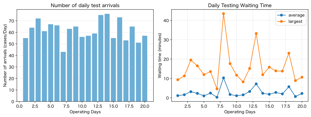
daily = events.groupby("day", as_index=False).agg(
    number_of_arrivals=("arrival_min", "size"), average_waiting_time=("wait_min", "mean"),
    maximum_waiting_time=("wait_min", "max"), waiting_rate=("waited", "mean"))
display(daily.style.format({"average_waiting_time": "{:.1f}", "maximum_waiting_time": "{:.1f}", "waiting_rate": "{:.1%}"}))

fig, axes = plt.subplots(1, 2, figsize=(11, 4.2))
axes[0].bar(daily["day"], daily["number_of_arrivals"], color="#6baed6")
axes[0].set_title("Number of daily test arrivals")
axes[0].set_xlabel("Operating Days")
axes[0].set_ylabel("Number of arrivals (cases/Day)")
axes[0].grid(True, axis="y", alpha=0.3)
axes[1].plot(daily["day"], daily["average_waiting_time"], marker="o", label="average")
axes[1].plot(daily["day"], daily["maximum_waiting_time"], marker="o", label="largest")
axes[1].set_title("Daily Testing Waiting Time")
axes[1].set_xlabel("Operating Days")
axes[1].set_ylabel("Waiting time (minutes)")
axes[1].grid(True, alpha=0.3)
axes[1].legend()
plt.tight_layout()
plt.show()| day | number_of_arrivals | average_waiting_time | maximum_waiting_time | waiting_rate | |
|---|---|---|---|---|---|
| 0 | 1 | 55 | 1.1 | 9.3 | 25.5% |
| 1 | 2 | 64 | 1.6 | 11.3 | 29.7% |
| 2 | 3 | 72 | 3.1 | 19.5 | 43.1% |
| 3 | 4 | 61 | 2.3 | 16.5 | 41.0% |
| 4 | 5 | 67 | 1.0 | 12.0 | 29.9% |
| 5 | 6 | 66 | 2.4 | 13.5 | 47.0% |
| 6 | 7 | 43 | 0.3 | 4.6 | 11.6% |
| 7 | 8 | 63 | 10.3 | 43.5 | 58.7% |
| 8 | 9 | 65 | 1.7 | 17.6 | 32.3% |
| 9 | 10 | 56 | 1.1 | 11.6 | 28.6% |
| 10 | 11 | 57 | 1.5 | 8.2 | 36.8% |
| 11 | 12 | 59 | 3.2 | 15.1 | 42.4% |
| 12 | 13 | 75 | 7.2 | 33.2 | 64.0% |
| 13 | 14 | 76 | 2.3 | 11.9 | 52.6% |
| 14 | 15 | 55 | 1.8 | 15.8 | 30.9% |
| 15 | 16 | 73 | 2.8 | 13.9 | 50.7% |
| 16 | 17 | 53 | 2.0 | 13.8 | 39.6% |
| 17 | 18 | 65 | 5.7 | 23.0 | 52.3% |
| 18 | 19 | 51 | 0.6 | 8.9 | 19.6% |
| 19 | 20 | 57 | 2.2 | 10.6 | 40.4% |
No.051: Modeling Arrival Rates
Meaning in Practice
Arrival rate refers to the number of lots entering inspection per unit time. By looking not only at daily averages but also by time of day, you can see which mountains cause congestion.
Approach to Analysis and Modeling
is the number of arrivals, and is the observation time. In Poisson arrivals, the number of cases per unit time is expressed as a Poisson distribution, but in practice, we check for irregularities, as rates change by time of day, day of the week, and variety.
Check with Python
arrival_profile = events.groupby("hour", as_index=False).size().rename(columns={"size": "20Daily arrivals"})
arrival_profile["Arrival rate_case time"] = arrival_profile["20Daily arrivals"] / 20
display(arrival_profile.style.format({"Arrival rate_case time": "{:.2f}"}))

fig, ax = plt.subplots()
ax.bar(arrival_profile["hour"], arrival_profile["Arrival rate_case time"], color="#2c7fb8")
ax.axhline(len(events) / (20 * 8), color="black", linestyle="--", label="all-time average")
ax.set_title("Test arrival rate by time slot")
ax.set_xlabel("Time (hour)")
ax.set_ylabel("Arrival rate λ(Item/Time)")
ax.grid(True, axis="y", alpha=0.3)
ax.legend()
plt.tight_layout()
plt.show()
print(f"Average Arrival Rate All Time: {len(events)/(20*8):.2f}records/time")| hour | 20Daily arrivals | Arrival rate_case time | |
|---|---|---|---|
| 0 | 9 | 105 | 5.25 |
| 1 | 10 | 150 | 7.50 |
| 2 | 11 | 178 | 8.90 |
| 3 | 12 | 218 | 10.90 |
| 4 | 13 | 201 | 10.05 |
| 5 | 14 | 164 | 8.20 |
| 6 | 15 | 120 | 6.00 |
| 7 | 16 | 97 | 4.85 |
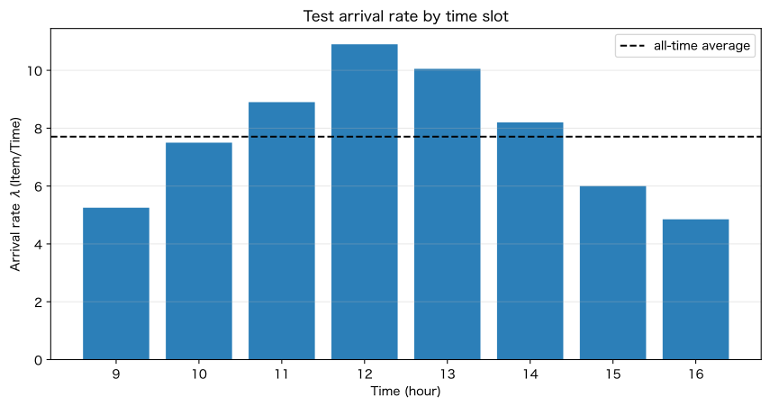
Average arrival rate over all hours: 7.71 items/hourReading the results
Peak arrival rates are higher than average, and congestion is concentrated during these hours. Not only increasing the number of workers but also leveling by staggering the completion time of the previous process and the delivery schedule are considered candidates.
Since rates are unstable during short observation periods, stratification is made by day, end of month, and variety switching.
No.052: Modeling Throughput
Meaning in Practice
The processing rate is the number of cases that one inspector can complete per unit time. Not only standard time but also performance distribution helps you understand abilities and variations.
Approach to Analysis and Modeling
If we set the average processing time to hours, it is . On average, 8 minutes is 7.5 cases per hour, but long processing times affect waiting times.
Check with Python
mean_service = events["service_min"].mean()
mu = 60 / mean_service
service_summary = events["service_min"].describe(percentiles=[0.5, 0.9, 0.95]).to_frame("Examination Hours_minutes")
display(service_summary.style.format("{:.2f}"))

fig, ax = plt.subplots()
ax.hist(events["service_min"], bins=25, color="#74c476", edgecolor="white")
ax.axvline(mean_service, color="black", linestyle="--", label="average")
ax.set_title("1Distribution of inspection times per lot")
ax.set_xlabel("Examination time (minutes)/Item)")
ax.set_ylabel("number_of_cases")
ax.grid(True, axis="y", alpha=0.3)
ax.legend()
plt.tight_layout()
plt.show()
print(f"Average Examination Time: {mean_service:.2f}minutes / 1Hit Rate μ: {mu:.2f}records/time")| Examination Hours_minutes | |
|---|---|
| count | 1233.00 |
| mean | 8.06 |
| std | 3.98 |
| min | 0.75 |
| 50% | 7.45 |
| 90% | 13.44 |
| 95% | 15.26 |
| max | 28.35 |
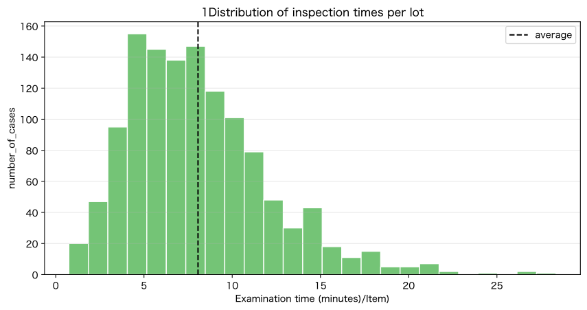
Average inspection time: 8.06 minutes / Processing rate per person μ: 7.44 cases/hourReading the results
Processing rate indicates average capability, but long-term deals at the right end of the distribution keep you waiting for followers. We stratify by type, inspection items, and re-inspection, and consider standard procedures and dedicated contact points.
No.053: Modeling Wait Time
Meaning in Practice
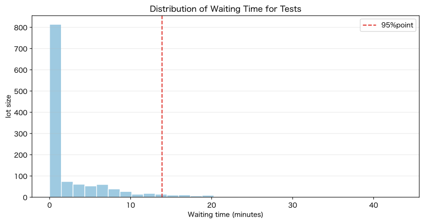
Waiting only on average does not represent shipping delay risk. The median, 90th and 95th percentiles, and waiting occurrence rate are listed together.
Approach to Analysis and Modeling
The waiting time for lot is , and the process stay time is . Service levels are defined by quantiles, such as ‘95% within a certain number of minutes.‘
Check with Python
wait_kpi = pd.DataFrame({
    "KPI": ["average", "median", "90%point", "95%point", "largest", "waiting_rate"],
    "value": [events["wait_min"].mean(), events["wait_min"].median(), events["wait_min"].quantile(.9),
           events["wait_min"].quantile(.95), events["wait_min"].max(), events["waited"].mean() * 100],
    "Unit": ["minutes", "minutes", "minutes", "minutes", "minutes", "%"],
})
display(wait_kpi.style.format({"value": "{:.2f}"}))

fig, ax = plt.subplots()
ax.hist(events["wait_min"], bins=30, color="#9ecae1", edgecolor="white")
ax.axvline(events["wait_min"].quantile(.95), color="#de2d26", linestyle="--", label="95%point")
ax.set_title("Distribution of Waiting Time for Tests")
ax.set_xlabel("Waiting time (minutes)")
ax.set_ylabel("lot size")
ax.grid(True, axis="y", alpha=0.3)
ax.legend()
plt.tight_layout()
plt.show()| KPI | value | Unit | |
|---|---|---|---|
| 0 | average | 2.85 | minutes |
| 1 | median | 0.00 | minutes |
| 2 | 90%point | 9.21 | minutes |
| 3 | 95%point | 13.88 | minutes |
| 4 | largest | 43.46 | minutes |
| 5 | waiting_rate | 40.15 | % |
Reading the results
If the score is 95% higher than average, there may be long waiting times for some lots. In processes with shipping deadlines, we manage the top quantiles and investigate the conditions under which long-term orders occur.
No.054: Modeling Utilization Rates
Meaning in Practice
Operating rate is calculated by dividing the incoming load by the processing capacity. If it’s too high, you won’t be able to absorb the delay.
Approach to Analysis and Modeling
When there are counters, it is . then the queue will diverge over the long term. Even if it’s less than 1, the waiting time increases sharply as you get closer to 1.
Check with Python
utilization = arrival_profile.copy()
utilization["Ability_case time"] = 2 * mu
utilization["Utilization rate"] = utilization["Arrival rate_case time"] / utilization["Ability_case time"]
display(utilization.style.format({"Arrival rate_case time": "{:.2f}", "Ability_case time": "{:.2f}", "Utilization rate": "{:.1%}"}))

fig, ax = plt.subplots()
ax.plot(utilization["hour"], utilization["Utilization rate"] * 100, marker="o", color="#d95f0e")
ax.axhline(85, color="black", linestyle="--", label="Guidelines 85%")
ax.set_title("Inspector Utilization Rate by Time of Day")
ax.set_xlabel("Time (hour)")
ax.set_ylabel("Utilization rate ρ(%)")
ax.grid(True, alpha=0.3)
ax.legend()
plt.tight_layout()
plt.show()
print(f"Average Utilization Rate: {len(events)/(20*8)/(2*mu):.1%}")| hour | 20Daily arrivals | Arrival rate_case time | Ability_case time | Utilization rate | |
|---|---|---|---|---|---|
| 0 | 9 | 105 | 5.25 | 14.88 | 35.3% |
| 1 | 10 | 150 | 7.50 | 14.88 | 50.4% |
| 2 | 11 | 178 | 8.90 | 14.88 | 59.8% |
| 3 | 12 | 218 | 10.90 | 14.88 | 73.2% |
| 4 | 13 | 201 | 10.05 | 14.88 | 67.5% |
| 5 | 14 | 164 | 8.20 | 14.88 | 55.1% |
| 6 | 15 | 120 | 6.00 | 14.88 | 40.3% |
| 7 | 16 | 97 | 4.85 | 14.88 | 32.6% |
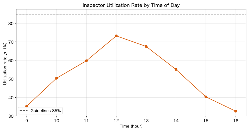
Average full-time utilization rate: 51.8%Reading the results
Even if there is some margin on the daily average, peak hours are still under high load. Before increasing the number of staff on a fixed daily basis, we compare peak cheering, adjusting break times, and standardizing arrivals.
No.055: Clarifying the relationship between the number of counters and processing capacity
Meaning in Practice
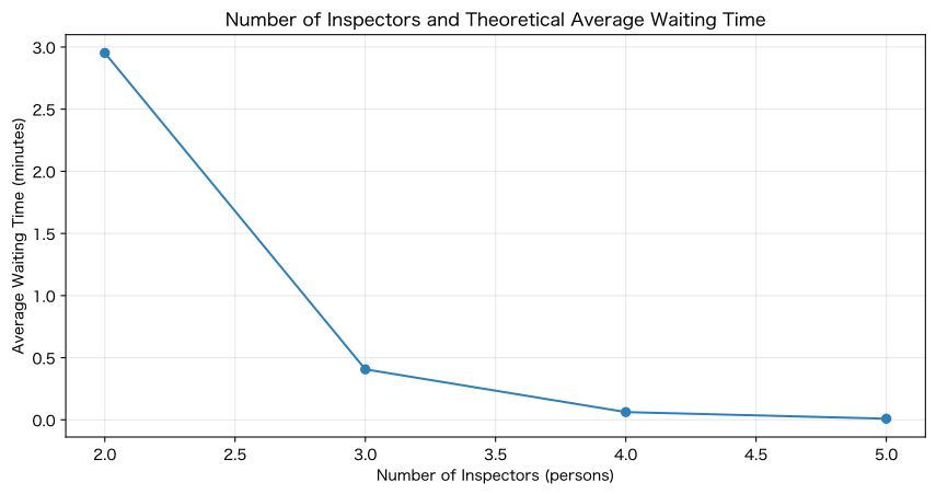
Increasing the number of inspectors increases total capacity, but improvements in wait times do not correlate with the number of people. Compare waiting times at multiple counters using the Erlang C method.
Approach to Analysis and Modeling
The M/M/c model assumes Poisson arrival, exponential processing time, and common matrix. Calculate the wait probability and average wait .
Check with Python
def erlang_c(lam, mu_value, servers):
    rho = lam / (servers * mu_value)
    if rho >= 1: return {"rho": rho, "wait_probability": 1.0, "wq_hours": np.inf, "lq": np.inf}
    a = lam / mu_value
    base = sum(a**n / math.factorial(n) for n in range(servers))
    tail = a**servers / (math.factorial(servers) * (1 - rho))
    p0 = 1 / (base + tail)
    pw = tail * p0
    wq = pw / (servers * mu_value - lam)
    return {"rho": rho, "wait_probability": pw, "wq_hours": wq, "lq": lam * wq}

lambda_all = len(events) / (20 * 8)
server_table = pd.DataFrame([{"Number of Inspectors": c, **erlang_c(lambda_all, mu, c)} for c in range(1, 6)])
server_table["Waiting for average_minutes"] = server_table["wq_hours"] * 60
display(server_table.style.format({"rho": "{:.1%}", "wait_probability": "{:.1%}", "Waiting for average_minutes": "{:.2f}", "lq": "{:.2f}"}))

fig, ax = plt.subplots()
stable = server_table.replace([np.inf], np.nan)
ax.plot(stable["Number of Inspectors"], stable["Waiting for average_minutes"], marker="o", color="#2c7fb8")
ax.set_title("Number of Inspectors and Theoretical Average Waiting Time")
ax.set_xlabel("Number of Inspectors (persons)")
ax.set_ylabel("Average Waiting Time (minutes)")
ax.grid(True, alpha=0.3)
plt.tight_layout()
plt.show()| Number of Inspectors | rho | wait_probability | wq_hours | lq | Waiting for average_minutes | |
|---|---|---|---|---|---|---|
| 0 | 1 | 103.5% | 100.0% | inf | inf | inf |
| 1 | 2 | 51.8% | 35.3% | 0.049204 | 0.38 | 2.95 |
| 2 | 3 | 34.5% | 9.9% | 0.006771 | 0.05 | 0.41 |
| 3 | 4 | 25.9% | 2.3% | 0.001038 | 0.01 | 0.06 |
| 4 | 5 | 20.7% | 0.4% | 0.000151 | 0.00 | 0.01 |
Reading the results
For one person, the arrival rate exceeds the capacity and is unstable. Improvement from two to three people is significant, while the subsequent marginal effect is smaller. The difference between theoretical assumptions and actual distributions is confirmed through simulation.
No.056: Modeling the Single Window Queue
Meaning in Practice
A single measuring instrument, approver, or special inspector is a basic example of M/M/1. You can explain why dedicated processes at the limit of capacity become stagnant.
Approach to Analysis and Modeling
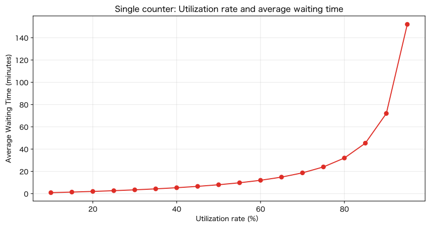
For M/M/1, , average wait time is , and in-process time is .
Check with Python
lambda_single, mu_single = 6.0, 7.5
rho_single = lambda_single / mu_single
wq_single = rho_single / (mu_single - lambda_single) * 60
w_single = 1 / (mu_single - lambda_single) * 60
single = pd.DataFrame({"Arrival rate_case time": [lambda_single], "processing rate_case time": [mu_single], "Utilization rate": [rho_single], "Waiting for average_minutes": [wq_single], "Construction Time_minutes": [w_single]})
display(single.style.format({"Utilization rate": "{:.1%}", "Waiting for average_minutes": "{:.1f}", "Construction Time_minutes": "{:.1f}"}))

rho_grid = np.linspace(.1, .95, 18)
wait_grid = rho_grid / (mu_single * (1 - rho_grid)) * 60
fig, ax = plt.subplots()
ax.plot(rho_grid * 100, wait_grid, marker="o", color="#de2d26")
ax.set_title("Single counter: Utilization rate and average waiting time")
ax.set_xlabel("Utilization rate (%)")
ax.set_ylabel("Average Waiting Time (minutes)")
ax.grid(True, alpha=0.3)
plt.tight_layout()
plt.show()| Arrival rate_case time | processing rate_case time | Utilization rate | Waiting for average_minutes | Construction Time_minutes | |
|---|---|---|---|---|---|
| 0 | 6.000000 | 7.500000 | 80.0% | 32.0 | 40.0 |
Reading the results
Even at 80% utilization, the average wait time is 32 minutes, and after 90%, the wait rate surges. For dedicated facilities, we consider separating reserve capacity, priority rules, and preprocessing.
No.057: Modeling Call Center Congestion
Meaning in Practice
The technical support desk for manufacturing companies also has a queue of multiple representatives. Waiting for answers leads to delays in equipment recovery, so we manage not only the number of calls but also response times.
Approach to Analysis and Modeling
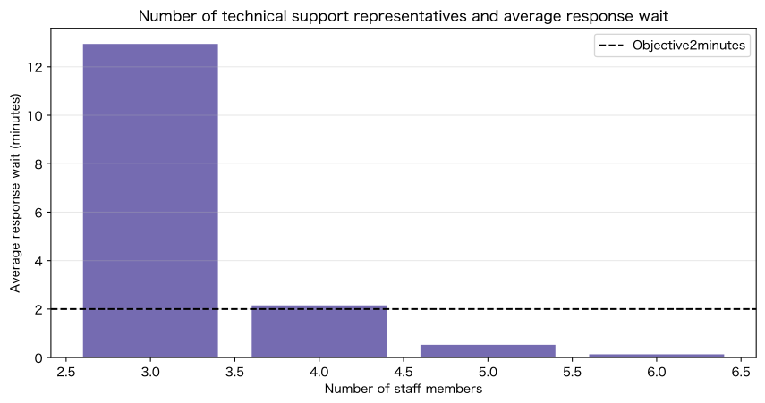
For M/M/c with 12 inquiries per hour and 5 per person per hour, we compare the utilization rate, waiting probability, and average response wait for each number of representatives.
Check with Python
support = pd.DataFrame([{"Number of Representatives": c, **erlang_c(12, 5, c)} for c in range(2, 7)])
support["Average response wait_minutes"] = support["wq_hours"] * 60
display(support.style.format({"rho": "{:.1%}", "wait_probability": "{:.1%}", "Average response wait_minutes": "{:.2f}"}))

fig, ax = plt.subplots()
ax.bar(support["Number of Representatives"], support["Average response wait_minutes"].replace(np.inf, np.nan), color="#756bb1")
ax.axhline(2, color="black", linestyle="--", label="Objective2minutes")
ax.set_title("Number of technical support representatives and average response wait")
ax.set_xlabel("Number of staff members")
ax.set_ylabel("Average response wait (minutes)")
ax.grid(True, axis="y", alpha=0.3)
ax.legend()
plt.tight_layout()
plt.show()| Number of Representatives | rho | wait_probability | wq_hours | lq | Average response wait_minutes | |
|---|---|---|---|---|---|---|
| 0 | 2 | 120.0% | 100.0% | inf | inf | inf |
| 1 | 3 | 80.0% | 64.7% | 0.215730 | 2.588764 | 12.94 |
| 2 | 4 | 60.0% | 28.7% | 0.035880 | 0.430565 | 2.15 |
| 3 | 5 | 48.0% | 11.4% | 0.008731 | 0.104773 | 0.52 |
| 4 | 6 | 40.0% | 4.0% | 0.002220 | 0.026635 | 0.13 |
Reading the results
Two are insufficient, three are working at high levels and waiting are long, so even more leeway is needed to reach the target of 2 minutes. In practice, we add abandonment, turnback, inquiry difficulty, and skill-based routing.
No.058: Modeling Wait Times for Stores and Reception
Meaning in Practice
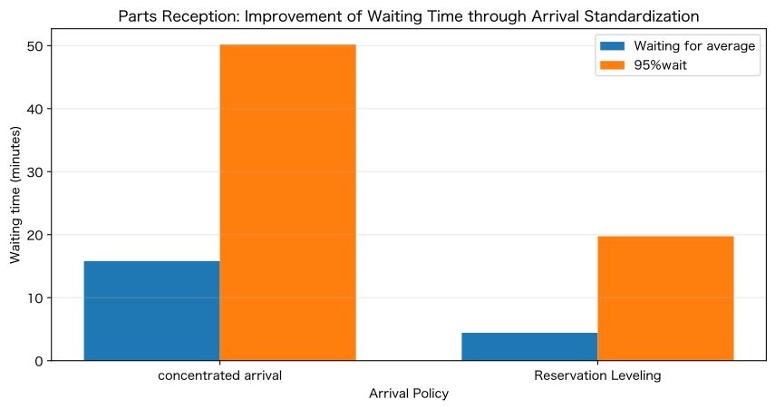
At parts acceptance reception, delivery shipments are concentrated at specific times. Simulate the effect of leveling arrivals in reservation slots without increasing the number of people.
Approach to Analysis and Modeling
The total number of arrivals and the two people at reception remain the same, but the time slot rate will be changed from peak [3,5,12,14,10,7,4,3] to flat type. Even if the average capacity is the same, the wait time varies depending on the arrival time.
Check with Python
def create_scenario(rates, seed):
    local = np.random.default_rng(seed)
    arr = []
    for day in range(20):
        for hour, rate in enumerate(rates):
            arr.extend(day * 480 + hour * 60 + np.sort(local.uniform(0, 60, local.poisson(rate))))
    arr = np.array(sorted(arr))
    service = local.gamma(4, 2.5, len(arr))
    result = simulate_queue(arr, service, 2)
    return {"number_of_cases": len(result), "Waiting for average": result["wait_min"].mean(), "95%wait": result["wait_min"].quantile(.95), "waiting_rate": (result["wait_min"] > 0).mean()}

peak_rates = np.array([3, 5, 12, 14, 10, 7, 4, 3])
flat_rates = np.repeat(peak_rates.mean(), 8)
reception = pd.DataFrame([{"policy": "concentrated arrival", **create_scenario(peak_rates, 100)}, {"policy": "Reservation Leveling", **create_scenario(flat_rates, 101)}])
display(reception.style.format({"Waiting for average": "{:.1f}minutes", "95%wait": "{:.1f}minutes", "waiting_rate": "{:.1%}"}))

fig, ax = plt.subplots()
x = np.arange(2)
ax.bar(x - .18, reception["Waiting for average"], .36, label="Waiting for average")
ax.bar(x + .18, reception["95%wait"], .36, label="95%wait")
ax.set_xticks(x, reception["policy"])
ax.set_title("Parts Reception: Improvement of Waiting Time through Arrival Standardization")
ax.set_xlabel("Arrival Policy")
ax.set_ylabel("Waiting time (minutes)")
ax.grid(True, axis="y", alpha=0.3)
ax.legend()
plt.tight_layout()
plt.show()| policy | number_of_cases | Waiting for average | 95%wait | waiting_rate | |
|---|---|---|---|---|---|
| 0 | concentrated arrival | 1146 | 15.8minutes | 50.2minutes | 68.2% |
| 1 | Reservation Leveling | 1187 | 4.4minutes | 19.7minutes | 46.9% |
Reading the results
Even if the total number of cases and number of people are the same, standardized reservations reduce waiting times. You can compare the costs for increasing staff, bookings, flight selection, and document pre-registration.
No.059: Modeling Manufacturing Line Congestion
Meaning in Practice
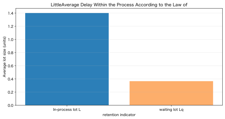
Waiting lots for inspection are in-process rigging. Using Little’s Law, we can connect arrival rates, process time, and average dwell counts.
Approach to Analysis and Modeling
For stable types, is , but if it’s just waiting in line, it’s . Align the units and get the number of cases per hour × hours.
Check with Python
lambda_hour = len(events) / (20 * 8)
mean_flow_hour = events["flow_min"].mean() / 60
mean_wait_hour = events["wait_min"].mean() / 60
little = pd.DataFrame({
    "indicator": ["In-process lot L", "waiting lot Lq"],
    "LittleLaw of": [lambda_hour * mean_flow_hour, lambda_hour * mean_wait_hour],
    "Event Time Integral": [events["flow_min"].sum() / (20 * 8 * 60), events["wait_min"].sum() / (20 * 8 * 60)],
})
display(little.style.format({"LittleLaw of": "{:.2f}records", "Event Time Integral": "{:.2f}records"}))

fig, ax = plt.subplots()
ax.bar(little["indicator"], little["LittleLaw of"], color=["#2c7fb8", "#fdae6b"])
ax.set_title("LittleAverage Delay Within the Process According to the Law of")
ax.set_xlabel("retention indicator")
ax.set_ylabel("Average lot size (units)")
ax.grid(True, axis="y", alpha=0.3)
plt.tight_layout()
plt.show()| indicator | LittleLaw of | Event Time Integral | |
|---|---|---|---|
| 0 | In-process lot L | 1.40records | 1.40records |
| 1 | waiting lot Lq | 0.37records | 0.37records |
Reading the results
Little’s law and event time integration coincide. If you want to halve in-process work-in-process without changing the arrival rate, you need to halve in-process time. This not only improves the work-in-progress limit but also improves the causes of waiting for inspections.
No.060: Balancing Wait Time and Staffing
Meaning in Practice
Increasing staff reduces waiting losses but raises labor costs. Compare total costs among candidates who meet delivery constraints.
Approach to Analysis and Modeling
The daily fee is 35,000 yen per person, with a waiting price of 8,000 yen per lot per hour, and we estimate 8 hours of operation.
Check with Python
staff_rows = []
for c in range(2, 7):
    q = erlang_c(lambda_all, mu, c)
    labor = c * 35_000
    wait_loss = lambda_all * 8 * q["wq_hours"] * 8_000 if np.isfinite(q["wq_hours"]) else np.inf
    staff_rows.append({"Number of Inspectors": c, "Utilization rate": q["rho"], "Waiting for average_minutes": q["wq_hours"] * 60, "personnel expenses_En-nichi": labor, "waiting loss_En-nichi": wait_loss, "Total cost_En-nichi": labor + wait_loss})
staffing = pd.DataFrame(staff_rows)
best_staff = staffing.loc[staffing["Total cost_En-nichi"].idxmin()]
display(staffing.style.format({"Utilization rate": "{:.1%}", "Waiting for average_minutes": "{:.2f}", "personnel expenses_En-nichi": "¥{:,.0f}", "waiting loss_En-nichi": "¥{:,.0f}", "Total cost_En-nichi": "¥{:,.0f}"}))

fig, ax = plt.subplots()
ax.plot(staffing["Number of Inspectors"], staffing["personnel expenses_En-nichi"], marker="o", label="personnel expenses")
ax.plot(staffing["Number of Inspectors"], staffing["waiting loss_En-nichi"], marker="o", label="waiting loss")
ax.plot(staffing["Number of Inspectors"], staffing["Total cost_En-nichi"], marker="o", linewidth=2, label="Total cost")
ax.axvline(best_staff["Number of Inspectors"], color="black", linestyle="--", label="Minimum-Cost")
ax.set_title("Number of Inspectors, Personnel Costs, and Waiting Losses")
ax.set_xlabel("Number of Inspectors (persons)")
ax.set_ylabel("1Daily cost (yen)")
ax.grid(True, alpha=0.3)
ax.legend()
plt.tight_layout()
plt.show()
print(f"Minimum-Cost: {int(best_staff['Number of Inspectors'])}name / Waiting for average {best_staff['Waiting for average_minutes']:.2f}minutes / ¥{best_staff['Total cost_En-nichi']:,.0f}/days")| Number of Inspectors | Utilization rate | Waiting for average_minutes | personnel expenses_En-nichi | waiting loss_En-nichi | Total cost_En-nichi | |
|---|---|---|---|---|---|---|
| 0 | 2 | 51.8% | 2.95 | ¥70,000 | ¥24,267 | ¥94,267 |
| 1 | 3 | 34.5% | 0.41 | ¥105,000 | ¥3,339 | ¥108,339 |
| 2 | 4 | 25.9% | 0.06 | ¥140,000 | ¥512 | ¥140,512 |
| 3 | 5 | 20.7% | 0.01 | ¥175,000 | ¥74 | ¥175,074 |
| 4 | 6 | 17.3% | 0.00 | ¥210,000 | ¥10 | ¥210,010 |
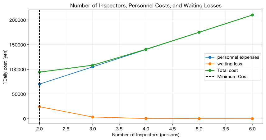
Minimum total cost: 2 people / Average wait time 2.95 minutes / ¥94,267/dayReading the results
As the number of people increases, waiting losses drop sharply, and labor costs rise linearly. Minimum total cost is one option, but first confirm that you meet the shipping deadline and the 95% waiting time cap.
Support during peak hours, arrival leveling, and reduced processing times are also compared using the same cost scale.
Practical Implications Seen Through Target Exercise
- Arrival rate and processing rate are defined in the same time unit.
- Evaluating not only daily averages but also peak hours
- Listing both average waiting points and top quantiles
- As the utilization rate approaches 1, waiting times increase nonlinearly
- The marginal effect of adding a counter diminishes
- Dedicated equipment and approval providers tend to become bottlenecks as a single point of contact.
- Reservations and leveling are alternatives to increasing enrollment.
- Connecting the number of tasks and lead time using Little’s Law
- Evaluating placements based on personnel costs, waiting losses, and delivery constraints
Waiting times arise not from a lack of effort on site, but from the structure of arrival, capability, and variation. It is important to compare measures that change the structure.
What is necessary for practical implementation
1. Record event times
Arrival, reception, start of processing, completion, re-inspection, and handover are all connected by lot ID.
2. Stratify Arrival and Processing
Distinguish between time zones, days of the week, varieties, inspection types, assigned skills, and re-inspections.
3. Connect Waiting KPIs with Business Impact
Define average, 95% points, deadline overtime, order quantity, overtime, and shipping delays.
4. Use theoretical formulas and simulations
Estimates are made using the Erlang formula, and breaks, priorities, time variations, and breakdowns are checked through event simulation.
5. Compare measures other than increasing staff
We compare cost and effectiveness by making reservations, changing delivery services, support, standard operations, dedicated contact points, and leveling upstream processes.
6. Verify through small-scale parallel operations
We test measures only during peak hours, checking wait times, quality, load, and costs before expanding.
Conclusion
No.051–060 focused on the final inspection process of the factory, confirming the queue model.
- Represents the occupancy rate from arrival rate, processing rate, and number of counters
- Evaluating wait time by average and quantile
- Understanding the nonlinearity of congestion in M/M/1 and M/M/c
- Comparing arrival leveling and increasing staff
- Connecting work-in-progress and in-process time with Little’s Law
- Evaluating deployment proposals based on personnel costs and waiting losses
The value of the queue model lies not only in visualizing congestion but also in converting it into decisions on delivery dates and staffing.
Consultations for Corporations
At Surikoubo, we support the following themes in manufacturing.
- Congestion analysis in inspection, transport, maintenance, and reception processes
- Event log design and process lead time visualization
- Simulation of personnel/equipment numbers, reservations, and priority rules
- Evaluation of Measures to Reduce Workloads and Shorten Delivery Times
- On-site KPI, dashboards, and operational design
- Practical Data-Based Training for Production Technology, Quality, and DX Departments
📩 Contact Us: surikobo.co.jp/contact Please feel free to consult us first.