
100 Exercises / column / 100 Exercises in the Line
Visualizing Process Load and Production Planning as 'Matrices': Learning the Basics of Matrices in Manufacturing Decision-Making
Visualizing process load and production planning in a “matrix”
Learning the Basics of Matrix in Manufacturing Decision-Making: 100 Exercises No.001–No.010
In manufacturing, data based on two axes is routinely handled: weekly and product-specific demand, product-by-process standard time, and process capacity. By organizing these into matrices, relationships that are easy to overlook just by looking at Excel tables can be transformed into reproducible calculations.
This series, “100 Exercises of the Matrix,” covers everything from the basics of matrices to linear algebra, eigenvalues, optimization and machine learning, manufacturing simulation, and practical, high-speed calculations across 100 questions. In this first article, we will focus on the production planning of a precision parts factory and address Matrix, vector, addition, multiplication, transpose, identity matrix, diagonal matrix, block matrix, matrix representation,NumPy. The goal is not to memorize symbols, but to define “which rows represent what, which columns represent what,” and to make judgments regarding process capability and cost.
[!NOTE] This material is a notebook previously used by Surikoubo (or personally by the representative, Kazuyama), and has been reconstructed, edited, and published with the company’s permission.
All data listed is fictional and has no relation whatsoever to real companies, factories, or figures.
Introduction: Practical Challenges in Manufacturing Covered in This Article
In a fictional precision parts factory, gear A, shaft B, and housing C are produced through the processes of cutting, heat treatment, grinding, and inspection. Production management personnel must create weekly plans that meet both regular demand and express orders, while ensuring that each process does not exceed the operating hours.
The practical challenge this time is to connect information divided into multiple tables as a matrix and quickly grasp the Which Weeks and Which Processes Are Bottlenecks. Ultimately, we aim to be able to calculate demand, yield, standard time, capacity, and cost on a consistent axis.
Common situations on site
- Sales demand tables are managed under ’× Products per Week,’ standard manufacturing technology schedules are ‘Product × Process,’ and factory capacity tables are managed under ’× Processes per Week’
- Demand and capacity fluctuate weekly due to express orders and equipment maintenance.
- The order of product and process names varies by file, so even if calculations are correct, compatibility may be incorrect
- The total production volume alone does not determine the process load, and bottlenecks become clear after the plan is finalized.
Matrices are a common language that connects “multiple tables with axes” like this.
Why is this issue so difficult to judge?
If the number of products is , the number of processes is , and the number of periods is , the demand alone is items, and the standard time is units. Additionally, yield, cost, and capability are added, making it harder to track relationships through manual calculations.
Also, matrix calculations are meaningful not only in numbers but also in Dimensions and Order. For example, the weekly product quantity and the product-specific process time are multiplied by , but if the product order in the columns does not match, the calculation itself will run but the answer will be incorrect in business practice. Therefore, it is necessary to manage shapes, units, and labels simultaneously.
Overview of Exercise covered this time
| No. | Theme | Confirmation Details in Manufacturing |
|---|---|---|
| 001 | What is a Matrix? | Weekly and product-specific production plans are presented in a single table. |
| 002 | What is a vector? | Display weekly demand and product-specific KPIs as a single axis |
| 003 | matrix addition | Combine regular demand and express orders |
| 004 | matrix multiplication | Calculating process load time from product quantities |
| 005 | Transposition | Shift your perspective from ’× products weekly’ to ‘products × weekly’ |
| 006 | identity matrix | Used for conversion and computational verification without changing values |
| 007 | diagonal matrix | Apply product-specific yield and cost without mixing |
| 008 | block matrix | Integrating multi-line structures into one large matrix |
| 009 | The Expressiveness of Matrices | Expressing everything from demand to capability and cost in a chain |
| 010 | Introduction to NumPy | Perform array operations, aggregation, and visualization that can be used in practical work. |
Using the same hypothetical factory data, the results of previous exercises are linked to the next decision.
Preparing the Python environment
For numerical calculations, I use NumPy; for labeled tables, pandas; for visualization, Matplotlib. To display graphs in Japanese, use japanize-matplotlib. External data is not loaded. Random numbers are fixed at np.random.default_rng(42) so that the same fictitious data is obtained no matter how many times you run them.
import platform

import japanize_matplotlib
import matplotlib
import matplotlib.pyplot as plt
from matplotlib_inline.backend_inline import set_matplotlib_formats
import numpy as np
import pandas as pd

set_matplotlib_formats("svg")
pd.set_option("display.max_columns", 20)
pd.set_option("display.width", 120)
np.set_printoptions(precision=2, suppress=True)

SEED = 42
rng = np.random.default_rng(SEED)

print("Python     :", platform.python_version())
print("NumPy      :", np.__version__)
print("pandas     :", pd.__version__)
print("Matplotlib :", matplotlib.__version__)
print("random number seed :", SEED)
Python     : 3.13.1
NumPy      : 2.5.1
pandas     : 3.0.3
Matplotlib : 3.11.0
Random Number Seed: 42
Creation of Fictional Data
Creating small-scale planning data for six weeks, three products, and four processes. Regular demand is based on standard demand plus weekly fluctuations and small random numbers, while express orders are fixed values modeled after business information. Standard time is “per unit,” process capacity is “per week,” and cost is “yen per unit.”
In practice, it is necessary to first manage master plates, check the compatibility of missing values, units, and product/process codes. In this article, to focus on the concept of matrices, we will use a pre-matched fictitious master.
weeks = [f"No.{i}week" for i in range(1, 7)]
products = ["gearA", "shaftB", "HousingC"]
processes = ["cutting", "heat treatment", "grinding", "Examination"]

base_level = np.array([920, 740, 560])
weekly_factor = np.array([0.96, 1.00, 1.04, 1.08, 1.02, 1.12])[:, None]
normal_demand = np.rint(
    base_level * weekly_factor + rng.normal(0, 24, size=(6, 3))
).astype(int)
rush_orders = np.array([
    [0, 0, 0], [80, 0, 0], [0, 60, 0],
    [0, 0, 90], [40, 40, 0], [100, 0, 70],
])
total_demand = normal_demand + rush_orders

# Product × Standard process time (minutes/piece)
routing_minutes = np.array([
    [1.60, 0.90, 1.20, 0.35],
    [1.80, 0.70, 1.50, 0.40],
    [2.20, 1.30, 0.80, 0.50],
])

# Weekly × Operating time for processes (minutes/week)
capacity_minutes = np.array([
    [4000, 2500, 3000, 1050], [4000, 2500, 3000, 1050],
    [3800, 2500, 3000, 1050], [4000, 2200, 3000, 1050],
    [4000, 2500, 2700, 1050], [4200, 2500, 3100, 1100],
])

yield_rate = np.array([0.980, 0.965, 0.985])
unit_cost = np.array([1250, 1680, 1420])

product_master = pd.DataFrame({
    "yield rate": yield_rate,
    "standard cost_individual yen": unit_cost,
}, index=products)
product_master
| yield rate | standard cost_individual yen | |
|---|---|---|
| gearA | 0.980 | 1250 |
| shaftB | 0.965 | 1680 |
| HousingC | 0.985 | 1420 |
demand_df = pd.DataFrame(total_demand, index=weeks, columns=products)
routing_df = pd.DataFrame(routing_minutes, index=products, columns=processes)
capacity_df = pd.DataFrame(capacity_minutes, index=weeks, columns=processes)

print("Total demand (units): Weekly × Products")
display(demand_df)
print("\nStandard time (minutes)/Individual): Product × Project")
display(routing_df)
print("\nEngineering Capability (points)/Week): Week × Project")
display(capacity_df)
Total demand (units): Week × products| gearA | shaftB | HousingC | |
|---|---|---|---|
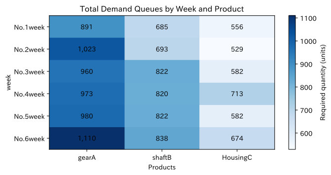
| No.1week | 891 | 685 | 556 |
| No.2week | 1023 | 693 | 529 |
| No.3week | 960 | 822 | 582 |
| No.4week | 973 | 820 | 713 |
| No.5week | 980 | 822 | 582 |
| No.6week | 1110 | 838 | 674 |
Standard Time (minutes/piece): Product × process| cutting | heat treatment | grinding | Examination | |
|---|---|---|---|---|
| gearA | 1.6 | 0.9 | 1.2 | 0.35 |
| shaftB | 1.8 | 0.7 | 1.5 | 0.40 |
| HousingC | 2.2 | 1.3 | 0.8 | 0.50 |
Engineering Capability (minutes/week): Weeks × Engineering| cutting | heat treatment | grinding | Examination | |
|---|---|---|---|---|
| No.1week | 4000 | 2500 | 3000 | 1050 |
| No.2week | 4000 | 2500 | 3000 | 1050 |
| No.3week | 3800 | 2500 | 3000 | 1050 |
| No.4week | 4000 | 2200 | 3000 | 1050 |
| No.5week | 4000 | 2500 | 2700 | 1050 |
| No.6week | 4200 | 2500 | 3100 | 1100 |
No.001: What is a Matrix?
Meaning in Practice
A matrix is a rectangle where numbers with two identical axes are arranged in a rectangle. Here, the row is weekly, the column is the product, and total demand is represented by . Element has a business meaning: “How many product are needed in week ?” By specifying the shape, you can check in advance whether the tables can be connected.
Approach to Analysis and Modeling
When creating a matrix, define the rows, columns, and units before the values. In this example,
That’s right. Since the matrix is not just a table but has rules for addition and multiplication, it can process subsequent process load calculations all at once.
Check with Python
Check the dimensions in shape and view weekly and product-specific quantity levels in the heatmap.
print("column D Shape:", total_demand.shape)
print("No.4Weekly HousingC d[3, 2]:", total_demand[3, 2], "units")

fig, ax = plt.subplots(figsize=(7.2, 3.8))
im = ax.imshow(total_demand, cmap="Blues", aspect="auto")
ax.set_title("Total Demand Queues by Week and Product")
ax.set_xlabel("Products")
ax.set_ylabel("week")
ax.set_xticks(range(len(products)), products)
ax.set_yticks(range(len(weeks)), weeks)
for i in range(len(weeks)):
    for j in range(len(products)):
        ax.text(j, i, f"{total_demand[i, j]:,}", ha="center", va="center")
ax.grid(False)
fig.colorbar(im, ax=ax, label="Required quantity (units)")
plt.tight_layout()
plt.show()
Shape of matrix D: (6, 3)
Week 4 Housing C d[3, 2]: 713 units
Reading the results
The demand matrix is (6, 3), meaning × 3 products in 6 weeks. Cells with darker colors have higher quantities, indicating high demand for multiple products in week 6. At this stage, you can identify ‘high-demand cells’ on site, but you cannot determine if the process is overloaded. It must be connected to the standard time matrix.
No.002: What is a Vector?
Meaning in Practice
A vector is a sequence of numbers arranged along a single axis. For example, the demand for three products in week 6 can be represented as a three-dimensional row vector, and the yield by product can be represented as a three-dimensional vector. Budget, inventory, unit price, KPIs, and so on can also be sorted out of the target by sorting them out.
Approach to Analysis and Modeling
Let the demand vector for week 6 be . In vectors, not only size but also the order of elements is important. By fixing the order of [gearA, shaftB, HousingC] as a master, you can safely compute with other vectors or matrices.
Check with Python
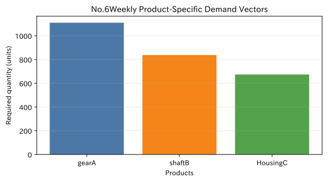
We extract the demand vector for week 6 and check the product mix ratio.
week6_vector = total_demand[5]
week6_share = week6_vector / week6_vector.sum()
week6_df = pd.DataFrame({
    "demand quantity_units": week6_vector,
    "Composition ratio_pct": week6_share * 100,
}, index=products)
display(week6_df.round(1))

fig, ax = plt.subplots(figsize=(6.8, 3.8))
ax.bar(products, week6_vector, color=["#4C78A8", "#F58518", "#54A24B"])
ax.set_title("No.6Weekly Product-Specific Demand Vectors")
ax.set_xlabel("Products")
ax.set_ylabel("Required quantity (units)")
ax.grid(axis="y", alpha=0.3)
plt.tight_layout()
plt.show()
| demand quantity_units | Composition ratio_pct | |
|---|---|---|
| gearA | 1110 | 42.3 |
| shaftB | 838 | 32.0 |
| HousingC | 674 | 25.7 |
Reading the results
Gear A has the highest demand in week 6, but the required process time varies by product. The product with the largest quantity is not always the main cause of bottlenecks. The vector concisely represents the “product-specific state” and later serves as input for multiplying by the standard time matrix.
No.003: Matrix Addition
Meaning in Practice
Tables managed by the same week, × products, and units can be added for each element, just like regular demand and express orders. This includes processes such as reflecting additional information from the sales department into existing plans or integrating orders from multiple customers.
Approach to Analysis and Modeling
If the regular demand matrix is and the express order matrix is , then the total demand matrix is
That’s right. For addition, the shape, matrix label, and unit of and must match. You can’t add ‘yen’ and ‘individual’, or ‘monthly’ and ‘weekly’ as is.
Check with Python
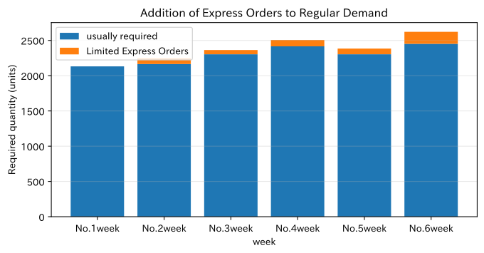
We check the weeks with the greatest impact from express orders using a stacked bar graph against normal demand.
assert normal_demand.shape == rush_orders.shape
assert np.array_equal(normal_demand + rush_orders, total_demand)

addition_summary = pd.DataFrame({
    "usually required_units": normal_demand.sum(axis=1),
    "Limited Express Orders_units": rush_orders.sum(axis=1),
    "Total demand_units": total_demand.sum(axis=1),
}, index=weeks)
display(addition_summary)

fig, ax = plt.subplots(figsize=(7.2, 3.8))
ax.bar(weeks, addition_summary["usually required_units"], label="usually required")
ax.bar(weeks, addition_summary["Limited Express Orders_units"], bottom=addition_summary["usually required_units"], label="Limited Express Orders")
ax.set_title("Addition of Express Orders to Regular Demand")
ax.set_xlabel("week")
ax.set_ylabel("Required quantity (units)")
ax.grid(axis="y", alpha=0.3)
ax.legend()
plt.tight_layout()
plt.show()
| usually required_units | Limited Express Orders_units | Total demand_units | |
|---|---|---|---|
| No.1week | 2132 | 0 | 2132 |
| No.2week | 2165 | 80 | 2245 |
| No.3week | 2304 | 60 | 2364 |
| No.4week | 2416 | 90 | 2506 |
| No.5week | 2304 | 80 | 2384 |
| No.6week | 2452 | 170 | 2622 |
Reading the results
In week 6, demand is usually high, and express orders are added, resulting in the highest total demand. Addition is a simple calculation, but if you simply look at additional orders as shown in a separate table, it’s easy to underestimate their impact on capability, so it’s important to integrate them on the same axis before passing them on to load calculation.
No.004: Multiplication of Matrices
Meaning in Practice
By using matrix multiplication, you can calculate the load by process at once from the quantity by product. This is the basic form of production planning, personnel planning, material requirement calculation, and cost allocation.
Approach to Analysis and Modeling
The product of demand matrix and standard time matrix
If so, is the load time for × processes per week. The inner dimension of the “three products” matches and is consolidated within the stack. The unit is ”× minutes per unit = minutes.”
Check with Python
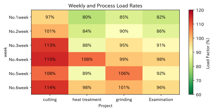
@ Calculate the load with an operator and calculate the ratio to process capability.
workload_minutes = total_demand @ routing_minutes
load_ratio = workload_minutes / capacity_minutes
load_ratio_df = pd.DataFrame(load_ratio * 100, index=weeks, columns=processes)

print("Project load factor (%)")
display(load_ratio_df.round(1))
print("maximum load rate:", f"{load_ratio.max() * 100:.1f}%")

fig, ax = plt.subplots(figsize=(7.4, 3.8))
im = ax.imshow(load_ratio * 100, cmap="RdYlGn_r", vmin=60, vmax=120, aspect="auto")
ax.set_title("Weekly and Process Load Rates")
ax.set_xlabel("Project")
ax.set_ylabel("week")
ax.set_xticks(range(len(processes)), processes)
ax.set_yticks(range(len(weeks)), weeks)
for i in range(len(weeks)):
    for j in range(len(processes)):
        ax.text(j, i, f"{load_ratio[i, j] * 100:.0f}%", ha="center", va="center")
ax.grid(False)
fig.colorbar(im, ax=ax, label="Load Factor (%)")
plt.tight_layout()
plt.show()
Project load factor (%)| cutting | heat treatment | grinding | Examination | |
|---|---|---|---|---|
| No.1week | 97.0 | 80.2 | 84.7 | 82.3 |
| No.2week | 101.2 | 83.7 | 89.7 | 85.7 |
| No.3week | 113.1 | 87.8 | 95.0 | 91.0 |
| No.4week | 115.0 | 108.0 | 98.9 | 97.6 |
| No.5week | 108.2 | 88.6 | 106.5 | 91.7 |
| No.6week | 113.5 | 98.5 | 100.9 | 96.4 |
Maximum load rate: 115.0%
Reading the results
The pressure levels by process, which were not visible from the quantity table, were converted into load rates for × processes per week. Cells exceeding 100% are plans that cannot be handled by existing capacity alone. Especially since the cutting process is highly demanding over several weeks, it is necessary to compare options such as overtime, outsourcing, moving forward, and adjusting order delivery dates.
No.005: Transposition
Meaning in Practice
Even with the same numbers, the axis you want to look at will change depending on the purpose of the meeting. While production management wants to see weekly product mix, product managers may want to see weekly trends for each product. Transposition is an operation that swaps rows and columns to change the viewpoint.
Approach to Analysis and Modeling
The transpose of is
It meets the requirements. Values and units remain unchanged, but the meanings of rows and columns are swapped. It is also essential when adjusting the orientation of vectors and matrices.
Check with Python
Compare the original demand table with the post-transpose table, and verify that it returns to the original after two transpositions.
demand_transposed = total_demand.T
transposed_df = pd.DataFrame(demand_transposed, index=products, columns=weeks)

print("pre-transposition:", total_demand.shape, "(Week × Products)")
print("After relocation:", demand_transposed.shape, "(Products × Week)")
print("Returns to the original after two transpositions.:", np.array_equal(demand_transposed.T, total_demand))
display(transposed_df)

product_peak = transposed_df.idxmax(axis=1).to_frame("Peak demand week")
product_peak["peak demand_units"] = transposed_df.max(axis=1)
display(product_peak)
Before translocation: (6, 3) (× products per week)
Post-transfer: (3, 6) (product × weeks)
Reverse after transposing twice: True| No.1week | No.2week | No.3week | No.4week | No.5week | No.6week | |
|---|---|---|---|---|---|---|
| gearA | 891 | 1023 | 960 | 973 | 980 | 1110 |
| shaftB | 685 | 693 | 822 | 820 | 822 | 838 |
| HousingC | 556 | 529 | 582 | 713 | 582 | 674 |
| Peak demand week | peak demand_units | |
|---|---|---|
| gearA | No.6week | 1110 |
| shaftB | No.6week | 838 |
| HousingC | No.4week | 713 |
Reading the results
After relocation, each product is arranged in rows, making it easier to track demand trends and peak weeks horizontally for each product. If the peaks for all products overlap in the same week, the room for leveling becomes smaller. Transpose may seem like a “display-only” operation, but it is a basic operation that switches axes according to the analysis question.
No.006: Identity Matrix
Meaning in Practice
The identity matrix is one that does not change the original value even when multiplied. It can be used for initial state of conversion processing, testing computational logic, or disabling parts of multiple conversions. It also serves as a standard when constructing transformations that represent the responsiveness of equipment and products step by step.
Approach to Analysis and Modeling
The identity matrix corresponds to three products, where the diagonal element is 1 and the others are 0,
It meets the requirements. This is the same role as 1 in multiplication of numbers. It can be used as a minimal test to check whether product order is disrupted during matrix processing.
Check with Python
Multiply the demand matrix by the identity matrix and confirm that the difference is zero.
identity_products = np.eye(len(products), dtype=int)
unchanged_demand = total_demand @ identity_products
difference = unchanged_demand - total_demand

print("3The following identity matrix I₃")
display(pd.DataFrame(identity_products, index=products, columns=products))
print("D @ I₃ And D The greatest absolute difference:", np.abs(difference).max())
print("exact match:", np.array_equal(unchanged_demand, total_demand))
3rd Order of Identity Matrix I₃| gearA | shaftB | HousingC | |
|---|---|---|---|
| gearA | 1 | 0 | 0 |
| shaftB | 0 | 1 | 0 |
| HousingC | 0 | 0 | 1 |
Maximum absolute difference between D @ I₃ and D: 0
Exact match: True
Reading the results
D @ I₃ matches the original demand matrix exactly, with a maximum difference of zero. In practical systems, this property can be used for regression testing. If values change with no conversion settings, there may be other processes such as product order, data type, rounding, or missing completion.
No.007: Diagonal Matrix
Meaning in Practice
If you want to apply different yields and unit prices for each product and don’t want to mix values from other products, a diagonal matrix is helpful. By placing product-specific coefficients on the diagonal elements, you can apply different multipliers for each column as a single matrix product.
Approach to Analysis and Modeling
If you create a diagonal matrix from yield vector , the equivalent of good product demand is . Also, to meet demand, the input quantity is set diagonally with the reciprocal of yield,
This is what is required. In actual planning, rounding up to an integer is used.
Check with Python
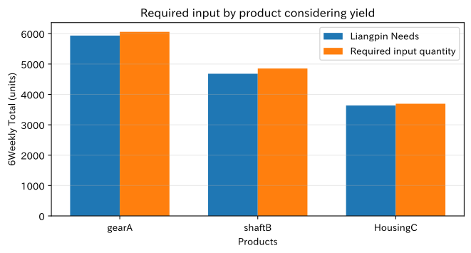
Calculate the required input quantity considering yield loss and the weekly input cost using the standard cost vector.
inverse_yield_matrix = np.diag(1 / yield_rate)
required_input = np.ceil(total_demand @ inverse_yield_matrix).astype(int)
weekly_input_cost = required_input @ unit_cost

yield_summary = pd.DataFrame({
    "Total demand_units": total_demand.sum(axis=0),
    "Required input quantity_units": required_input.sum(axis=0),
    "Yield Loss Forecast_units": required_input.sum(axis=0) - total_demand.sum(axis=0),
}, index=products)
display(yield_summary)
display(pd.DataFrame({"Weekly input cost_JPY": weekly_input_cost}, index=weeks).style.format("{:,.0f}"))

fig, ax = plt.subplots(figsize=(7.0, 3.8))
x = np.arange(len(products))
ax.bar(x - 0.18, yield_summary["Total demand_units"], width=0.36, label="Liangpin Needs")
ax.bar(x + 0.18, yield_summary["Required input quantity_units"], width=0.36, label="Required input quantity")
ax.set_title("Required input by product considering yield")
ax.set_xlabel("Products")
ax.set_ylabel("6Weekly Total (units)")
ax.set_xticks(x, products)
ax.grid(axis="y", alpha=0.3)
ax.legend()
plt.tight_layout()
plt.show()
| Total demand_units | Required input quantity_units | Yield Loss Forecast_units | |
|---|---|---|---|
| gearA | 5937 | 6060 | 123 |
| shaftB | 4680 | 4852 | 172 |
| HousingC | 3636 | 3694 | 58 |
| Weekly input cost_JPY | |
|---|---|
| No.1week | 3,132,600 |
| No.2week | 3,276,880 |
| No.3week | 3,495,580 |
| No.4week | 3,697,330 |
| No.5week | 3,520,580 |
| No.6week | 3,848,870 |
Reading the results
Since yield is less than 100%, even if you input as much as customer demand, it will not be enough. Especially for shaft B with low yield, it is necessary to explicitly factor the quantity difference into the plan. By using diagonal matrices, you can incorporate demand, cost, and load into the calculation system while maintaining product-specific coefficients.
No.008: Block Matrix
Meaning in Practice
When integrating models for multiple lines, multiple factories, or product groups, you can use block matrices that arrange existing small matrices as sections. If you do not share processes between lines, place the coefficients for each line in the diagonal block and set the non-diagonal block to zero.
Approach to Analysis and Modeling
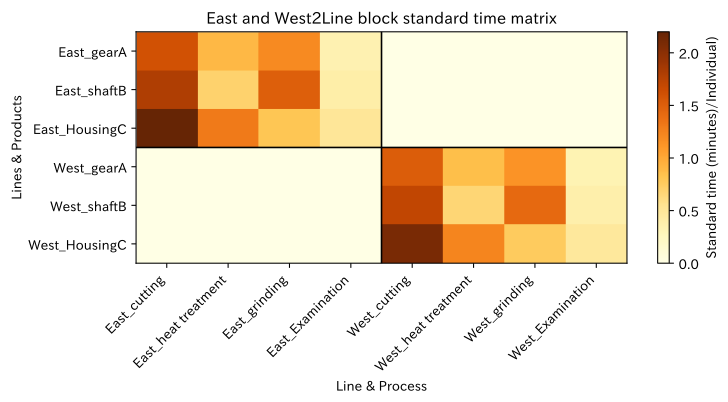
Assuming the standard time for the ‘product × process’ of the East and West lines is and there is no mutual use, the merged matrix
That’s right. If you set the non-diagonal block to anything other than zero, you can also express support production and the relationships of common processes. The block structure makes the independence of the organization and equipment visible.
Check with Python
Assuming the standard time of the east line and the west line that is 5% faster than that, we create a block diagonal matrix.
east_routing = routing_minutes
west_routing = routing_minutes * 0.95
zero_block = np.zeros_like(routing_minutes)
combined_routing = np.block([
    [east_routing, zero_block],
    [zero_block, west_routing],
])

row_labels = [f"East_{p}" for p in products] + [f"West_{p}" for p in products]
column_labels = [f"East_{p}" for p in processes] + [f"West_{p}" for p in processes]
print("Shape of the Unified Standard Time Matrix:", combined_routing.shape)
display(pd.DataFrame(combined_routing, index=row_labels, columns=column_labels))

fig, ax = plt.subplots(figsize=(8.0, 4.3))
im = ax.imshow(combined_routing, cmap="YlOrBr", aspect="auto")
ax.set_title("East and West2Line block standard time matrix")
ax.set_xlabel("Line & Process")
ax.set_ylabel("Lines & Products")
ax.set_xticks(range(len(column_labels)), column_labels, rotation=45, ha="right")
ax.set_yticks(range(len(row_labels)), row_labels)
ax.axvline(3.5, color="black", linewidth=1.2)
ax.axhline(2.5, color="black", linewidth=1.2)
ax.grid(False)
fig.colorbar(im, ax=ax, label="Standard time (minutes)/Individual)")
plt.tight_layout()
plt.show()
Shape of the Unified Standard Time Matrix: (6, 8)| East_cutting | East_heat treatment | East_grinding | East_Examination | West_cutting | West_heat treatment | West_grinding | West_Examination | |
|---|---|---|---|---|---|---|---|---|
| East_gearA | 1.6 | 0.9 | 1.2 | 0.35 | 0.00 | 0.000 | 0.000 | 0.0000 |
| East_shaftB | 1.8 | 0.7 | 1.5 | 0.40 | 0.00 | 0.000 | 0.000 | 0.0000 |
| East_HousingC | 2.2 | 1.3 | 0.8 | 0.50 | 0.00 | 0.000 | 0.000 | 0.0000 |
| West_gearA | 0.0 | 0.0 | 0.0 | 0.00 | 1.52 | 0.855 | 1.140 | 0.3325 |
| West_shaftB | 0.0 | 0.0 | 0.0 | 0.00 | 1.71 | 0.665 | 1.425 | 0.3800 |
| West_HousingC | 0.0 | 0.0 | 0.0 | 0.00 | 2.09 | 1.235 | 0.760 | 0.4750 |
Reading the results
The merged matrix consists of 6 product rows × 8 process sequences, with values only at the top left and bottom right. This explicitly assumes that the East-West Line is independent. In practice, when there is shared equipment or transfer between lines, coefficients are added to non-diagonal blocks to reflect in the model how far alternative production can be made.
No.009: The Expressiveness of Matrices
Meaning in Practice
The value of matrices lies not in storing a single table, but in linking demand, yield, process load, capacity, and cost along a common axis. Multiple scenarios with different conditions can be compared using the same formula, clarifying the premises of the planning meeting.
Approach to Analysis and Modeling
When using demand , yield correction , standard time , and capacity , the input base load factor is calculated using the division for each element,
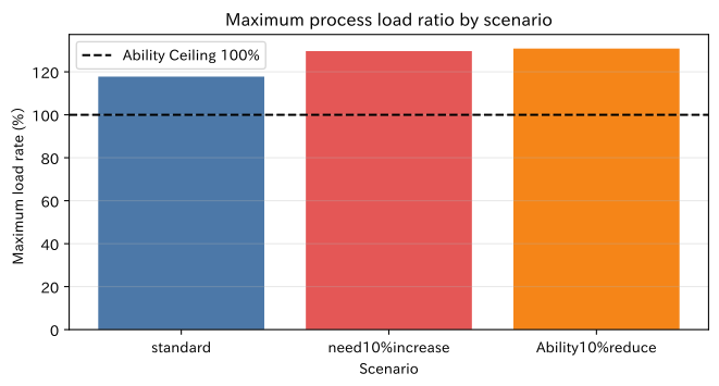
It can be expressed as such. Here, the three scenarios—“Standard,” “10% Increase in Demand,” and “10% Capacity Decrease”—are passed through the same calculation function, with the maximum load rate and the number of cells exceeding capacity set as KPIs.
Check with Python
Compare the maximum process load rate, number of cells exceeding capacity, and total input cost for each scenario.
def evaluate_scenario(demand_factor=1.0, capacity_factor=1.0):
    scenario_demand = np.ceil(total_demand * demand_factor)
    scenario_input = scenario_demand @ inverse_yield_matrix
    scenario_workload = scenario_input @ routing_minutes
    scenario_ratio = scenario_workload / (capacity_minutes * capacity_factor)
    scenario_cost = (scenario_input @ unit_cost).sum()
    return {
        "maximum load rate_pct": scenario_ratio.max() * 100,
        "Number of Cells Overloaded": int((scenario_ratio > 1).sum()),
        "Total Input Cost_million yen": scenario_cost / 1_000_000,
    }

scenario_results = pd.DataFrame({
    "standard": evaluate_scenario(),
    "need10%increase": evaluate_scenario(demand_factor=1.10),
    "Ability10%reduce": evaluate_scenario(capacity_factor=0.90),
}).T
display(scenario_results.round(2))

fig, ax = plt.subplots(figsize=(7.0, 3.8))
colors = ["#4C78A8", "#E45756", "#F58518"]
ax.bar(scenario_results.index, scenario_results["maximum load rate_pct"], color=colors)
ax.axhline(100, color="black", linestyle="--", label="Ability Ceiling 100%")
ax.set_title("Maximum process load ratio by scenario")
ax.set_xlabel("Scenario")
ax.set_ylabel("Maximum load rate (%)")
ax.grid(axis="y", alpha=0.3)
ax.legend()
plt.tight_layout()
plt.show()
| maximum load rate_pct | Number of Cells Overloaded | Total Input Cost_million yen | |
|---|---|---|---|
| standard | 117.76 | 10.0 | 20.96 |
| need10%increase | 129.66 | 17.0 | 23.07 |
| Ability10%reduce | 130.85 | 18.0 | 20.96 |
Reading the results
Even in the baseline scenario, there is capacity exceedance, and when demand increases or capacity decreases, the maximum load rate and excess points increase even further. These results transform the feeling of “tight planning” into comparable KPIs such as maximum load rate, number of excess cells, and input cost. However, overtime, work-in-progress inventory, scheduling, and lot constraints are not yet reflected, so the next stage of model expansion is necessary for practical judgment.
No.010: Introduction to NumPy
Meaning in Practice
NumPy treats matrices and vectors as arrays, allowing the same processes to be applied collectively across many weeks, products, and processes. By reducing cell-by-cell loops and copying formulas, it is easy to recalculate when planning conditions change, enabling the creation of verifiable business logic.
Approach to Analysis and Modeling
The first operations used in practice are shape verification using shape, matrix product using @, axial aggregation using sum(axis=...), extraction using Boolean conditions, and judgment using where. axis=0 aggregates results by row and returns results by column, while axis=1 is aggregated in the column direction and returns results by row.
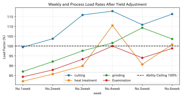
Here, we recalculate the process load after yield correction, list the weekly maximum load process, and list the countermeasure priorities.
Check with Python
Using NumPy’s vectorization operations, the final process load dashboard is created.
input_workload = required_input @ routing_minutes
input_load_ratio = input_workload / capacity_minutes
max_process_index = np.argmax(input_load_ratio, axis=1)
max_ratio_by_week = np.max(input_load_ratio, axis=1)
priority = np.where(max_ratio_by_week > 1.10, "Emergency measures", np.where(max_ratio_by_week > 1.00, "needs adjustment", "Within Capacity"))

dashboard = pd.DataFrame({
    "Total demand_units": total_demand.sum(axis=1),
    "maximum load engineering": np.array(processes)[max_process_index],
    "maximum load rate_pct": max_ratio_by_week * 100,
    "Judgment": priority,
}, index=weeks)
display(dashboard.round({"maximum load rate_pct": 1}))

fig, ax = plt.subplots(figsize=(8.0, 4.3))
for j, process in enumerate(processes):
    ax.plot(weeks, input_load_ratio[:, j] * 100, marker="o", label=process)
ax.axhline(100, color="black", linestyle="--", label="Ability Ceiling 100%")
ax.set_title("Weekly and Process Load Rates After Yield Adjustment")
ax.set_xlabel("week")
ax.set_ylabel("Load Factor (%)")
ax.grid(alpha=0.3)
ax.legend(ncol=3)
plt.tight_layout()
plt.show()

print("Finite values for all arrays:", np.isfinite(input_load_ratio).all())
print("Number of Cells Overloaded:", int(np.count_nonzero(input_load_ratio > 1)))
| Total demand_units | maximum load engineering | maximum load rate_pct | Judgment | |
|---|---|---|---|---|
| No.1week | 2132 | cutting | 99.4 | Within Capacity |
| No.2week | 2245 | cutting | 103.7 | needs adjustment |
| No.3week | 2364 | cutting | 115.8 | Emergency measures |
| No.4week | 2506 | cutting | 117.8 | Emergency measures |
| No.5week | 2384 | cutting | 110.8 | Emergency measures |
| No.6week | 2622 | cutting | 116.3 | Emergency measures |
Finite values in all arrays: True
Number of Ability Overrun Cells: 10
Reading the results
You can check the maximum load process and judgments for each week in the same table, showing that the priority for countermeasures is high, especially around week 6. The line graph also shows which steps are continuously approaching the upper limit. With NumPy, simply swapping the input matrix allows you to reapply the same logic to the entire period.
The important point here is that @ does not automatically guarantee the correct operational response. Since NumPy arrays do not have labels, it is necessary to verify the order and units of products and processes before calculation, and to check the number of outliers, defects, and capacity exceedances after output.
Practical Implications Seen Through Target Exercise
- By defining table axes, you can connect data between departments: By clearly specifying the shapes of × products per week, product × processes, and × processes per week, you can track the relationship from sales demand to manufacturing load.
- Quantity and load are not the same: Since the standard time varies by product, judging bottlenecks solely by quantity lists is incorrect.
- Yield needs to be reflected on the input side.: If you directly apply the demand for good products directly to process load, you underestimate the required input quantity and load.
- Matrices can represent assumptions as structures: The zero in the block matrix is the very business assumption that there is no alternative production between lines.
- Scenarios can be compared using the same formula: If increased demand or decreased capacity are treated as input changes, the calculation method does not change for each meeting, increasing explainability.
What is necessary for practical implementation
- Master maintenance: Determine the responsible department for product code, process code, standard time, yield, and cost and update frequency
- Standardization of Granularity and Units: Do not mix days, weeks, months, individuals, lots, kg, minutes, or hours, and clearly state the conversion rules
- Label Verification: Before converting to NumPy, explicitly align the row and column order using pandas or similar tools.
- Definition of Ability: Use effective capability considering breaks, maintenance, planning, and utilization rates rather than calendar time.
- Model Extension: Add constraints necessary for decision-making, such as lot size, work-in-progress inventory, delivery dates, setup order, outsourcing, and overtime limits.
- Verification and Operation: Continuously measure the difference between planned load and actual labor work, and revise standard hours and yield
It is practical to experiment with small target processes, confirm the validity of numerical definitions and results with on-site personnel, and then expand the scope of targets.
Conclusion
From No.001 to No.010, starting from weekly product demand, we reviewed the meanings of matrices and vectors, addition, multiplication, transpose, identity matrix, diagonal matrices, block matrices, matrix expressiveness, and basic operations of NumPy.
The core of matrix calculation is not complex formulas, but Clarifying the meanings of rows, columns, units, and order. If this is achieved, demand can be converted into process load, yield and capacity can be taken into account, and alternatives can be compared using the same KPI. In the next stage, students will learn broadcasting, computational complexity, and sparse matrices, moving on to the foundation for efficiently handling larger-scale manufacturing data.
Consultations for Corporations
At Mathematical Laboratory, we support manufacturing production planning, visualization of process loads, analysis of inventory, personnel, and equipment capacity, mathematical optimization, simulation, and in-house data talent development.
For issues such as “wanting to make spreadsheet planning tasks reproducible,” “analyzing the difference between standard time and actual results,” or “quantitatively comparing which processes to invest in,” we offer consultations ranging from data inventory to small-scale verification and business implementation.
📩 Contact Us: surikobo.co.jp/contact
Please feel free to consult us first.