
100 Exercises / column / 100 Exercises in the Line
Integrating Quality, Demand, and Production Planning in Manufacturing with Python | Learning Matrix Analysis in Practice
Integrate quality, demand, and supply constraints to design weekly production decisions.
By viewing quality data, equipment sensors, demand, business conditions, and parts lists as a matrix, we consolidate everything from anomaly detection to production allocation into a single decision-making process. Using a fictional precision parts manufacturer as a subject, we examine the analysis methods and Python libraries from the perspective of “what to use to decide.”
[!NOTE] This material is a notebook previously used by Surikoubo (or personally by the representative, Kazuyama), and has been reconstructed, edited, and published with the company’s permission.
All data listed is fictional and has no relation whatsoever to real companies, factories, or figures.
Introduction: Practical Challenges in Manufacturing Covered in This Article
At production meetings, information such as “defect rates have increased,” “equipment behavior is different than usual,” “next month’s orders are hard to read,” and “materials are insufficient” are brought in simultaneously. Even if individual analyses are correct, if the units, timelines, and criteria for judgment are not aligned, it will not lead to choices such as increasing production, inspections, outsourcing, or increasing inventory.
In this article, we incorporate data from quality assurance, production management, sales, and procurement into common matrix calculations and KPIs. The goal is not just to compete in forecasting accuracy, but to clearly state constraints and losses, and to create reproducible weekly decisions.
Common situations on site
- Although the quality control chart has been updated, it is not connected to rules for equipment inspections or production allocation
- Threshold monitoring for each sensor misses abnormalities where multiple items gradually deteriorate simultaneously.
- Demand forecasts remain one-point, and the asymmetry between out-of-stock costs and surplus inventory costs cannot be addressed.
- Business sentiment, actual orders, production capacity, and component constraints are managed in separate tables
- Even if advanced libraries are introduced, input, output, and responsible persons are not defined and do not stick
Therefore, in this notebook, we link the output of each analysis to the “next action” and the “conditions for reviewing the decision.”
Why is this issue so difficult to judge?
First, quality, demand, and equipment fluctuate probabilistically. A single point exceeding the control limit does not necessarily mean failure, and there can be discrepancies in the forecast value. Second, there are trade-offs between KPIs. Increasing inspections can reduce leakage, but it affects delivery times and inspection costs. Third, correlation and causation are different. Even if temperature and vibration rise simultaneously, it does not necessarily mean equipment deterioration.
Therefore, the analysis results should not be automatic conclusions but designed as a closed-loop judgment material for Observation → Probability evaluation → constrained choice → On-site Inspection → Learning.
Overview of Exercise covered this time
| No. | Theme | This time’s question | Main Outputs |
|---|---|---|---|
| 081 | Quality control | Is the defect rate normal fluctuation? | p Control Chart / Control Limit |
| 082 | anomaly detection | Is the combination of multiple sensors abnormal? | Mahala Novis Distance |
| 083 | Demand forecasting | What is the demand and the margin of error 13 weeks ahead? | Regression Prediction & MAE |
| 084 | Decision Support | Which actions to choose for each demand scenario | Expected loss queue |
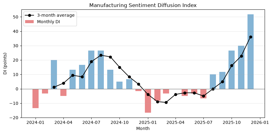
| 085 | Manufacturing DI | Is the direction on the ground improving or worsening? | DI and Moving Averages |
| 086 | NumPy | Can SKU× line planning be quickly estimated? | Rows of Good Products |
| 087 | SciPy | What is the allocation under capacity and demand constraints? | linear programming |
| 088 | PyTorch | Can it learn nonlinear anomalous patterns? | Anomaly Probability Model |
| 089 | Sparse Matrix | Can large-scale BOMs be computed with minimal memory? | CSR Matrix & Requirements |
| 090 | NetworkX | Where are the key nodes in the supply chain? | Centrality-Dependency Graph |
No.081–085 are the issues of decision-making, while No.086–090 are the tools for implementing them. The second half will not just focus on introducing libraries, but will also connect to business decisions in the first half.
Preparing the Python environment
No external data is used. Fix the seed of the random number generator so that the same table and graph can be reproduced in the same environment. The English notation in the graph is to avoid garbled characters caused by Japanese font differences in the Markdown conversion destination.
%matplotlib inline
import platform
import warnings

import matplotlib.pyplot as plt
import networkx as nx
import numpy as np
import pandas as pd
import scipy
from scipy import optimize, sparse, stats
import torch

SEED = 42
rng = np.random.default_rng(SEED)
np.set_printoptions(precision=3, suppress=True)
pd.options.display.float_format = "{:,.3f}".format
plt.rcParams["figure.figsize"] = (9, 4.5)

print(f"Python {platform.python_version()}")
print(f"NumPy {np.__version__} / pandas {pd.__version__} / SciPy {scipy.__version__}")
print(f"PyTorch {torch.__version__} / NetworkX {nx.__version__}")
Python 3.13.1
NumPy 2.5.1 / pandas 3.0.3 / SciPy 1.18.0
PyTorch 2.13.0 / NetworkX 3.6.1Creation of Fictional Data
Suppose a fictional precision parts manufacturer produces products A, B, and C on two lines. It generates 180 days of daily quality reports, 240 equipment sensors, and 104 weeks of weekly demand. In the last 30 days, changes in process conditions are intentionally included, and some sensors are intentionally included with complex anomalies.
In reality, these items are obtained from MES, QMS, equipment PLC, and sales management, but here we organize them into a single analytical data sheet that clearly indicates the meaning and granularity of the columns.
# Quality Daily: Hypothetical setting where line L2 defect rate increases in the latter half
dates = pd.date_range("2025-01-01", periods=180, freq="D")
lines = np.where(np.arange(len(dates)) % 2 == 0, "L1", "L2")
inspected = rng.integers(180, 260, len(dates))
temperature = 23 + 3 * np.sin(np.arange(len(dates)) / 18) + rng.normal(0, 0.8, len(dates))
base_rate = 0.018 + 0.002 * (lines == "L2")
shift = ((np.arange(len(dates)) >= 150) & (lines == "L2")) * 0.025
defect_rate_true = np.clip(base_rate + shift + 0.0015 * np.maximum(temperature - 25, 0), 0, 0.12)
defects = rng.binomial(inspected, defect_rate_true)
quality_df = pd.DataFrame({
    "date": dates, "line": lines, "inspected": inspected,
    "defects": defects, "temperature_c": temperature,
})
quality_df["defect_rate"] = quality_df["defects"] / quality_df["inspected"]

# Equipment sensors: Generate normal data and add multivariate deviations in some areas.
n_sensor = 240
sensor_mean = np.array([2.2, 58.0, 7.5])  # vibration, temperature, current
sensor_cov = np.array([[0.10, 0.35, 0.08], [0.35, 5.0, 0.45], [0.08, 0.45, 0.30]])
sensor_values = rng.multivariate_normal(sensor_mean, sensor_cov, n_sensor)
true_anomaly = np.zeros(n_sensor, dtype=int)
anomaly_idx = np.array([211, 218, 225, 232, 237])
sensor_values[anomaly_idx] += np.array([1.0, 3.5, 1.4])
true_anomaly[anomaly_idx] = 1
sensor_df = pd.DataFrame(sensor_values, columns=["vibration", "temp_c", "current_a"])
sensor_df["time"] = pd.date_range("2025-06-01", periods=n_sensor, freq="h")
sensor_df["true_anomaly"] = true_anomaly

# Weekly demand: three products with trends, annual cycles, promotional effects, and noise
weeks = pd.date_range("2024-01-01", periods=104, freq="W-MON")
t = np.arange(len(weeks))
product_params = {"A": (430, 1.1, 55), "B": (310, 0.5, 38), "C": (220, 1.5, 30)}
rows = []
for product, (level, trend, amp) in product_params.items():
    promo = ((t % 26) == 20).astype(int)
    demand = level + trend * t + amp * np.sin(2 * np.pi * t / 52) + 45 * promo + rng.normal(0, 22, len(t))
    rows.extend(zip(weeks, [product] * len(t), np.maximum(np.rint(demand), 0).astype(int), promo))
demand_df = pd.DataFrame(rows, columns=["week", "product", "demand", "promo"])

display(quality_df.tail(6))
display(sensor_df.loc[anomaly_idx, ["time", "vibration", "temp_c", "current_a"]])
display(demand_df.groupby("product")["demand"].agg(["mean", "std", "min", "max"]))| date | line | inspected | defects | temperature_c | defect_rate | |
|---|---|---|---|---|---|---|
| 174 | 2025-06-24 | L1 | 235 | 7 | 22.467 | 0.030 |
| 175 | 2025-06-25 | L2 | 216 | 11 | 21.677 | 0.051 |
| 176 | 2025-06-26 | L1 | 237 | 2 | 22.340 | 0.008 |
| 177 | 2025-06-27 | L2 | 192 | 5 | 22.618 | 0.026 |
| 178 | 2025-06-28 | L1 | 252 | 3 | 21.781 | 0.012 |
| 179 | 2025-06-29 | L2 | 220 | 17 | 21.792 | 0.077 |
| time | vibration | temp_c | current_a | |
|---|---|---|---|---|
| 211 | 2025-06-09 19:00:00 | 3.741 | 63.986 | 8.928 |
| 218 | 2025-06-10 02:00:00 | 3.254 | 59.705 | 8.781 |
| 225 | 2025-06-10 09:00:00 | 3.232 | 62.033 | 9.007 |
| 232 | 2025-06-10 16:00:00 | 3.367 | 61.797 | 9.584 |
| 237 | 2025-06-10 21:00:00 | 2.821 | 59.198 | 8.830 |
| mean | std | min | max | |
|---|---|---|---|---|
| product | ||||
| A | 485.712 | 47.753 | 376 | 581 |
| B | 336.740 | 37.064 | 243 | 425 |
| C | 300.548 | 46.951 | 195 | 414 |
No.081: Quality Control — Finding Process Changes in p Control Diagrams
Meaning in Practice
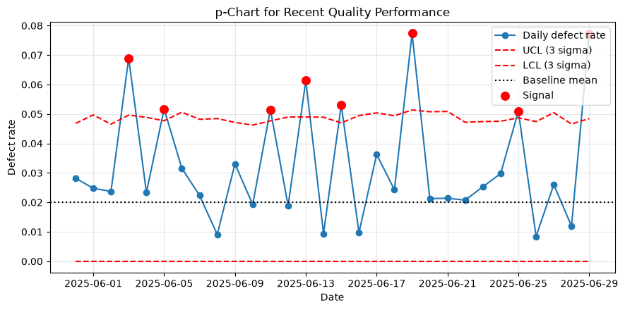
If you view every daily defect rate as a problem, the site experiences exhaustion from investigations. On the other hand, looking only at the average misses small process changes. p The control chart is a primary screening that distinguishes random variation from changes to be investigated for counting data where the number of tests varies daily.
Approach to Analysis and Modeling
Let the centerline obtained by dividing the total number of defects during the reference period by the total number of inspections , and the number of inspections per day as , then the 3-sigma management limit is as follows.
Assuming the first 150 days are a stable baseline period, the most recent 30 days are monitored. Exceeding the control limit is not a definitive cause, but rather a signal to check the lot, materials, equipment, and measurement system.
Check with Python
baseline = quality_df.iloc[:150]
monitor = quality_df.iloc[150:].copy()
p_bar = baseline["defects"].sum() / baseline["inspected"].sum()
sigma = np.sqrt(p_bar * (1 - p_bar) / monitor["inspected"])
monitor["ucl"] = p_bar + 3 * sigma
monitor["lcl"] = np.maximum(0, p_bar - 3 * sigma)
monitor["signal"] = (monitor["defect_rate"] > monitor["ucl"]) | (monitor["defect_rate"] < monitor["lcl"])

summary_081 = monitor.groupby("line").agg(
    days=("date", "size"), mean_defect_rate=("defect_rate", "mean"), signals=("signal", "sum")
)
display(summary_081)

fig, ax = plt.subplots()
ax.plot(monitor["date"], monitor["defect_rate"], marker="o", label="Daily defect rate")
ax.plot(monitor["date"], monitor["ucl"], "r--", label="UCL (3 sigma)")
ax.plot(monitor["date"], monitor["lcl"], "r--", label="LCL (3 sigma)")
ax.axhline(p_bar, color="black", linestyle=":", label="Baseline mean")
signals = monitor[monitor["signal"]]
ax.scatter(signals["date"], signals["defect_rate"], color="red", s=70, zorder=3, label="Signal")
ax.set_title("p-Chart for Recent Quality Performance")
ax.set_xlabel("Date")
ax.set_ylabel("Defect rate")
ax.grid(True, alpha=0.3)
ax.legend()
fig.tight_layout()
plt.show()| days | mean_defect_rate | signals | |
|---|---|---|---|
| line | |||
| L1 | 15 | 0.019 | 0 |
| L2 | 15 | 0.045 | 8 |
Reading the results
In recent times, there have been exceeded control limits, especially among L2s. This is not a conclusion that “L2 has failed,” but rather a signal that it is unlikely to be in the same process state as the reference period. We stratify material lots, arrangements, temperatures, and measuring instruments that have exceeded the required dates, and consider isolating nonconforming products and strengthening inspections until the cause is identified. If abnormalities are mixed into the reference period itself, the limits expand, so a centerline approval process is also necessary.
No.082: Anomaly Detection — Monitoring Equipment with Sensor Combinations
Meaning in Practice
Vibration, temperature, and current are interrelated. Even if each item falls within a single threshold, combinations that are usually unlikely to occur are worth inspection. Multivariate anomaly detection quantifies the “discomfort of the combination.”
Approach to Analysis and Modeling
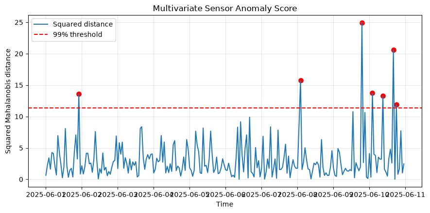
Using the mean of the normal period and the covariance matrix , the Mahalanobis distance of observation
to measure it. As a reference threshold assuming a normal distribution of three variables, 99% of the distribution is used. In practice, standards are divided according to equipment condition, and thresholds are calibrated based on false alarm rates and missed costs.
Check with Python
features = ["vibration", "temp_c", "current_a"]
reference = sensor_df.loc[:179, features].to_numpy()
mu = reference.mean(axis=0)
cov_inv = np.linalg.pinv(np.cov(reference, rowvar=False))
delta = sensor_df[features].to_numpy() - mu
sensor_df["mahalanobis_sq"] = np.einsum("ij,jk,ik->i", delta, cov_inv, delta)
threshold = stats.chi2.ppf(0.99, df=len(features))
sensor_df["detected"] = sensor_df["mahalanobis_sq"] > threshold

confusion_082 = pd.crosstab(sensor_df["true_anomaly"], sensor_df["detected"],
                            rownames=["Actual"], colnames=["Detected"])
display(confusion_082)
display(sensor_df.nlargest(8, "mahalanobis_sq")[["time", *features, "mahalanobis_sq", "detected"]])

fig, ax = plt.subplots()
ax.plot(sensor_df["time"], sensor_df["mahalanobis_sq"], label="Squared distance")
ax.axhline(threshold, color="red", linestyle="--", label="99% threshold")
ax.scatter(sensor_df.loc[sensor_df["detected"], "time"],
           sensor_df.loc[sensor_df["detected"], "mahalanobis_sq"], color="red", s=45)
ax.set_title("Multivariate Sensor Anomaly Score")
ax.set_xlabel("Time")
ax.set_ylabel("Squared Mahalanobis distance")
ax.grid(True, alpha=0.3)
ax.legend()
fig.tight_layout()
plt.show()| Detected | False | True |
|---|---|---|
| Actual | ||
| 0 | 232 | 3 |
| 1 | 1 | 4 |
| time | vibration | temp_c | current_a | mahalanobis_sq | detected | |
|---|---|---|---|---|---|---|
| 211 | 2025-06-09 19:00:00 | 3.741 | 63.986 | 8.928 | 24.886 | True |
| 232 | 2025-06-10 16:00:00 | 3.367 | 61.797 | 9.584 | 20.604 | True |
| 170 | 2025-06-08 02:00:00 | 2.120 | 57.330 | 5.488 | 15.740 | True |
| 218 | 2025-06-10 02:00:00 | 3.254 | 59.705 | 8.781 | 13.740 | True |
| 22 | 2025-06-01 22:00:00 | 2.021 | 64.686 | 8.007 | 13.585 | True |
| 225 | 2025-06-10 09:00:00 | 3.232 | 62.033 | 9.007 | 13.268 | True |
| 234 | 2025-06-10 18:00:00 | 2.133 | 54.265 | 5.851 | 11.882 | True |
| 205 | 2025-06-09 13:00:00 | 1.281 | 52.630 | 6.376 | 10.775 | False |
Reading the results
The injected complex anomalies appear at higher distances, showing that correlation structures can be used more than fixed thresholds for a single sensor. However, statistical anomalies and failures are not synonymous. It is necessary to compare the operating modes, tool changes, and warm-up runs of higher-time intervals, and return the inspection results as labels. If covariance is unstable, using a pseudo-inverse matrix instead of an inverse matrix does not resolve the data shortage itself.
No.083: Demand Forecast — Estimating 13 Weeks Ahead and Forecast Error
Meaning in Practice
Demand forecasting is not only for forecasting sales, but also for material ordering, personnel planning, and safety stock. The key is to continuously evaluate the gap between forecasts and actual results and understand which timeframe can be used for decision-making.
Approach to Analysis and Modeling
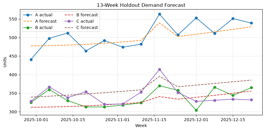
For each product, create linear models with explanatory variables such as segments, temporal trends, annual cycles of sine and cosine, and promotional flags.
The last 13 weeks are not used as a test period for studying, and MAE and WAPE are calculated. Here, we use a describable reference model as a comparative axis before moving on to more complex models.
Check with Python
forecast_rows, metric_rows = [], []
for product, group in demand_df.groupby("product"):
    group = group.sort_values("week").reset_index(drop=True)
    tt = np.arange(len(group))
    X = np.column_stack([
        np.ones(len(group)), tt,
        np.sin(2 * np.pi * tt / 52), np.cos(2 * np.pi * tt / 52), group["promo"]
    ])
    split = len(group) - 13
    beta, *_ = np.linalg.lstsq(X[:split], group.loc[:split-1, "demand"], rcond=None)
    pred = X[split:] @ beta
    actual = group.loc[split:, "demand"].to_numpy()
    metric_rows.append({
        "product": product,
        "MAE": np.mean(np.abs(actual - pred)),
        "WAPE_pct": 100 * np.sum(np.abs(actual - pred)) / np.sum(actual),
    })
    forecast_rows.extend(zip(group.loc[split:, "week"], [product] * 13, actual, pred))

forecast_df = pd.DataFrame(forecast_rows, columns=["week", "product", "actual", "forecast"])
metrics_083 = pd.DataFrame(metric_rows).set_index("product")
display(metrics_083)

fig, ax = plt.subplots()
for product, group in forecast_df.groupby("product"):
    ax.plot(group["week"], group["actual"], marker="o", label=f"{product} actual")
    ax.plot(group["week"], group["forecast"], linestyle="--", label=f"{product} forecast")
ax.set_title("13-Week Holdout Demand Forecast")
ax.set_xlabel("Week")
ax.set_ylabel("Units")
ax.grid(True, alpha=0.3)
ax.legend(ncol=2)
fig.tight_layout()
plt.show()| MAE | WAPE_pct | |
|---|---|---|
| product | ||
| A | 19.536 | 3.856 |
| B | 16.462 | 4.875 |
| C | 26.440 | 7.686 |
Reading the results
Product-specific MAE is “how many misses per week,” while WAPE is the error leveled by product scale. Planners do not treat one-point forecasts as finalized values, but instead pass at least MAE-equivalent fluctuations to the sensitivity analysis of capacity and inventory. Unconfirmed promotional plans, cancellation of observation demand due to out-of-stock items, and lack of history for new products need to be handled separately. The reason for using time-series division is to avoid mixing future information into the training.
No.084: Decision Support — Choosing Actions Based on Scenarios and Loss Matrices
Meaning in Practice
Even with the same forecast, companies that value stockouts heavily and those that value inventory differ in their optimal behavior. Decision support not only lists predictions but also options, possible scenarios, probabilities, and losses, making it possible to audit the reasons for judgments.
Approach to Analysis and Modeling
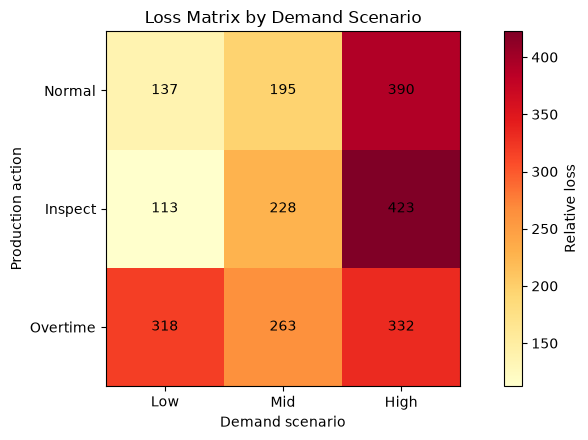
If we the losses from action and demand scenario , and set the scenario probability to , the expected loss is
That’s right. Next week, product A’s demand is divided into three states: low, medium, and high, and normal production, enhanced inspections, and increased overtime are compared. Losses include out-of-stock items, surpluses, additional operations, and outflow of defective outflows. The amount is a fictional relative value.
Check with Python
actions = pd.DataFrame({
    "action": ["Normal Production", "Strengthening Inspections", "Increased overtime production"],
    "planned_units": [525, 500, 590],
    "yield_rate": [0.965, 0.985, 0.960],
    "fixed_cost": [0, 55, 90],
})
states = np.array([480, 535, 600])
state_prob = np.array([0.25, 0.50, 0.25])
good_units = actions["planned_units"].to_numpy() * actions["yield_rate"].to_numpy()

# Loss units: Missing items 3, Surplus 1, Outflow agency expenses 6, Fixed costs
shortage = np.maximum(states[None, :] - good_units[:, None], 0)
surplus = np.maximum(good_units[:, None] - states[None, :], 0)
escape_proxy = actions["planned_units"].to_numpy()[:, None] * (1 - actions["yield_rate"].to_numpy()[:, None]) * 6
loss_matrix = 3 * shortage + surplus + escape_proxy + actions["fixed_cost"].to_numpy()[:, None]
expected_loss = loss_matrix @ state_prob

decision_084 = pd.DataFrame(loss_matrix, index=actions["action"],
                            columns=["need_low", "need_middle", "need_high"])
decision_084["expected loss"] = expected_loss
display(decision_084.round(1).sort_values("expected loss"))

fig, ax = plt.subplots()
im = ax.imshow(loss_matrix, cmap="YlOrRd")
for i in range(loss_matrix.shape[0]):
    for j in range(loss_matrix.shape[1]):
        ax.text(j, i, f"{loss_matrix[i, j]:.0f}", ha="center", va="center")
ax.set_xticks(range(3), ["Low", "Mid", "High"])
ax.set_yticks(range(3), ["Normal", "Inspect", "Overtime"])
ax.set_title("Loss Matrix by Demand Scenario")
ax.set_xlabel("Demand scenario")
ax.set_ylabel("Production action")
ax.grid(False)
fig.colorbar(im, ax=ax, label="Relative loss")
fig.tight_layout()
plt.show()| need_low | need_middle | need_high | expected loss | |
|---|---|---|---|---|
| action | ||||
| Normal Production | 136.900 | 195.400 | 390.400 | 229.500 |
| Strengthening Inspections | 112.500 | 227.500 | 422.500 | 247.500 |
| Increased overtime production | 318.000 | 263.000 | 332.400 | 294.100 |
Reading the results
The recommended plan is the one with the least expected loss, under the set probability and cost. However, this is not an answer that replaces the judgment of those in charge. It is important to change high demand probability, out-of-stock prices, yield improvements through inspections, and to see where recommendations switch. Absolute constraints such as labor limits and customer-specific priorities are treated as constraints rather than embedded in losses.
No.085: Manufacturing DI — Making Direction a Common Language
Meaning in Practice
Even if the order amount hasn’t changed yet, advance information such as inquiries, quotes, and delivery inquiries is available on site. DI (Diffusion Index) subtracts the percentage of responses indicating improvement from the percentage of responses indicating improvement to indicate deterioration, making it a single indicator of direction. It can be used as an early indicator to start dialogues between sales, procurement, and production.
Approach to Analysis and Modeling
If we set the number of responding companies as , the number of improvement responses as , and the number of deteriorated responses as ,
That’s right. “Sideways” is included in the denominator but does not directly correspond to the difference. It generates a hypothetical survey of 60 companies over 24 months and uses a 3-month moving average to suppress short-term noise. If the sample composition changes, time series comparisons can be disrupted, so the continuous response rate is also subject to management.
Check with Python
months = pd.date_range("2024-01-01", periods=24, freq="MS")
latent = 0.12 * np.sin(np.arange(24) / 3.2) + np.linspace(-0.06, 0.12, 24)
survey_rows = []
for month, score in zip(months, latent):
    p_improve = np.clip(0.28 + score, 0.08, 0.65)
    p_worsen = np.clip(0.27 - score, 0.08, 0.65)
    p_same = 1 - p_improve - p_worsen
    counts = rng.multinomial(60, [p_improve, p_same, p_worsen])
    survey_rows.append((month, *counts))
di_df = pd.DataFrame(survey_rows, columns=["month", "improve", "same", "worsen"])
di_df["DI"] = 100 * (di_df["improve"] - di_df["worsen"]) / di_df[["improve", "same", "worsen"]].sum(axis=1)
di_df["DI_3m"] = di_df["DI"].rolling(3).mean()
display(di_df.tail(8))

fig, ax = plt.subplots()
colors = np.where(di_df["DI"] >= 0, "tab:blue", "tab:red")
ax.bar(di_df["month"], di_df["DI"], width=20, color=colors, alpha=0.55, label="Monthly DI")
ax.plot(di_df["month"], di_df["DI_3m"], color="black", marker="o", label="3-month average")
ax.axhline(0, color="gray", linewidth=1)
ax.set_title("Manufacturing Sentiment Diffusion Index")
ax.set_xlabel("Month")
ax.set_ylabel("DI (points)")
ax.grid(True, axis="y", alpha=0.3)
ax.legend()
fig.tight_layout()
plt.show()| month | improve | same | worsen | DI | DI_3m | |
|---|---|---|---|---|---|---|
| 16 | 2025-05-01 | 13 | 31 | 16 | -5.000 | -2.778 |
| 17 | 2025-06-01 | 15 | 28 | 17 | -3.333 | -2.778 |
| 18 | 2025-07-01 | 15 | 26 | 19 | -6.667 | -5.000 |
| 19 | 2025-08-01 | 18 | 30 | 12 | 10.000 | 0.000 |
| 20 | 2025-09-01 | 18 | 31 | 11 | 11.667 | 5.000 |
| 21 | 2025-10-01 | 23 | 30 | 7 | 26.667 | 16.111 |
| 22 | 2025-11-01 | 25 | 28 | 7 | 30.000 | 22.778 |
| 23 | 2025-12-01 | 35 | 21 | 4 | 51.667 | 36.111 |
Reading the results
If DI is above 0, there are more improvement responses than worsening responses, and an upward trend in the three-month average indicates continued direction. However, DI refers to the expansion of change, not the increase or decrease in order amounts. Therefore, lead performance is verified alongside actual orders, cancellations, and estimate conversion rates. Since departmental DI with fewer responses tends to be inaccurate, be sure to include both the numbers and the number of responses.
No.086: NumPy — Estimating SKU×line planning with a matrix
Meaning in Practice
Production planning is a combination of products, lines, shifts, and yields. In manual calculations for each cell, the number of formulas increases every time conditions change, and transcription errors also occur. With NumPy’s array operations, planned quantities and yields are treated as matrices of the same type, allowing multiple scenarios to be compared in bulk.
Approach to Analysis and Modeling
Let the planned quantity matrix be and the yield matrix be , then the factor product
This is the expected quantity of good products in the SKU× line. If you add up in the row direction, it’s by line; if you add up in the column direction, it’s by SKU. It is important not to confuse matrix products with element products.
Check with Python
product_names = np.array(["A", "B", "C"])
line_names = np.array(["L1", "L2"])
plan = np.array([[300, 180, 100], [240, 190, 150]])  # rows: lines, columns: products
yield_matrix = np.array([[0.985, 0.975, 0.965], [0.970, 0.960, 0.950]])
good_matrix = plan * yield_matrix

numpy_086 = pd.DataFrame(good_matrix, index=line_names, columns=product_names)
numpy_086["Line total"] = numpy_086.sum(axis=1)
numpy_086.loc["Product total"] = numpy_086.sum(axis=0)
display(numpy_086)

yield_scenarios = np.stack([yield_matrix, yield_matrix - 0.01, yield_matrix + 0.005])
scenario_totals = (plan[None, :, :] * yield_scenarios).sum(axis=(1, 2))
display(pd.DataFrame({"scenario": ["base", "downside", "improved"],
"expected_good_units": scenario_totals}))| A | B | C | Line total | |
|---|---|---|---|---|
| L1 | 295.500 | 175.500 | 96.500 | 567.500 |
| L2 | 232.800 | 182.400 | 142.500 | 557.700 |
| Product total | 528.300 | 357.900 | 239.000 | 1,125.200 |
| scenario | expected_good_units | |
|---|---|---|
| 0 | base | 1,125.200 |
| 1 | downside | 1,113.600 |
| 2 | improved | 1,131.000 |
Reading the results
Since the expected quantity of good products can be calculated using the same method for each line and product, it can consistently accommodate changes in conditions during meetings. The difference from the downward scenario provides quantitative grounds for considering additional inspections and reserve capabilities. However, the expected value is not a guaranteed value for individual lots. Specify the estimated yield period, variety switching, and reworkable quantities, and test the units and axis order of the original data.
No.087: SciPy — Optimizing constrained production allocation
Meaning in Practice
Even if you want to meet demand, there are limits to line time, materials, and compatible equipment. Empirical allocation is hard to explain and requires readjustment every time conditions change. Linear planning clearly defines benefits and constraints, and quickly creates actionable reference proposals.
Approach to Analysis and Modeling
We the production volume of each line and product, set marginal profit as , and solve . SciPy’s linprog is a minimization problem, so the coefficient sign is inverted. Line time and demand ceiling are given as inequality constraints .
Check with Python
# Variable order: L1-A, L1-B, L1-C, L2-A, L2-B, L2-C
margin = np.array([8.5, 7.0, 6.2, 8.0, 7.4, 6.6])
hours = np.array([0.08, 0.10, 0.13, 0.09, 0.09, 0.11])
demand_cap = np.array([560, 390, 270])

A_ub = []
b_ub = []
A_ub.extend([
    [hours[0], hours[1], hours[2], 0, 0, 0],
    [0, 0, 0, hours[3], hours[4], hours[5]],
])
b_ub.extend([52, 50])
for p in range(3):
    row = np.zeros(6)
    row[p] = 1
    row[p + 3] = 1
    A_ub.append(row)
    b_ub.append(demand_cap[p])

result = optimize.linprog(-margin, A_ub=np.array(A_ub), b_ub=np.array(b_ub),
                          bounds=[(0, None)] * 6, method="highs")
allocation = result.x.reshape(2, 3)
allocation_df = pd.DataFrame(allocation, index=line_names, columns=product_names)
allocation_df["Used hours"] = (allocation * hours.reshape(2, 3)).sum(axis=1)
display(allocation_df.round(1))
print(f"Optimization success: {result.success}")
print(f"Maximum contribution margin: {-result.fun:,.1f}")
print("Demand utilization:", np.round(allocation.sum(axis=0) / demand_cap, 3))| A | B | C | Used hours | |
|---|---|---|---|---|
| L1 | 560.000 | 72.000 | 0.000 | 52.000 |
| L2 | 0.000 | 318.000 | 194.400 | 50.000 |
Optimization success: True
Maximum contribution margin: 8,900.0
Demand utilization: [1.   1.   0.72]
Reading the results
The optimal solution allocates limited line time based on a combination of marginal profit and processing time. If there are products that cannot be produced up to the demand ceiling, it indicates a missed opportunity under capability constraints. In practice, integer lots, number of setups, minimum production volume, personnel skills, and maintenance time are added. Also, if numerical understanding cannot be implemented on site, rather than blaming the field, it is better to restore the missing constraints to the model.
No.088: PyTorch — Learning Nonlinear Anomaly Probabilities
Meaning in Practice
Equipment abnormalities can have interactions such as “high vibration and high current.” PyTorch uses neural networks and automatic differentiation to learn patterns that are difficult to represent with simple linear boundaries. On the other hand, in settings where teacher labels are scarce, caution is needed to avoid overlearning.
Approach to Analysis and Modeling
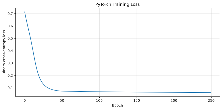
Sensors are standardized, and anomaly probabilities are estimated using a small network of 3 inputs→8 intermediate units→ and 1 output. Loss is a bivalent crossover entropy. While anomalies in fictional data are amplified and replicated to secure learning examples, in practice, verification across time series and reliable labels based on inspection results are necessary.
Check with Python
torch.manual_seed(SEED)
normal_x = rng.multivariate_normal(sensor_mean, sensor_cov, 500)
abnormal_x = rng.multivariate_normal(sensor_mean + np.array([1.0, 3.5, 1.4]), sensor_cov, 140)
X_raw = np.vstack([normal_x, abnormal_x])
y_raw = np.r_[np.zeros(len(normal_x)), np.ones(len(abnormal_x))]
order = rng.permutation(len(y_raw))
X_raw, y_raw = X_raw[order], y_raw[order]
split = 500
mean_train, std_train = X_raw[:split].mean(0), X_raw[:split].std(0)
X = torch.tensor((X_raw - mean_train) / std_train, dtype=torch.float32)
y = torch.tensor(y_raw[:, None], dtype=torch.float32)

model = torch.nn.Sequential(
    torch.nn.Linear(3, 8), torch.nn.ReLU(), torch.nn.Linear(8, 1)
)
optimizer_t = torch.optim.Adam(model.parameters(), lr=0.03)
loss_fn = torch.nn.BCEWithLogitsLoss()
loss_history = []
for epoch in range(250):
    optimizer_t.zero_grad()
    loss = loss_fn(model(X[:split]), y[:split])
    loss.backward()
    optimizer_t.step()
    loss_history.append(loss.item())

with torch.no_grad():
    test_prob = torch.sigmoid(model(X[split:])).numpy().ravel()
test_pred = (test_prob >= 0.5).astype(int)
accuracy = (test_pred == y_raw[split:]).mean()
print(f"Final training loss: {loss_history[-1]:.4f}")
print(f"Holdout accuracy: {accuracy:.3f}")
display(pd.crosstab(pd.Series(y_raw[split:], name="Actual"),
                    pd.Series(test_pred, name="Predicted")))

fig, ax = plt.subplots()
ax.plot(loss_history)
ax.set_title("PyTorch Training Loss")
ax.set_xlabel("Epoch")
ax.set_ylabel("Binary cross-entropy loss")
ax.grid(True, alpha=0.3)
fig.tight_layout()
plt.show()
Final training loss: 0.0603
Holdout accuracy: 0.943| Predicted | 0 | 1 |
|---|---|---|
| Actual | ||
| 0.000 | 103 | 5 |
| 1.000 | 3 | 29 |
Reading the results
Losses have decreased, and anomalies can be identified even in pending data. However, this accuracy is based on fictitious data with clear generation rules and does not serve as the basis for production performance. In practical implementation, external verification by equipment and period, recall and accuracy rate, man-hours for handling false alarms, and probability calibration are checked. It is important to keep the explainable distance metric from No.082 as the reference model and measure the added value of complex models.
No.089: Sparse Matrix — Compute Large BOMs with Minimal Memory
Meaning in Practice
The BOM matrices for all products × all materials are mostly zero in reality. Dense matrices that store up to 0 waste memory and computation time as the number of items increases. Sparse matrices store only the “components used,” making demand expansion and range of influence searches realistic.
Approach to Analysis and Modeling
If element of BOM matrix is the material usage per unit of the product and the production plan are , then the required material quantity is
That’s right. The CSR format is suitable for row-oriented access and matrix vector multiplication. This time, in addition to small business examples, we will compare storage memory using a virtual BOM of 2,000 products × 800 components.
Check with Python
materials = ["Steel material", "resin", "bearing", "Sensors", "Packaging materials"]
bom_dense = np.array([
    [2.0, 0.0, 1.0, 0.0, 1.0],
    [1.5, 0.4, 2.0, 1.0, 1.0],
    [0.8, 0.7, 0.0, 1.0, 1.0],
])
bom_csr = sparse.csr_matrix(bom_dense)
production_plan = np.array([520, 360, 250])
requirements = bom_csr.T @ production_plan
display(pd.DataFrame({"material": materials, "required_quantity": requirements}))

large_bom = sparse.random(2000, 800, density=0.005, format="csr", random_state=SEED,
                          data_rvs=lambda n: rng.integers(1, 5, n).astype(float))
dense_bytes = np.prod(large_bom.shape) * np.dtype(float).itemsize
sparse_bytes = large_bom.data.nbytes + large_bom.indices.nbytes + large_bom.indptr.nbytes
memory_089 = pd.DataFrame({
    "format": ["Dense estimate", "CSR actual"],
    "memory_MB": [dense_bytes / 1024**2, sparse_bytes / 1024**2],
    "stored_values": [np.prod(large_bom.shape), large_bom.nnz],
})
display(memory_089)
print(f"CSR memory reduction: {(1 - sparse_bytes / dense_bytes) * 100:.1f}%")| material | required_quantity | |
|---|---|---|
| 0 | Steel material | 1,780.000 |
| 1 | resin | 319.000 |
| 2 | bearing | 1,240.000 |
| 3 | Sensors | 610.000 |
| 4 | Packaging materials | 1,130.000 |
| format | memory_MB | stored_values | |
|---|---|---|---|
| 0 | Dense estimate | 12.207 | 1600000 |
| 1 | CSR actual | 0.099 | 8000 |
CSR memory reduction: 99.2%Reading the results
In small BOMs, you can expand the material requirements simply by multiplying the transpose matrix. In large-scale cases, CSRs with only non-zero elements significantly reduce memory compared to dense matrices. On the other hand, dense matrices or frequent updates by element can sometimes be disadvantageous for sparse formats. It is important to separately manage BOM plates, expiration dates, substitute materials, yield, and roundup orders, and not to simply convert simple required quantities into order quantities.
No.090: NetworkX — Identifying Key Points in Supply and Production Networks
Meaning in Practice
When multiple products share the same component, a supply halt from one company can spread to multiple lines. A tabular BOM alone can make it difficult to grasp detour routes, shared components, and bridging processes. Graph analysis identifies priority monitoring targets based on the network structure.
Approach to Analysis and Modeling
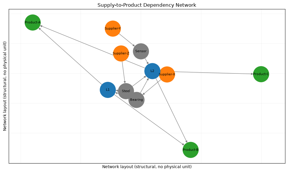
Represents the supplied → parts→ lines→ products as directed graphs. Degree centrality indicates the number of direct connections, while mediation centrality indicates how much appears along the shortest path between nodes. Centrality is a structural indicator that does not include business impact or replacement days, so it is used together with stoppage losses.
Check with Python
G = nx.DiGraph()
edges = [
    ("Supplier-X", "Bearing"), ("Supplier-Y", "Sensor"), ("Supplier-Z", "Steel"),
    ("Bearing", "L1"), ("Bearing", "L2"), ("Sensor", "L2"),
    ("Steel", "L1"), ("Steel", "L2"),
    ("L1", "Product-A"), ("L1", "Product-B"),
    ("L2", "Product-A"), ("L2", "Product-B"), ("L2", "Product-C"),
]
G.add_edges_from(edges)
degree = nx.degree_centrality(G)
betweenness = nx.betweenness_centrality(G, normalized=True)
centrality_090 = pd.DataFrame({"degree": degree, "betweenness": betweenness}).sort_values(
    ["betweenness", "degree"], ascending=False
)
display(centrality_090.head(8))

pos = nx.spring_layout(G, seed=SEED)
node_colors = ["tab:orange" if n.startswith("Supplier") else
               "tab:green" if n.startswith("Product") else
               "tab:blue" if n.startswith("L") else "tab:gray" for n in G.nodes]
fig, ax = plt.subplots(figsize=(10, 6))
nx.draw_networkx(G, pos=pos, ax=ax, node_color=node_colors, node_size=1500,
                 font_size=8, arrows=True, edge_color="gray")
ax.set_title("Supply-to-Product Dependency Network")
ax.set_xlabel("Network layout (structural, no physical unit)")
ax.set_ylabel("Network layout (structural, no physical unit)")
ax.grid(True, alpha=0.15)
fig.tight_layout()
plt.show()| degree | betweenness | |
|---|---|---|
| L2 | 0.600 | 0.156 |
| Bearing | 0.300 | 0.056 |
| Steel | 0.300 | 0.056 |
| L1 | 0.400 | 0.044 |
| Sensor | 0.200 | 0.044 |
| Product-A | 0.200 | 0.000 |
| Product-B | 0.200 | 0.000 |
| Supplier-X | 0.100 | 0.000 |
Reading the results
Highly mediated lines and common components are structural points that connect multiple routes. From there, you can create priority candidates for multiple purchases, substitute certification, safety stock, and preventive maintenance. However, it is highly centralized and does not decide on investments; instead, it accumulates the impact of gross profit upon suspension, recovery time, and detectability. Because graphs are sensitive to missing masters, it is necessary to determine responsibility for updating suppliers, substitute relationships, and process paths.
Practical Implications Seen Through Target Exercise
Across the ten themes, the key is not to introduce methods individually, but to pass the output to the next process.
- p Narrow down survey candidates based on normal variation using control charts and multivariate anomaly detection
- Separate quantity forecasts and directions with demand forecasting and DI
- Translating uncertainty into action choices in loss matrices
- Create baseline plans aligned with yield, capacity, and demand using NumPy and SciPy
- PyTorch is used only when it exceeds the simple model, and extends to company-wide components and dependencies through sparse matrices and graphs
By tracking not only analysis accuracy but also time from detection to confirmation, recommended adoption rates, and total losses from out-of-stock, outflows, and inventory as operational KPIs, you can evaluate whether analytics are connected to business outcomes.
What is necessary for practical implementation
- definition of judgment: Define in advance who will see which outputs and decide what to do with what frequency and frequency
- Data Contracts: Equipment/item/lot ID, unit, time, missing items, revision history, and responsible department
- Benchmark management: Set review cycles for control limits, anomaly thresholds, forecast errors, loss prices, and constraints.
- Verification Design: Avoid mixing in future information by conducting verification and comparing existing rules by equipment, period, and product
- Sharing with people: The model is proposed as a candidate, with clear responsibilities for on-site inspection, exception approval, and stoppage decisions.
- Operational Monitoring: Continuously record data delays, distribution changes, false alarms, reasons for non-execution, and improvement effects
- Phased Implementation: Try using one line and one meeting format, confirm operational effectiveness and maintenance load, then expand
The starting point for implementation is to define the success condition of a PoC not as “the model moves” but as “decision time or total loss improves and its effectiveness can be remeasured.”
Conclusion
From No.081 to No.090, quality control, anomaly detection, demand forecasting, decision support, and manufacturing DI were connected to implementations using NumPy, SciPy, PyTorch, sparse matrices, and NetworkX. Matrices are not just a calculation form; they are tools that describe different tasks such as product ×lines, observation ×× features, behavioral scenarios, and product × components under a common structure.
In practice, what creates value is not the most complex model, but a system that visualizes fluctuations and constraints, shares rationale for decisions, and updates standards based on results. Although the figures in this notebook are fictional, by translating data granularity, evaluation metrics, constraints, and boundaries of responsibility into your own context, you can use them as blueprints for small validations.
Consultations for Corporations
At Suri Kobo, we support everything from problem organization to PoC, operational design, and human resource development in quality analysis, equipment anomaly detection, demand forecasting, production planning optimization, and supply chain visualization in manufacturing. Even when data is not yet fully prepared, you can review decisions and available data, and design the scope of work together.
📩 Contact Us: surikobo.co.jp/contact
Please feel free to consult us first.