
100 Exercises / column / 100 Exercises in the Line
Introduction to Process Network Analysis in Manufacturing | Learning PCA, PageRank, and GCN with Python
Deciphering quality risks and improvement measures through inter-process connections
Learning Manufacturing Decision-Making with Covariance, PCA, and Graph Matrices: 100 Exercises No.041–No.050
Quality issues on the manufacturing line cannot be resolved by a single piece of equipment alone. This is because temperature, vibration, and current are interconnected, and upstream fluctuations appear in the inspection results through multiple processes. This article uses a fictional precision parts line as the subject and covers Capture the structure of multivariate data, evaluate the impact on the process network, and compare improvement measures series of decisions.
[!NOTE] This material is a notebook previously used by Surikoubo (or personally by the representative, Kazuyama), and has been reconstructed, edited, and published with the company’s permission.
All data listed is fictional and has no relation whatsoever to real companies, factories, or figures.
Introduction: Practical Challenges in Manufacturing Covered in This Article
In the virtual factory, precision parts are produced in eight processes from mixing to packaging. Sensor values and defect rates are recorded for each lot, but the process manager is left with the following questions.
- Among the many sensors, which one is simultaneously measuring the same phenomenon?
- Explain quality fluctuations on a few axes and identify attention lots.
- Where to start inspections in the process network where upstream abnormalities are transmitted?
- When improvement measures are introduced, how much will the number of downtime days and high-risk processes be reduced?
The goal is not to line up analytical methods, but to transform them into Inspection rankings, countermeasure candidates, and comparison materials useful for investment decisions.
Common situations on site
- Temperature, vibration, current, and pressure all rise simultaneously, and it’s unclear which is the main cause
- There are process-specific KPIs, but transportation, reprocessing, and quality transfer between processes are not included in the evaluation
- Inspecting only the abnormal process and overlooking the upstream process, which is the actual starting point.
- AI PoC was established, but due to lack of training data and accountability, it could not proceed to operational operations.
- Only the average before and after improvement is compared, without examining the distribution or variability of downtime risk
Why is this issue so difficult to judge?
Manufacturing data consists of two structures: Correlation between variables and Connections between processes. Tabulation alone cannot fully represent overlapping similar sensors or the impact paths including detours and reprocessing.
Therefore, in the first half, we will organize sensor fluctuations using covariance matrices and PCA. In the latter half, graphs are represented as matrices with nodes as nodes and impact paths as edges, and expanded to PageRank, Markov chains, Graph Laplacian, random walk, GCN, and so on. Finally, we use recommendations and simulations to connect the analysis results to concrete policy candidates.
Overview of Exercise covered this time
| No. | Theme | Judgment in the manufacturing industry |
|---|---|---|
| 041 | codisperse matrix | Which sensors change in sync |
| 042 | PCA | Can quality fluctuations be summarized into a few axes? |
| 043 | PageRank | How to rank inspection processes based on the affected pathway |
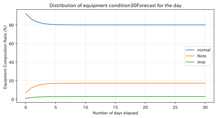
| 044 | Markov chain | At what ratio will the equipment status shift in the future? |
| 045 | Grafflaplasian | Where are the cohesion of the process network and local inconsistencies? |
| 046 | Random walk | Which processes are most likely to occur from the starting point of the anomaly? |
| 047 | Quantum random walk | How Interference-Involved Search Differs from Classical Law |
| 048 | Applications to GCN | Create risk representations including information about adjacent processes |
| 049 | Application to Recommendation Systems | Candidate improvement measures not yet implemented for each facility |
| 050 | Application to Simulation | Comparing the reduction of downtime risk through improvement proposals |
Preparing the Python environment
NumPy performs matrix calculations, pandas checks table formats, and Matplotlib visualizes. No external data is used. The random number generator is fixed in np.random.default_rng(42) to allow the same fictitious data and simulation results to be reproduced.
%matplotlib inline
%config InlineBackend.figure_format = 'svg'

import platform
import sys

import japanize_matplotlib
import matplotlib
import matplotlib.pyplot as plt
import numpy as np
import pandas as pd
from IPython.display import display

rng = np.random.default_rng(42)
pd.set_option("display.precision", 4)

print("Python:", sys.version.split()[0])
print("OS:", platform.platform())
print("NumPy:", np.__version__)
print("pandas:", pd.__version__)
print("Matplotlib:", matplotlib.__version__)
Python: 3.13.1
OS: macOS-26.3-arm64-arm-64bit-Mach-O
NumPy: 2.5.1
pandas: 3.0.3
Matplotlib: 3.11.0Creation of Fictional Data
For a precision parts line with 8 processes, we produce a total of 320 lots: 240 lots, which are closer to normal, plus 80 lots after the quality attention trend. Sensor values are set to be influenced by the “load,” “heat,” and “machine condition” behind the settings. The process network used in the latter half includes not only the usual flow but also a reprocessing path from grinding to heat treatment.
Attention tendencies are artificially assigned for explanation. In practice, it is necessary to organize differences in defective label definition, post-measurement sorting, re-inspection, and product composition to prevent future information from being Data leakage mixed into explanatory variables.
n_lots = 320
sensor_names = ["spindle current", "bearing temperature", "vibrationRMS", "hydraulic pressure", "cooling water temperature", "processing time"]
stations = ["mix", "take shape", "rough processing", "heat treatment", "grinding", "Cleaning", "Examination", "Packaging"]

# Mixing latent states to generate correlated sensor data
latent = rng.normal(size=(n_lots, 3))
latent[:, 1] += 0.50 * latent[:, 0]
latent[:, 2] += 0.25 * latent[:, 0]
loading = np.array([
    [1.00, 0.20, 0.15], [0.25, 1.05, 0.25], [0.15, 0.25, 1.10],
    [0.75, 0.05, 0.20], [0.05, 0.90, 0.10], [0.80, 0.30, 0.35],
])
baseline = np.array([38.0, 66.0, 2.2, 5.6, 23.0, 41.0])
scale = np.array([4.5, 3.0, 0.42, 0.32, 1.7, 3.8])
sensor_values = baseline + (latent @ loading.T + rng.normal(0, 0.16, (n_lots, 6))) * scale

# Some of the latter 80 lots are given attention to heat and vibration directions.
attention = np.zeros(n_lots, dtype=bool)
attention_rows = rng.choice(np.arange(240, n_lots), size=22, replace=False)
attention[attention_rows] = True
sensor_values[attention] += np.array([1.2, 5.5, 0.85, 0.05, 1.8, 2.0])

lot_df = pd.DataFrame(sensor_values, columns=sensor_names)
lot_df.insert(0, "lot", [f"LOT-{i+1:03d}" for i in range(n_lots)])
lot_df["Quality Attention"] = attention
lot_df["defect_rate_pct"] = np.clip(
    0.8 + 0.22 * latent[:, 0] + 0.28 * latent[:, 2] + 2.2 * attention + rng.normal(0, 0.18, n_lots),
    0.05, None,
)

# A directed adjacency matrix representing the strength of influence transmitted from row i to column j
A = np.zeros((len(stations), len(stations)))
edges = [
    (0, 1, 1.0), (1, 2, 0.9), (2, 3, 0.9), (3, 4, 1.0),
    (4, 5, 0.8), (5, 6, 0.9), (6, 7, 0.7), (4, 3, 0.25),
    (2, 5, 0.20), (3, 6, 0.35),
]
for i, j, weight in edges:
    A[i, j] = weight

display(lot_df.head().style.format({name: "{:.2f}" for name in sensor_names + ["defect_rate_pct"]}))
print("lot size:", len(lot_df), " / Quality Notice Lot Quantity:", int(lot_df["Quality Attention"].sum()))| lot | spindle current | bearing temperature | vibrationRMS | hydraulic pressure | cooling water temperature | processing time | Quality Attention | defect_rate_pct | |
|---|---|---|---|---|---|---|---|---|---|
| 0 | LOT-001 | 40.29 | 64.12 | 2.44 | 5.71 | 21.80 | 41.18 | False | 1.00 |
| 1 | LOT-002 | 40.00 | 60.88 | 1.67 | 5.74 | 20.56 | 40.69 | False | 0.45 |
| 2 | LOT-003 | 38.52 | 65.61 | 2.12 | 5.57 | 22.93 | 40.87 | False | 1.02 |
| 3 | LOT-004 | 33.93 | 67.42 | 2.49 | 5.36 | 23.78 | 40.12 | False | 0.67 |
| 4 | LOT-005 | 39.94 | 70.37 | 2.46 | 5.68 | 24.78 | 42.87 | False | 0.88 |
Lot size: 320 / Quality Lot Quantity: 22fig, axes = plt.subplots(1, 2, figsize=(11, 4.2))
axes[0].plot(lot_df.index, lot_df["bearing temperature"], color="tab:red", linewidth=1)
axes[0].axvline(239.5, color="black", linestyle="--", label="Start of the Evaluation Period")
axes[0].set_title("Bearing temperatures by lot")
axes[0].set_xlabel("Lot order")
axes[0].set_ylabel("Bearing temperature (℃)")
axes[0].grid(True, alpha=0.3)
axes[0].legend()
im = axes[1].imshow(A, cmap="Blues", vmin=0, vmax=1)
axes[1].set_title("Directed adjacency matrix representing inter-process effects")
axes[1].set_xlabel("Impact on the Priority Project")
axes[1].set_ylabel("Impact Element Engineering")
axes[1].set_xticks(range(len(stations)), stations, rotation=45, ha="right")
axes[1].set_yticks(range(len(stations)), stations)
axes[1].grid(True, color="white", linewidth=0.3, alpha=0.5)
fig.colorbar(im, ax=axes[1], label="The Weight of Impact")
plt.tight_layout()
plt.show()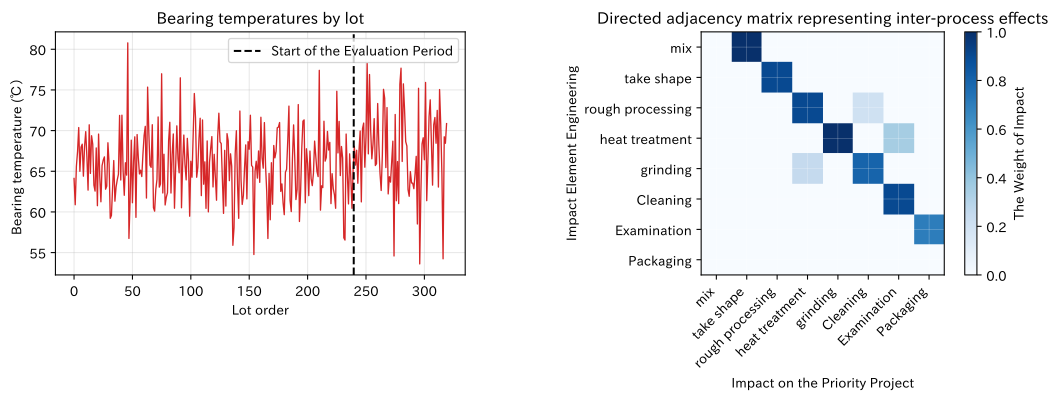
No.041: Codisperse Matrix
Meaning in Practice
The covariance matrix summarizes how much the sensor varies individually and which combinations are linked into a single table. It forms the basis for understanding linked sensor groups, reviewing duplicate measurements, and detecting multivariate anomalies.
Approach to Analysis and Modeling
The sample covariance of variable is
That’s right. Diagonal elements represent variance, while non-diagonal elements represent covariation of two variables. However, since covariance is influenced by the unit, when comparing strength, the standardized covariance, i.e., the correlation matrix, is also checked. Correlation does not imply causation; common driving conditions can drive both.
Check with Python
train_sensors = lot_df.loc[:239, sensor_names]
cov_df = train_sensors.cov()
corr_df = train_sensors.corr()
display(cov_df.style.format("{:.3f}").background_gradient(cmap="Blues"))

fig, ax = plt.subplots(figsize=(7.4, 5.4))
im = ax.imshow(corr_df, cmap="coolwarm", vmin=-1, vmax=1)
ax.set_title("Sensor Correlation Matrix for Normal Reference Period")
ax.set_xlabel("Sensors")
ax.set_ylabel("Sensors")
ax.set_xticks(range(len(sensor_names)), sensor_names, rotation=35, ha="right")
ax.set_yticks(range(len(sensor_names)), sensor_names)
ax.grid(True, color="white", linewidth=0.4, alpha=0.5)
for i in range(len(sensor_names)):
    for j in range(len(sensor_names)):
        ax.text(j, i, f"{corr_df.iloc[i, j]:.2f}", ha="center", va="center", fontsize=8)
fig.colorbar(im, ax=ax, label="correlation coefficient")
plt.tight_layout()
plt.show()| spindle current | bearing temperature | vibrationRMS | hydraulic pressure | cooling water temperature | processing time | |
|---|---|---|---|---|---|---|
| spindle current | 28.781 | 17.287 | 1.444 | 1.445 | 6.526 | 22.949 |
| bearing temperature | 17.287 | 17.562 | 1.217 | 0.827 | 7.543 | 15.373 |
| vibrationRMS | 1.444 | 1.217 | 0.246 | 0.086 | 0.464 | 1.526 |
| hydraulic pressure | 1.445 | 0.827 | 0.086 | 0.079 | 0.300 | 1.193 |
| cooling water temperature | 6.526 | 7.543 | 0.464 | 0.300 | 3.434 | 5.916 |
| processing time | 22.949 | 15.373 | 1.526 | 1.193 | 5.916 | 19.812 |
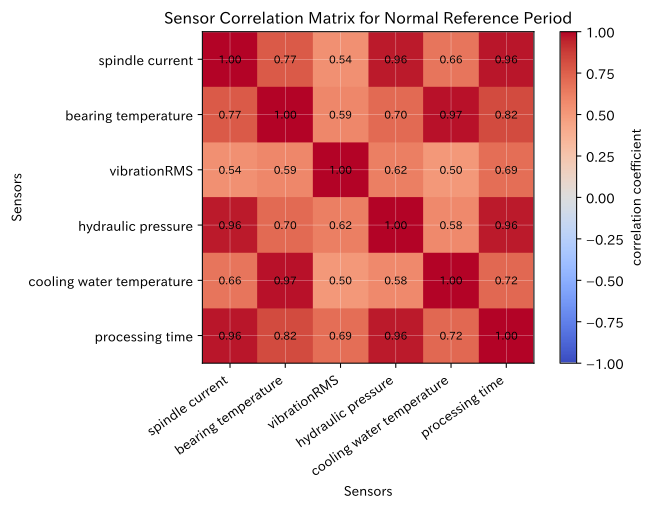
Reading the results
Positive correlations are observed among spindle current, hydraulic pressure, machining time, bearing temperature, and coolant temperature. Therefore, treating everything as an independent alert may duplicate the same phenomenon. On the other hand, immediately removing highly correlated sensors is also risky. Since relationships may only break down during failures, the roles are evaluated separately: correlation during normal times, residuals during abnormal times, and sensor redundancy.
No.042: PCA (Principal Component Analysis)
Meaning in Practice
PCA summarizes multiple correlated sensors into a few composite indicators that are perpendicular to each other. Numerous management charts are compiled into an overview map, serving as the gateway to discover lots that deviate from normal operation.
Approach to Analysis and Modeling
The covariance matrix of the standardized data is eigenvalue-decomposed to create principal component axes from eigenvectors with larger eigenvalues. Principal Component Score
That’s right. Axes with high contribution rates usually explain fluctuations well, but sometimes they appear in the direction of smaller eigenvalues. Therefore, not only the score chart but also the reconstructed residual is examined operationally.
Check with Python
train_mean = train_sensors.mean()
train_std = train_sensors.std(ddof=1)
Z = (lot_df[sensor_names] - train_mean) / train_std
C = np.cov(Z.iloc[:240], rowvar=False)
eigvals, eigvecs = np.linalg.eigh(C)
order = np.argsort(eigvals)[::-1]
eigvals, eigvecs = eigvals[order], eigvecs[:, order]
scores = Z.to_numpy() @ eigvecs
pca_summary = pd.DataFrame({
    "eigenvalue": eigvals,
    "contribution rate": eigvals / eigvals.sum(),
    "Cumulative contribution rate": np.cumsum(eigvals / eigvals.sum()),
}, index=[f"PC{i}" for i in range(1, 7)])
display(pca_summary.style.format({"eigenvalue": "{:.3f}", "contribution rate": "{:.1%}", "Cumulative contribution rate": "{:.1%}"}))

fig, axes = plt.subplots(1, 2, figsize=(11, 4.3))
axes[0].bar(range(1, 7), pca_summary["contribution rate"] * 100, color="steelblue")
axes[0].plot(range(1, 7), pca_summary["Cumulative contribution rate"] * 100, marker="o", color="tab:orange")
axes[0].set_title("PCAContribution rate and cumulative contribution rate")
axes[0].set_xlabel("main component")
axes[0].set_ylabel("Contribution Rate (%)")
axes[0].grid(True, axis="y", alpha=0.3)

colors = np.where(lot_df["Quality Attention"], "tab:red", "steelblue")
axes[1].scatter(scores[:, 0], scores[:, 1], c=colors, alpha=0.65, s=24)
axes[1].set_title("No.1・Issue2Lot Overview by Main Components")
axes[1].set_xlabel("No.1principal component score")
axes[1].set_ylabel("No.2principal component score")
axes[1].grid(True, alpha=0.3)
plt.tight_layout()
plt.show()| eigenvalue | contribution rate | Cumulative contribution rate | |
|---|---|---|---|
| PC1 | 4.715 | 78.6% | 78.6% |
| PC2 | 0.684 | 11.4% | 90.0% |
| PC3 | 0.541 | 9.0% | 99.0% |
| PC4 | 0.028 | 0.5% | 99.5% |
| PC5 | 0.018 | 0.3% | 99.8% |
| PC6 | 0.013 | 0.2% | 100.0% |
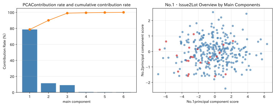
Reading the results
The leading minority principal component explains most of the sensor variation, and many quality-sensitive lots usually appear apart from the usual lot group. This does not mean that “attention lots were automatically determined,” but rather that review candidates were created using multiple sensors together. In practice, we check the contributing sensor based on the main component loading and verify whether the same separation is maintained by type, equipment, and season.
No.043:PageRank
Meaning in Practice
When there are multiple pathways of influence between processes, a simple number of connections alone cannot determine which critical process is important. Using PageRank, you can highly evaluate processes that are affected from critical ones and rank inspection candidates that tend to have a high quality impact.
Approach to Analysis and Modeling
If we the transition matrix normalized by the exit degree and the damping coefficient , then the PageRank vector is
It meets the requirements. Find the steady solution through iteration. Here, the ranking depends on the direction and weight definitions of the adjacent matrix, so first determine which of the “flow of things,” “propagation of defects,” or “information reference” is represented.
Check with Python
row_sum = A.sum(axis=1, keepdims=True)
P_graph = np.divide(A, row_sum, out=np.full_like(A, 1 / len(stations)), where=row_sum > 0)
alpha = 0.85
rank = np.full(len(stations), 1 / len(stations))
for _ in range(200):
    new_rank = alpha * P_graph.T @ rank + (1 - alpha) / len(stations)
    if np.linalg.norm(new_rank - rank, ord=1) < 1e-12:
        break
    rank = new_rank

pagerank_df = pd.DataFrame({"Project": stations, "PageRank": rank}).sort_values("PageRank", ascending=False)
display(pagerank_df.style.format({"PageRank": "{:.4f}"}))

fig, ax = plt.subplots(figsize=(7.8, 4.1))
ax.bar(pagerank_df["Project"], pagerank_df["PageRank"], color="teal")
ax.set_title("Quality Impact NetworkPageRank")
ax.set_xlabel("Project")
ax.set_ylabel("PageRankScore")
ax.grid(True, axis="y", alpha=0.3)
plt.tight_layout()
plt.show()| Project | PageRank | |
|---|---|---|
| 7 | Packaging | 0.1983 |
| 6 | Examination | 0.1864 |
| 5 | Cleaning | 0.1371 |
| 3 | heat treatment | 0.1365 |
| 4 | grinding | 0.1258 |
| 2 | rough processing | 0.1024 |
| 1 | take shape | 0.0737 |
| 0 | mix | 0.0398 |
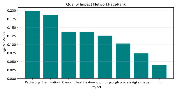
Reading the results
Processes where multiple paths of influence, such as inspection, heat treatment, and grinding converge, are considered top-tier. It can be used as a first-tier priority when the number of inspection personnel is limited, but a process with a higher PageRank does not necessarily mean it is the cause process. Since it may be a concentration point of impact, maintenance priorities are determined by combining starting point search using inverted graphs, failure frequency, downtime loss, and detectability.
No.044: Markov Chain
Meaning in Practice
By dividing equipment status into stages such as ‘normal, caution, and stop,’ and estimating the state transition probability, you can estimate future shutdown rates, inspection loads, and spare parts demand.
Approach to Analysis and Modeling
If we the current state distribution as a row vector and the transition matrix as ,
That’s right. The sum of each line is 1, and the elements must be non-negative. A typical first-order Markov chain assumes that “the next state depends only on the current state.” If deterioration history, cumulative operating hours, and maintenance details are effective, the condition is increased or another model is considered.
Check with Python
state_names = ["normal", "Note", "stop"]
P_state = np.array([
    [0.90, 0.09, 0.01],
    [0.35, 0.55, 0.10],
    [0.70, 0.20, 0.10],
])
p0 = np.array([0.92, 0.07, 0.01])
days = np.arange(0, 31)
state_path = np.array([p0 @ np.linalg.matrix_power(P_state, int(day)) for day in days])

evals, evecs = np.linalg.eig(P_state.T)
stationary = np.real(evecs[:, np.argmin(np.abs(evals - 1))])
stationary /= stationary.sum()
display(pd.DataFrame(P_state, index=state_names, columns=state_names).style.format("{:.1%}"))
display(pd.DataFrame({"30after": state_path[-1], "steady distribution": stationary}, index=state_names).style.format("{:.2%}"))

fig, ax = plt.subplots(figsize=(7.6, 4.2))
for i, state in enumerate(state_names):
    ax.plot(days, state_path[:, i] * 100, label=state)
ax.set_title("Distribution of equipment condition30Forecast for the day")
ax.set_xlabel("Number of days elapsed")
ax.set_ylabel("Equipment Composition Ratio (%)")
ax.grid(True, alpha=0.3)
ax.legend()
plt.tight_layout()
plt.show()| normal | Note | stop | |
|---|---|---|---|
| normal | 90.0% | 9.0% | 1.0% |
| Note | 35.0% | 55.0% | 10.0% |
| stop | 70.0% | 20.0% | 10.0% |
| 30after | steady distribution | |
|---|---|---|
| normal | 79.96% | 79.96% |
| Note | 17.24% | 17.24% |
| stop | 2.80% | 2.80% |
Reading the results
Even if there is a lot of normal equipment at the initial stage, over time it approaches the steady ratio set by the transition matrix. The caution-stop ratio after 30 days is a baseline value for considering the required number of inspection personnel and alternative equipment. In practice, the estimated number of transition probabilities and confidence intervals are shown, and conservation policies and periods with seasonal changes are not mixed together.
No.045: Graflaplacian
Meaning in Practice
Graph Laplacians represent how process networks are connected and can be used to split process groups, smooth KPIs between adjacent processes, and detect local inconsistencies.
Approach to Analysis and Modeling
Let the undirected adjacency matrix be and the degree matrix be , then the Laplacian
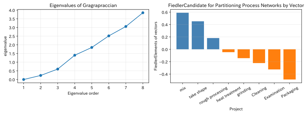
That’s right. For any process KPI vector , increases as the difference between connected processes increases. Additionally, Fiedler vectors, corresponding to the second smallest eigenvalue, provide candidates for partitioning the process network.
Check with Python
W = np.maximum(A, A.T)
D = np.diag(W.sum(axis=1))
L = D - W
lap_evals, lap_evecs = np.linalg.eigh(L)
fiedler = lap_evecs[:, 1]
cluster = np.where(fiedler >= 0, "engineering groupA", "engineering groupB")
lap_df = pd.DataFrame({"Project": stations, "Fiedlervalue": fiedler, "split candidate": cluster})
display(lap_df.style.format({"Fiedlervalue": "{:+.3f}"}))
print("From the smallest4eigenvalues:", np.round(lap_evals[:4], 4))

fig, axes = plt.subplots(1, 2, figsize=(10.8, 4.1))
axes[0].plot(range(1, len(stations) + 1), lap_evals, marker="o")
axes[0].set_title("Eigenvalues of Gragrapraccian")
axes[0].set_xlabel("Eigenvalue order")
axes[0].set_ylabel("eigenvalue")
axes[0].grid(True, alpha=0.3)
axes[1].bar(stations, fiedler, color=np.where(fiedler >= 0, "steelblue", "tab:orange"))
axes[1].set_title("FiedlerCandidate for Partitioning Process Networks by Vector")
axes[1].set_xlabel("Project")
axes[1].set_ylabel("FiedlerElements of vectors")
axes[1].tick_params(axis="x", rotation=30)
axes[1].grid(True, axis="y", alpha=0.3)
plt.tight_layout()
plt.show()| Project | Fiedlervalue | split candidate | |
|---|---|---|---|
| 0 | mix | +0.590 | engineering groupA |
| 1 | take shape | +0.452 | engineering groupA |
| 2 | rough processing | +0.182 | engineering groupA |
| 3 | heat treatment | -0.046 | engineering groupB |
| 4 | grinding | -0.143 | engineering groupB |
| 5 | Cleaning | -0.222 | engineering groupB |
| 6 | Examination | -0.325 | engineering groupB |
| 7 | Packaging | -0.487 | engineering groupB |
Four eigenvalues from the smallest one: [0.0.2336 0.601 1.3984]
Reading the results
From the symbols of the Fiedler vector, candidates for splitting the process group centered on upstream and downstream can be obtained. This serves as a clue for designing quality meetings and monitoring models on a process group basis. However, since the division is based solely on mathematical connection structures, operational units are determined based on equipment responsibility, physical distance, inspection capacity, and lot traceability.
No.046: Random Walk
Meaning in Practice
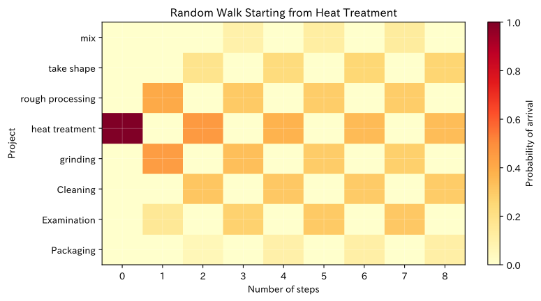
Considering that the effects of anomalies are probabilistically transmitted to the connection destination, you can evaluate “which process is easiest to reach a few steps from the starting point” using random walking. This serves as material for considering the placement of additional tests and the scope of tracking.
Approach to Analysis and Modeling
Using the transition matrix normalized by the degree of an undirected graph, from the initial distribution ,
Calculate it. Here, the connection weight is treated as ease of transition. To represent the actual rate of defective propagation, it is necessary to estimate weights from traceability data and process experiments.
Check with Python
P_walk = np.divide(W, W.sum(axis=1, keepdims=True), out=np.zeros_like(W), where=W.sum(axis=1, keepdims=True) > 0)
start_idx = stations.index("heat treatment")
p_start = np.eye(len(stations))[start_idx]
walk_steps = np.arange(0, 9)
walk_dist = np.array([p_start @ np.linalg.matrix_power(P_walk, int(k)) for k in walk_steps])
display(pd.DataFrame(walk_dist[[0, 2, 4, 8]], index=["0step", "2step", "4step", "8step"], columns=stations).style.format("{:.1%}"))

fig, ax = plt.subplots(figsize=(8.5, 4.6))
im = ax.imshow(walk_dist.T, aspect="auto", cmap="YlOrRd", vmin=0)
ax.set_title("Random Walk Starting from Heat Treatment")
ax.set_xlabel("Number of steps")
ax.set_ylabel("Project")
ax.set_xticks(range(len(walk_steps)), walk_steps)
ax.set_yticks(range(len(stations)), stations)
ax.grid(True, color="white", linewidth=0.3, alpha=0.5)
fig.colorbar(im, ax=ax, label="Probability of arrival")
plt.tight_layout()
plt.show()| mix | take shape | rough processing | heat treatment | grinding | Cleaning | Examination | Packaging | |
|---|---|---|---|---|---|---|---|---|
| 0step | 0.0% | 0.0% | 0.0% | 100.0% | 0.0% | 0.0% | 0.0% | 0.0% |
| 2step | 0.0% | 18.0% | 0.0% | 45.5% | 0.0% | 30.9% | 0.0% | 5.6% |
| 4step | 0.0% | 23.0% | 0.0% | 36.9% | 0.0% | 30.4% | 0.0% | 9.8% |
| 8step | 0.0% | 26.1% | 0.0% | 33.8% | 0.0% | 29.2% | 0.0% | 10.8% |
Reading the results
The effects that begin with heat treatment probabilistically spread to grinding, inspection, reprocessing, and other pathways. Since the priority changes depending on the number of steps, isolation immediately after an outbreak and tracking after time must change the scope of view. In practice, the actual lot path, dwell time, and branching rate are used and redesigned as directed graphs.
No.047: Quantum Random Walk
Meaning in Practice
Quantum random walks propagate complex amplitudes rather than probability, representing interference between paths. It is a fundamental concept of quantum search and quantum algorithms, and a research theme for complex graph searches. In this exercise, rather than using a method that is immediately introduced to the manufacturing site, we will examine the differences from the classic random walk through small queues.
Approach to Analysis and Modeling
In the continuous-time quantum walk, graphaplasian is treated as Hamiltonian.
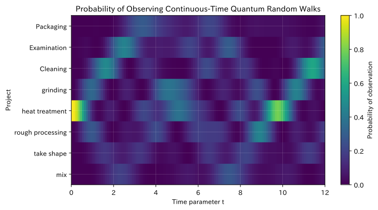
and the observation probability for process is . Unlike classical walks, it does not monotonically converge to a probability distribution, but instead produces vibrations caused by interference. The following are ideal mathematical models and do not demonstrate quantum dominance or real-world effects.
Check with Python
times = np.linspace(0, 12, 121)
psi0 = np.zeros(len(stations), dtype=complex)
psi0[start_idx] = 1.0

# Using L = QΛQ^T, calculate the matrix exponential function for each eigenvalue
quantum_prob = []
for t in times:
    phase = np.exp(-1j * lap_evals * t)
    psi_t = lap_evecs @ (phase * (lap_evecs.T @ psi0))
    quantum_prob.append(np.abs(psi_t) ** 2)
quantum_prob = np.array(quantum_prob)

print("Maximum error of random sum over all time periods:", f"{np.max(np.abs(quantum_prob.sum(axis=1) - 1)):.3e}")
display(pd.DataFrame(quantum_prob[[0, 25, 60, 120]], index=["t=0", "t=2.5", "t=6", "t=12"], columns=stations).style.format("{:.1%}"))

fig, ax = plt.subplots(figsize=(8.5, 4.6))
im = ax.imshow(quantum_prob.T, aspect="auto", origin="lower", cmap="viridis", extent=[times.min(), times.max(), -0.5, 7.5])
ax.set_title("Probability of Observing Continuous-Time Quantum Random Walks")
ax.set_xlabel("Time parameter t")
ax.set_ylabel("Project")
ax.set_yticks(range(len(stations)), stations)
ax.grid(True, color="white", linewidth=0.3, alpha=0.35)
fig.colorbar(im, ax=ax, label="Probability of observation")
plt.tight_layout()
plt.show()
Maximum error of sum of stochastic sums over all time periods: 6.661e-16| mix | take shape | rough processing | heat treatment | grinding | Cleaning | Examination | Packaging | |
|---|---|---|---|---|---|---|---|---|
| t=0 | 0.0% | 0.0% | 0.0% | 100.0% | 0.0% | 0.0% | 0.0% | 0.0% |
| t=2.5 | 17.8% | 8.0% | 5.6% | 0.4% | 8.0% | 4.5% | 44.2% | 11.6% |
| t=6 | 4.5% | 7.6% | 18.9% | 18.3% | 7.8% | 14.8% | 14.5% | 13.5% |
| t=12 | 4.7% | 4.9% | 17.9% | 0.2% | 4.5% | 33.5% | 28.6% | 5.8% |
Reading the results
While the sum of probabilities remains at 1 within the numerical margin of error, the observed probabilities for each step fluctuate over time. Unlike the monotonous diffusion of classic walks like No.046, this one is characterized by interference along the path changing the distribution. At present, it is reasonable to use classical methods as the standard, while treating quantum methods as verification challenges that include problem scale, data input costs, fair comparison with classical calculations, and actual device noise.
No.048: Application to GCN
Meaning in Practice
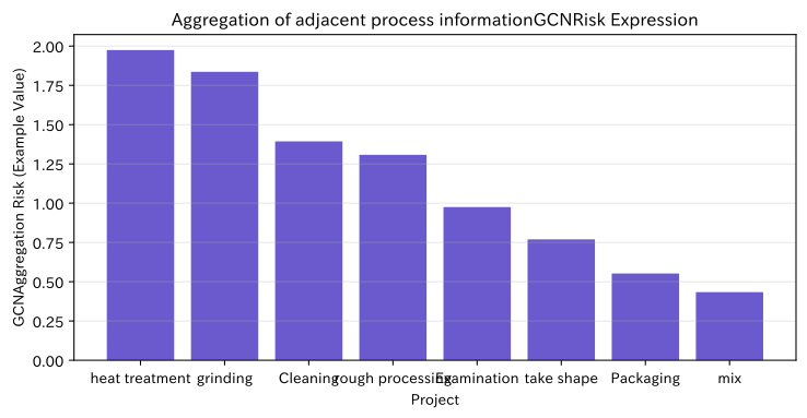
GCN (Graph Convolutional Network) learns by aggregating information not only from the characteristics of its own process but also from adjacent processes. These lines are where upstream and downstream conditions affect quality, and can be used for process risk prediction and estimating abnormal locations.
Approach to Analysis and Modeling
Let the adjacency matrix with the self-loop be and the degree matrix be , then the GCN of the first layer is
You can write it like this. is the process feature, and is the weight to be learned. Here, we use fixed weights to illustrate how information aggregation works. In actual operation, training and evaluation are conducted using time-series segmented training data, and generalization to unknown equipment is confirmed.
Check with Python
# Hypothetical features by process: temperature deviation, vibration deviation, recent defect rate
X_node = np.array([
    [0.2, 0.1, 0.4], [0.4, 0.2, 0.6], [0.8, 0.7, 1.1], [1.7, 1.0, 1.5],
    [1.1, 1.8, 1.8], [0.5, 0.4, 0.8], [0.3, 0.2, 1.4], [0.2, 0.1, 0.5],
])
A_tilde = W + np.eye(len(stations))
d_inv_sqrt = np.diag(1 / np.sqrt(A_tilde.sum(axis=1)))
A_norm = d_inv_sqrt @ A_tilde @ d_inv_sqrt
theta = np.array([[0.8, -0.2], [0.5, 0.7], [0.6, 0.4]])
H = np.maximum(0, A_norm @ X_node @ theta)
gcn_risk = H @ np.array([0.65, 0.35])

gcn_df = pd.DataFrame({
    "Project": stations,
    "Simple sum of process characteristics": X_node.sum(axis=1),
    "GCNAggregation risk": gcn_risk,
}).sort_values("GCNAggregation risk", ascending=False)
display(gcn_df.style.format({"Simple sum of process characteristics": "{:.2f}", "GCNAggregation risk": "{:.3f}"}))

fig, ax = plt.subplots(figsize=(7.8, 4.1))
ax.bar(gcn_df["Project"], gcn_df["GCNAggregation risk"], color="slateblue")
ax.set_title("Aggregation of adjacent process informationGCNRisk Expression")
ax.set_xlabel("Project")
ax.set_ylabel("GCNAggregation Risk (Example Value)")
ax.grid(True, axis="y", alpha=0.3)
plt.tight_layout()
plt.show()| Project | Simple sum of process characteristics | GCNAggregation risk | |
|---|---|---|---|
| 3 | heat treatment | 4.20 | 1.975 |
| 4 | grinding | 4.70 | 1.836 |
| 5 | Cleaning | 1.70 | 1.393 |
| 2 | rough processing | 2.60 | 1.307 |
| 6 | Examination | 1.90 | 0.975 |
| 1 | take shape | 1.20 | 0.770 |
| 7 | Packaging | 0.80 | 0.552 |
| 0 | mix | 0.70 | 0.434 |
Reading the results
The advanced features of heat treatment and grinding are reflected in adjacent processes, resulting in rankings different from simple aggregation of your own process. This is the foundation of GCN’s information aggregation. However, these values represent untrained example scores and do not claim predictive performance. At the time of implementation, logistic regression and tree models are used as comparison targets to verify whether improvements through GCN justify the maintenance costs of process graphs.
No.049: Application to Recommendation Systems
Meaning in Practice
By organizing the improvements and effectiveness evaluations tried for each facility into a matrix, you can supplement unimplemented combinations and recommend candidates for the “next small-scale test.” Rather than replacing the expertise of experts, it is intended to reduce oversights.
Approach to Analysis and Modeling
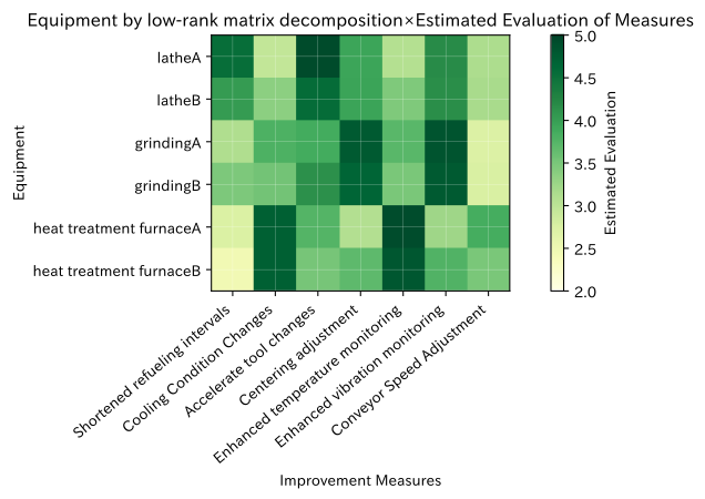
There are unevaluated elements in the evaluation queue for equipment × measures. Provisional completion of the defect with column averaging, and the severed SVD after centralization
to create a low-dimensional similar structure. In practice, deletions are not confused with zero evaluation; matrix decomposition is used to include only observed elements in the loss function, as well as rankings that include equipment specifications, costs, and safety constraints.
Check with Python
machine_names = ["latheA", "latheB", "grindingA", "grindingB", "heat treatment furnaceA", "heat treatment furnaceB"]
action_names = ["Shortened refueling intervals", "Cooling Condition Changes", "Accelerate tool changes", "Centering adjustment", "Enhanced temperature monitoring", "Enhanced vibration monitoring", "Conveyor Speed Adjustment"]
ratings = np.array([
    [4.5, 3.0, 4.8, np.nan, 2.8, 4.0, np.nan],
    [4.2, 3.2, 4.6, 4.0, np.nan, 4.3, np.nan],
    [3.0, 3.8, 4.2, 4.7, np.nan, 4.9, 2.5],
    [np.nan, 3.6, 4.0, 4.5, 3.2, 4.8, 2.8],
    [2.5, 4.8, np.nan, 2.8, 4.9, 3.4, 3.6],
    [2.7, 4.6, 3.0, np.nan, 4.7, 3.5, 3.8],
])
observed = ~np.isnan(ratings)
item_mean = np.nanmean(ratings, axis=0)
filled = np.where(observed, ratings, item_mean)
centered = filled - item_mean
U, s, Vt = np.linalg.svd(centered, full_matrices=False)
rank = 2
estimated = (U[:, :rank] * s[:rank]) @ Vt[:rank] + item_mean

recommendations = []
for i, machine in enumerate(machine_names):
    candidates = np.where(~observed[i])[0]
    if len(candidates):
        best = candidates[np.argmax(estimated[i, candidates])]
        recommendations.append((machine, action_names[best], estimated[i, best]))
recommend_df = pd.DataFrame(recommendations, columns=["Equipment", "Next Candidate for Verification", "Estimated Evaluation"])
display(pd.DataFrame(ratings, index=machine_names, columns=action_names).style.format("{:.1f}", na_rep="Not implemented"))
display(recommend_df.style.format({"Estimated Evaluation": "{:.2f}"}))

fig, ax = plt.subplots(figsize=(8.8, 4.8))
im = ax.imshow(estimated, cmap="YlGn", vmin=2, vmax=5)
ax.set_title("Equipment by low-rank matrix decomposition×Estimated Evaluation of Measures")
ax.set_xlabel("Improvement Measures")
ax.set_ylabel("Equipment")
ax.set_xticks(range(len(action_names)), action_names, rotation=40, ha="right")
ax.set_yticks(range(len(machine_names)), machine_names)
ax.grid(True, color="white", linewidth=0.3, alpha=0.5)
fig.colorbar(im, ax=ax, label="Estimated Evaluation")
plt.tight_layout()
plt.show()| Shortened refueling intervals | Cooling Condition Changes | Accelerate tool changes | Centering adjustment | Enhanced temperature monitoring | Enhanced vibration monitoring | Conveyor Speed Adjustment | |
|---|---|---|---|---|---|---|---|
| latheA | 4.5 | 3.0 | 4.8 | Not implemented | 2.8 | 4.0 | Not implemented |
| latheB | 4.2 | 3.2 | 4.6 | 4.0 | Not implemented | 4.3 | Not implemented |
| grindingA | 3.0 | 3.8 | 4.2 | 4.7 | Not implemented | 4.9 | 2.5 |
| grindingB | Not implemented | 3.6 | 4.0 | 4.5 | 3.2 | 4.8 | 2.8 |
| heat treatment furnaceA | 2.5 | 4.8 | Not implemented | 2.8 | 4.9 | 3.4 | 3.6 |
| heat treatment furnaceB | 2.7 | 4.6 | 3.0 | Not implemented | 4.7 | 3.5 | 3.8 |
| Equipment | Next Candidate for Verification | Estimated Evaluation | |
|---|---|---|---|
| 0 | latheA | Centering adjustment | 3.93 |
| 1 | latheB | Enhanced temperature monitoring | 3.45 |
| 2 | grindingA | Enhanced temperature monitoring | 3.70 |
| 3 | grindingB | Shortened refueling intervals | 3.46 |
| 4 | heat treatment furnaceA | Accelerate tool changes | 3.74 |
| 5 | heat treatment furnaceB | Centering adjustment | 3.67 |
Reading the results
For each facility, we were able to extract one candidate with a higher estimated evaluation from the measures that had not yet been implemented. This is not a decision to be implemented, but rather material for determining the next order of verification. Measures that do not meet safety requirements, downtime, costs, or equipment manufacturers’ warranty conditions are excluded from the recommendation list, and those with high estimated evaluations are also verified in actual effectiveness through A/B testing and phased implementation.
No.050: Application to Simulation
Meaning in Practice
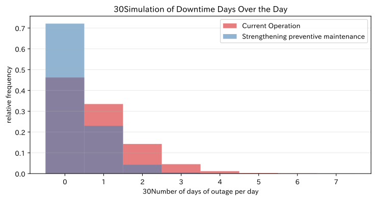
The value of improvement measures is easier to judge not only by the average downtime rate but also by the distribution of “how many days can the system stop in 30 days?” The state transitions defined in the matrix are deployed to Monte Carlo simulations and compared with current operations and preventive maintenance enhancement plans.
Approach to Analysis and Modeling
We will use the transition matrix from No.044 as the current proposal, and create an improvement plan that increases the recovery from attention to normal and reduces the transition from attention to stop. Multiple 30-day routes are generated in each scenario, and the average number of stopping days, the 95th percentile, and the probability of stopping more than once are compared.
Expectations alone cannot represent rare long-term shutdowns. On the other hand, simulation results may not be accurate beyond the input transition probability range, so sensitivity analysis and updates based on actual results are necessary.
Check with Python
P_improved = np.array([
    [0.92, 0.075, 0.005],
    [0.48, 0.47, 0.05],
    [0.78, 0.17, 0.05],
])

def simulate_stop_days(P, n_runs=10000, horizon=30):
    states = rng.choice(3, size=n_runs, p=p0)
    stop_days = np.zeros(n_runs, dtype=int)
    for _ in range(horizon):
        u = rng.random(n_runs)
        cumulative = np.cumsum(P[states], axis=1)
        states = (u[:, None] > cumulative).sum(axis=1)
        stop_days += states == 2
    return stop_days

stop_current = simulate_stop_days(P_state)
stop_improved = simulate_stop_days(P_improved)
simulation_df = pd.DataFrame({
    "Scenario": ["Current Operation", "Strengthening preventive maintenance"],
    "Average number of days shut down": [stop_current.mean(), stop_improved.mean()],
    "95%point": [np.quantile(stop_current, 0.95), np.quantile(stop_improved, 0.95)],
    "1Probability of Downtime for More Than Days": [(stop_current >= 1).mean(), (stop_improved >= 1).mean()],
})
display(simulation_df.style.format({"Average number of days shut down": "{:.2f}", "95%point": "{:.0f}", "1Probability of Downtime for More Than Days": "{:.1%}"}))

bins = np.arange(-0.5, max(stop_current.max(), stop_improved.max()) + 1.5)
fig, ax = plt.subplots(figsize=(7.8, 4.2))
ax.hist(stop_current, bins=bins, alpha=0.60, density=True, label="Current Operation", color="tab:red")
ax.hist(stop_improved, bins=bins, alpha=0.60, density=True, label="Strengthening preventive maintenance", color="steelblue")
ax.set_title("30Simulation of Downtime Days Over the Day")
ax.set_xlabel("30Number of days of outage per day")
ax.set_ylabel("relative frequency")
ax.grid(True, axis="y", alpha=0.3)
ax.legend()
plt.tight_layout()
plt.show()| Scenario | Average number of days shut down | 95%point | 1Probability of Downtime for More Than Days | |
|---|---|---|---|---|
| 0 | Current Operation | 0.82 | 3 | 53.8% |
| 1 | Strengthening preventive maintenance | 0.34 | 1 | 27.9% |
Reading the results
Under the Preventive Maintenance Enhancement Plan, both the average number of days shut down and the probability of stopping for more than one day will decrease. By combining improvement costs and losses per day of outage, you can proceed to estimate expected benefits and return on investment. However, the transition probability after improvement is an assumption. First, trials are conducted on select facilities, and after updating the queue based on measured recovery and downtime rates, the overall deployment is determined.
Practical Implications Seen Through Target Exercise
- Viewing the two structures: the table and the process network: Covariance and PCA organize relationships between sensors, while graph matrices organize relationships between processes.
- Rankings do not confirm the cause: PageRank and random walk narrow down inspection candidates, but physical causes are confirmed through on-site inspection.
- The complexity of the model is justified by comparison.: GCN and quantum methods evaluate added value based on simple statistics and classical methods.
- Recommendations should be based on the order of verification: Estimates of unimplemented measures are not grounds for omitting constraint verification and small-scale testing.
- From point prediction to distribution: By showing the effectiveness of measures not only by average but also by the distribution of suspension days, you can make judgments including risk tolerance.
What is necessary for practical implementation
1. Define processes, variables, and time
Enable unique tracking of process ID, equipment ID, lot, variety, time, and reprocessing route. Record sensor units, aggregation windows, loss processing, and normal reference periods in the data dictionary.
2. Define the meaning of the graph and the responsibility for updating it
Clearly indicate whether the adjacency matrix represents the flow of goods, fault propagation, or information reference. When there are changes in processes, equipment expansion, or transport routes, decide who updates the graphs and weights.
3. Compare with a simple baseline model over time
Based on criteria such as PCA, rules, and logistic regression, it compares the accuracy of complex models, lead detection times, false alarms, and computation times in a time-series division. We also check performance differences by type, equipment, and period.
4. Connecting to on-site KPIs and decision-making procedures
It determines who will check the top scorers, which additional measurements will be performed, and under what conditions to stop, continue, or monitor progress. Effectiveness is evaluated by downtime, unnecessary inspections, repair costs, delivery time impact, and verification work.
5. Leaving Uncertainty and Auditability Left
There is an estimated error in transition probabilities and recommended values. Input data, code, random number seeds, model versions, and decision results are recorded, and decisions overturned by people are also applied to the next update.
Conclusion
From No.041 to No.050, we examined hypothetical precision component lines, examining multivariate sensors using covariance matrices and PCA, process network analysis using PageRank, Markov chains, graphaprasian random walks, the concept of quantum random walks, information aggregation of GCNs, recommendations for improvement through matrix decomposition, and state transition simulations.
The value of a matrix is not in the complex calculations themselves. Representing the relationships among sensors, processes, and measures in a common format, allowing the field to decide what to check next and which proposals to try. is in the center.
Consultations for Corporations
At Suri Kobo, we support multivariable sensor analysis, process network analysis, equipment condition modeling, anomaly detection, improvement measure simulation, and everything from PoC to on-site operations in manufacturing.
For issues such as “We have process-specific data but cannot track overall quality impacts,” “I want to explain the order of anomaly inspections to the field,” or “I want to compare the effectiveness of improvement measures before implementation,” we offer consultations ranging from inventory of data and business flows to small-scale verification and operational design.
📩 Contact Us: surikobo.co.jp/contact
Please feel free to consult us first.