
100 Exercises / Probability Statistics / Probability & Statistics: Python 100 Exercises
Analyzing Quality and Production Risks in Manufacturing with NumPy | 10 Exercises on Python Probability Statistics
Capturing Quality and Production Risk in Numbers: 10 Exercise-Down NumPy Probabilistic Simulations for Manufacturing
This article is the first installment of the 100 Exercises on implementing probability and statistics in Python. In all 100 pieces, NumPyBasics, probability distributions, visualization, statistics, estimation, hypothesis testing, regression, Bayesian statistics, time series, simulation is treated step by step. The goal is not to memorize grammar or formulas, but to translate manufacturing decisions—such as quality, production capacity, inventory, and equipment maintenance—into reproducible calculations.
This time, as No.001 to No.010, we will cover everything from NumPy layouts to Monte Carlo methods and computational speed comparisons, using fictional precision parts factories as the subject. By stepwise reinterpreting the same data, we ensure that array computation is not just a “tool for faster aggregation” but also serves as a foundation for decisions that include uncertainty.
[!NOTE] This material is a notebook previously used by Surikoubo (or personally by the representative, Kazuyama), and has been reconstructed, edited, and published with the company’s permission.
All data listed is fictional and has no relation whatsoever to real companies, factories, or figures.
Introduction: Practical Challenges in Manufacturing Covered in This Article
In precision parts factories, production volume, inspection measurements, defect counts, and downtime accumulate daily by line. However, what meetings need is not just a report card. The judgments are: “How far away from the standard center,” “What is the probability of achieving the profit plan for the following month?” and “Can the same analysis be applied to large volumes of data?”
This notebook generates production results for 3 lines and 30 days, along with dimensional measurements obtained from each line. It clearly defines the shape of the array, uses element-specific calculations and matrix operations differently, and implements everything in a continuous sequence to create future scenarios using random numbers.
Common situations on site
- Even though production volumes differ by line, they compare quality based solely on the number of defects.
- The process of applying product-specific standard values to each measurement is now copy-and-paste spreadsheets
- Each time I run a random number simulation, the results change, and the numbers cannot be reproduced during the review.
- Averages are reported, but the margins of distribution or the ‘probability of falling below the standard’ are not shared
- Loop processing becomes prolonged, making daily analysis and scenario comparison operations unestablished
These may seem like separate issues, but by designing the data as an appropriate array and explicitly specifying the computational axes and random number generation conditions, a significant part can be organized in a common way.
Why is this issue so difficult to judge?
Manufacturing data consists of multiple axes, including days, lines, products, and measurement items. If you misalign the axis of the array, the code will move but the tallying will have different meanings. Also, since future production volumes and defect numbers are not finalized, downside risks cannot be grasped based solely on average scenarios.
Furthermore, the simulation results are samples of random numbers. Without recording the number of trials, random seeds, and assumed distributions, it is impossible to reproduce the results or verify their validity. In this notebook, the shape, aggregation axis, units, and random number generator for each array are intentionally displayed.
Overview of Exercise covered this time
| No. | Theme | Questions in the Manufacturing Industry |
|---|---|---|
| 001 | Creating a NumPy array | How to express the performance of the × line in Japan |
| 002 | vector operation | Can we compare quality by leveling differences in production scale? |
| 003 | matrix operation | Can daily performance be consolidated by week or line in bulk? |
| 004 | Broadcast | Can line-specific standards be safely applied all day? |
| 005 | random number generation | How to simulate unknown measurements and stop times |
| 006 | random number seed | Can a third party reproduce the analysis results? |
| 007 | Histogram Drawing | Can you read the variation and hem behind the average values? |
| 008 | Drawing the Cumulative Distribution Function | Can you directly read the percentage of values below the standard value? |
| 009 | Monte Carlo Simulation | Can you estimate the probability of monthly profits falling downward? |
| 010 | Computational Speed Comparison | Can you calculate large-scale scenarios within the operational time? |
No.001 to No.004 cover data structures and deterministic calculations, No.005 to No.009 deal with the generation, visualization, and evaluation of uncertainty, and No.010 address computational efficiency necessary for continuous operation.
Preparing the Python environment
It does not rely on external data and uses numpy, pandas, and matplotlib. Load japanize_matplotlib to display Japanese labels. For random numbers, NumPy Generator is used to manage the reference seed in one place.
import sys
import timeit

import japanize_matplotlib
import matplotlib.pyplot as plt
import numpy as np
import pandas as pd
from IPython.display import display

SEED = 20260711
rng = np.random.default_rng(SEED)
np.set_printoptions(precision=3, suppress=True)
pd.options.display.float_format = "{:,.3f}".format

print(f"Python: {sys.version.split()[0]}")
print(f"NumPy: {np.__version__}")
print(f"random number seed: {SEED}")
Python: 3.13.1
NumPy: 2.5.1
Random Seed: 20260711Creation of Fictional Data
Suppose the factory has three lines—A, B, and C—and operates for 30 days. Daily production volume varies by day of the week and line capacity, while defect counts are generated from production volume and the base defect rate per line. Additionally, for parts with a dimension standard of 10.00 mm, we create measurements for 500 pieces per line.
This generative model does not claim a real-world causal structure. This is a common scenario for comparing calculation methods, and when applied in practice, assumptions are redesigned to include equipment history, product type, lot, material, measuring instruments, and so on.
days = np.arange(1, 31)
lines = np.array(["A", "B", "C"])
weekday_factor = np.array([1.00 if (d - 1) % 7 < 5 else 0.82 for d in days])
line_capacity = np.array([1_050, 930, 810])

expected_output = weekday_factor[:, None] * line_capacity[None, :]
production = rng.poisson(expected_output)
base_defect_rate = np.array([0.018, 0.026, 0.034])
defects = rng.binomial(production, base_defect_rate)

dimension_mean = np.array([10.000, 10.012, 9.992])
dimension_sd = np.array([0.032, 0.041, 0.052])
measurements = rng.normal(
    loc=dimension_mean[:, None],
    scale=dimension_sd[:, None],
    size=(3, 500),
)

daily_df = pd.DataFrame(production, columns=lines, index=pd.Index(days, name="days"))
print("Production Quantity Sequence:", production.shape, "defective number sequence:", defects.shape,
      "Dimensioning Array:", measurements.shape)
display(daily_df.head())
Production quantity array: (30, 3) Defect number array: (30, 3) Dimensional measurement array: (3, 500)| A | B | C | |
|---|---|---|---|
| days | |||
| 1 | 1019 | 933 | 845 |
| 2 | 1008 | 942 | 837 |
| 3 | 1057 | 941 | 800 |
| 4 | 1092 | 976 | 769 |
| 5 | 1070 | 967 | 831 |
No.001: Creating a NumPy array
Meaning in Practice
If you convert the daily × line number table into a two-dimensional array, you can import the data contract of “row for day, column for line” into calculations. In manufacturing data, it is important to fix not only the value but also the meaning of the axis and the unit. If this is unclear, it can lead to accidents where the line total and the daily total are mixed.
Approach to Analysis and Modeling
NumPy arrays hold values of the same data type in a regular pattern. shape=(30, 3) means 30 days × 3 lines. If you aggregate with axis=0, you can condense 30 days to get daily values; if axis=1, you can condense 3 lines to get daily values. In practice, each axis and unit are left in code comments and data dictionaries.
Check with Python
array_design = pd.DataFrame({
    "Confirmation items": ["dimensional number", "shape", "number of elements", "data type", "leading day's3Line"],
    "value": [production.ndim, str(production.shape), production.size,
           str(production.dtype), production[0].tolist()],
})
display(array_design)
print("1Date & LineBProduction Numbers:", production[0, 1], "units")| Confirmation items | value | |
|---|---|---|
| 0 | dimensional number | 2 |
| 1 | shape | (30, 3) |
| 2 | number of elements | 90 |
| 3 | data type | int64 |
| 4 | leading day's3Line | [1019, 933, 845] |
Day 1 - Number of units produced on Line B: 933 unitsReading the results
The production quantity consists of 30 rows × 3 columns, totaling 90 elements in an integer array. If you specify the target as in production[0, 1], you can uniquely obtain the position of Day 1 and Line B. In actual systems, to avoid losing axis labels on individual arrays, it is safer to design the input phase by combining DataFrame and metadata, and converting them to NumPy during numerical calculations.
No.002: Vector Operations
Meaning in Practice
A line with a high number of defects does not necessarily mean poor quality. Since a high production volume tends to increase defects, the defect rate and quality loss amount by line are compared using the same calculation rules.
Approach to Analysis and Modeling
If the number of productions per line is and the number of defects is , the defect rate vector is divided by element.
to find it. Furthermore, if the loss per defect is , the loss per line is . What is needed here is not the dot product, but the element operation that computes elements at the same position.
Check with Python
line_production = production.sum(axis=0)
line_defects = defects.sum(axis=0)
line_defect_rate = line_defects / line_production
loss_per_defect = np.array([4_500, 5_000, 5_800])
quality_loss = line_defects * loss_per_defect

line_kpi = pd.DataFrame({
    "production_volume": line_production,
    "number_of_defects": line_defects,
    "non_performing_rate": line_defect_rate,
    "bad1loss per unit(jpy)": loss_per_defect,
    "estimated quality loss(jpy)": quality_loss,
}, index=pd.Index(lines, name="Line"))
display(line_kpi.style.format({"non_performing_rate": "{:.2%}", "estimated quality loss(jpy)": "{:,.0f}"}))| production_volume | number_of_defects | non_performing_rate | bad1loss per unit(jpy) | estimated quality loss(jpy) | |
|---|---|---|---|---|---|
| Line | |||||
| A | 29709 | 531 | 1.79% | 4500 | 2,389,500 |
| B | 26751 | 710 | 2.65% | 5000 | 3,550,000 |
| C | 23240 | 824 | 3.55% | 5800 | 4,779,200 |
Reading the results
With vector operations, we were able to apply the same KPI definition to all three lines at once. Improvement priorities are determined not only by defect rates but also by quality loss reflecting production volume and loss unit prices. However, this assumes that the loss rate here is constant. When including customer churn, delivery delays, and sorting work, the loss model needs to be refined separately.
No.003: Matrix Operations
Meaning in Practice
If you manually create weekly and line-by-line aggregations from monthly data every time, the way periods are divided and the copy range of formulas fluctuates. If you define aggregation rules as matrices, you can apply the same period transformation to multiple lines at once.
Approach to Analysis and Modeling
Let the daily production matrix and the aggregation matrix that shows which week each day belongs to . The weekly production queue is
That’s right. In matrix product, the inner dimension 30 coincide, and the daily axis is aggregated. Since matrix product @ and element product * have different meanings, select them according to the model formula.
Check with Python
week_id = np.minimum((days - 1) // 7, 4)
week_matrix = np.eye(5, dtype=int)[week_id].T
weekly_production = week_matrix @ production

weekly_df = pd.DataFrame(
    weekly_production,
    index=pd.Index([f"No.{i}week" for i in range(1, 6)], name="Period"),
    columns=lines,
)
weekly_df["All Lines"] = weekly_df.sum(axis=1)
display(weekly_df)
print("aggregation matrix @ daily queue:", week_matrix.shape, "@", production.shape,
"=", weekly_production.shape)| A | B | C | All Lines | |
|---|---|---|---|---|
| Period | ||||
| No.1week | 6976 | 6340 | 5423 | 18739 |
| No.2week | 6843 | 6187 | 5391 | 18421 |
| No.3week | 6856 | 6277 | 5525 | 18658 |
| No.4week | 6970 | 6102 | 5281 | 18353 |
| No.5week | 2064 | 1845 | 1620 | 5529 |
Aggregate matrix @ daily matrix: (5, 30) @ (30, 3) = (5, 3)Reading the results
From the aggregation matrix of 5×30 and the daily matrix of 30×3, we obtained the weekly matrix of 5×3. The fifth week only covers two days, the 29th and 30th, so note that it is smaller than other weeks. Instead of simply comparing weekly sums as differences in ability, we normalize and interpret them by working days or planned hours.
No.004: Broadcast
Meaning in Practice
If the planned production quantity or management standards differ for each line, there may be cases where three standard values are applied to the results of three lines × 30 days. By using broadcasts, you can calculate without explicitly making copies of the reference values.
Approach to Analysis and Modeling
When you subtract the line-specific reference vector for shape from the actual matrix of shape , NumPy matches the final dimensions and virtually expands the reference to each row. The plan achievement rate is
That’s right. Broadcasting is convenient, but calculations can sometimes be made even with unintended shapes. shape and several manual calculations are verified.
Check with Python
daily_target = np.array([1_000, 900, 780])
achievement = production / daily_target
shortfall = production - daily_target

broadcast_check = pd.DataFrame({
    "Line": lines,
    "Daily Goals": daily_target,
    "Monthly average performance": production.mean(axis=0),
    "Average Achievement Rate": achievement.mean(axis=0),
    "Number of days not reached": (shortfall < 0).sum(axis=0),
}).set_index("Line")
display(broadcast_check.style.format({"Monthly average performance": "{:,.1f}", "Average Achievement Rate": "{:.1%}"}))
print("Achievements", production.shape, "/ Objective", daily_target.shape, "-> Achievement rate", achievement.shape)| Daily Goals | Monthly average performance | Average Achievement Rate | Number of days not reached | |
|---|---|---|---|---|
| Line | ||||
| A | 1000 | 990.3 | 99.0% | 9 |
| B | 900 | 891.7 | 99.1% | 8 |
| C | 780 | 774.7 | 99.3% | 12 |
Achievements (30, 3) / Goals (3,) - > Achievement Rate (30, 3)Reading the results
A single line-specific target vector was applied to all 30 days, allowing calculation of the average achievement rate and days not met by line. However, setting the same goals as weekdays on holidays can overestimate the number of days left unreached. In practice, it is necessary to reflect calendars, planned stoppages, and variety compositions in the reference sequence, and to “compare only the days that can be compared.”
No.005: Random Number Generation
Meaning in Practice
Measurements under the new conditions and equipment downtime were not finalized before implementation. Random numbers are not tools for predicting the future, but tools for creating numerous scenarios that could occur under assumed variability and to assess the sensitivity of judgments.
Approach to Analysis and Modeling
Select distributions that match the variable’s generation process, such as a normal distribution for dimension values and a binomial distribution for the number of defects within a certain period. Here, we will look at the dimensions of the improved Line C.
Assume this and generate 1,000 of them. Distribution selection is based on observation data, process knowledge, and residual diagnostics to ensure that outliers and between-lot variances are not ignored.
Check with Python
improved_c = rng.normal(loc=10.000, scale=0.038, size=1_000)
lower_spec, upper_spec = 9.90, 10.10
random_summary = pd.DataFrame({
    "indicator": ["Sample size", "average(mm)", "standard_deviation(mm)", "smallest(mm)", "largest(mm)", "Non-standard rate"],
    "value": [improved_c.size, improved_c.mean(), improved_c.std(ddof=1),
           improved_c.min(), improved_c.max(),
           ((improved_c < lower_spec) | (improved_c > upper_spec)).mean()],
})
display(random_summary)| indicator | value | |
|---|---|---|
| 0 | Sample size | 1,000.000 |
| 1 | average(mm) | 9.999 |
| 2 | standard_deviation(mm) | 0.038 |
| 3 | smallest(mm) | 9.890 |
| 4 | largest(mm) | 10.109 |
| 5 | Non-standard rate | 0.007 |
Reading the results
The mean and standard deviation of the generated sample are close to the set value, but since the sample is finite, they do not match perfectly. The estimated non-standard rate also varies with each trial. When evaluating improvement proposals, separating the effect of aligning the average with the standard deviation and reducing the standard deviation makes it easier to explain whether equipment adjustment or variation reduction should be prioritized.
No.006: Random Number Seed
Meaning in Practice
In management meetings, audits, and model reviews, it is important that “the same input and code yield the same results.” By fixing seeds, pseudo-random number sequences can be reproduced, allowing comparison of only the impact of calculation changes.
Approach to Analysis and Modeling
Pseudorandom numbers are generated by deterministic algorithms. If you have the same generator, same seed, and same call order, the column will be the same. On the other hand, seed fixation does not guarantee the correctness of the model. Also, to avoid relying solely on a single seed for a favorable conclusion, the production evaluation uses multiple scenarios and sufficient trials.
Check with Python
rng_a = np.random.default_rng(SEED)
rng_b = np.random.default_rng(SEED)
rng_c = np.random.default_rng(SEED + 1)

sample_a = rng_a.integers(0, 100, size=8)
sample_b = rng_b.integers(0, 100, size=8)
sample_c = rng_c.integers(0, 100, size=8)
seed_check = pd.DataFrame({"same_seed_a": sample_a, "same_seed_b": sample_b,
                           "differentseed": sample_c})
display(seed_check.T)
print("Sequences of the same seed match:", np.array_equal(sample_a, sample_b))
print("Sequences of different seeds match:", np.array_equal(sample_a, sample_c))| 0 | 1 | 2 | 3 | 4 | 5 | 6 | 7 | |
|---|---|---|---|---|---|---|---|---|
| Sameseed_A | 84 | 19 | 17 | 90 | 7 | 53 | 61 | 66 |
| Sameseed_B | 84 | 19 | 17 | 90 | 7 | 53 | 61 | 66 |
| differentseed | 33 | 69 | 35 | 48 | 2 | 86 | 51 | 41 |
Sequences of the same seed match: True
Sequences of different seeds match: False
Reading the results
Two rows made from the same seed match perfectly, while rows of different seeds do not. In practice, in addition to seeds, library versions, distribution parameters, number of trials, and code versions are recorded in the analysis deliverables. When performing parallel processing, it is also necessary to design independent random number streams.
No.007: Histogram Drawing
Meaning in Practice
Even if the average dimensions are close to the standard center, large variation can result in non-standard measurements. The histogram visualizes the center, spread, distortion, multiple peaks, and bases, serving as an entry point to confirm process conditions that cannot be seen by averages alone.
Approach to Analysis and Modeling
The histogram divides the range of values into bins and counts the frequency of each interval. Since the appearance changes depending on the width of the bin, the comparison line uses the same bin. density=True normalizing area to 1 is useful for comparing distribution shapes, but it does not indicate the actual number of defects.
Check with Python
bins = np.linspace(9.82, 10.18, 28)
fig, ax = plt.subplots(figsize=(9, 5))
for i, line_name in enumerate(lines):
    ax.hist(measurements[i], bins=bins, alpha=0.45, density=True,
            label=f"Line{line_name}")
ax.axvline(lower_spec, color="crimson", linestyle="--", label="Specification Lower Limit")
ax.axvline(upper_spec, color="crimson", linestyle="--", label="specification upper limit")
ax.set_title("By Line Distribution of Dimensional Measurements")
ax.set_xlabel("Dimensions (mm)")
ax.set_ylabel("probability density")
ax.grid(True, alpha=0.3)
ax.legend()
plt.tight_layout()
plt.show()

hist_summary = pd.DataFrame({
    "average(mm)": measurements.mean(axis=1),
    "standard_deviation(mm)": measurements.std(axis=1, ddof=1),
    "specimen non-specification rate": ((measurements < lower_spec) | (measurements > upper_spec)).mean(axis=1),
}, index=pd.Index(lines, name="Line"))
display(hist_summary.style.format({"average(mm)": "{:.4f}", "standard_deviation(mm)": "{:.4f}",
                                   "specimen non-specification rate": "{:.2%}"}))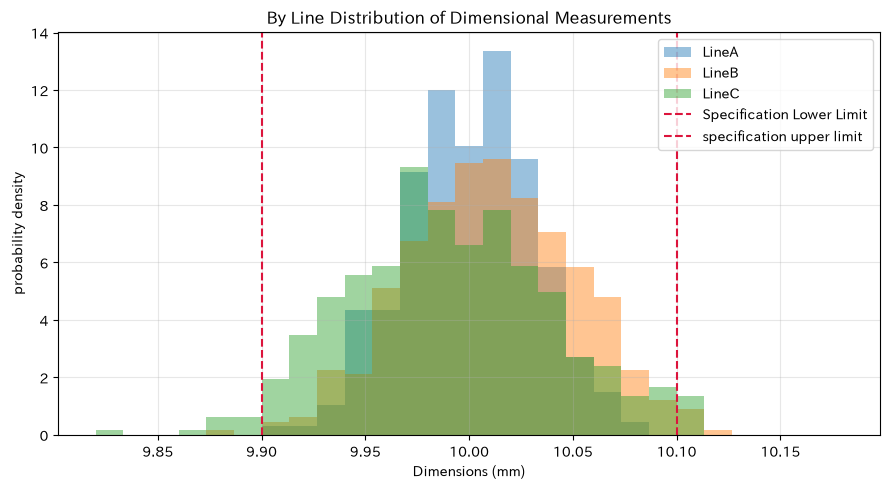
| average(mm) | standard_deviation(mm) | specimen non-specification rate | |
|---|---|---|---|
| Line | |||
| A | 10.0001 | 0.0311 | 0.00% |
| B | 10.0108 | 0.0406 | 1.60% |
| C | 9.9906 | 0.0495 | 4.00% |
Reading the results
Line B has its center shifted upward, and line C is set to have a relatively wider distribution. These two require different countermeasures: the former focuses on central coordination, while the latter involves investigating variability factors including materials, equipment, and measurement systems. Without definitive process capability or distribution suitability based solely on histograms, time series, stratification, control charts, and measurement system analysis are also checked.
No.008: Drawing Cumulative Distribution Functions
Meaning in Practice
Cumulative Distribution Functions (CDF) are effective in decision-making using threshold values, such as “What percentage is below 10.05 mm?” or “What is the percentage below the minimum standard?” It can also be used to explain procurement standards, sorting criteria, and warning values for preventive maintenance.
Approach to Analysis and Modeling
The cumulative distribution function is
That’s right. For an unknown population CDF, samples are arranged in ascending order and the proportion of each point is plotted using the Experience Cumulative Distribution Function (ECDF). Without assuming a specific distribution pattern, you can read the ratio below the threshold based on the observation sample.
Check with Python
fig, ax = plt.subplots(figsize=(9, 5))
for i, line_name in enumerate(lines):
    x = np.sort(measurements[i])
    y = np.arange(1, x.size + 1) / x.size
    ax.step(x, y, where="post", label=f"Line{line_name}")
ax.axvline(10.05, color="black", linestyle="--", label="Judgment threshold 10.05 mm")
ax.set_title("By Line Empirical cumulative distribution of dimension measurements (ECDF)")
ax.set_xlabel("Dimensions (mm)")
ax.set_ylabel("cumulative probability P(Xbutxbelow)")
ax.grid(True, alpha=0.3)
ax.legend()
plt.tight_layout()
plt.show()

threshold = 10.05
cdf_at_threshold = (measurements <= threshold).mean(axis=1)
display(pd.DataFrame({"10.05mmThe following percentages": cdf_at_threshold},
                     index=pd.Index(lines, name="Line")).style.format("{:.1%}"))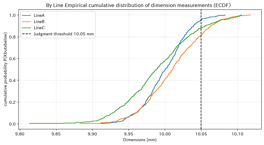
| 10.05mmThe following percentages | |
|---|---|
| Line | |
| A | 95.0% |
| B | 81.4% |
| C | 88.0% |
Reading the results
Even with the same threshold, the cumulative rate varies by line. If the ECDF rises sharply, the price will concentrate within a narrow range; if it is gradual, it can be interpreted as having greater fluctuation. If you want an exceedance rate, use , but since the boundary definition changes depending on whether it contains the sample point equivalent, < and <= are matched to the standard definition.
No.009: Monte Carlo Simulation
Meaning in Practice
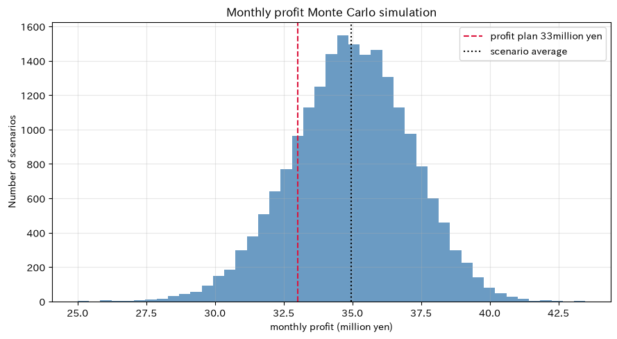
Monthly profits are subject to multiple uncertainties simultaneously, such as production volume, defects, and equipment shutdowns. If the expected profits exceed the plan, you cannot identify the risk of not being met. It generates numerous future scenarios and evaluates downside probabilities and quantiles.
Approach to Analysis and Modeling
Profit from each scenario
Let’s say so. is the number produced, is the defect rate, is the marginal profit per good product, is the number of defects, is the defect loss, and is the stoppage loss. To keep the explanation brief, we assume independent distributions, but if there is a correlation between demand and uptime, or downtime and defect rates, simultaneous distribution or conditional models are necessary.
Check with Python
mc_rng = np.random.default_rng(SEED + 9)
n_scenarios = 20_000
monthly_units = mc_rng.normal(line_production.sum(), 2_200, size=n_scenarios).clip(0)
scenario_defect_rate = mc_rng.beta(55, 1_945, size=n_scenarios)
scenario_defects = mc_rng.binomial(monthly_units.astype(int), scenario_defect_rate)
downtime_hours = mc_rng.gamma(shape=4.0, scale=5.0, size=n_scenarios)

margin_per_good = 620
loss_per_bad = 5_200
downtime_cost_per_hour = 85_000
profit = ((monthly_units - scenario_defects) * margin_per_good
          - scenario_defects * loss_per_bad
          - downtime_hours * downtime_cost_per_hour)
profit_million = profit / 1_000_000
profit_target = 33.0

mc_summary = pd.DataFrame({
    "indicator": ["expected benefit", "5%point", "median", "95%point", "33Probability of not reaching one million yen"],
    "value": [profit_million.mean(), *np.quantile(profit_million, [0.05, 0.50, 0.95]),
           (profit_million < profit_target).mean()],
})
display(mc_summary)

fig, ax = plt.subplots(figsize=(9, 5))
ax.hist(profit_million, bins=45, color="steelblue", alpha=0.8)
ax.axvline(profit_target, color="crimson", linestyle="--", label="profit plan 33million yen")
ax.axvline(profit_million.mean(), color="black", linestyle=":", label="scenario average")
ax.set_title("Monthly profit Monte Carlo simulation")
ax.set_xlabel("monthly profit (million yen)")
ax.set_ylabel("Number of scenarios")
ax.grid(True, alpha=0.3)
ax.legend()
plt.tight_layout()
plt.show()| indicator | value | |
|---|---|---|
| 0 | expected benefit | 34.947 |
| 1 | 5%point | 31.296 |
| 2 | median | 34.984 |
| 3 | 95%point | 38.403 |
| 4 | 33Probability of not reaching one million yen | 0.181 |
Reading the results
By showing not only the average but also a 5% point and the probability of not meeting the plan, you can discuss the safety margin of profit planning. The 5% point is not a “guaranteed lower limit,” but rather a value exceeding 95% of scenarios under the assumed model. Since the distribution of equipment downtime and defect rates differs from actual conditions, results can also change, so calibration based on historical data, sensitivity analysis under pessimistic, standard, and optimistic conditions, and qualitative evaluation of risks outside the model are included together.
No.010: Comparison of Calculation Speed
Meaning in Practice
Even if the analysis is correct, if it takes several hours to calculate, it cannot be used for daily operations or condition searches. NumPy vectorization can sometimes be written faster and shorter than Python’s explicit loops when applying the same process to many elements.
Approach to Analysis and Modeling
Here, for one million measurements, the non-standard rate is calculated using loops and vector operations. First, confirm that both answers match, then measure multiple times with timeit. Since speed is affected by CPU, library version, and array size, it is read as a relative comparison in this execution environment rather than absolute values.
Check with Python
speed_rng = np.random.default_rng(SEED + 10)
large_measurements = speed_rng.normal(10.0, 0.045, size=1_000_000)

def defect_rate_loop(values, lower, upper):
    count = 0
    for value in values:
        if value < lower or value > upper:
            count += 1
    return count / len(values)

def defect_rate_vectorized(values, lower, upper):
    return np.mean((values < lower) | (values > upper))

loop_result = defect_rate_loop(large_measurements, lower_spec, upper_spec)
vector_result = defect_rate_vectorized(large_measurements, lower_spec, upper_spec)
loop_time = timeit.timeit(
    lambda: defect_rate_loop(large_measurements, lower_spec, upper_spec), number=3
) / 3
vector_time = timeit.timeit(
    lambda: defect_rate_vectorized(large_measurements, lower_spec, upper_spec), number=10
) / 10

speed_comparison = pd.DataFrame({
    "Methods": ["Pythonloop", "NumPyvector operation"],
    "Non-standard rate": [loop_result, vector_result],
    "Average Execution Time(seconds)": [loop_time, vector_time],
    "loop ratio": [1.0, vector_time / loop_time],
})
display(speed_comparison.style.format({"Non-standard rate": "{:.4%}",
                                       "Average Execution Time(seconds)": "{:.6f}", "loop ratio": "{:.3f}"}))
print("The results are unanimous.:", np.isclose(loop_result, vector_result))
print(f"In this environment, vector operations are about {loop_time / vector_time:.1f} double speed")| Methods | Non-standard rate | Average Execution Time(seconds) | loop ratio | |
|---|---|---|---|---|
| 0 | Pythonloop | 2.6316% | 0.047111 | 1.000 |
| 1 | NumPyvector operation | 2.6316% | 0.001195 | 0.025 |
Results match: True
In this environment, vector operations are about 39.4 times faster.
Reading the results
Both methods return the same out-of-standard rate, and at this array size, vector operations are significantly faster. For performance improvement, we first test the matching of answers and measure them at a size close to the actual data. Since vectorization consumes memory through temporary arrays, for large data, optimization includes segmentation, aggregation methods, data types, and I/O.
Practical Implications Seen Through Target Exercise
- Array design is the very definition of the business: Clearly indicating which of the day, line, type, or measurement item to be placed on each axis can reduce aggregation errors.
- Switching between number of cases and rates: Rate is required for comparing quality conditions, and evaluation of economic impact requires the number of cases and loss unit price.
- Manage reference values as data: Even if you can apply it all at once via broadcast, ignoring the standards of holidays, product types, and equipment conditions will not make the right decisions.
- Expanding perspectives from average to distribution: With histograms and CDF, not only the center but also the hem, threshold exceedance, and variation can be used as evidence to judge the results.
- Communicating uncertainty with probabilities: The Monte Carlo method allows you to present not only expected values but also quantiles and the probability of not meeting plans.
- Including repeatability and speed in operational requirements: Seeds, environments, and code versions are recorded, and processing times are measured before continuous operation can be transferred.
What is necessary for practical implementation
- Data models that can track product IDs, lots, lines, equipment, varieties, shifts, dates and times, and measuring instruments
- Unification of units, denominators, and exclusion conditions for dimensions, defect rates, production quantities, downtime times, and loss amounts
- Data quality rules to detect missing measurements, duplicates, instrument calibration, time offsets, and planned stoppages
- Mechanisms for regularly updating distribution assumptions and parameters, as well as backtesting against actual results
- Reproducibility management that keeps seeds, Python environments, input snapshots, code versions, and approval histories
- Criteria for dividing on-site management limits, quality assurance standards, and management risk tolerance
- The workflow of who reviews the analysis results and who changes equipment conditions and production plans
In a PoC, the decision is first focused on a single point, then the current judgment, required lead time, lost misjudgments, and available data are organized. It is important to include not only model accuracy but also whether it led to improvement actions in the evaluation metrics.
Conclusion
For No.001 to No.010, manufacturing data was designed as NumPy arrays, aggregated using vectors, matrices, and broadcasts, and uncertainty was evaluated using random numbers, histograms, CDFs, and Monte Carlo methods. Finally, we confirmed that even with the same out-of-standard rate calculations, vectorization can shorten processing time.
What’s important is not just that the code works. Only when Array axes, numerical units, random number assumptions, threshold definitions, conditions under which results can be reproduced can be explained can analytics be used for decision-making on the manufacturing floor.
Consultations for Corporations
At Suri Kobo, we support manufacturing companies in quality control, process capability evaluation, anomaly detection, demand and production simulation, mathematical optimization, and data analysis talent development. From on-site data inventory to PoC, integration into decision-making processes, and internal training, we design according to challenges and data maturity.
📩 Contact Us: surikobo.co.jp/contact
Please feel free to consult us first.