
100 Exercises / linear algebra / Linear algebra 100 Exercises
Introduction to Linear Algebra in Manufacturing | 10 Exercises to Compare Process KPIs by Vector
Linear Algebra That Turns Multi-Metric Process Data into a “Comparable Form”: 10 Exercise-Ups to Learning Vectors with Manufacturing KPIs
On the manufacturing floor, decisions are made by simultaneously looking at indicators of varying unit and importance, such as defect rates, downtime, power intensity, and production volume. This article uses data from eight fictitious processes to cover up to Represent the state of the process as a vector, search for similar processes, and quantify improvement priorities.
This series of “100 Exercises on Linear Algebra” progresses step-by-step through vectors, matrices, eigenvalues, matrix factorization, and applications, translating formulas into practical business decisions. In the first 10 books, you will develop the fundamental perspectives of regression, PCA, optimization, recommendation, and search.
[!NOTE] This material is a notebook previously used by Surikoubo (or personally by the representative, Kazuyama), and has been reconstructed, edited, and published with the company’s permission.
All data listed is fictional and has no relation whatsoever to real companies, factories, or figures.
Introduction: Practical Challenges in Manufacturing Covered in This Article
Consider the situation at the monthly meeting where you decide which process to improve first. While the ranking is simple based on defect rates, the conclusion can change if you include downtime, energy, and production volume. The goal of this article is not to forcefully push multiple KPIs into a single score, but to make them A state where comparisons can be made while maintaining a multi-indicator structure and the rationale for judgment can be explained..
Common situations on site
- Each KPI has different units and ‘good orientation’
- Veterans make quick comprehensive judgments, but it’s hard to inherit the basis for their decisions.
- While we can see the difference from the average, we haven’t checked the overall process similarity
- The more metrics you add, the more duplicates and calculation instability of the same information increase.
Why is this issue so difficult to judge?
1 point for defect rate and 1 hour of downtime cannot be added as is. Also, processes with large production volumes tend to appear large even in absolute quantities, confusing scale with efficiency. Linear algebra treats KPIs as coordinates and provides a common language for separating Size, orientation, proximity, overlapping information.
Overview of Exercise covered this time
| No. | Theme | Questions in the Manufacturing Industry |
|---|---|---|
| 001 | vector | How to represent the state of the process |
| 002 | dot product | How to reflect the importance of KPIs |
| 003 | norm | How much does the overall deviation from the standard be? |
| 004 | distance | Which processes are close to each other? |
| 005 | cosine similarity | Is the composition of tasks excluding scale similar? |
| 006 | normalization | How to align differences in units and scales |
| 007 | base | How to understand the KPI coordinate axis |
| 008 | dimension | Are the number of indicators and amount of information the same? |
| 009 | linear combination | How to create the overall score |
| 010 | primary independence | Check for duplicate KPIs |
Preparing the Python environment
It does not rely on external data and uses only NumPy, pandas, and Matplotlib. Fix the random seed and rerun it so that the result is the same. Japanese set the font to japanize_matplotlib.
import sys
import numpy as np
import pandas as pd
import matplotlib.pyplot as plt
import japanize_matplotlib
from IPython.display import display

SEED = 42
rng = np.random.default_rng(SEED)
pd.set_option("display.precision", 3)

print(f"Python: {sys.version.split()[0]}")
print(f"NumPy: {np.__version__}, pandas: {pd.__version__}")
Python: 3.11.9
NumPy: 1.26.4, pandas: 2.2.2Creation of Fictional Data
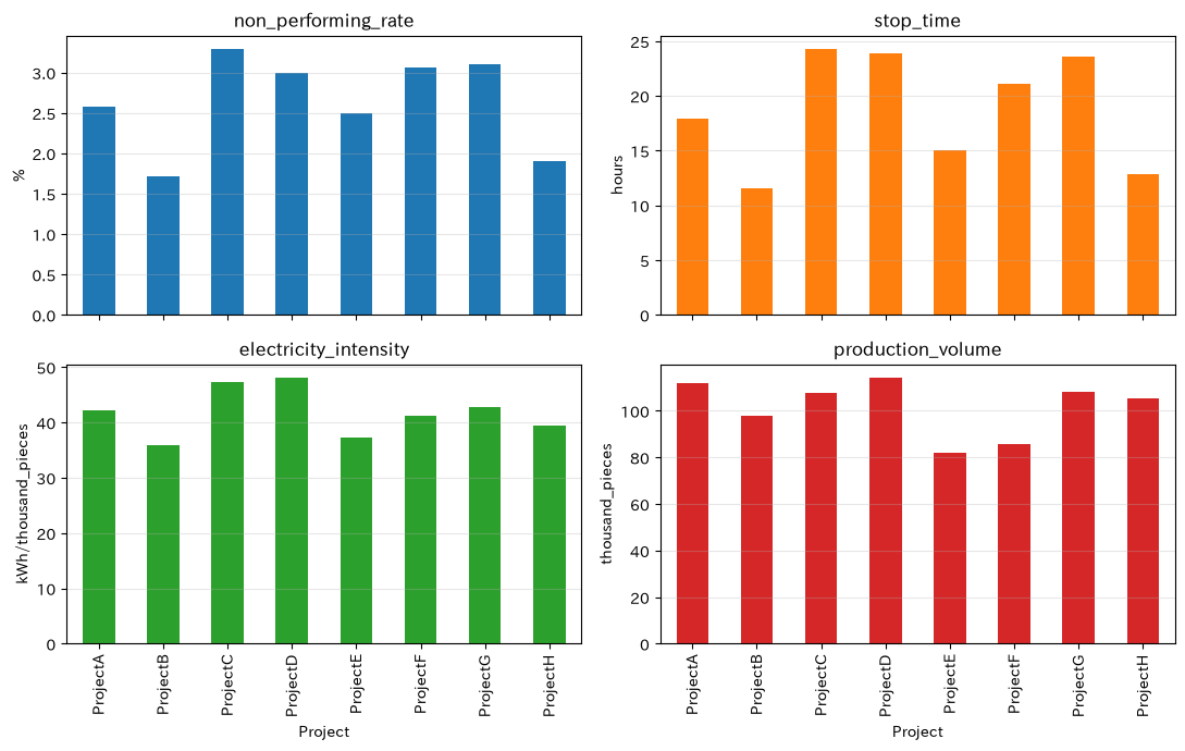
Generate monthly KPIs across eight steps. Here, the lower the defect rate, downtime, and power intensity, the better, while the higher the production volume, the better the indicator. To use it later in calculations, we also create a value for the “task direction” by reversing the sign only the production volume.
processes = [f"Project{c}" for c in "ABCDEFGH"]
latent_load = rng.normal(0, 1, len(processes))
latent_age = rng.normal(0, 1, len(processes))

df = pd.DataFrame({
    "non_performing_rate_pct": np.clip(2.5 + 0.65*latent_age + rng.normal(0, .25, 8), .5, None),
    "stop_time_h": np.clip(18 + 4.5*latent_age + 2*latent_load + rng.normal(0, 1.5, 8), 3, None),
    "electricity_intensity_kwh": np.clip(42 + 3*latent_age + 2.5*latent_load + rng.normal(0, 1.2, 8), 20, None),
    "production_volume_thousand_pieces": np.clip(105 + 12*latent_load - 4*latent_age + rng.normal(0, 4, 8), 50, None),
}, index=processes).round(2)
df.index.name = "Project"
display(df)

ax = df.plot(kind="bar", subplots=True, layout=(2, 2), figsize=(11, 7), legend=False)
titles = ["non_performing_rate", "stop_time", "electricity_intensity", "production_volume"]
ylabels = ["%", "hours", "kWh/thousand_pieces", "thousand_pieces"]
for a, title, ylabel in zip(np.ravel(ax), titles, ylabels):
    a.set_title(title); a.set_xlabel("Project"); a.set_ylabel(ylabel); a.grid(axis="y", alpha=.3)
plt.tight_layout()
plt.show()| non_performing_rate_pct | stop_time_h | electricity_intensity_kWh | production_volume_thousand_pieces | |
|---|---|---|---|---|
| Project | ||||
| ProjectA | 2.58 | 17.89 | 42.10 | 111.70 |
| ProjectB | 1.71 | 11.55 | 35.86 | 98.10 |
| ProjectC | 3.29 | 24.26 | 47.25 | 107.83 |
| ProjectD | 2.99 | 23.93 | 48.04 | 114.10 |
| ProjectE | 2.50 | 15.01 | 37.18 | 81.79 |
| ProjectF | 3.06 | 21.11 | 41.12 | 85.74 |
| ProjectG | 3.11 | 23.57 | 42.73 | 108.15 |
| ProjectH | 1.90 | 12.89 | 39.41 | 105.54 |
No.001: What is a vector?
Meaning in Practice
A vector represents the state of process A not just as a “defect rate” but as a sequence of multiple KPIs. By representing processes with KPIs in the same order, you can handle inter-process comparisons and scoring using common calculations.
Approach to Analysis and Modeling
The KPI vector for process
Let’s say so. What matters is not just the value, but also fixing the meaning and order of the ingredients, such as ‘the first ingredient has a defect rate.’ A vector is not just an array but an observation unit with a defined function.
Check with Python
kpi_cols = ["non_performing_rate_pct", "stop_time_h", "electricity_intensity_kwh", "production_volume_thousand_pieces"]
X = df[kpi_cols].to_numpy()
x_a = X[0]
print("ProjectAofKPIvector:", x_a)
print("shape:", x_a.shape, "(4Vector of Ingredients)")
display(pd.Series(x_a, index=kpi_cols, name="ProjectA"))
KPI vector for process A: [ 2.58 17.89 42.1 111.7 ]
Shape: (4,) (4-component vector)
Non-performing loan rate_pct 2.58
Stop time_h 17:89
Power intensity _kWh: 42.10
Production Volume_Thousand Units 111.70
Name: Project A, dtype: float64Reading the results
Process A can now be treated as a single point in four-dimensional space rather than four independent report values. However, at this stage, units are mixed, so simple amounts or sums of components have no meaning. Define the comparison rules from the next exercise onward.
No.002: What is the inner product?
Meaning in Practice
There is a focus on improvement policies. The inner product, which multiplies priorities such as quality, stable operation, and energy saving, by KPI vectors, is a basic operation for creating evaluation points aligned with policy.
Approach to Analysis and Modeling
Issue vector and weight product after standardization
are the priority for improvement. The higher the positive value, the greater the “issues aligned with priority policies.” Weight is the management decision itself, and sensitivity analysis and consensus building are necessary.
Check with Python
issue = df.copy()
issue["production_volume_thousand_pieces"] *= -1  # The larger the issue, the more unified it is
Z = (issue - issue.mean()) / issue.std(ddof=0)
weights = pd.Series([0.40, 0.30, 0.20, 0.10], index=kpi_cols, name="weight")
priority = Z.to_numpy() @ weights.to_numpy()
score_table = pd.DataFrame({"Improvement Priority by Inner Product": priority}, index=df.index).sort_values(
    "Improvement Priority by Inner Product", ascending=False)
display(weights.to_frame())
display(score_table)| weight | |
|---|---|
| non_performing_rate_pct | 0.4 |
| stop_time_h | 0.3 |
| electricity_intensity_kWh | 0.2 |
| production_volume_thousand_pieces | 0.1 |
| Improvement Priority by Inner Product | |
|---|---|
| Project | |
| ProjectC | 1.033 |
| ProjectD | 0.775 |
| ProjectG | 0.633 |
| ProjectF | 0.563 |
| ProjectA | -0.171 |
| ProjectE | -0.385 |
| ProjectH | -1.058 |
| ProjectB | -1.389 |
Reading the results
The highest scores are expected to improve the current policy of 40% quality and 30% stoppages. This is not universal “evil.” Since increasing the weight of energy savings can change rankings, meetings present weights and rankings together.
No.003: What is a Norm?
Meaning in Practice
By measuring how far a process deviates from standard conditions on a single scale, you can perform primary screening of steps requiring attention.
Approach to Analysis and Modeling
The Euclid norm ( norm) is
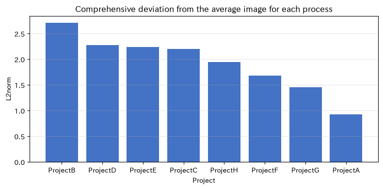
That’s right. By using standardized values, we measure the deviation from the mean image excluding unit differences. Note that the signs disappear, so it is important to note that protrusions in good and bad directions are not distinguished.
Check with Python
norms = np.linalg.norm(Z.to_numpy(), axis=1)
norm_table = pd.DataFrame({"From the average imageL2norm": norms}, index=df.index).sort_values(
    "From the average imageL2norm", ascending=False)
display(norm_table)

plt.figure(figsize=(8, 4))
plt.bar(norm_table.index, norm_table.iloc[:, 0], color="#4472C4")
plt.title("Comprehensive deviation from the average image for each process")
plt.xlabel("Project"); plt.ylabel("L2norm"); plt.grid(axis="y", alpha=.3); plt.tight_layout(); plt.show()| From the average imageL2norm | |
|---|---|
| Project | |
| ProjectB | 2.707 |
| ProjectD | 2.280 |
| ProjectE | 2.242 |
| ProjectC | 2.204 |
| ProjectH | 1.944 |
| ProjectF | 1.684 |
| ProjectG | 1.456 |
| ProjectA | 0.927 |
Reading the results
Processes with large norms are considered “unaverage” processes. However, favorable outliers such as high production volume are also included. Therefore, after extracting candidates with norms, a two-step approach is appropriate: review the original standardized components and identify which KPIs caused the divergence.
No.004: What is Distance?
Meaning in Practice
When you want to expand improvement cases of similar processes horizontally, you can find the process with the KPI structure that most closely resembles them. In addition to classifications based on the same equipment type or product group, similarity in actual data can be used as a basis for judgment.
Approach to Analysis and Modeling
The Euclidean distance between process is
That’s right. The distance is symmetrical, and the distance to yourself is zero. Here too, standardization should come first, ensuring that only KPIs with larger units do not dominate distance.
Check with Python
Z_np = Z.to_numpy()
distance_matrix = np.linalg.norm(Z_np[:, None, :] - Z_np[None, :, :], axis=2)
dist_df = pd.DataFrame(distance_matrix, index=df.index, columns=df.index)
display(dist_df.round(2))

masked = distance_matrix.copy()
np.fill_diagonal(masked, np.inf)
i, j = np.unravel_index(np.argmin(masked), masked.shape)
print(f"Closest Combinations: {df.index[i]} And {df.index[j]}(Distance {masked[i, j]:.3f})")| Project | ProjectA | ProjectB | ProjectC | ProjectD | ProjectE | ProjectF | ProjectG | ProjectH |
|---|---|---|---|---|---|---|---|---|
| Project | ||||||||
| ProjectA | 0.00 | 2.84 | 2.27 | 2.08 | 2.99 | 2.57 | 1.57 | 1.83 |
| ProjectB | 2.84 | 0.00 | 4.89 | 4.80 | 2.20 | 3.59 | 4.05 | 1.18 |
| ProjectC | 2.27 | 4.89 | 0.00 | 0.81 | 4.15 | 2.59 | 1.17 | 3.97 |
| ProjectD | 2.08 | 4.80 | 0.81 | 0.00 | 4.43 | 3.10 | 1.43 | 3.78 |
| ProjectE | 2.99 | 2.20 | 4.15 | 4.43 | 0.00 | 1.93 | 3.43 | 2.48 |
| ProjectF | 2.57 | 3.59 | 2.59 | 3.10 | 1.93 | 0.00 | 2.10 | 3.27 |
| ProjectG | 1.57 | 4.05 | 1.17 | 1.43 | 3.43 | 2.10 | 0.00 | 3.24 |
| ProjectH | 1.83 | 1.18 | 3.97 | 3.78 | 2.48 | 3.27 | 3.24 | 0.00 |
Closest combination: Phase C and Phase D (distance 0.810)Reading the results
The shortest process pairs are combinations that are in a state close when all four indicators are combined. On the other hand, we do not guarantee conditions not included in data, such as equipment specifications. We use it to select candidates for horizontal deployment, and after confirming on-site conditions, we make a final decision.
No.005: Cosine Similarity
Meaning in Practice
Sometimes, rather than focusing on the absolute size of the issue, you may want to compare the similarity of the task structure, such as focusing on defects and stoppages. Cosine similarity measures the proximity of direction by separating the scale to some extent.
Approach to Analysis and Modeling
Values range from to , with values closer to 1 indicating the same direction, around 0 being perpendicular, and closer to -1 the opposite direction. In average-centered standardization vectors, the opposite direction represents a relationship where one side has a major challenge and the other is better than the average.
Check with Python
unit_Z = Z_np / np.linalg.norm(Z_np, axis=1, keepdims=True)
cosine = unit_Z @ unit_Z.T
cos_df = pd.DataFrame(cosine, index=df.index, columns=df.index)
display(cos_df.round(2))

cos_masked = cosine.copy()
np.fill_diagonal(cos_masked, -np.inf)
i, j = np.unravel_index(np.argmax(cos_masked), cos_masked.shape)
print(f"The most similar combination of task structures: {df.index[i]} And {df.index[j]}(Similarity {cosine[i, j]:.3f})")| Project | ProjectA | ProjectB | ProjectC | ProjectD | ProjectE | ProjectF | ProjectG | ProjectH |
|---|---|---|---|---|---|---|---|---|
| Project | ||||||||
| ProjectA | 1.00 | 0.02 | 0.14 | 0.41 | -0.73 | -0.93 | 0.20 | 0.35 |
| ProjectB | 0.02 | 1.00 | -0.98 | -0.85 | 0.62 | -0.30 | -0.89 | 0.92 |
| ProjectC | 0.14 | -0.98 | 1.00 | 0.94 | -0.75 | 0.13 | 0.87 | -0.83 |
| ProjectD | 0.41 | -0.85 | 0.94 | 1.00 | -0.92 | -0.21 | 0.80 | -0.60 |
| ProjectE | -0.73 | 0.62 | -0.75 | -0.92 | 1.00 | 0.55 | -0.70 | 0.30 |
| ProjectF | -0.93 | -0.30 | 0.13 | -0.21 | 0.55 | 1.00 | 0.11 | -0.62 |
| ProjectG | 0.20 | -0.89 | 0.87 | 0.80 | -0.70 | 0.11 | 1.00 | -0.82 |
| ProjectH | 0.35 | 0.92 | -0.83 | -0.60 | 0.30 | -0.62 | -0.82 | 1.00 |
The most similar combination in the task structure: Phase C and Procedure D (similarity 0.935)Reading the results
Processes with high cosine similarity may have similar improvement theme structures. Since distance is considered “horizontal proximity” and cosine similarity is “proximity in direction,” listing both together allows for a more detailed explanation of the validity of lateral deployment.
No.006: Normalization
Meaning in Practice
The defect rate and production volume have different numerical values. If calculated as-is, production volume becomes dominant, so scale adjustments tailored to the purpose of comparison are necessary.
Approach to Analysis and Modeling
A typical method is standardization, where each column is set to an average of 0 and a standard deviation of 1
and unit vectorization that sets each line to length 1. The former focuses on scaling between KPIs, while the latter focuses on comparing directions by process. The specification clearly states which term “normalization” refers to.
Check with Python
check = pd.DataFrame({
    "Standardized average": Z.mean(),
    "Standard Deviation After Standardization": Z.std(ddof=0),
})
display(check.round(10))
display(pd.DataFrame(unit_Z, index=df.index, columns=kpi_cols).round(3).head())
print("row norm:", np.linalg.norm(unit_Z, axis=1).round(6))| Standardized average | Standard Deviation After Standardization | |
|---|---|---|
| non_performing_rate_pct | -0.0 | 1.0 |
| stop_time_h | 0.0 | 1.0 |
| electricity_intensity_kWh | -0.0 | 1.0 |
| production_volume_thousand_pieces | 0.0 | 1.0 |
| non_performing_rate_pct | stop_time_h | electricity_intensity_kWh | production_volume_thousand_pieces | |
|---|---|---|---|---|
| Project | ||||
| ProjectA | -0.124 | -0.198 | 0.103 | -0.967 |
| ProjectB | -0.632 | -0.552 | -0.531 | 0.116 |
| ProjectC | 0.539 | 0.515 | 0.618 | -0.251 |
| ProjectD | 0.280 | 0.468 | 0.683 | -0.487 |
| ProjectE | -0.117 | -0.348 | -0.497 | 0.787 |
Line norm: [1. 1. 1. 1. 1. 1. 1. 1.]Reading the results
After column standardization, the average of each KPI is nearly zero, with a standard deviation of 1, and after unit vectorization of rows, the length of each step becomes 1. Since standardized parameters are created separately each month to adjust the standards, in actual operation, the mean and standard deviation of the reference period are stored and applied.
No.007: What is a Base?
Meaning in Practice
Even for the same process state, the way explanations are made varies depending on whether you view them from the perspective of ‘original KPIs’ or ‘quality, stability, environment, and capability.’ The basis is how to choose the coordinate axis to describe the state.
Approach to Analysis and Modeling
The standard basis for four-dimensional space is . If we set the column of orthogonal matrix as the new orthonormal basis, the new coordinates are
You can convert and restore them. Even if the foundation changes, information is not lost; only the expression changes.
Check with Python
Q = np.array([
    [1, 1, 0, 0],
    [1,-1, 0, 0],
    [0, 0, 1, 1],
    [0, 0, 1,-1],
], dtype=float) / np.sqrt(2)
z_a = Z_np[0]
coords = Q.T @ z_a
restored = Q @ coords
result = pd.DataFrame({"Original coordinates": z_a, "restored value": restored}, index=kpi_cols)
display(result.round(4))
print("Coordinates at the New Basis:", coords.round(4))
print("reconstruction error:", np.linalg.norm(z_a - restored))| Original coordinates | restored value | |
|---|---|---|
| non_performing_rate_pct | -0.115 | -0.115 |
| stop_time_h | -0.183 | -0.183 |
| electricity_intensity_kWh | 0.096 | 0.096 |
| production_volume_thousand_pieces | -0.896 | -0.896 |
Coordinates at the new base: [-0.2107 0.0486 -0.5663 0.7015]
Reconstruction error: 2.3469468764647177e-16
Reading the results
We were able to restore the original vector from the new basis coordinates with almost no error. Basis transformation is not about “changing the data,” but about “changing the viewing axis.” In practice, being able to explain the meaning of new axes in field terminology is just as important as mathematical validity.
No.008: What is Dimension?
Meaning in Practice
If there are four columns of KPIs, they are formally four-dimensional, but if all the indicators move similarly, the actual amount of information is reduced. The number of dashboard items does not match the amount of independent information needed for decision-making.
Approach to Analysis and Modeling
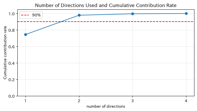
The singular value of the data matrix indicates the magnitude of variation in each direction. Cumulative contribution rate
This allows you to identify the effective dimensions necessary to maintain much variation. This time, we use SVD for concept verification, but PCA will be covered in detail during subsequent exercises.
Check with Python
_, singular_values, _ = np.linalg.svd(Z_np, full_matrices=False)
ratio = singular_values**2 / np.sum(singular_values**2)
cum_ratio = np.cumsum(ratio)
dim_table = pd.DataFrame({
    "singular value": singular_values,
    "contribution rate": ratio,
    "Cumulative contribution rate": cum_ratio,
}, index=[f"direction{i}" for i in range(1, 5)])
display(dim_table.round(3))

plt.figure(figsize=(7, 4))
plt.plot(range(1, 5), cum_ratio, marker="o")
plt.axhline(.9, color="red", linestyle="--", label="90%")
plt.title("Number of Directions Used and Cumulative Contribution Rate")
plt.xlabel("number of directions"); plt.ylabel("Cumulative contribution rate"); plt.xticks(range(1, 5)); plt.ylim(0, 1.05)
plt.grid(alpha=.3); plt.legend(); plt.tight_layout(); plt.show()| singular value | contribution rate | Cumulative contribution rate | |
|---|---|---|---|
| direction1 | 4.882 | 0.745 | 0.745 |
| direction2 | 2.738 | 0.234 | 0.979 |
| direction3 | 0.750 | 0.018 | 0.997 |
| direction4 | 0.317 | 0.003 | 1.000 |
Reading the results
Looking at the cumulative contribution rate, it is possible to explain major fluctuations without using all four columns. However, there are cases where the contribution rate is low and there are signs of a serious accident. Dimension reduction reduces the burden of visualization and monitoring, but essential KPIs for quality assurance must not be mechanically removed.
No.009: Linear Combination
Meaning in Practice
The process of creating composite indicators such as quality risk and operational load from multiple KPIs is a linear chain of vectors. It is also the mathematical form of the weighted average, which is widely used in the field.
Approach to Analysis and Modeling
For vector and coefficient ,
is called a linear combination. By adding the vectors of each KPI column with weights, you get the overall score vector for all processes. The design of coefficient signs, scales, and total constraints determines the meaning of the score.
Check with Python
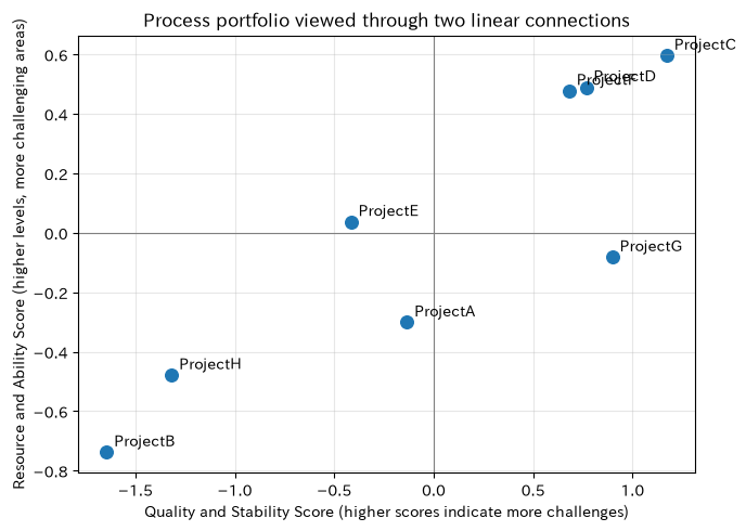
quality_score = 0.7 * Z["non_performing_rate_pct"] + 0.3 * Z["stop_time_h"]
resource_score = 0.6 * Z["electricity_intensity_kwh"] + 0.4 * Z["production_volume_thousand_pieces"]
combined = pd.DataFrame({
    "Quality and Stability Score": quality_score,
    "Resource & Ability Score": resource_score,
}, index=df.index)
display(combined.sort_values("Quality and Stability Score", ascending=False))

plt.figure(figsize=(7, 5))
plt.scatter(combined.iloc[:, 0], combined.iloc[:, 1], s=70)
for name, row in combined.iterrows():
    plt.annotate(name, (row.iloc[0], row.iloc[1]), xytext=(5, 4), textcoords="offset points")
plt.axhline(0, color="gray", lw=.8); plt.axvline(0, color="gray", lw=.8)
plt.title("Process portfolio viewed through two linear connections")
plt.xlabel("Quality and Stability Score (higher scores indicate more challenges)")
plt.ylabel("Resource and Ability Score (higher levels, more challenging areas)")
plt.grid(alpha=.3); plt.tight_layout(); plt.show()| Quality and Stability Score | Resource & Ability Score | |
|---|---|---|
| Project | ||
| ProjectC | 1.172 | 0.596 |
| ProjectG | 0.898 | -0.082 |
| ProjectD | 0.766 | 0.490 |
| ProjectF | 0.681 | 0.478 |
| ProjectA | -0.135 | -0.301 |
| ProjectE | -0.417 | 0.037 |
| ProjectH | -1.319 | -0.479 |
| ProjectB | -1.646 | -0.738 |
Reading the results
With two synthetic axes, processes can be classified based on quality, stability, resources, and capability. The upper right process is for comprehensive improvement, the lower right is for quality-centered, and these serve as materials for dividing initiatives. We also check for placement changes when the coefficients are changed, ensuring decisions are made without relying too heavily on a single weight setting.
No.010: First Independence
Meaning in Practice
Adding columns that can be fully reproduced by constant multiples or sums of existing KPIs, such as ‘operating loss rate’ defined from downtime, does not add new information. Overlapping metrics destabilize model estimates and make meeting materials redundant.
Approach to Analysis and Modeling
A vector set is called first-order independent,
All coefficients that satisfy this condition are limited to zero. If the rank of the data matrix is less than the number of columns, at least one column is a linear combination of other columns. However, since “almost dependent” is more common in actual data than exact matches, singular values and number of conditions are also checked.
Check with Python
independent_matrix = Z_np
duplicate_col = 2 * Z_np[:, 0] + 0.5 * Z_np[:, 1]
dependent_matrix = np.column_stack([Z_np, duplicate_col])

print("Number of original columns / Rank:", independent_matrix.shape[1], "/", np.linalg.matrix_rank(independent_matrix))
print("derivativeKPINumber of columns after addition / Rank:", dependent_matrix.shape[1], "/", np.linalg.matrix_rank(dependent_matrix))
print("Reproduction error of additional columns:", np.linalg.norm(duplicate_col - (2*Z_np[:, 0] + .5*Z_np[:, 1])))
print("Singular Values After Addition:", np.linalg.svd(dependent_matrix, compute_uv=False).round(6))
Original number of columns / Rank: 4 / 4
Number of columns / rank after added derived KPIs: 5 / 4
Additional column reproduction error: 0.0
Singular values after addition: [8.430206 3.088074 0.80626 0.347143 0. ]Reading the results
Adding one column to the derived KPI increased the number of columns, but the rank did not increase. In other words, even if the number of displayed items increases, the number of independent information does not increase. The KPI ledger records formulas and sources, and the analysis model adopts either the original indicator or the derived indicator depending on the purpose.
Practical Implications Seen Through Target Exercise
- By vectorizing processes, you can explicitly state the comparison rules.: You can discuss empirical comprehensive judgments as components, metrics, and weights.
- Distinguish by size and orientation: Norms and distances represent the level of deviation, while cosine similarity represents the assignment composition, and the applications differ.
- Scale adjustment is not a preprocessing but a task definition.: You need to decide who approves the reference period, outliers, and the direction of merit or failure.
- The number of indicators and the amount of information are not the same: Checking dimension and first-level independence helps avoid duplicate KPIs and unstable models.
- The overall score embeds a policy: The weights of inner products and linear combinations are transparent, allowing you to verify the robustness of rankings across multiple scenarios.
What is necessary for practical implementation
- Define KPIs, units, aggregation cycles, positive directions, and make missing handling data a data dictionary.
- Equipping conditions that determine comparability, such as equipment, products, and shift configurations,
- Fix the reference period for standardization and set update rules when process changes occur.
- Weight is agreed upon in quality assurance, manufacturing, and management, and sensitivity analysis is maintained.
- Integrate scores into decision-making flows that include on-site inspections rather than directly linking scores to automated disposal
- Monitor monthly distribution changes, missing values, outliers, and overlapping indicators
Conclusion
In No.001 to No.010, process states with multiple indicators were represented as vectors, and data design was compared using dot products, norms, distances, and similarity, and data design was checked using normalization, basis, dimension, linear joining, and first-order independence. Linear algebra is more of a multipleKPIDesign language that makes decision-making reproducible than a computational technique. In the next stage, by moving on to spaces with vectors, orthogonality, and projection, we will lead to understanding prediction, anomaly detection, and optimization.
Consultations for Corporations
At Surikoubou, you can consult on support tailored to on-site challenges and data maturity, such as designing manufacturing KPIs, process comparison, anomaly detection, demand forecasting, optimization, and training notebook setup. We can address issues even from the conceptual stage, such as “Which indicators should be established first?”
📩 Contact Us: surikobo.co.jp/contact
Please feel free to consult us first.