
100 Exercises / Machine Learning / Practical Machine Learning 100 Exercises
Introduction to Data Analysis in Manufacturing | From CSV Loading to Correlation Analysis: 10 Practical Steps in Python
Turning manufacturing data into ‘judgmental information’: The first 10 exercises in production, quality, and equipment data analysis
In manufacturing sites, Ensuring that data is trusted and ready for use in meetings and improvement activities. is more important than simply collecting data. In this article, we use daily data from a fictional precision parts factory as a subject, and will practice a diagnostic workflow covering everything from CSV acceptance confirmation to distribution, scatter plots, and correlation coefficients.
This “100 Machine Learning Exercises” covers step-by-step tasks including data verification, preprocessing, regression and classification, model validation, feature design, demand forecasting, anomaly detection, recommendation and clustering, and lightweight MLOps. The goal is not to memorize the methods, but to acquire The ability to turn on-site questions into analyzable forms and connect them to decision-making. This time, we will cover the entry points No.001 to No.010.
[!NOTE] This material is a notebook previously used by Surikoubo (or personally by the representative, Kazuyama), and has been reconstructed, edited, and published with the company’s permission.
All data listed is fictional and has no relation whatsoever to real companies, factories, or figures.
Introduction: Practical Challenges in Manufacturing Covered in This Article
The anticipated question is, “In response to the recent worsening defect rate, which line, product, or equipment conditions should be investigated?” The daily CSV contains production quantity, downtime, temperature, vibration, and number of defects. However, if you generate only averages or machine learning models without verifying the meanings, missing or distribution of columns, you may mistake input errors or differences in population composition for equipment malfunctions.
The goal of this article is to verify the quality of the data and create Primary Diagnosis Report that leads to on-site interviews and additional measurements. Correlation is not used to prove the cause, but rather as a tool to narrow down hypotheses that prioritize confirmation.
Common situations on site
- Multiple lines of daily reports were consolidated, but the units, input rules, and reasons for missing data were not aligned.
- Only the average for all factories is shared, making product composition and line differences invisible.
- The relationship between heuristic rules and data, such as ‘defects are common on hot days,’ remains unverified.
- Definitions of downtime and quantity of good products differ between analysts and on-site operators
Why is this issue so difficult to judge?
The defect rate is influenced not only by equipment conditions but also by product difficulty, production line, lot, and inspection conditions. Also, the missing items are not always random. For example, if vibration sensor shortages are concentrated during equipment shutdown, simple exclusion of missing lines underestimates abnormalities. Therefore, it is necessary to check the Particle size, type, defects, distribution, stratification in order.
Overview of Exercise covered this time
| No. | operation | Practical Confirmation Items |
|---|---|---|
| 001 | Loading CSV | Character Encoding, Breaks, and Line Consistency |
| 002 | Beginning, End, and Column Name | Period, Lineup, Expected Column |
| 003 | Number of rows and columns | Observation Coverage and Granularity |
| 004 | data type | Whether calculation and time series processing are possible |
| 005 | missing value | Scale of Missed Measurements and Operational Reasons |
| 006 | basic statistics | Level, variation, anomaly candidates |
| 007 | Category Aggregation | Biased Line and Product Configurations |
| 008 | Histogram | Distribution shape, hem, multiple groups |
| 009 | Scatter plot | Relationships between variables and hierarchical differences |
| 010 | correlation coefficient | Prioritizing hypotheses |
Preparing the Python environment
pandas handles tabular data, numpy generates reproducible fictional data, and visualizes it in matplotlib. By fixing the random number seed, the result will be the same even if you rerun.
from io import StringIO
import sys
import numpy as np
import pandas as pd
import matplotlib
import matplotlib.pyplot as plt

SEED = 1201
rng = np.random.default_rng(SEED)
plt.rcParams["figure.figsize"] = (8, 4.5)

print(f"Python: {sys.version.split()[0]}")
print(f"pandas: {pd.__version__}")
print(f"matplotlib: {matplotlib.__version__}")
print(f"random number seed: {SEED}")
Python: 3.13.1
pandas: 3.0.3
matplotlib: 3.11.0
Random Number Seeds: 1201Creation of Fictional Data
One line should be “Daily performance for a certain day, a certain line, or a certain product.” It is important to specify the unit of analysis. This is because the meaning of the aggregated result changes depending on which row represents equipment, lot, or time slot in the same column.
The defect rate is defined by the following formula.
\text{Defect Rate (%)} = \frac{\text{Number of Defects}} {\text{Number of Production}}\times 100As temperature, vibration, and stop time increase, defects slightly increase, and the P-300 product is a fictional structure that makes processing more difficult. Intentionally create a small number of deficiencies in the vibration value.
n_days = 60
dates = pd.date_range("2025-04-01", periods=n_days, freq="D")
lines = np.array(["L-A", "L-B", "L-C"])
products = np.array(["P-100", "P-200", "P-300"])
records = []

for date in dates:
    for line in lines:
        product = rng.choice(products, p=[0.45, 0.35, 0.20])
        planned = int(rng.integers(430, 571))
        downtime = max(0, rng.gamma(2.0, 8.0) + (line == "L-C") * 6)
        produced = max(300, int(planned - 1.25 * downtime + rng.normal(0, 10)))
        temperature = rng.normal(72 + (line == "L-C") * 2.5, 3.5)
        vibration = rng.normal(2.6 + (line == "L-B") * 0.20, 0.38)
        defect_rate = (0.010 + 0.0006 * downtime + 0.0018 * (temperature - 72)
                       + 0.009 * (vibration - 2.6) + 0.010 * (product == "P-300"))
        defect_rate = float(np.clip(defect_rate, 0.002, 0.12))
        defects = int(rng.binomial(produced, defect_rate))
        records.append([date, line, product, planned, produced, downtime,
                        temperature, vibration, defects])

source_df = pd.DataFrame(records, columns=[
    "date", "line", "product", "planned_qty", "produced_qty",
    "downtime_min", "temperature_c", "vibration_mm_s", "defect_qty"
])
source_df.loc[rng.choice(source_df.index, 7, replace=False), "vibration_mm_s"] = np.nan
source_df["defect_rate_pct"] = source_df["defect_qty"] / source_df["produced_qty"] * 100
source_df["downtime_min"] = source_df["downtime_min"].round(1)
source_df["temperature_c"] = source_df["temperature_c"].round(1)
source_df["vibration_mm_s"] = source_df["vibration_mm_s"].round(2)
source_df["defect_rate_pct"] = source_df["defect_rate_pct"].round(2)

# Create CSV strings in memory to avoid dependencies on external files
csv_buffer = StringIO()
source_df.to_csv(csv_buffer, index=False)
print(f"Created Fictional Data: {len(source_df):,}rows × {source_df.shape[1]}columns")
source_df.head(3)
Created fictional data: 180 rows × 10 columns| date | line | product | planned_qty | produced_qty | downtime_min | temperature_c | vibration_mm_s | defect_qty | defect_rate_pct | |
|---|---|---|---|---|---|---|---|---|---|---|
| 0 | 2025-04-01 | L-A | P-100 | 431 | 412 | 13.1 | 78.9 | 2.42 | 22 | 5.34 |
| 1 | 2025-04-01 | L-B | P-100 | 457 | 435 | 17.7 | 72.1 | 3.18 | 11 | 2.53 |
| 2 | 2025-04-01 | L-C | P-200 | 460 | 421 | 16.7 | 74.8 | 2.57 | 9 | 2.14 |
No.001: Loading CSV
Meaning in Practice
Accepting CSV is the entry point for analysis. Not only does it successfully load, but it also checks whether the granularity of a single line, character encoding, separators, and date interpretation matches the data specifications. In automatic linkage, verification is also necessary to stop processing if the expected column is incomplete.
Approach to Analysis and Modeling
Here, the CSV in memory is loaded with pd.read_csv, and the date sequence is converted to date and time type in parse_dates. By separating input and analysis processes, it becomes easier to replace them with file storage or database integration in the future.
Check with Python
csv_buffer.seek(0)
df = pd.read_csv(csv_buffer, parse_dates=["date"])
print(f"Loading complete: {len(df):,}rows × {df.shape[1]}columns")
df.head(3)
Load complete: 180 lines × 10 columns| date | line | product | planned_qty | produced_qty | downtime_min | temperature_c | vibration_mm_s | defect_qty | defect_rate_pct | |
|---|---|---|---|---|---|---|---|---|---|---|
| 0 | 2025-04-01 | L-A | P-100 | 431 | 412 | 13.1 | 78.9 | 2.42 | 22 | 5.34 |
| 1 | 2025-04-01 | L-B | P-100 | 457 | 435 | 17.7 | 72.1 | 3.18 | 11 | 2.53 |
| 2 | 2025-04-01 | L-C | P-200 | 460 | 421 | 16.7 | 74.8 | 2.57 | 9 | 2.14 |
Reading the results
180 lines are loaded, allowing you to check date, line, and product-specific records. In practice, automating matching between expected rows and required columns at this stage allows for early detection of specification changes in upstream systems.
No.002: Checking the beginning, end, and column names of the data
Meaning in Practice
The front and last sections are simple tests to detect mismatches in the target period or order of order. The list of column names forms a contract connecting the on-site data dictionary with the analysis code.
Approach to Analysis and Modeling
head combines tail and columns. However, since the end alone cannot guarantee any abnormalities along the way, this is not a complete inspection but the first hurdle at the time of acceptance.
Check with Python
print("list by name:", df.columns.tolist())
print("\nLead2rows")
display(df.head(2))
print("end2rows")
display(df.tail(2))
Column names: ['date', 'line', 'product', 'planned_qty', 'produced_qty', 'downtime_min', 'temperature_c', 'vibration_mm_s', 'defect_qty', 'defect_rate_pct']
First 2 lines| date | line | product | planned_qty | produced_qty | downtime_min | temperature_c | vibration_mm_s | defect_qty | defect_rate_pct | |
|---|---|---|---|---|---|---|---|---|---|---|
| 0 | 2025-04-01 | L-A | P-100 | 431 | 412 | 13.1 | 78.9 | 2.42 | 22 | 5.34 |
| 1 | 2025-04-01 | L-B | P-100 | 457 | 435 | 17.7 | 72.1 | 3.18 | 11 | 2.53 |
Last 2 lines| date | line | product | planned_qty | produced_qty | downtime_min | temperature_c | vibration_mm_s | defect_qty | defect_rate_pct | |
|---|---|---|---|---|---|---|---|---|---|---|
| 178 | 2025-05-30 | L-B | P-200 | 455 | 430 | 10.3 | 77.8 | 3.25 | 10 | 2.33 |
| 179 | 2025-05-30 | L-C | P-200 | 460 | 435 | 12.9 | 73.0 | 2.82 | 8 | 1.84 |
Reading the results
The period is from April 1 to May 30, 2025, during which the necessary production, equipment, and quality columns are available. While it may appear to be in date order, in production we add mechanical verification using date.is_monotonic_increasing and the required column set.
No.003: Checking the Number of Rows and Columns in the Data
Meaning in Practice
The number of cases is a basic KPI representing the coverage of observations. If the 60-day × is 3 lines, the expected value is 180 lines. If the amount is too little, it may not be submitted; if too much, there may be duplication, so you should review the business processes before the analysis results.
Approach to Analysis and Modeling
Check the number of queues in shape and calculate the difference from the expected number of cases in the business. Furthermore, by counting overlapping dates × lines, the uniqueness of the granularity is also verified.
Check with Python
expected_rows = n_days * len(lines)
actual_rows, actual_cols = df.shape
duplicate_keys = df.duplicated(["date", "line"]).sum()
print(f"Achievements: {actual_rows}rows × {actual_cols}columns")
print(f"Difference from Expected Number of Lines: {actual_rows - expected_rows:+d}rows")
print(f"Date×line overlap: {duplicate_keys}rows")
Achievements: 180 lines × 10 columns
Difference from expected number of lines: +0 lines
Duplicate date × line: 0 linesReading the results
Both the difference from the expected value and the key overlap are zero. Therefore, this data is comprehensively provided on a daily and line basis. However, for factories with holidays, it is necessary to define the expected number of cases using an operating calendar.
No.004: Checking Data Types
Meaning in Practice
If quantities are aggregated as strings, it becomes merged; if dates are treated as strings, monthly aggregation and period differences will be incorrect. A type is not only computable but also a quality condition that preserves the meaning of the value.
Approach to Analysis and Modeling
Check type, number of non-missing records, and memory usage in dtypes and info. Expect dates to be datetime, identifiers to object, and measurements and quantities to be numeric types.
Check with Python
dtype_table = pd.DataFrame({"dtype": df.dtypes.astype(str), "non_null": df.notna().sum()})
display(dtype_table)
print(f"dateRows are date-based: {pd.api.types.is_datetime64_any_dtype(df['date'])}")| dtype | non_null | |
|---|---|---|
| date | datetime64[us] | 180 |
| line | str | 180 |
| product | str | 180 |
| planned_qty | int64 | 180 |
| produced_qty | int64 | 180 |
| downtime_min | float64 | 180 |
| temperature_c | float64 | 180 |
| vibration_mm_s | float64 | 173 |
| defect_qty | int64 | 180 |
| defect_rate_pct | float64 | 180 |
The date column is the date type: TrueReading the results
Dates are day-time, quantities are integers, and continuous measurements are floating. You can also see from the mold table that the number of non-defective vibrations is low. By looking at type check and missing check together, you can quickly detect input errors.
No.005: Check for missing values
Meaning in Practice
Sensor missing is not just a blank field; it can provide clues about equipment status, such as communication disconnections, calibration, or stoppages. Do not complete zeros or delete lines without checking the missing rate and the reason for business occurrence.
Approach to Analysis and Modeling
Calculate the number and percentage of missing items in each column. The ratio is ( is the number of missing columns , is the total number of rows). In subsequent analysis, note that the number of available cases varies depending on the target variable.
Check with Python
missing = pd.DataFrame({"missing_count": df.isna().sum(), "missing_rate_pct": df.isna().mean().mul(100).round(2)})
missing = missing.query("missing_count > 0")
display(missing if not missing.empty else pd.DataFrame({"status": ["No missing"]}))| missing_count | missing_rate_pct | |
|---|---|---|
| vibration_mm_s | 7 | 3.89 |
Reading the results
There are 7 missing vibration values (about 3.9%). Even if the scale is small, you should examine the bias toward specific lines or high stop times. In this article, we will not delete or complete the work, but instead use rows available for graphs and correlation calculations.
No.006: Checking Basic Statistics
Meaning in Practice
Average alone overlooks variability in equipment conditions and extreme outages. By listing medians, quartiles, minimum/maximum, and above, you can understand the normal operating range and survey candidates.
Approach to Analysis and Modeling
describe returns the number of cases, mean, standard deviation, and quartiles. Standard deviation indicates the scatter of observations, but note that it does not directly compare the size of columns with different units.
Check with Python
numeric_cols = ["produced_qty", "downtime_min", "temperature_c", "vibration_mm_s", "defect_rate_pct"]
stats = df[numeric_cols].describe().T.round(2)
display(stats)
print(f"Median defect rate: {df['defect_rate_pct'].median():.2f}%")| count | mean | std | min | 25% | 50% | 75% | max | |
|---|---|---|---|---|---|---|---|---|
| produced_qty | 180.0 | 474.74 | 40.42 | 372.00 | 444.00 | 474.00 | 508.00 | 574.00 |
| downtime_min | 180.0 | 19.11 | 11.63 | 1.40 | 10.30 | 17.95 | 26.02 | 63.10 |
| temperature_c | 180.0 | 72.89 | 3.72 | 59.10 | 70.70 | 73.00 | 75.30 | 81.00 |
| vibration_mm_s | 173.0 | 2.64 | 0.41 | 1.69 | 2.36 | 2.63 | 2.91 | 3.81 |
| defect_rate_pct | 180.0 | 2.55 | 1.38 | 0.00 | 1.53 | 2.37 | 3.29 | 6.11 |
Median defect rate: 2.37%Reading the results
Downtime and defect rates may have maximums greater than the third quartile and be long to the right cuff. It is a candidate for immediate inspection on the maximum day, but to confirm an outlier, it is necessary to cross-check with maintenance records and product conditions.
No.007: Aggregating Categorical Variables
Meaning in Practice
When line and product configurations are skewed, changes in the overall average may occur not as equipment improvements but as changes in the production mix. Compare the number of cases and KPIs by category side by side to check comparability.
Approach to Analysis and Modeling
groupby aggregates observation numbers, production numbers, downtime times, and defect rates by line. The defect rate is calculated not by a simple average of daily rates, but by weighting total defects ÷ total production.
Check with Python
line_summary = (df.groupby("line", as_index=False)
 .agg(records=("date", "size"), produced_qty=("produced_qty", "sum"),
      defect_qty=("defect_qty", "sum"), avg_downtime_min=("downtime_min", "mean")))
line_summary["weighted_defect_rate_pct"] = line_summary["defect_qty"] / line_summary["produced_qty"] * 100
display(line_summary.round(2))
print("Number of Cases by Product:")
display(df["product"].value_counts().rename_axis("product").to_frame("records"))| line | records | produced_qty | defect_qty | avg_downtime_min | weighted_defect_rate_pct | |
|---|---|---|---|---|---|---|
| 0 | L-A | 60 | 28345 | 638 | 16.64 | 2.25 |
| 1 | L-B | 60 | 28781 | 665 | 18.37 | 2.31 |
| 2 | L-C | 60 | 28327 | 854 | 22.31 | 3.01 |
Number of items by product:| records | |
|---|---|
| product | |
| P-100 | 82 |
| P-200 | 56 |
| P-300 | 42 |
Reading the results
Each line has 60 observations, making the number of observations even, but line C has relatively higher stop times and weighted defect rates. This does not determine the cause, but rather indicates the priority of hierarchical verification of product configuration and equipment conditions.
No.008: Visualizing Numerical Variables with Histograms
Meaning in Practice
Looking at the distribution, you can see the length of the hem, the number of peaks, and concentration near the management limit, which cannot be determined by average values alone. If there are only a few days with long downtime, the conservation plan cannot be designed based solely on average downtime.
Approach to Analysis and Modeling
A histogram divides the range into intervals (bins) to count frequencies. Since the appearance changes depending on the number of bins, multiple settings or combining it with boxed beard diagrams are effective. Here, we show the distribution, average, and median defect rates.
Check with Python
fig, ax = plt.subplots()
ax.hist(df["defect_rate_pct"], bins=14, color="#2878B5", edgecolor="white", alpha=0.85)
ax.axvline(df["defect_rate_pct"].mean(), color="#D95319", linestyle="--", label="Mean")
ax.axvline(df["defect_rate_pct"].median(), color="#2CA02C", linestyle=":", label="Median")
ax.set_title("Distribution of Daily Defect Rate")
ax.set_xlabel("Defect rate (%)")
ax.set_ylabel("Number of line-days")
ax.grid(axis="y", alpha=0.3)
ax.legend()
plt.tight_layout()
plt.show()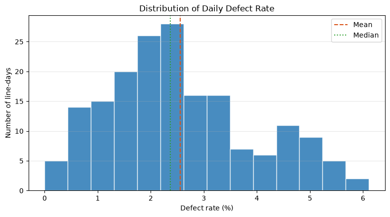
Reading the results
The defect rate is mostly in the lower areas, with the hem extending to the right side. Therefore, rather than using only averages as representative values, sharing medians and top quantiles at quality meetings makes it easier to explain the impact of a few deterioration days.
No.009: Viewing Relationships Between Variables in Scatter Plots
Meaning in Practice
If simultaneous increases in downtime and defect rates are observed, it becomes a hypothesis to prioritize investigating planning, restarts, and equipment malfunctions. Color-coding points by line makes it harder to confuse overall trends with differences in equipment groups.
Approach to Analysis and Modeling
Each point in the scatter plot is a one-line day. Stop time is placed on the horizontal axis and defect rate on the vertical axis, with lines for layering. We also check whether the relationships are curved, if the variance changes, or if there are any special points.
Check with Python
fig, ax = plt.subplots()
colors = {"L-A": "#2878B5", "L-B": "#F39C12", "L-C": "#3A923A"}
for line, part in df.groupby("line"):
    ax.scatter(part["downtime_min"], part["defect_rate_pct"], s=35, alpha=0.7, label=line, color=colors[line])
ax.set_title("Downtime and Daily Defect Rate by Line")
ax.set_xlabel("Downtime (minutes)")
ax.set_ylabel("Defect rate (%)")
ax.grid(alpha=0.3)
ax.legend(title="Line")
plt.tight_layout()
plt.show()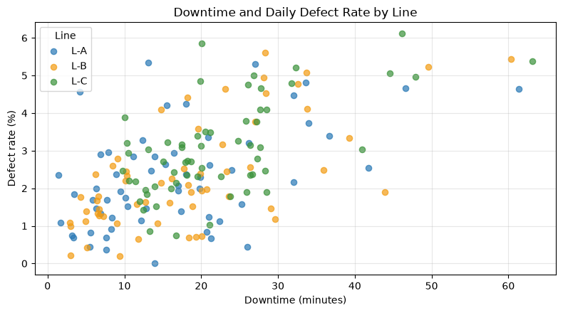
Reading the results
The longer the stopping time, the higher the defect rate, and line C tends to have more dots in the upper right. However, since a third factor, such as the ratio of product P-300, is also possible, it cannot be concluded that stopping is the cause of the defect based solely on the scatter chart.
No.010: Checking the Correlation Coefficient
Meaning in Practice
The correlation coefficient helps quickly search for strongly related combinations from numerous measurements and determines the order for site inspections. On the other hand, causality, nonlinear relationships, and relationships within the line are not automatically guaranteed.
Approach to Analysis and Modeling
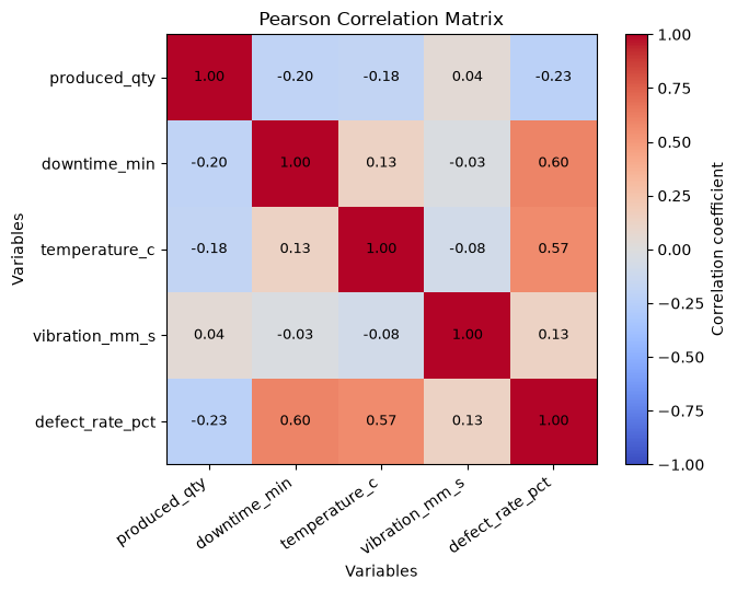
Pearson’s correlation coefficient is the value of covariance normalized with standard deviation. , take -1 to 1. Missing items are excluded per pair.
Check with Python
corr_cols = ["produced_qty", "downtime_min", "temperature_c", "vibration_mm_s", "defect_rate_pct"]
corr = df[corr_cols].corr().round(2)
display(corr)

fig, ax = plt.subplots(figsize=(7, 5.5))
im = ax.imshow(corr, cmap="coolwarm", vmin=-1, vmax=1)
ax.set_xticks(range(len(corr_cols)), corr_cols, rotation=35, ha="right")
ax.set_yticks(range(len(corr_cols)), corr_cols)
for i in range(len(corr_cols)):
    for j in range(len(corr_cols)):
        ax.text(j, i, f"{corr.iloc[i, j]:.2f}", ha="center", va="center", fontsize=9)
ax.set_title("Pearson Correlation Matrix")
ax.set_xlabel("Variables")
ax.set_ylabel("Variables")
ax.grid(False)
fig.colorbar(im, ax=ax, label="Correlation coefficient")
plt.tight_layout()
plt.show()| produced_qty | downtime_min | temperature_c | vibration_mm_s | defect_rate_pct | |
|---|---|---|---|---|---|
| produced_qty | 1.00 | -0.20 | -0.18 | 0.04 | -0.23 |
| downtime_min | -0.20 | 1.00 | 0.13 | -0.03 | 0.60 |
| temperature_c | -0.18 | 0.13 | 1.00 | -0.08 | 0.57 |
| vibration_mm_s | 0.04 | -0.03 | -0.08 | 1.00 | 0.13 |
| defect_rate_pct | -0.23 | 0.60 | 0.57 | 0.13 | 1.00 |
Reading the results
Defect rates show a positive correlation with downtime and temperature, while production volume shows a negative correlation. This aligns with the structure embedded in the hypothetical data, but the next analysis requires regression and chronological verification of products and lines.
Practical Implications Seen Through Target Exercise
In this initial diagnosis, the number of data entries and key granularity were as expected, there were a few missing vibration values, and the stop time and defect rate of line C were relatively high. Also, since the defect rate is not symmetrical, not only the average but also the median and upper quantiles should be used together.
The important thing is not to conclude that “Line C is the cause” or “Reducing stoppages will definitely reduce defects.” What we obtained here is a hypothesis for next matching maintenance history, product mix, scheduling, work teams, and measurement calibration. Descriptive statistics are not rituals before model building, but rather the process of clarifying the assumptions of analysis and decision-making risks.
What is necessary for practical implementation
- Data Definition Document: Clearly state the granularity, unit, calculation formula, and responsible department on one line.
- Automatic Acceptance Inspection: Check required columns, type, number of entries, duplicates, value range, and freshness
- Missing Reason Code: Distinguishing between communication outages, maintenance, downtime, and input gaps
- Layered Design: Make lines, products, equipment, work teams, and lots traceable.
- Rules of Judgment: Decide who decides to investigate, stop, and improve at what threshold
- Effectiveness Verification: Evaluate before and after improvement under comparable conditions for the same KPI
If personal information or trade secrets are involved, access control, anonymization, retention periods, and audit logs are also included in the design. Instead of directly running the search results in the notebook, we move them to processes that include regular execution, exception notifications, and version management.
Conclusion
From No.001 to No.010, we loaded the CSV and checked structure, type, missing data, statistics, category composition, distribution, and relationships between variables. By following this order, you can reduce input errors and aggregation illusions, and explain “what additional checks should be made” before moving on to machine learning.
The next practical step is to investigate the causes of vibration defects, stratify relationships by line and product, and cross-check them with maintenance histories. Connecting the meaning of the data with on-site judgments before model accuracy forms the foundation for continued analysis.
Consultations for Corporations
At Surikou Kobo, we support everything from inventory of manufacturing data, design of quality and equipment KPIs, PoC, construction of predictive and anomaly detection models, to on-site implementation, tailored to your challenges and data maturity. You can consult from stages such as “We have data, but where should we check?” or “Analysis results don’t lead to improvement activities.”
📩 Contact Us: surikobo.co.jp/contact
Please feel free to consult us first.