
100 Exercises / anomaly detection / Abnormality detection: 100 Exercises
Introduction to Multivariate Anomaly Detection in Manufacturing | Practicing PCA and Mahala Novis Distances with Python
Detecting Equipment Abnormalities Missed by Sensors Alone: Practical Multivariate Anomaly Detection (No.061–No.070)
In manufacturing equipment, even if temperature and pressure are within control ranges, there can be The relationship between multiple sensors is breaking down from normal operation.. In this article, we use a hypothetical continuous production facility as the subject matter and cover everything in a single flow: checking correlations, principal component analysis (PCA), reconstruction errors, Mahalanobis distances, and organizing possible causes.
The target is the No.061〜No.070(Chapter7Chapter: Multivariate Anomaly Detection) of “Abnormality Detection 100 Exercises.” The goal is not just to operate the model, but to translate it into a form that maintenance, quality, and production personnel can use to prioritize inspections and make decisions for additional measurements.
[!NOTE] This material is a notebook previously used by Surikoubo (or personally by the representative, Kazuyama), and has been reconstructed, edited, and published with the company’s permission.
All data listed is fictional and has no relation whatsoever to real companies, factories, or figures.
Introduction: Practical Challenges in Manufacturing Covered in This Article
In the continuous production facility “Mixer-A,” temperature, pressure, vibration, motor current, and coolant flow are monitored every minute. Monitoring the upper and lower limits of each sensor alone can sometimes overlook Relationship Abnormality such as insufficient cooling for the load or imbalances between pressure and flow rate.
The business questions this time are the following three points.
- How to quantify the relationships between sensors during normal operation
- How to narrow down the inspection targets from multiple detection methods
- How to connect abnormal scores to the initial response to cause investigation
Common situations on site
- Although the management limits for each sensor are observed, quality variability increases.
- Normal ranges fluctuate depending on equipment load and product types, and fixed thresholds increase false alarms
- As a result of increasing the number of sensors, it becomes difficult to confirm correlations and explain causes
- Even if abnormality scores can be achieved, maintenance staff cannot decide “where to check”
Multivariate anomaly detection does not replace univariate monitoring. The safety upper and lower limits should continue to be monitored as before, and the realistic positioning is to compensatorily assess any relationship breakdowns that occur within them.
Why is this issue so difficult to judge?
If is based on observations with sensors, the boundary between normal and abnormal is not a box parallel to each axis, but rather an oblique region reflecting the correlations between variables. Additionally, the normal state itself changes depending on operating conditions, variety, season, and sensor replacement.
Therefore, in practice, it is necessary to consider the following separately.
- Statistical Deviation: Is it deviating from the usual data from the past?
- Operational Abnormalities: Does it lead to safety, quality, and downtime risks?
- Responsiveness: Can the site be converted into a candidate cause that can be identified?
The model’s score is not a diagnostic result but rather evidence used to determine the inspection order.
Overview of Exercise covered this time
| No. | Theme | Practical deliverables |
|---|---|---|
| 061 | multivariate anomaly | Understanding the difference from univariate monitoring |
| 062 | correlation matrix | List of Normal Relationships |
| 063 | scatter plot matrix | Visual Confirmation of Nonlinear, Group, and Deviation Patterns |
| 064 | PCA | Summary to a few operating state axes |
| 065 | PCA Reconstruction Error | Deviation from Normal Structure |
| 066 | principal component space | Visualization of inspection candidates |
| 067 | Mahala Novis Distance | Correlation Consideration Distance |
| 068 | Distance Judgment | Manageable alert candidates |
| 069 | Cause Candidate Analysis | Sensor candidates with significant contributions |
| 070 | Notes on Higher Dimensions | Pre-implementation Checklist |
Preparing the Python environment
We use NumPy, pandas, matplotlib, and scikit-learn. External data is not loaded; random number seeds are fixed and reproducible. Notations in the graph are in English to avoid Japanese font differences depending on the execution environment.
import sys
import numpy as np
import pandas as pd
import matplotlib
import matplotlib.pyplot as plt
import sklearn
from pandas.plotting import scatter_matrix
from sklearn.decomposition import PCA
from sklearn.preprocessing import StandardScaler

SEED = 202507
rng = np.random.default_rng(SEED)
pd.set_option("display.max_columns", 20)
pd.set_option("display.float_format", lambda x: f"{x:,.3f}")

print(f"Python: {sys.version.split()[0]}")
print(f"NumPy: {np.__version__}, pandas: {pd.__version__}")
print(f"matplotlib: {matplotlib.__version__}, scikit-learn: {sklearn.__version__}")
Python: 3.13.1
NumPy: 2.5.1, pandas: 3.0.3
matplotlib: 3.11.0, scikit-learn: 1.9.0Creation of Fictional Data
We create 480 minutes of driving data. The first 360 minutes are reference period the equipment is stable, and the last 120 minutes are used as the monitoring period. Inject the following relationship breakdowns into part of the monitoring period.
- Cooling system abnormalities: High temperature relative to load and low cooling water flow rate
- Drive system abnormalities: High vibration and current relative to load
- Pressure system abnormalities: The normal relationship between pressure and flow rate is disrupted.
true_cause is a fictional label for verification. It is not used for learning or threshold setting.
n = 480
time = pd.date_range("2025-01-15 08:00", periods=n, freq="min")
load = np.clip(rng.normal(0, 1, n), -2.4, 2.4)
ambient = 0.7 * np.sin(np.linspace(0, 3 * np.pi, n)) + rng.normal(0, 0.15, n)

df = pd.DataFrame({
    "timestamp": time,
    "temperature_C": 68.0 + 2.2 * load + 0.8 * ambient + rng.normal(0, 0.45, n),
    "pressure_MPa": 1.80 + 0.18 * load + rng.normal(0, 0.035, n),
    "vibration_mm_s": 2.40 + 0.28 * load + rng.normal(0, 0.10, n),
    "motor_current_A": 42.0 + 4.8 * load + rng.normal(0, 0.75, n),
    "coolant_flow_L_min": 31.0 + 2.0 * load - 0.5 * ambient + rng.normal(0, 0.55, n),
})
df["true_cause"] = "normal"

anomaly_map = {
    "cooling_relation": [386, 387, 388, 389],
    "drive_relation": [421, 422, 423, 424],
    "pressure_relation": [458, 459, 460, 461],
}
for cause, idx in anomaly_map.items():
    df.loc[idx, "true_cause"] = cause
df.loc[anomaly_map["cooling_relation"], ["temperature_C", "coolant_flow_L_min"]] += [3.2, -3.0]
df.loc[anomaly_map["drive_relation"], ["vibration_mm_s", "motor_current_A"]] += [0.75, 5.5]
df.loc[anomaly_map["pressure_relation"], ["pressure_MPa", "coolant_flow_L_min"]] += [0.22, -2.6]

features = ["temperature_C", "pressure_MPa", "vibration_mm_s", "motor_current_A", "coolant_flow_L_min"]
train_mask = np.arange(n) < 360
print(f"Number of Data Entries: {len(df):,}, reference period: {train_mask.sum():,}, Monitoring Period: {(~train_mask).sum():,}")
df.head()
Number of data entries: 480, Reference period: 360, Monitoring period: 120| timestamp | temperature_C | pressure_MPa | vibration_mm_s | motor_current_A | coolant_flow_L_min | true_cause | |
|---|---|---|---|---|---|---|---|
| 0 | 2025-01-15 08:00:00 | 63.187 | 1.421 | 1.781 | 29.779 | 27.232 | normal |
| 1 | 2025-01-15 08:01:00 | 65.697 | 1.655 | 2.311 | 38.384 | 30.303 | normal |
| 2 | 2025-01-15 08:02:00 | 69.995 | 1.975 | 2.568 | 45.791 | 32.274 | normal |
| 3 | 2025-01-15 08:03:00 | 68.658 | 1.932 | 2.590 | 42.751 | 32.041 | normal |
| 4 | 2025-01-15 08:04:00 | 66.395 | 1.642 | 2.153 | 37.482 | 30.070 | normal |
No.061: Understanding What Multivariate Abnormalities Are
Meaning in Practice
Simply keeping it within the upper and lower limits does not guarantee the integrity of the equipment. For example, a temperature of 72°C and a cooling water flow rate of 29 L/min may be acceptable on their own, but under normal conditions under high load, it may seem unnatural.
Approach to Analysis and Modeling
Assuming the univariate rule is “temperature 63–75°C, pressure 1.4–2.2 MPa, vibration 1.6–3.4 mm/s, current 30–55 A, flow rate 25–38 L/min,” and check whether known relationship anomalies slip through.
Check with Python
limits = {
    "temperature_C": (63, 75), "pressure_MPa": (1.4, 2.2),
    "vibration_mm_s": (1.6, 3.4), "motor_current_A": (30, 55),
    "coolant_flow_L_min": (25, 38),
}
single_alarm = pd.Series(False, index=df.index)
for col, (low, high) in limits.items():
    single_alarm |= ~df[col].between(low, high)

comparison = pd.crosstab(df["true_cause"], single_alarm, rownames=["true_cause"], colnames=["single_limit_alarm"])
comparison| single_limit_alarm | False | True |
|---|---|---|
| true_cause | ||
| cooling_relation | 4 | 0 |
| drive_relation | 4 | 0 |
| normal | 453 | 15 |
| pressure_relation | 2 | 2 |
Reading the results
Even if there are points detected by univariate rules, it does not guarantee that all cases of relationship anomalies can be reliably detected. Conversely, it can also cause abnormalities at the edge of normal driving. Therefore, while keeping the safety limit monitoring, deviations from the correlation structure are used as separate scores.
No.062: Checking Correlation Matrix
Meaning in Practice
The correlation matrix lists which sensors are normally responding to the same operating load. Strong correlations provide clues to redundancy, but do not prove causation.
Approach to Analysis and Modeling
We calculate Pearson’s correlation coefficient just for the base period. Mixing in monitoring periods can alter the “normal relationship” itself.
Check with Python
corr = df.loc[train_mask, features].corr()
corr.round(2)| temperature_C | pressure_MPa | vibration_mm_s | motor_current_A | coolant_flow_L_min | |
|---|---|---|---|---|---|
| temperature_C | 1.000 | 0.940 | 0.910 | 0.950 | 0.900 |
| pressure_MPa | 0.940 | 1.000 | 0.930 | 0.970 | 0.930 |
| vibration_mm_s | 0.910 | 0.930 | 1.000 | 0.930 | 0.910 |
| motor_current_A | 0.950 | 0.970 | 0.930 | 1.000 | 0.940 |
| coolant_flow_L_min | 0.900 | 0.930 | 0.910 | 0.940 | 1.000 |
fig, ax = plt.subplots(figsize=(7, 5))
im = ax.imshow(corr, vmin=-1, vmax=1, cmap="coolwarm")
ax.set_xticks(range(len(features)), [c.replace("_", "\n") for c in features], rotation=35, ha="right")
ax.set_yticks(range(len(features)), [c.replace("_", " ") for c in features])
for i in range(len(features)):
    for j in range(len(features)):
        ax.text(j, i, f"{corr.iloc[i, j]:.2f}", ha="center", va="center", fontsize=8)
ax.set_title("Correlation matrix during baseline operation")
ax.set_xlabel("Sensor variable")
ax.set_ylabel("Sensor variable")
ax.grid(False)
fig.colorbar(im, ax=ax, label="Correlation coefficient")
plt.tight_layout()
plt.show()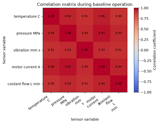
Reading the results
Positive correlations with current, temperature, and pressure are observed because they are generated in response to a common operating load. What matters here is not the size of the coefficient itself, but the Will this standard relationship be maintained going forward?. If there are multiple types or operating modes, correlations are checked for each mode.
No.063: Viewing Relationships Between Variables with Scatter Matrix
Meaning in Practice
The correlation coefficient alone overlooks curve relationships, multiple driving groups, and a few outliers. The scatter plot matrix is a diagnostic diagram used to identify on-site interview targets before model construction.
Approach to Analysis and Modeling
To make the display easier to read, we overlay outliers in the reference and monitoring periods for the four representative variables. Color is not the true cause but a classification between standard, monitoring normal, and verification anomalies.
Check with Python
plot_cols = ["temperature_C", "pressure_MPa", "motor_current_A", "coolant_flow_L_min"]
view = df.loc[::3, plot_cols].copy()
axes = scatter_matrix(view, figsize=(9, 9), diagonal="hist", alpha=0.45, color="#4C78A8")
abnormal = df[df["true_cause"] != "normal"]
for i, y in enumerate(plot_cols):
    for j, x in enumerate(plot_cols):
        ax = axes[i, j]
        if i != j:
            ax.scatter(abnormal[x], abnormal[y], color="#D62728", s=22, marker="x")
        ax.grid(True, alpha=0.25)
plt.suptitle("Scatter matrix: baseline pattern and injected relation anomalies", y=1.01)
plt.xlabel("Sensor value / red x: injected anomaly")
plt.ylabel("Sensor value")
plt.tight_layout()
plt.show()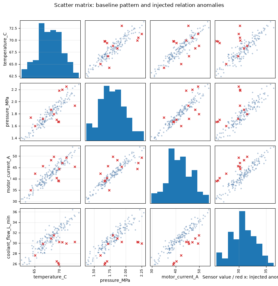
Reading the results
The red dots deviate from the elongated bands formed by normal point clouds, even if not extreme on individual axes. If the group splits into multiple groups, it is necessary to check the variety, arrangement, and return mode of operation rather than assuming abnormality.
No.064: Reducing Dimensions with PCA
Meaning in Practice
PCA summarizes a large number of correlated sensors into a few “operating state axes.” By reducing the number of surveillance screen axes, you can separate major fluctuations during normal operation from other minor relationship breakdowns.
Approach to Analysis and Modeling
Standardize sensors with different units and learn PCA within a reference period. The standardized matrix is defined by the principal component loading
to the projection. This time, we will adopt two principal components for visualization and reconstruction, but the number of adopteds will be determined not only by cumulative contribution rate but also by the cost of missed or false alarms.
Check with Python
scaler = StandardScaler()
X_train = scaler.fit_transform(df.loc[train_mask, features])
X_all = scaler.transform(df[features])

pca_full = PCA().fit(X_train)
explained = pd.DataFrame({
    "component": [f"PC{i}" for i in range(1, len(features) + 1)],
    "explained_ratio": pca_full.explained_variance_ratio_,
    "cumulative_ratio": np.cumsum(pca_full.explained_variance_ratio_),
})
explained| component | explained_ratio | cumulative_ratio | |
|---|---|---|---|
| 0 | PC1 | 0.945 | 0.945 |
| 1 | PC2 | 0.020 | 0.965 |
| 2 | PC3 | 0.019 | 0.984 |
| 3 | PC4 | 0.011 | 0.994 |
| 4 | PC5 | 0.006 | 1.000 |
fig, ax = plt.subplots(figsize=(7, 4))
ax.bar(explained["component"], explained["explained_ratio"], color="#4C78A8", label="Individual")
ax.plot(explained["component"], explained["cumulative_ratio"], color="#F58518", marker="o", label="Cumulative")
ax.set_title("PCA explained variance during baseline operation")
ax.set_xlabel("Principal component")
ax.set_ylabel("Explained variance ratio")
ax.set_ylim(0, 1.05)
ax.grid(True, axis="y", alpha=0.3)
ax.legend()
plt.tight_layout()
plt.show()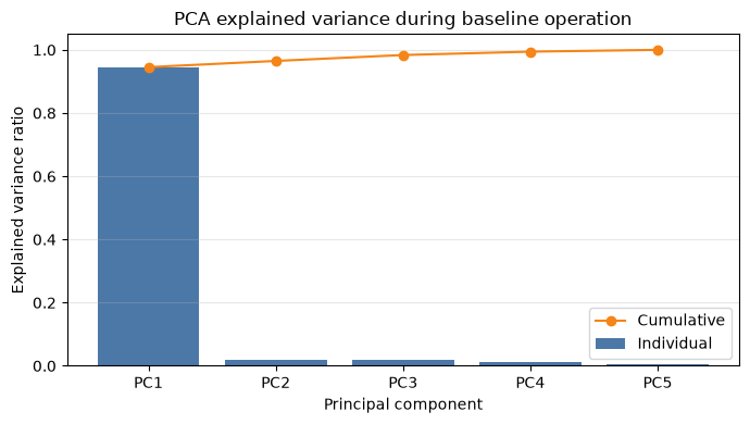
Reading the results
The first principal component represents the common load prominently, while the subsequent components show subtle differences between sensors. Since abnormal information can remain even in components with low contribution rates, it is necessary not only to “retain it until the cumulative contribution rate is high” but also to verify reconstruction errors.
No.065: Detecting Abnormalities Due to PCA Reconstruction Errors
Meaning in Practice
Observations that are difficult to reproduce with two main components of normal operation are considered inspection candidates that fall outside the main driving patterns. It becomes easier to distinguish between the high equipment load and the breakdown of sensor relationships.
Approach to Analysis and Modeling
The square error of standardized observation and reconstructed value
Let’s say so. The threshold is set at the 99th percentile of the reference period, and the alert rate expected under normal conditions is clearly indicated.
Check with Python
pca = PCA(n_components=2).fit(X_train)
scores = pca.transform(X_all)
X_reconstructed = pca.inverse_transform(scores)
reconstruction_error = np.sum((X_all - X_reconstructed) ** 2, axis=1)
pca_threshold = np.quantile(reconstruction_error[train_mask], 0.99)
df["pca_error"] = reconstruction_error
df["pca_alarm"] = df["pca_error"] > pca_threshold

pd.DataFrame({
    "baseline_99pct_threshold": [pca_threshold],
    "monitoring_alarms": [int(df.loc[~train_mask, "pca_alarm"].sum())],
    "monitoring_alarm_rate": [df.loc[~train_mask, "pca_alarm"].mean()],
})| baseline_99pct_threshold | monitoring_alarms | monitoring_alarm_rate | |
|---|---|---|---|
| 0 | 0.708 | 14 | 0.117 |
fig, ax = plt.subplots(figsize=(10, 4))
ax.plot(df["timestamp"], df["pca_error"], color="#4C78A8", linewidth=1, label="PCA reconstruction error")
ax.axhline(pca_threshold, color="#D62728", linestyle="--", label="Baseline 99th percentile")
ax.axvline(df.loc[360, "timestamp"], color="gray", linestyle=":", label="Monitoring start")
ax.scatter(df.loc[df["pca_alarm"], "timestamp"], df.loc[df["pca_alarm"], "pca_error"], color="#D62728", s=20)
ax.set_title("PCA reconstruction error over time")
ax.set_xlabel("Timestamp")
ax.set_ylabel("Squared reconstruction error")
ax.grid(True, alpha=0.3)
ax.legend(loc="upper left")
plt.tight_layout()
plt.show()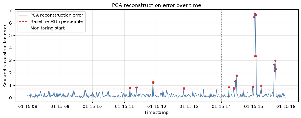
Reading the results
Times when the monitoring period exceeds the threshold are candidates that are difficult to explain with the usual structure. The 99th percentile is not a universal value. Even if the false alarm rate per minute is small, the number of cases accumulates during 24-hour operation, so the operating threshold is adjusted by considering the number of consecutive incidents and equipment downtime costs.
No.066: Visualizing Outliers in Principal Component Space
Meaning in Practice
The principal component space is a diagram that shares with the site whether the alert is “at the edge of the load” or “deviated from the usual group.” Alerts that freeze in the same direction may indicate a common cause or a series of events.
Approach to Analysis and Modeling
Set PC1 as the horizontal axis and PC2 as the vertical axis, and repeatedly alert for PCA reconstruction errors. However, even at points where the two diagrams overlap, the discarded components may be far apart.
Check with Python
fig, ax = plt.subplots(figsize=(7, 5))
ax.scatter(scores[train_mask, 0], scores[train_mask, 1], s=15, alpha=0.35, color="#4C78A8", label="Baseline")
monitor_normal = (~train_mask) & (~df["pca_alarm"].to_numpy())
ax.scatter(scores[monitor_normal, 0], scores[monitor_normal, 1], s=18, alpha=0.55, color="#54A24B", label="Monitoring / no alarm")
alarm = df["pca_alarm"].to_numpy()
ax.scatter(scores[alarm, 0], scores[alarm, 1], s=42, marker="x", color="#D62728", label="PCA alarm")
ax.set_title("Operating states in principal-component space")
ax.set_xlabel("PC1 score")
ax.set_ylabel("PC2 score")
ax.grid(True, alpha=0.3)
ax.legend()
plt.tight_layout()
plt.show()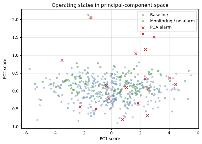
Reading the results
The position of the dot indicates similarity in driving conditions, and the color indicates the judgment result. Being at the edge of the main component space does not necessarily mean it is a failure. It checks against driving records such as high load and startup to confirm whether alerts for the same area repeat.
No.067: Calculating the Mahara Novis Distance
Meaning in Practice
Mahalanobis distance measures “how far you are from the usual center,” taking into account variability and correlation of variables. Changes along the correlation direction are relatively small, while changes across the relationship are highly valued.
Approach to Analysis and Modeling
For the mean of the reference period and the covariance matrix , the squared Mahalanobis distance
Let’s say so. For numerical stability, a pseudo-inverse matrix is used for the inverse.
Check with Python
mu = X_train.mean(axis=0)
cov = np.cov(X_train, rowvar=False)
precision = np.linalg.pinv(cov)
centered = X_all - mu
mahalanobis_sq = np.einsum("ij,jk,ik->i", centered, precision, centered)
df["mahalanobis_sq"] = mahalanobis_sq

df.loc[~train_mask, ["timestamp", "true_cause", "mahalanobis_sq"]].nlargest(10, "mahalanobis_sq")| timestamp | true_cause | mahalanobis_sq | |
|---|---|---|---|
| 424 | 2025-01-15 15:04:00 | drive_relation | 122.452 |
| 422 | 2025-01-15 15:02:00 | drive_relation | 108.729 |
| 421 | 2025-01-15 15:01:00 | drive_relation | 107.022 |
| 458 | 2025-01-15 15:38:00 | pressure_relation | 72.714 |
| 461 | 2025-01-15 15:41:00 | pressure_relation | 66.094 |
| 388 | 2025-01-15 14:28:00 | cooling_relation | 63.051 |
| 460 | 2025-01-15 15:40:00 | pressure_relation | 62.694 |
| 423 | 2025-01-15 15:03:00 | drive_relation | 60.361 |
| 459 | 2025-01-15 15:39:00 | pressure_relation | 57.027 |
| 387 | 2025-01-15 14:27:00 | cooling_relation | 53.034 |
Reading the results
The top list can be used as inspection priorities during the monitoring period. However, the reason for the long distance is not only due to breakdowns but also from unlearned, normal breeds and driving conditions. Saves distance rankings and driving context as a set.
No.068: Detecting Anomalies by Mahara Novis Distance
Meaning in Practice
By converting distance into alerts, you can plan the number of daily inspections and corresponding man-hours. Thresholds are determined not only by statistical significance but also by the number of cases the site can process and the cost of missed cases.
Approach to Analysis and Modeling
To avoid relying too heavily on distribution assumptions, we will also adopt the empirical 99th percentile of the base period. We also check for matches and discrepancies with PCA reconstruction errors, distinguishing between different types of deviations.
Check with Python
md_threshold = np.quantile(df.loc[train_mask, "mahalanobis_sq"], 0.99)
df["md_alarm"] = df["mahalanobis_sq"] > md_threshold

alarm_compare = pd.crosstab(
    df.loc[~train_mask, "pca_alarm"],
    df.loc[~train_mask, "md_alarm"],
    rownames=["PCA alarm"], colnames=["Mahalanobis alarm"],
)
print(f"Mahalanobis threshold (baseline 99th percentile): {md_threshold:.3f}")
alarm_compare
Mahalanobis threshold (baseline 99th percentile): 13.725| Mahalanobis alarm | False | True |
|---|---|---|
| PCA alarm | ||
| False | 102 | 4 |
| True | 3 | 11 |
evaluation = []
for method in ["pca_alarm", "md_alarm"]:
    for cause, idx in anomaly_map.items():
        evaluation.append({
            "method": method,
            "cause": cause,
            "detected": int(df.loc[idx, method].sum()),
            "injected": len(idx),
        })
pd.DataFrame(evaluation)| method | cause | detected | injected | |
|---|---|---|---|---|
| 0 | pca_alarm | cooling_relation | 2 | 4 |
| 1 | pca_alarm | drive_relation | 4 | 4 |
| 2 | pca_alarm | pressure_relation | 4 | 4 |
| 3 | md_alarm | cooling_relation | 4 | 4 |
| 4 | md_alarm | drive_relation | 4 | 4 |
| 5 | md_alarm | pressure_relation | 4 | 4 |
Reading the results
Points where both methods agree are prioritized, while discrepancies are examined for the nature of deviations. PCA reconstruction error is a relationship breakdown that cannot be explained by the main subspace, and the Mahalanobis distance responds to the overall distance from the center. You can check the number of detected cases on verification labels, but in actual production, continuous evaluation based on failure records and inspection results is necessary.
No.069: Analyzing Possible Causes of Multivariate Anomalies
Meaning in Practice
Simply saying “It’s abnormal” does not lead to an inspection. It indicates which sensors have deviated from the normal structure and translates them into the order of checking cooling systems, drive systems, and pressure systems.
Approach to Analysis and Modeling
Residuals in the PCA Standardized Space
Let the square of the variable be the candidate for contribution by variable. This is not causal contribution, but a Investigation clues indicating which variables constituted the reconstruction error.
Check with Python
residual_sq = (X_all - X_reconstructed) ** 2
contribution = pd.DataFrame(residual_sq, columns=features, index=df.index)
df["priority_alarm"] = df["pca_alarm"] & df["md_alarm"]
priority_idx = df.index[(~train_mask) & df["priority_alarm"]]

root_cause_rows = []
for idx in priority_idx:
    top = contribution.loc[idx].sort_values(ascending=False).head(2)
    root_cause_rows.append({
        "timestamp": df.loc[idx, "timestamp"],
        "true_cause_for_validation": df.loc[idx, "true_cause"],
        "first_sensor_candidate": top.index[0],
        "second_sensor_candidate": top.index[1],
        "pca_error": df.loc[idx, "pca_error"],
        "mahalanobis_sq": df.loc[idx, "mahalanobis_sq"],
    })
root_cause_table = pd.DataFrame(root_cause_rows).sort_values("pca_error", ascending=False)
root_cause_table.head(12)| timestamp | true_cause_for_validation | first_sensor_candidate | second_sensor_candidate | pca_error | mahalanobis_sq | |
|---|---|---|---|---|---|---|
| 4 | 2025-01-15 15:02:00 | drive_relation | vibration_mm_s | coolant_flow_L_min | 6.741 | 108.729 |
| 6 | 2025-01-15 15:04:00 | drive_relation | vibration_mm_s | coolant_flow_L_min | 6.655 | 122.452 |
| 3 | 2025-01-15 15:01:00 | drive_relation | vibration_mm_s | coolant_flow_L_min | 6.469 | 107.022 |
| 5 | 2025-01-15 15:03:00 | drive_relation | vibration_mm_s | coolant_flow_L_min | 3.355 | 60.361 |
| 9 | 2025-01-15 15:40:00 | pressure_relation | pressure_MPa | coolant_flow_L_min | 2.990 | 62.694 |
| 7 | 2025-01-15 15:38:00 | pressure_relation | pressure_MPa | coolant_flow_L_min | 2.671 | 72.714 |
| 10 | 2025-01-15 15:41:00 | pressure_relation | pressure_MPa | temperature_C | 2.274 | 66.094 |
| 8 | 2025-01-15 15:39:00 | pressure_relation | pressure_MPa | coolant_flow_L_min | 2.165 | 57.027 |
| 2 | 2025-01-15 14:28:00 | cooling_relation | vibration_mm_s | coolant_flow_L_min | 1.772 | 63.051 |
| 1 | 2025-01-15 14:26:00 | cooling_relation | vibration_mm_s | motor_current_A | 1.305 | 43.357 |
| 0 | 2025-01-15 14:14:00 | normal | vibration_mm_s | pressure_MPa | 0.836 | 15.219 |
top_idx = df.loc[(~train_mask) & df["priority_alarm"], "pca_error"].nlargest(8).index
plot_data = contribution.loc[top_idx]
fig, ax = plt.subplots(figsize=(9, 5))
bottom = np.zeros(len(plot_data))
for col in features:
    ax.bar(range(len(plot_data)), plot_data[col], bottom=bottom, label=col)
    bottom += plot_data[col].to_numpy()
ax.set_xticks(range(len(plot_data)), [df.loc[i, "timestamp"].strftime("%H:%M") for i in top_idx], rotation=45)
ax.set_title("Sensor-wise contribution candidates for priority alarms")
ax.set_xlabel("Alarm timestamp")
ax.set_ylabel("Squared standardized residual")
ax.grid(True, axis="y", alpha=0.3)
ax.legend(bbox_to_anchor=(1.02, 1), loc="upper left")
plt.tight_layout()
plt.show()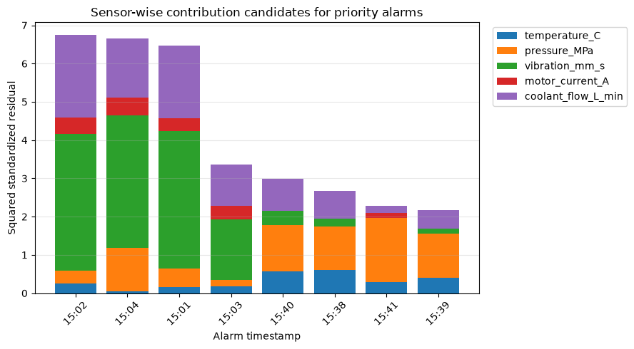
Reading the results
We compare the two highly contributing sensors with equipment diagrams, control logic, and maintenance history. For example, if temperature and coolant flow are high, heat exchanger dirt, valve opening, and flow meter drift are considered candidates. However, since contributions spread among correlated variables, you should not assume that the maximum value of the bar is the cause of failure.
No.070: Organizing Precautions for Anomaly Detection in High-Dimensional Data
Meaning in Practice
Increasing the number of sensors does not automatically improve accuracy. Redundant sensors, missing sensors, time offs, and mixed modes destabilize distance and covariance estimation, increasing maintenance workload.
Approach to Analysis and Modeling
For 360 reference data points, a noise column is added to the original five variables, and the number of conditions in the covariance matrix is compared with the variation in Mahalanobis distance. The larger the number of conditions, the more unstable the inverse matrix calculation tends to be, and the risk of overlearning increases with dimensions close to the number of data entries.
Check with Python
dimension_check = []
for noise_dim in [0, 5, 20, 50, 100]:
    extra_train = rng.normal(size=(train_mask.sum(), noise_dim))
    extra_monitor = rng.normal(size=((~train_mask).sum(), noise_dim))
    high_train = np.column_stack([X_train, extra_train])
    high_monitor = np.column_stack([X_all[~train_mask], extra_monitor])
    high_cov = np.cov(high_train, rowvar=False)
    high_precision = np.linalg.pinv(high_cov)
    high_mu = high_train.mean(axis=0)
    centered_monitor = high_monitor - high_mu
    d2 = np.einsum("ij,jk,ik->i", centered_monitor, high_precision, centered_monitor)
    dimension_check.append({
        "variables": high_train.shape[1],
        "samples_per_variable": high_train.shape[0] / high_train.shape[1],
        "covariance_condition_number": np.linalg.cond(high_cov),
        "monitor_distance_cv": d2.std() / d2.mean(),
    })
dimension_check = pd.DataFrame(dimension_check)
dimension_check| variables | samples_per_variable | covariance_condition_number | monitor_distance_cv | |
|---|---|---|---|---|
| 0 | 5 | 72.000 | 166.027 | 1.808 |
| 1 | 10 | 36.000 | 169.486 | 1.296 |
| 2 | 25 | 14.400 | 174.781 | 0.677 |
| 3 | 55 | 6.545 | 204.311 | 0.385 |
| 4 | 105 | 3.429 | 233.850 | 0.241 |
fig, ax1 = plt.subplots(figsize=(7, 4))
ax1.plot(dimension_check["variables"], dimension_check["samples_per_variable"], marker="o", color="#4C78A8")
ax1.set_title("Data support decreases as sensor dimensions grow")
ax1.set_xlabel("Number of variables")
ax1.set_ylabel("Baseline samples per variable")
ax1.set_yscale("log")
ax1.grid(True, which="both", alpha=0.3)
plt.tight_layout()
plt.show()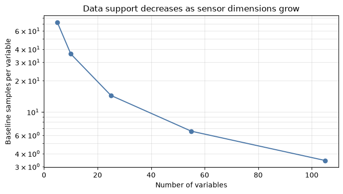
Reading the results
As the number of variables increases, the baseline data per variable decreases, reducing the reliability of covariance estimation. In practice, we check the following:
- Synchronize sensor time, organize errors, and calibration history
- Separate varieties, processes, and operating modes, and avoid mixing too many normal groups.
- Reduce columns and duplicate columns that are unrelated to the purpose
- Candidates include PCA, reduced covariance, and regularization
- Evaluating false positive rates under normal conditions outside the learning period
- Assign responsibility for explaining the cause and maintaining the model
Since the number of conditions in this simple experiment depends on random numbers, it is treated not as a quality standard but as a diagnostic indicator for dimensional increases.
Practical Implications Seen Through Target Exercise
- Univariate and multivariate measures are used together: Use safety limits as rules, and multivariate models as early candidates for relationship breakdowns.
- The quality of the reference period determines the model quality.: Information such as the period confirmed as normal, operating mode, and immediately after maintenance is required.
- Prioritizing multiple scores: Assign high priority to the matching between PCA and Mahala Novis distances, and investigate properties without discarding any mismatches.
- Explanations are not the causes, but inspection candidates: Variable contributions are linked to equipment knowledge and inspection results are recorded.
- The number of alertsKPIto make: Not only accuracy, but also daily number of cases, confirmation time, true cause arrival rate, and amount of avoidance of stoppages.
What is necessary for practical implementation
When moving from PoC to operation, the following designs are necessary.
| domain | confirmation item |
|---|---|
| Data | Tag definitions, units, cycles, time synchronization, missing items, calibration/exchange history |
| reference period | Coverage of normal judging cases, variety, load, and season, exclusion period |
| Reception | Comparison with failure and quality records, missed or false alarm costs, and out-of-time verification |
| Alert | Threshold, number of consecutive attempts, suppression time, priority, notification recipient |
| Business | Initial procedures, inspection checklists, result entry, and division of responsibilities |
| Utilization | Monitoring distribution changes, relearning conditions, model version management, audit logs |
It is practical to first narrow down to one equipment and one failure mode, and confirm whether candidates can be reproduced using historical data or whether the field can handle daily alerts.
Conclusion
From No.061 to No.070, we started with observations using correlation and scatter plots, quantified multivariate anomalies using PCA reconstruction error and Mahalanobis distance, and linked variable-specific residuals to possible causes.
The important thing is not to equate abnormal scores with fault diagnosis. The model shows the difference from normal driving. By layering operating conditions, equipment structure, maintenance history, and quality results, only then can inspection priorities be determined for decision-making.
Consultations for Corporations
At Suri Kobo, we support anomaly detection PoC for manufacturing industries, sensor data quality diagnosis, alert design, operational design including on-site explanation feasibility, and corporate training. Even if issues or existing data are not yet organized, you can consult us starting from the target equipment, decision-making, and evaluation methods.
📩 Contact Us: surikobo.co.jp/contact
Please feel free to consult us first.