
100 Exercises / anomaly detection / Abnormality detection: 100 Exercises
Using Abnormality Detection in Manufacturing Industry in Practice | 10 Exercise-On Design for Evaluation Indicators, Thresholds, and Alerts
Turning Manufacturing Equipment Anomalies into “Actionable Alerts”: 10 Exercise-On Indicators and Alert Design
Anomaly detection models do not create value on site simply by producing abnormal scores. This article uses equipment monitoring at a fictional processing plant as a subject, treating Indicators for measuring model quality and Which alerts should the limited maintenance man-hours be assigned to? as a single decision-making issue. The target is No.081 to No.090.
[!NOTE] This material is a notebook previously used by Surikoubo (or personally by the representative, Kazuyama), and has been reconstructed, edited, and published with the company’s permission.
All data listed is fictional and has no relation whatsoever to real companies, factories, or figures.
Introduction: Practical Challenges in Manufacturing Covered in This Article
Imagine a factory where abnormal scores are sent every 5 minutes from processing equipment. There are few true signs of failure, and there is an upper limit to the number of inspections that can be inspected. What is needed in this situation is not only a “highly accurate model,” but also operational design that simultaneously considers downtime due to missed detections, inspection man-hours due to false positives, the importance of the equipment, and response deadlines.
The goal of this article is not to report technical indicators. It’s about creating a state where At which threshold, how many items, in what order, and by who will check them? can be explained.
Common situations on site
- Anomalies occur in less than a few percent of all observations, and models that consistently judge only accuracy as “normal” also score high
- As false positives increase, inspectors lose trust in alerts.
- Missed opportunities can lead to sudden stoppages, work-in-progress disposal, and delivery delays, but losses vary by equipment
- Even with the same abnormal score, the order of response differs between critical and auxiliary equipment.
- Model evaluation and on-site alert management tables are separated.
Why is this issue so difficult to judge?
Raising the threshold to increase precision reduces false positives, but lowers Recall and increases missed detections. The same trade-off applies in the opposite direction. F1, ROC-AUC, and PR-AUC are all useful but do not directly indicate the amount, personnel, or response deadlines. Therefore, it is necessary to gradually connect statistical indicators, operational costs, and processing capacity.
Overview of Exercise covered this time
| No. | Theme | Connecting to decision-making |
|---|---|---|
| 081 | Evaluation Indicators | Creating a Comprehensive Picture of Judgment from Mixed Queues |
| 082 | Precision/Recall | Balancing false positives and missed spots |
| 083 | F1 Score | Comparing the two using a single metric |
| 084 | ROC-AUC | Check the identification order by full threshold |
| 085 | PR-AUC | See effective performance against rare anomalies |
| 086 | False positives and missed costs | Translate technical errors into amounts |
| 087 | Threshold optimization | Choose investment points with lower expected costs |
| 088 | Number of alerts | Understand daily and line loads |
| 089 | priority | Decide the order of response based on importance and urgency |
| 090 | On-site Operation Design | Setting SLAs, Restraints, and Escalations |
Preparing the Python environment
No external data is used; only NumPy, pandas, Matplotlib, and scikit-learn are used. Fix the random number seed so you can reproduce the same result. To avoid environment-dependent garbled text, the graphs are displayed in English, and the text supplements Japanese reading.
import sys
import numpy as np
import pandas as pd
import matplotlib
import matplotlib.pyplot as plt

from sklearn.metrics import (
    confusion_matrix, precision_score, recall_score, f1_score,
    roc_curve, roc_auc_score, precision_recall_curve, average_precision_score,
)

SEED = 202509
rng = np.random.default_rng(SEED)
pd.set_option("display.max_columns", 20)
pd.set_option("display.float_format", lambda x: f"{x:,.3f}")

print("Python     :", sys.version.split()[0])
print("NumPy      :", np.__version__)
print("pandas     :", pd.__version__)
print("Matplotlib :", matplotlib.__version__)
Python : 3.13.1
NumPy : 2.5.1
pandas : 3.0.3
Matplotlib : 3.11.0Creation of Fictional Data
Over 30 days, we create 1,200 judgment opportunities from 3 lines and 6 pieces of equipment. actual_anomaly indicates the correct answer confirmed by later inspection and failure records, and anomaly_score indicates the abnormality level from 0 to 1 as shown by the model. The abnormality rate is kept at about 6%, creating an imbalance close to reality. Additionally, it provides equipment criticality, downtime impact amount, and elapsed time since detection.
n = 1200
timestamps = pd.date_range("2025-01-01", periods=n, freq="36min")
lines = rng.choice(["Line-A", "Line-B", "Line-C"], n, p=[0.40, 0.35, 0.25])
machines = np.array([f"{line}-M{rng.integers(1, 3)}" for line in lines])
actual = rng.binomial(1, 0.06, n)

# Partial overlap of normal and abnormal distributions creates situations where complete distinction cannot be made
score = np.where(actual == 1, rng.beta(5.0, 2.2, n), rng.beta(1.5, 6.0, n))
score = np.clip(score + np.where(lines == "Line-C", 0.025, 0), 0, 1)
criticality = np.where(lines == "Line-A", 3, np.where(lines == "Line-B", 2, 1))
impact_k_yen = criticality * rng.integers(350, 701, n)  # Suspension impact (thousand yen)
elapsed_min = rng.integers(5, 181, n)

df = pd.DataFrame({
    "timestamp": timestamps, "line": lines, "machine": machines,
    "actual_anomaly": actual, "anomaly_score": score,
    "criticality": criticality, "impact_k_yen": impact_k_yen,
    "elapsed_min": elapsed_min,
})
df["date"] = df["timestamp"].dt.date

print(f"Number of observations: {len(df):,}records / True anomaly: {df['actual_anomaly'].sum():,}records "
      f"({df['actual_anomaly'].mean():.1%})")
display(df.head())
Number of observations: 1,200 / True anomalies: 64 (5.3%)| timestamp | line | machine | actual_anomaly | anomaly_score | criticality | impact_k_yen | elapsed_min | date | |
|---|---|---|---|---|---|---|---|---|---|
| 0 | 2025-01-01 00:00:00 | Line-B | Line-B-M2 | 0 | 0.253 | 2 | 962 | 10 | 2025-01-01 |
| 1 | 2025-01-01 00:36:00 | Line-C | Line-C-M2 | 0 | 0.367 | 1 | 622 | 98 | 2025-01-01 |
| 2 | 2025-01-01 01:12:00 | Line-A | Line-A-M2 | 1 | 0.610 | 3 | 1761 | 177 | 2025-01-01 |
| 3 | 2025-01-01 01:48:00 | Line-A | Line-A-M1 | 0 | 0.264 | 3 | 1059 | 25 | 2025-01-01 |
| 4 | 2025-01-01 02:24:00 | Line-A | Line-A-M2 | 0 | 0.113 | 3 | 1098 | 20 | 2025-01-01 |
fig, ax = plt.subplots(figsize=(9, 4.5))
ax.hist(df.loc[df["actual_anomaly"] == 0, "anomaly_score"], bins=25,
        alpha=0.65, label="Normal", color="#4C78A8")
ax.hist(df.loc[df["actual_anomaly"] == 1, "anomaly_score"], bins=25,
        alpha=0.65, label="Anomaly", color="#E45756")
ax.set_title("Anomaly score distribution by actual class")
ax.set_xlabel("Anomaly score")
ax.set_ylabel("Number of observations")
ax.grid(True, alpha=0.3)
ax.legend()
fig.tight_layout()
plt.show()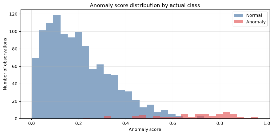
No.081: Organizing Evaluation Indicators for Anomaly Detection
Meaning in Practice
First, predictions and actual results are divided into four categories: TP (Correct Detection), FP (False Positive), FN (Miss), and TN (Correct Positive Judgment). At the factory, FP is not required for inspection, while FN is used to address the risk of sudden shutdowns. It’s important not only to focus on accuracy but also to share this breakdown during management meetings.
Approach to Analysis and Modeling
Set the threshold to and the score as an alert. The representative indicators are as follows.
\mathrm{Recall}=\frac{TP}{TP+FN}$$ First, set the provisional threshold of 0.50 to create an evaluation table. ### Check with Python ```python def metrics_at_threshold(data, threshold): y_true = data["actual_anomaly"].to_numpy() y_pred = (data["anomaly_score"].to_numpy() >= threshold).astype(int) tn, fp, fn, tp = confusion_matrix(y_true, y_pred).ravel() return {"threshold": threshold, "TP": tp, "FP": fp, "FN": fn, "TN": tn, "precision": precision_score(y_true, y_pred, zero_division=0), "recall": recall_score(y_true, y_pred, zero_division=0), "f1": f1_score(y_true, y_pred, zero_division=0), "accuracy": (tp + tn) / len(y_true)} base = metrics_at_threshold(df, 0.50) display(pd.DataFrame([base])) display(pd.DataFrame([[base["TN"], base["FP"]], [base["FN"], base["TP"]]], index=["Actual normal", "Actual anomaly"], columns=["Predicted normal", "Predicted alert"])) ``` <style scoped> .dataframe tbody tr th:only-of-type { vertical-align: middle; } .dataframe tbody tr th { vertical-align: top; } .dataframe thead th { text-align: right; } </style> <table border="1" class="dataframe"> <thead> <tr style="text-align: right;"> <th></th> <th>threshold</th> <th>TP</th> <th>FP</th> <th>FN</th> <th>TN</th> <th>precision</th> <th>recall</th> <th>f1</th> <th>accuracy</th> </tr> </thead> <tbody> <tr> <th>0</th> <td>0.500</td> <td>53</td> <td>41</td> <td>11</td> <td>1095</td> <td>0.564</td> <td>0.828</td> <td>0.671</td> <td>0.957</td> </tr> </tbody> </table> <style scoped> .dataframe tbody tr th:only-of-type { vertical-align: middle; } .dataframe tbody tr th { vertical-align: top; } .dataframe thead th { text-align: right; } </style> <table border="1" class="dataframe"> <thead> <tr style="text-align: right;"> <th></th> <th>Predicted normal</th> <th>Predicted alert</th> </tr> </thead> <tbody> <tr> <th>Actual normal</th> <td>1095</td> <td>41</td> </tr> <tr> <th>Actual anomaly</th> <td>11</td> <td>53</td> </tr> </tbody> </table> ### Reading the results Even if accuracy is high, anomalies are rare, so you can't be reassured. Looking at TP, FP, and FN by actual number of cases, it becomes clear how many tasks are generated for inspection staff and how many signs are missed. The following indicators summarize this mixed sequence from different perspectives. ## No.082: Confirm Precision Recall ### Meaning in Practice Precision is about "how much is truly abnormal when an alert is activated," which relates to on-site trust and inspection efficiency. Recall refers to "how much actual anomaly has been detected," and relates to the strength of the conservation safety net. ### Approach to Analysis and Modeling When the threshold is lowered, Recall generally goes up and Precision goes down. Not only a single value, but also two indicators and the number of alerts for each candidate threshold are compared. ### Check with Python ```python thresholds = np.arange(0.20, 0.86, 0.05) tradeoff = pd.DataFrame([metrics_at_threshold(df, t) for t in thresholds]) tradeoff["alerts"] = tradeoff["TP"] + tradeoff["FP"] display(tradeoff[["threshold", "precision", "recall", "alerts"]].round(3)) fig, ax = plt.subplots(figsize=(8, 4.5)) ax.plot(tradeoff["threshold"], tradeoff["precision"], marker="o", label="Precision") ax.plot(tradeoff["threshold"], tradeoff["recall"], marker="s", label="Recall") ax.set_title("Precision and recall by threshold") ax.set_xlabel("Threshold") ax.set_ylabel("Metric value") ax.set_ylim(0, 1.05) ax.grid(True, alpha=0.3) ax.legend() fig.tight_layout() plt.show() ``` <style scoped> .dataframe tbody tr th:only-of-type { vertical-align: middle; } .dataframe tbody tr th { vertical-align: top; } .dataframe thead th { text-align: right; } </style> <table border="1" class="dataframe"> <thead> <tr style="text-align: right;"> <th></th> <th>threshold</th> <th>precision</th> <th>recall</th> <th>alerts</th> </tr> </thead> <tbody> <tr> <th>0</th> <td>0.200</td> <td>0.114</td> <td>1.000</td> <td>561</td> </tr> <tr> <th>1</th> <td>0.250</td> <td>0.149</td> <td>0.984</td> <td>422</td> </tr> <tr> <th>2</th> <td>0.300</td> <td>0.194</td> <td>0.984</td> <td>325</td> </tr> <tr> <th>3</th> <td>0.350</td> <td>0.255</td> <td>0.938</td> <td>235</td> </tr> <tr> <th>4</th> <td>0.400</td> <td>0.355</td> <td>0.938</td> <td>169</td> </tr> <tr> <th>5</th> <td>0.450</td> <td>0.483</td> <td>0.906</td> <td>120</td> </tr> <tr> <th>6</th> <td>0.500</td> <td>0.564</td> <td>0.828</td> <td>94</td> </tr> <tr> <th>7</th> <td>0.550</td> <td>0.681</td> <td>0.766</td> <td>72</td> </tr> <tr> <th>8</th> <td>0.600</td> <td>0.833</td> <td>0.703</td> <td>54</td> </tr> <tr> <th>9</th> <td>0.650</td> <td>0.891</td> <td>0.641</td> <td>46</td> </tr> <tr> <th>10</th> <td>0.700</td> <td>0.900</td> <td>0.562</td> <td>40</td> </tr> <tr> <th>11</th> <td>0.750</td> <td>0.963</td> <td>0.406</td> <td>27</td> </tr> <tr> <th>12</th> <td>0.800</td> <td>1.000</td> <td>0.328</td> <td>21</td> </tr> <tr> <th>13</th> <td>0.850</td> <td>1.000</td> <td>0.156</td> <td>10</td> </tr> </tbody> </table> 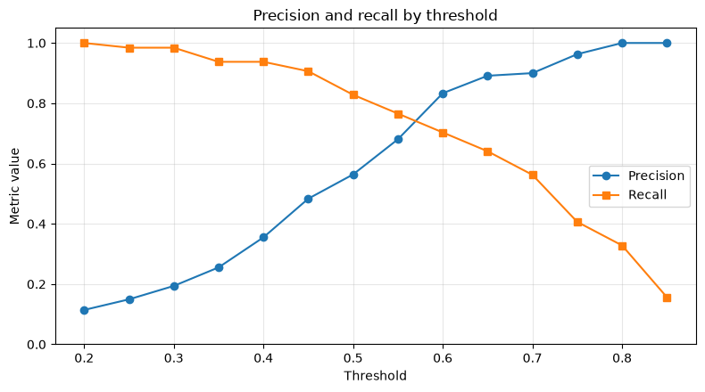 ### Reading the results A low threshold reduces missed cases but also generates numerous false positives. A high threshold improves inspection efficiency but fails to detect abnormalities. In factories, specifying safety-side constraints such as "Recall 90% or higher" with processing capacity constraints like "no more than 10 cases per day" can make the discussion more concrete. ## No.083: Check F1 Score ### Meaning in Practice When you want to compare multiple models or thresholds with a single number, F1, which is a harmonic average of Precision and Recall, is useful. However, since false positives and missed cases are treated with equal weight, the final operational decisions should not be left solely to F1. ### Approach to Analysis and Modeling $$F_1=2\frac{\mathrm{Precision}\times\mathrm{Recall}} {\mathrm{Precision}+\mathrm{Recall}}$$ If either is lower, F1 will also be low. Check the most important points among the candidates. ### Check with Python ```python f1_best = tradeoff.loc[tradeoff["f1"].idxmax()] display(tradeoff[["threshold", "precision", "recall", "f1"]].round(3)) print(f"under candidateF1largest: threshold={f1_best['threshold']:.2f}, " f"F1={f1_best['f1']:.3f}") fig, ax = plt.subplots(figsize=(8, 4.5)) ax.plot(tradeoff["threshold"], tradeoff["f1"], marker="o", color="#59A14F") ax.axvline(f1_best["threshold"], linestyle="--", color="#E15759", label="Best F1") ax.set_title("F1 score by threshold") ax.set_xlabel("Threshold") ax.set_ylabel("F1 score") ax.set_ylim(0, 1.05) ax.grid(True, alpha=0.3) ax.legend() fig.tight_layout() plt.show() ``` <style scoped> .dataframe tbody tr th:only-of-type { vertical-align: middle; } .dataframe tbody tr th { vertical-align: top; } .dataframe thead th { text-align: right; } </style> <table border="1" class="dataframe"> <thead> <tr style="text-align: right;"> <th></th> <th>threshold</th> <th>precision</th> <th>recall</th> <th>f1</th> </tr> </thead> <tbody> <tr> <th>0</th> <td>0.200</td> <td>0.114</td> <td>1.000</td> <td>0.205</td> </tr> <tr> <th>1</th> <td>0.250</td> <td>0.149</td> <td>0.984</td> <td>0.259</td> </tr> <tr> <th>2</th> <td>0.300</td> <td>0.194</td> <td>0.984</td> <td>0.324</td> </tr> <tr> <th>3</th> <td>0.350</td> <td>0.255</td> <td>0.938</td> <td>0.401</td> </tr> <tr> <th>4</th> <td>0.400</td> <td>0.355</td> <td>0.938</td> <td>0.515</td> </tr> <tr> <th>5</th> <td>0.450</td> <td>0.483</td> <td>0.906</td> <td>0.630</td> </tr> <tr> <th>6</th> <td>0.500</td> <td>0.564</td> <td>0.828</td> <td>0.671</td> </tr> <tr> <th>7</th> <td>0.550</td> <td>0.681</td> <td>0.766</td> <td>0.721</td> </tr> <tr> <th>8</th> <td>0.600</td> <td>0.833</td> <td>0.703</td> <td>0.763</td> </tr> <tr> <th>9</th> <td>0.650</td> <td>0.891</td> <td>0.641</td> <td>0.745</td> </tr> <tr> <th>10</th> <td>0.700</td> <td>0.900</td> <td>0.562</td> <td>0.692</td> </tr> <tr> <th>11</th> <td>0.750</td> <td>0.963</td> <td>0.406</td> <td>0.571</td> </tr> <tr> <th>12</th> <td>0.800</td> <td>1.000</td> <td>0.328</td> <td>0.494</td> </tr> <tr> <th>13</th> <td>0.850</td> <td>1.000</td> <td>0.156</td> <td>0.270</td> </tr> </tbody> </table> Maximum F1 candidate candidate: threshold=0.60, F1=0.763 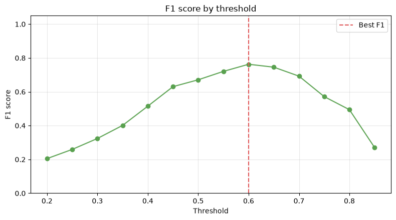 ### Reading the results The F1 maximum point is useful as a statistical baseline. However, in factories where the stop loss is orders of magnitude greater than inspection costs, a threshold lower than the F1 maximum point may be reasonable. F1 serves as a "narrowing indicator" for narrowing down candidates, while cost evaluation is a "metric for determining investment points." ## No.084: Checking ROC-AUC ### Meaning in Practice ROC-AUC can be interpreted as the probability that randomly selected abnormal data will score higher than the normal data. This is an indicator that confirms the model's ability to rank anomalies at the top before setting a threshold. ### Approach to Analysis and Modeling The ROC curve plots the false positive rate $FPR=FP/(FP+TN)$ and the true positive rate (Recall) at full thresholds. The closer the AUC is to 1, the better the ranking, and 0.5 is equivalent to a random result. However, when abnormalities are rare, note that the FPR appears small due to a large number of TNs. ### Check with Python ```python y_true = df["actual_anomaly"].to_numpy() y_score = df["anomaly_score"].to_numpy() fpr, tpr, roc_thresholds = roc_curve(y_true, y_score) roc_auc = roc_auc_score(y_true, y_score) print(f"ROC-AUC: {roc_auc:.3f}") fig, ax = plt.subplots(figsize=(6, 5)) ax.plot(fpr, tpr, label=f"ROC-AUC = {roc_auc:.3f}", color="#4C78A8") ax.plot([0, 1], [0, 1], linestyle="--", color="gray", label="Random") ax.set_title("ROC curve") ax.set_xlabel("False positive rate") ax.set_ylabel("True positive rate") ax.grid(True, alpha=0.3) ax.legend() fig.tight_layout() plt.show() ``` ROC-AUC: 0.976 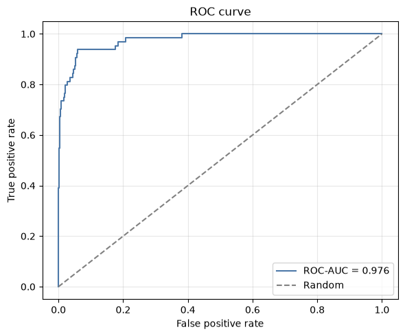 ### Reading the results A higher ROC-AUC means that prioritization based on scores is worth considering. However, AUC does not know how many false positives are generated per day. For anomaly detection with strong class imbalance, the following PR-AUC and actual case counts are always used together. ## No.085: Check PR-AUC ### Meaning in Practice The PR curve directly represents the exchange between alert accuracy and anomaly recall. In manufacturing data where anomalies are rare, the evaluation makes it easier to imagine on-site loads than the ROC curve. ### Approach to Analysis and Modeling Here, we use Average Precision (AP) as a summary of the PR curve. The standard for random ranking is generally the abnormality rate. Therefore, AP looks not only at absolute values but also at how much improvement has been made from the baseline anomaly rate. ### Check with Python ```python precision_curve, recall_curve, pr_thresholds = precision_recall_curve(y_true, y_score) pr_auc = average_precision_score(y_true, y_score) baseline = y_true.mean() print(f"PR-AUC (Average Precision): {pr_auc:.3f}") print(f"Random Criteria (Anomaly Rate) : {baseline:.3f}") fig, ax = plt.subplots(figsize=(6, 5)) ax.plot(recall_curve, precision_curve, label=f"AP = {pr_auc:.3f}", color="#F28E2B") ax.axhline(baseline, linestyle="--", color="gray", label=f"Baseline = {baseline:.3f}") ax.set_title("Precision-recall curve") ax.set_xlabel("Recall") ax.set_ylabel("Precision") ax.set_xlim(0, 1.02) ax.set_ylim(0, 1.02) ax.grid(True, alpha=0.3) ax.legend() fig.tight_layout() plt.show() ``` PR-AUC (Average Precision): 0.835 Random Criteria (Anomaly Rate): 0.053 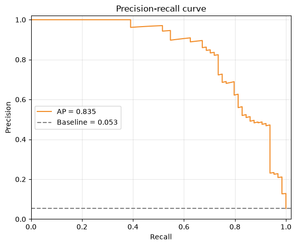 ### Reading the results If PR-AUC significantly exceeds the anomaly rate, then the operation of checking the top alerts makes sense. However, AP is also average. If the on-site processing capacity is in the top 50, the precision and number of cases captured within that range are separately checked. ## No.086: Organizing the Costs of False Positives and Missed Spots ### Meaning in Practice Even with the same case, FP causes inspection time, while FN causes stoppages, disposal, and delivery delays. When the margin of error is converted into amounts, manufacturing, maintenance, and management can discuss thresholds on the same scale. ### Approach to Analysis and Modeling Let's define a simple expected cost as follows. $$C(t)=c_{FP}\,FP(t)+c_{FN}\,FN(t)+c_{TP}\,TP(t)$$ $c_{FP}$ is the cost of unnecessary inspections, $c_{FN}$ is the missed loss, and $c_{TP}$ is the preventive inspection fee when the item is correctly detected. Here, we assume 20,000 yen, 800,000 yen, and 50,000 yen per case. In practice, it is further subdivided by the amount of downtime impact and safety impact by equipment type. ### Check with Python ```python COST_FP = 20_000 COST_FN = 800_000 COST_TP = 50_000 cost_table = tradeoff.copy() cost_table["false_alarm_cost_yen"] = cost_table["FP"] * COST_FP cost_table["miss_cost_yen"] = cost_table["FN"] * COST_FN cost_table["planned_check_cost_yen"] = cost_table["TP"] * COST_TP cost_table["total_cost_yen"] = cost_table[[ "false_alarm_cost_yen", "miss_cost_yen", "planned_check_cost_yen" ]].sum(axis=1) display(cost_table[["threshold", "FP", "FN", "TP", "total_cost_yen"]] .assign(total_cost_yen=lambda x: x["total_cost_yen"].map("¥{:,.0f}".format))) ``` <style scoped> .dataframe tbody tr th:only-of-type { vertical-align: middle; } .dataframe tbody tr th { vertical-align: top; } .dataframe thead th { text-align: right; } </style> <table border="1" class="dataframe"> <thead> <tr style="text-align: right;"> <th></th> <th>threshold</th> <th>FP</th> <th>FN</th> <th>TP</th> <th>total_cost_yen</th> </tr> </thead> <tbody> <tr> <th>0</th> <td>0.200</td> <td>497</td> <td>0</td> <td>64</td> <td>¥13,140,000</td> </tr> <tr> <th>1</th> <td>0.250</td> <td>359</td> <td>1</td> <td>63</td> <td>¥11,130,000</td> </tr> <tr> <th>2</th> <td>0.300</td> <td>262</td> <td>1</td> <td>63</td> <td>¥9,190,000</td> </tr> <tr> <th>3</th> <td>0.350</td> <td>175</td> <td>4</td> <td>60</td> <td>¥9,700,000</td> </tr> <tr> <th>4</th> <td>0.400</td> <td>109</td> <td>4</td> <td>60</td> <td>¥8,380,000</td> </tr> <tr> <th>5</th> <td>0.450</td> <td>62</td> <td>6</td> <td>58</td> <td>¥8,940,000</td> </tr> <tr> <th>6</th> <td>0.500</td> <td>41</td> <td>11</td> <td>53</td> <td>¥12,270,000</td> </tr> <tr> <th>7</th> <td>0.550</td> <td>23</td> <td>15</td> <td>49</td> <td>¥14,910,000</td> </tr> <tr> <th>8</th> <td>0.600</td> <td>9</td> <td>19</td> <td>45</td> <td>¥17,630,000</td> </tr> <tr> <th>9</th> <td>0.650</td> <td>5</td> <td>23</td> <td>41</td> <td>¥20,550,000</td> </tr> <tr> <th>10</th> <td>0.700</td> <td>4</td> <td>28</td> <td>36</td> <td>¥24,280,000</td> </tr> <tr> <th>11</th> <td>0.750</td> <td>1</td> <td>38</td> <td>26</td> <td>¥31,720,000</td> </tr> <tr> <th>12</th> <td>0.800</td> <td>0</td> <td>43</td> <td>21</td> <td>¥35,450,000</td> </tr> <tr> <th>13</th> <td>0.850</td> <td>0</td> <td>54</td> <td>10</td> <td>¥43,700,000</td> </tr> </tbody> </table> ### Reading the results Because the missed unit price is set high, even a small number of FNs have a significant impact on total costs. Even if the unit price is not a precise accounting value, you can confirm the robustness of decision-making by setting three scenarios: pessimism, standard, and optimism. Abnormalities related to safety or legal regulations are treated not only as monetary conversion but also as restrictions on the "Recall Lower Limit." ## No.087: Setting the threshold based on operational costs ### Meaning in Practice Thresholds are not parameters set solely by model developers. These are operational rules that reflect maintenance processing capacity, downtime losses, and safety requirements. It simultaneously indicates the minimum cost points and operational constraints, creating an approvable basis. ### Approach to Analysis and Modeling Candidate thresholds are thoroughly scanned to minimize expected costs. We also check examples where a Recall rate of 85% or higher is mandatory. By optimizing with constraints, the design does not offset safety requirements at the cost of protection. ### Check with Python ```python fine_thresholds = np.linspace(0.10, 0.90, 161) optimization = pd.DataFrame([metrics_at_threshold(df, t) for t in fine_thresholds]) optimization["alerts"] = optimization["TP"] + optimization["FP"] optimization["total_cost_yen"] = ( optimization["FP"] * COST_FP + optimization["FN"] * COST_FN + optimization["TP"] * COST_TP ) best_cost = optimization.loc[optimization["total_cost_yen"].idxmin()] feasible = optimization[optimization["recall"] >= 0.85] best_constrained = feasible.loc[feasible["total_cost_yen"].idxmin()] display(pd.DataFrame([best_cost, best_constrained], index=["Minimum cost", "Minimum cost with Recall >= 0.85"])[ ["threshold", "precision", "recall", "f1", "alerts", "total_cost_yen"] ].round(3)) fig, ax = plt.subplots(figsize=(8, 4.5)) ax.plot(optimization["threshold"], optimization["total_cost_yen"] / 1_000_000, color="#B279A2") ax.axvline(best_constrained["threshold"], linestyle="--", color="#E15759", label="Selected threshold") ax.set_title("Expected business cost by threshold") ax.set_xlabel("Threshold") ax.set_ylabel("Total cost (million JPY)") ax.grid(True, alpha=0.3) ax.legend() fig.tight_layout() plt.show() SELECTED_THRESHOLD = float(best_constrained["threshold"]) df["alert"] = (df["anomaly_score"] >= SELECTED_THRESHOLD).astype(int) print(f"Adoption threshold: {SELECTED_THRESHOLD:.3f}") ``` <style scoped> .dataframe tbody tr th:only-of-type { vertical-align: middle; } .dataframe tbody tr th { vertical-align: top; } .dataframe thead th { text-align: right; } </style> <table border="1" class="dataframe"> <thead> <tr style="text-align: right;"> <th></th> <th>threshold</th> <th>precision</th> <th>recall</th> <th>f1</th> <th>alerts</th> <th>total_cost_yen</th> </tr> </thead> <tbody> <tr> <th>Minimum cost</th> <td>0.440</td> <td>0.451</td> <td>0.938</td> <td>0.609</td> <td>133.000</td> <td>7,660,000.000</td> </tr> <tr> <th>Minimum cost with Recall >= 0.85</th> <td>0.440</td> <td>0.451</td> <td>0.938</td> <td>0.609</td> <td>133.000</td> <td>7,660,000.000</td> </tr> </tbody> </table> 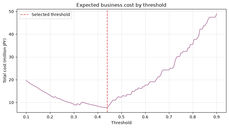 Adoption threshold: 0.440 ### Reading the results The adoption value was set not by "F1 Maximum," but by an explainable rule of "minimum expected cost while meeting the Recall constraint." Since the optimal value also changes when unit prices or constraints change, the threshold and assumptions are managed together in the board. ## No.088: Aggregating the Number of Alerts ### Meaning in Practice Even if the total number of cases is within an acceptable range, concentrating on a specific day or line will make it impossible to respond. Visualizes daily and line-by-line loads and connects them to shift personnel and patrol plans. ### Approach to Analysis and Modeling Alerts are aggregated by date and line to detect days exceeding daily processing capacity. Here, we assume the standard processing capacity of 8 cases per day for the entire factory. The aggregation granularity is aligned with the assigned units assigned to actual operations. ### Check with Python ```python daily_line = (df[df["alert"] == 1] .pivot_table(index="date", columns="line", values="alert", aggfunc="sum", fill_value=0)) daily_line["Total"] = daily_line.sum(axis=1) DAILY_CAPACITY = 8 daily_line["Over capacity"] = daily_line["Total"] > DAILY_CAPACITY display(daily_line.head(10)) print(f"Processing capacity exceeded date: {daily_line['Over capacity'].sum()}days / {len(daily_line)}days") fig, ax = plt.subplots(figsize=(10, 4.8)) plot_cols = [c for c in ["Line-A", "Line-B", "Line-C"] if c in daily_line.columns] daily_line[plot_cols].plot(kind="bar", stacked=True, ax=ax, color=["#4C78A8", "#F28E2B", "#59A14F"][:len(plot_cols)]) ax.axhline(DAILY_CAPACITY, linestyle="--", color="#E15759", label="Daily capacity") ax.set_title("Daily alerts by production line") ax.set_xlabel("Date") ax.set_ylabel("Number of alerts") ax.grid(True, axis="y", alpha=0.3) ax.legend() ax.tick_params(axis="x", labelrotation=75) fig.tight_layout() plt.show() ``` <style scoped> .dataframe tbody tr th:only-of-type { vertical-align: middle; } .dataframe tbody tr th { vertical-align: top; } .dataframe thead th { text-align: right; } </style> <table border="1" class="dataframe"> <thead> <tr style="text-align: right;"> <th>line</th> <th>Line-A</th> <th>Line-B</th> <th>Line-C</th> <th>Total</th> <th>Over capacity</th> </tr> <tr> <th>date</th> <th></th> <th></th> <th></th> <th></th> <th></th> </tr> </thead> <tbody> <tr> <th>2025-01-01</th> <td>3</td> <td>4</td> <td>2</td> <td>9</td> <td>True</td> </tr> <tr> <th>2025-01-02</th> <td>1</td> <td>1</td> <td>0</td> <td>2</td> <td>False</td> </tr> <tr> <th>2025-01-03</th> <td>0</td> <td>2</td> <td>0</td> <td>2</td> <td>False</td> </tr> <tr> <th>2025-01-04</th> <td>3</td> <td>0</td> <td>1</td> <td>4</td> <td>False</td> </tr> <tr> <th>2025-01-05</th> <td>2</td> <td>0</td> <td>2</td> <td>4</td> <td>False</td> </tr> <tr> <th>2025-01-06</th> <td>3</td> <td>5</td> <td>3</td> <td>11</td> <td>True</td> </tr> <tr> <th>2025-01-07</th> <td>4</td> <td>2</td> <td>1</td> <td>7</td> <td>False</td> </tr> <tr> <th>2025-01-08</th> <td>0</td> <td>4</td> <td>0</td> <td>4</td> <td>False</td> </tr> <tr> <th>2025-01-09</th> <td>4</td> <td>1</td> <td>1</td> <td>6</td> <td>False</td> </tr> <tr> <th>2025-01-10</th> <td>2</td> <td>0</td> <td>1</td> <td>3</td> <td>False</td> </tr> </tbody> </table> Processing capacity exceeded days: 3 days / 30 days 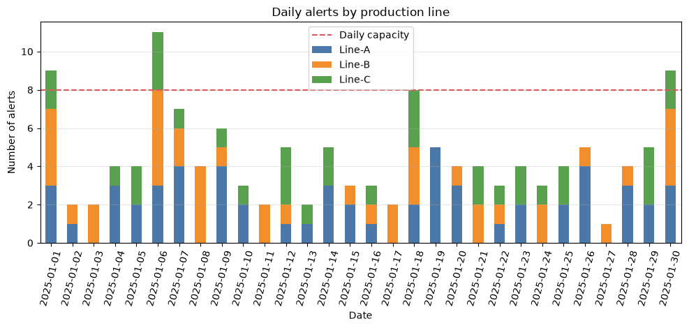 ### Reading the results If there are days when processing capacity exceeds limits, before simply raising the threshold, consider reducing overlap within the same equipment, redistributing by shift, and queue splitting based on importance. Count KPIs monitor not only averages but also maximum, 95% points, and days overrun. ## No.089: Designing Alert Priorities ### Meaning in Practice When all alerts are treated side by side, signs of critical equipment are buried behind minor alerts. Integrate anomalies, downtime impacts, and urgency to create rankings that a limited number of personnel can handle from above. ### Approach to Analysis and Modeling As an example, align each element from 0 to 1 and define the following priority scores. $$P=0.50\,S+0.30\,I+0.20\,U$$ $S$ is the anomaly score, $I$ is the equipment importance, and $U$ is the urgency based on elapsed time. Weights are assumptions and will be updated based on past response results and on-site reviews. ### Check with Python ```python alerts = df[df["alert"] == 1].copy() alerts["importance_norm"] = alerts["criticality"] / 3 alerts["urgency_norm"] = np.clip(alerts["elapsed_min"] / 120, 0, 1) alerts["priority_score"] = ( 0.50 * alerts["anomaly_score"] + 0.30 * alerts["importance_norm"] + 0.20 * alerts["urgency_norm"] ) alerts["priority"] = pd.cut(alerts["priority_score"], bins=[-np.inf, 0.65, 0.80, np.inf], labels=["P3", "P2", "P1"]) priority_counts = alerts["priority"].value_counts().reindex(["P1", "P2", "P3"], fill_value=0) display(priority_counts.rename("alerts").to_frame()) display(alerts.sort_values("priority_score", ascending=False)[[ "timestamp", "line", "machine", "anomaly_score", "criticality", "impact_k_yen", "elapsed_min", "priority_score", "priority" ]].head(10)) fig, ax = plt.subplots(figsize=(6.5, 4.2)) priority_counts.plot(kind="bar", ax=ax, color=["#E15759", "#F28E2B", "#4C78A8"]) ax.set_title("Alert count by priority") ax.set_xlabel("Priority") ax.set_ylabel("Number of alerts") ax.grid(True, axis="y", alpha=0.3) ax.tick_params(axis="x", labelrotation=0) fig.tight_layout() plt.show() ``` <style scoped> .dataframe tbody tr th:only-of-type { vertical-align: middle; } .dataframe tbody tr th { vertical-align: top; } .dataframe thead th { text-align: right; } </style> <table border="1" class="dataframe"> <thead> <tr style="text-align: right;"> <th></th> <th>alerts</th> </tr> <tr> <th>priority</th> <th></th> </tr> </thead> <tbody> <tr> <th>P1</th> <td>19</td> </tr> <tr> <th>P2</th> <td>55</td> </tr> <tr> <th>P3</th> <td>59</td> </tr> </tbody> </table> <style scoped> .dataframe tbody tr th:only-of-type { vertical-align: middle; } .dataframe tbody tr th { vertical-align: top; } .dataframe thead th { text-align: right; } </style> <table border="1" class="dataframe"> <thead> <tr style="text-align: right;"> <th></th> <th>timestamp</th> <th>line</th> <th>machine</th> <th>anomaly_score</th> <th>criticality</th> <th>impact_k_yen</th> <th>elapsed_min</th> <th>priority_score</th> <th>priority</th> </tr> </thead> <tbody> <tr> <th>786</th> <td>2025-01-20 15:36:00</td> <td>Line-A</td> <td>Line-A-M2</td> <td>0.928</td> <td>3</td> <td>1587</td> <td>121</td> <td>0.964</td> <td>P1</td> </tr> <tr> <th>716</th> <td>2025-01-18 21:36:00</td> <td>Line-A</td> <td>Line-A-M1</td> <td>0.896</td> <td>3</td> <td>1473</td> <td>150</td> <td>0.948</td> <td>P1</td> </tr> <tr> <th>237</th> <td>2025-01-06 22:12:00</td> <td>Line-A</td> <td>Line-A-M2</td> <td>0.843</td> <td>3</td> <td>1296</td> <td>166</td> <td>0.922</td> <td>P1</td> </tr> <tr> <th>735</th> <td>2025-01-19 09:00:00</td> <td>Line-A</td> <td>Line-A-M2</td> <td>0.803</td> <td>3</td> <td>1341</td> <td>132</td> <td>0.901</td> <td>P1</td> </tr> <tr> <th>574</th> <td>2025-01-15 08:24:00</td> <td>Line-A</td> <td>Line-A-M1</td> <td>0.898</td> <td>3</td> <td>1587</td> <td>88</td> <td>0.896</td> <td>P1</td> </tr> <tr> <th>1083</th> <td>2025-01-28 01:48:00</td> <td>Line-A</td> <td>Line-A-M1</td> <td>0.855</td> <td>3</td> <td>1911</td> <td>92</td> <td>0.881</td> <td>P1</td> </tr> <tr> <th>266</th> <td>2025-01-07 15:36:00</td> <td>Line-A</td> <td>Line-A-M2</td> <td>0.776</td> <td>3</td> <td>1755</td> <td>112</td> <td>0.874</td> <td>P1</td> </tr> <tr> <th>751</th> <td>2025-01-19 18:36:00</td> <td>Line-A</td> <td>Line-A-M2</td> <td>0.727</td> <td>3</td> <td>1899</td> <td>143</td> <td>0.864</td> <td>P1</td> </tr> <tr> <th>249</th> <td>2025-01-07 05:24:00</td> <td>Line-A</td> <td>Line-A-M1</td> <td>0.722</td> <td>3</td> <td>1845</td> <td>137</td> <td>0.861</td> <td>P1</td> </tr> <tr> <th>1162</th> <td>2025-01-30 01:12:00</td> <td>Line-A</td> <td>Line-A-M1</td> <td>0.827</td> <td>3</td> <td>1899</td> <td>88</td> <td>0.860</td> <td>P1</td> </tr> </tbody> </table> 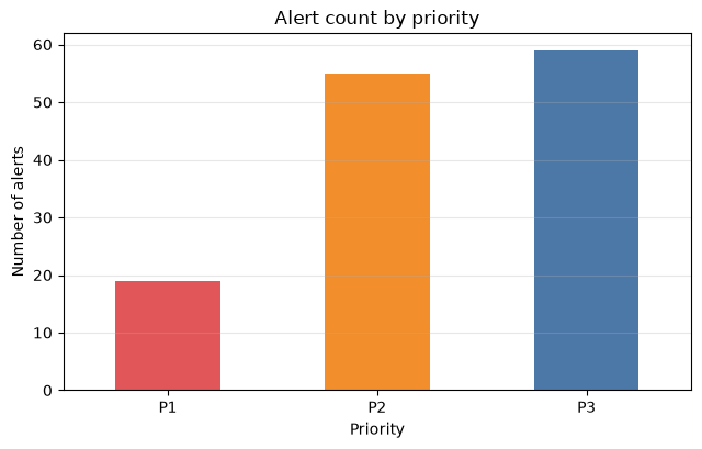 ### Reading the results The priority is not a "model score reformulation," but rather a response order that includes business impact. If there are always too many P1s, the segmentation is not working. Keep P1 to an immediate number of cases and leave each element and weight available for auditing. ## No.090: Designing alerts usable on the field ### Meaning in Practice Finally, the responsibility and deadline from judgment to completion are determined. Even if the model is good, without notification recipients, duplication reduction, verification procedures, and result records, the improvement cycle will not continue. ### Approach to Analysis and Modeling Assign SLAs and notification recipients according to priority. Additionally, a "cooldown" effect is provided to consolidate proximity alerts for the same equipment into a single item. Here, we suppress consecutive notifications within 120 minutes on the same equipment and create an operational queue for the person in charge to see. ### Check with Python ```python alerts = alerts.sort_values(["machine", "timestamp"]).copy() alerts["minutes_since_previous"] = ( alerts.groupby("machine")["timestamp"].diff().dt.total_seconds().div(60) ) COOLDOWN_MIN = 120 alerts["notify"] = alerts["minutes_since_previous"].isna() | ( alerts["minutes_since_previous"] > COOLDOWN_MIN ) sla_map = {"P1": 15, "P2": 60, "P3": 240} owner_map = {"P1": "Person responsible for preservation+Manufacturing Manager", "P2": "Duty Duty Crew", "P3": "Daily Patrols"} alerts["sla_min"] = alerts["priority"].astype(str).map(sla_map) alerts["owner"] = alerts["priority"].astype(str).map(owner_map) alerts["due_at"] = alerts["timestamp"] + pd.to_timedelta(alerts["sla_min"], unit="m") queue = alerts[alerts["notify"]].sort_values( ["priority_score", "timestamp"], ascending=[False, True] ) print(f"pre-suppression: {len(alerts)}records / After notification: {len(queue)}records / " f"suppression rate: {1 - len(queue) / len(alerts):.1%}") display(queue[["timestamp", "machine", "priority", "owner", "sla_min", "due_at", "anomaly_score", "priority_score"]].head(12)) ``` Before suppression: 133 items / After notification: 125 items / Suppression rate: 6.0% <style scoped> .dataframe tbody tr th:only-of-type { vertical-align: middle; } .dataframe tbody tr th { vertical-align: top; } .dataframe thead th { text-align: right; } </style> <table border="1" class="dataframe"> <thead> <tr style="text-align: right;"> <th></th> <th>timestamp</th> <th>machine</th> <th>priority</th> <th>owner</th> <th>sla_min</th> <th>due_at</th> <th>anomaly_score</th> <th>priority_score</th> </tr> </thead> <tbody> <tr> <th>786</th> <td>2025-01-20 15:36:00</td> <td>Line-A-M2</td> <td>P1</td> <td>Person responsible for preservation+Manufacturing Manager</td> <td>15</td> <td>2025-01-20 15:51:00</td> <td>0.928</td> <td>0.964</td> </tr> <tr> <th>716</th> <td>2025-01-18 21:36:00</td> <td>Line-A-M1</td> <td>P1</td> <td>Person responsible for preservation+Manufacturing Manager</td> <td>15</td> <td>2025-01-18 21:51:00</td> <td>0.896</td> <td>0.948</td> </tr> <tr> <th>237</th> <td>2025-01-06 22:12:00</td> <td>Line-A-M2</td> <td>P1</td> <td>Person responsible for preservation+Manufacturing Manager</td> <td>15</td> <td>2025-01-06 22:27:00</td> <td>0.843</td> <td>0.922</td> </tr> <tr> <th>574</th> <td>2025-01-15 08:24:00</td> <td>Line-A-M1</td> <td>P1</td> <td>Person responsible for preservation+Manufacturing Manager</td> <td>15</td> <td>2025-01-15 08:39:00</td> <td>0.898</td> <td>0.896</td> </tr> <tr> <th>1083</th> <td>2025-01-28 01:48:00</td> <td>Line-A-M1</td> <td>P1</td> <td>Person responsible for preservation+Manufacturing Manager</td> <td>15</td> <td>2025-01-28 02:03:00</td> <td>0.855</td> <td>0.881</td> </tr> <tr> <th>266</th> <td>2025-01-07 15:36:00</td> <td>Line-A-M2</td> <td>P1</td> <td>Person responsible for preservation+Manufacturing Manager</td> <td>15</td> <td>2025-01-07 15:51:00</td> <td>0.776</td> <td>0.874</td> </tr> <tr> <th>751</th> <td>2025-01-19 18:36:00</td> <td>Line-A-M2</td> <td>P1</td> <td>Person responsible for preservation+Manufacturing Manager</td> <td>15</td> <td>2025-01-19 18:51:00</td> <td>0.727</td> <td>0.864</td> </tr> <tr> <th>249</th> <td>2025-01-07 05:24:00</td> <td>Line-A-M1</td> <td>P1</td> <td>Person responsible for preservation+Manufacturing Manager</td> <td>15</td> <td>2025-01-07 05:39:00</td> <td>0.722</td> <td>0.861</td> </tr> <tr> <th>1162</th> <td>2025-01-30 01:12:00</td> <td>Line-A-M1</td> <td>P1</td> <td>Person responsible for preservation+Manufacturing Manager</td> <td>15</td> <td>2025-01-30 01:27:00</td> <td>0.827</td> <td>0.860</td> </tr> <tr> <th>1012</th> <td>2025-01-26 07:12:00</td> <td>Line-A-M1</td> <td>P1</td> <td>Person responsible for preservation+Manufacturing Manager</td> <td>15</td> <td>2025-01-26 07:27:00</td> <td>0.862</td> <td>0.856</td> </tr> <tr> <th>975</th> <td>2025-01-25 09:00:00</td> <td>Line-A-M1</td> <td>P1</td> <td>Person responsible for preservation+Manufacturing Manager</td> <td>15</td> <td>2025-01-25 09:15:00</td> <td>0.724</td> <td>0.844</td> </tr> <tr> <th>1175</th> <td>2025-01-30 09:00:00</td> <td>Line-B-M2</td> <td>P1</td> <td>Person responsible for preservation+Manufacturing Manager</td> <td>15</td> <td>2025-01-30 09:15:00</td> <td>0.864</td> <td>0.832</td> </tr> </tbody> </table> ### Reading the results By suppressing notifications, we were able to create queues to process from P1 while reducing the number of cases the person in charge viewed. In actual operations, it is necessary to record transitions between states such as "Confirmed," "Observation Required," "Work Instructions," "No Abnormalities," and "Closed," escalation when no action is taken, and reasons for judgment. Suppressed notifications are not deleted for audit purposes, and correspondences with previous events are preserved. ## Practical Implications Seen Through Target Exercise 1. **Model performance and operational quality are two different things.**: Even if AUC is high, if the site cannot handle it due to concentrated notifications or duplicate notifications, it will not generate value. 2. **Thresholds vary depending on business conditions**: Missed losses, inspection costs, safety restrictions, and changes in personnel count will also affect adoption values. 3. **For rare events, the actual number of cases is listed together**: Shows not only the percentage, but also TP, FP, FN, daily alert count, and days exceeding capacity. 4. **Prioritize business impacts**: Integrates not only anomaly scores but also critical equipment, downtime impacts, and elapsed times. 5. **The response results become the next training data.**: By structuring and preserving on-site judgments and actions, reassessment and improvement become possible. ## What is necessary for practical implementation - Definition of correct labels: criteria and deadlines for determining faults, quality anomalies, signs, and false positives - Cost agreement: Evaluation of false positive man-hours, downtime, disposal, delivery schedules, and safety impacts - Operational capability: Number of personnel by shift, priority SLAs, communication network for nights and holidays - System integration: sensor infrastructure, maintenance management system, notifications, and audit log connections - KPIs: Recall, Precision, Number of FNs, Response Time, Days Beyond Capacity, Containment Rate, Recurrence Rate - Governance: Threshold change approval, model data version management, regular reviews In the early stages of implementation, it is realistic to do not automatically convert alerts into work instructions but to use shadow operations to verify the number of cases and their validity. Each equipment group is trialed for 4 to 8 weeks, followed by on-site reviews and then gradually expanded to the target area. ## Conclusion From No.081 to No.090, we progressed from mixed queues to Precision, Recall, F1, ROC-AUC, and PR-AUC, translating false positives and overlooks into operational costs. Furthermore, we selected thresholds based on cost and Recall constraints, and designed daily loads, priority, SLAs, and duplication reduction. The anomaly detection deliverables are not limited to model files. **Designing evaluation criteria, threshold basis, alert queues, response rules, and improvement logs all in one place.** leads to a system that continues to be used on site. ## Consultations for Corporations At Mathematical Laboratory, we support manufacturing site constraints, including anomaly detection PoC, evaluation design, equipment-specific loss assessment, threshold optimization, and alert operation design. You can consult from stages such as frequent false positives in existing models, wanting to link evaluation indicators to management decisions, or wanting to integrate with maintenance systems. > 📩 **Contact Us**: [surikobo.co.jp/contact](https://surikobo.co.jp/contact) > Please feel free to consult us first.