
100 Exercises / anomaly detection / Abnormality detection: 100 Exercises
Manufacturing Anomaly Detection in Practice with Python | Eight Machine Learning Methods and Threshold Design
Capturing Early Signs in Injection Molding Equipment: Multivariate Anomaly Detection with 10 Exercises Using Machine Learning (No.051–No.060)
Overview
If temperature, vibration, current, and hydraulic pressure are monitored only at individual upper limits, equipment deterioration is missed—‘all values are within the upper limit, but the combinations are unnatural.’ In this article, we use a hypothetical injection molding line as a subject, examining six unsupervised learning streams, model comparison, and threshold design for anomaly scores as a single decision-making process.
The goal is not just to choose the model with the highest precision. Establishing monitoring rules that can be maintained on-site, taking into account the number of inspections that can be inspected, losses from missed items, explainability, and the operational burden of relearning..
[!NOTE] This material is a notebook previously used by Surikoubo (or personally by the representative, Kazuyama), and has been reconstructed, edited, and published with the company’s permission.
All data listed is fictional and has no relation whatsoever to real companies, factories, or figures.
Introduction: Practical Challenges in Manufacturing Covered in This Article
At injection molding facility A-01, sensor values are collected for each shot of the product. The goal of maintenance personnel is not to definitively identify failures, but to narrow down shots that differ from usual and to identify inspection targets during planned shutdowns.
The output of the anomaly detection model is treated as a Primary screening to prioritize inspections, not as a facility shutdown command. Scores can also be high due to sensor calibration defects, product switching, or startup conditions, so cross-checking with work history and quality results is essential.
Common situations on site
- There is a large amount of normal data, but few fault labels and definitions fluctuate
- With the management limits of a single sensor, it is impossible to detect the breakdown of relationships among multiple variables.
- There is a limit to the number of inspection personnel, and if alerts are too frequent, operations become mere formality
- The distribution of ‘normal’ varies depending on variety, equipment, season, and post-conservation
Why is this issue so difficult to judge?
Unsupervised anomaly detection does not directly learn the correct label, but determines the degree of anomaly based on data sparseness, boundaries, and distribution. Therefore, even with the same data, candidates vary depending on the method and hyperparameters. Also, statistically unusual phenomena and operational abnormalities that lead to stoppages or defects are not synonymous.
Overview of Exercise covered this time
| No. | Methods and Issues | On-site Verification |
|---|---|---|
| 051 | Isolation Forest | Shots prone to isolation in multivariate spaces |
| 052 | Local Outlier Factor | Locally less frequent than peripheral shots |
| 053 | One-Class SVM | Flexible boundaries of the normal domain |
| 054 | Elliptic Envelope | Elliptical normal region considering covariance |
| 055 | k Near-Distance | Transparency anomaly depending on the distance to the nearby area |
| 056 | clustering | Handling of small groups or points far from the center |
| 057 | KMeans | Candidate selection based on distance to the nearest center |
| 058 | DBSCAN | Noise points in low-density regions |
| 059 | Model Comparison | Comparison of detection performance, number of cases, and consensus |
| 060 | threshold adjustment | Reflecting inspection capability and missed costs |
Preparing the Python environment
Data is handled with numpy and pandas, utilizing each model of scikit-learn. The graph uses only matplotlib. For reproducibility, the random number seed is fixed at 42.
import warnings
import numpy as np
import pandas as pd
import matplotlib
import matplotlib.pyplot as plt
import sklearn

from sklearn.cluster import DBSCAN, KMeans
from sklearn.covariance import EllipticEnvelope
from sklearn.ensemble import IsolationForest
from sklearn.metrics import precision_score, recall_score, f1_score
from sklearn.neighbors import LocalOutlierFactor, NearestNeighbors
from sklearn.pipeline import make_pipeline
from sklearn.preprocessing import StandardScaler
from sklearn.svm import OneClassSVM

warnings.filterwarnings("ignore", category=UserWarning, module="matplotlib")
SEED = 42
np.random.seed(SEED)
pd.set_option("display.max_columns", 20)

print(f"numpy       : {np.__version__}")
print(f"pandas      : {pd.__version__}")
print(f"matplotlib  : {matplotlib.__version__}")
print(f"scikit-learn: {sklearn.__version__}")
numpy : 2.5.1
pandas : 3.0.3
matplotlib : 3.11.0
scikit-learn: 1.9.0Creation of Fictional Data
Normally, 900 shots are generated, but 40 shots are required. Normally, as the mold temperature rises, the heater current increases slightly, and it is assumed that vibration and hydraulic pressure are weakly related. The data to be verified includes multiple deterioration patterns, such as increased vibration, disrupted temperature-current relationships, and decreased hydraulic pressure.
known_issue is a label for evaluation that was later identified during inspections and quality checks. It is not used for model training. This is not a complete failure label but a limited audit result for comparison.
rng = np.random.default_rng(SEED)
n_normal, n_issue = 900, 40

mean = np.array([210.0, 2.4, 31.0, 8.0])
cov = np.array([
    [16.0, 0.7, 5.0, 1.0],
    [0.7, 0.36, 0.4, 0.3],
    [5.0, 0.4, 9.0, 1.2],
    [1.0, 0.3, 1.2, 1.0],
])
normal = rng.multivariate_normal(mean, cov, n_normal)

issue_1 = rng.multivariate_normal([211, 5.4, 33, 9.4], np.diag([9, .20, 4, .35]), 14)
issue_2 = rng.multivariate_normal([222, 2.7, 25, 8.2], np.diag([8, .25, 3, .50]), 13)
issue_3 = rng.multivariate_normal([207, 3.6, 32, 5.4], np.diag([7, .22, 4, .20]), 13)
issue = np.vstack([issue_1, issue_2, issue_3])

columns = ["mold_temp_c", "vibration_mm_s", "heater_current_a", "oil_pressure_mpa"]
df = pd.DataFrame(np.vstack([normal, issue]), columns=columns)
df.insert(0, "shot_id", [f"S{i:04d}" for i in range(1, len(df) + 1)])
df["known_issue"] = np.r_[np.zeros(n_normal, dtype=int), np.ones(n_issue, dtype=int)]
X = df[columns]
X_scaled = StandardScaler().fit_transform(X)

print(f"Number of shots: {len(df):,} / Evaluation Confirmation: {df['known_issue'].sum()}")
display(df.head())
display(df.groupby("known_issue")[columns].agg(["mean", "std"]).round(2))
Number of shots: 940 / Points to check for evaluation: 40| shot_id | mold_temp_c | vibration_mm_s | heater_current_a | oil_pressure_mpa | known_issue | |
|---|---|---|---|---|---|---|
| 0 | S0001 | 207.579632 | 2.201556 | 32.597790 | 8.998515 | 0 |
| 1 | S0002 | 215.879777 | 2.994548 | 37.801656 | 9.099905 | 0 |
| 2 | S0003 | 209.024388 | 2.377789 | 32.812262 | 9.146080 | 0 |
| 3 | S0004 | 211.071845 | 2.910164 | 28.307671 | 7.929873 | 0 |
| 4 | S0005 | 207.416243 | 2.676244 | 32.282850 | 8.891665 | 0 |
| mold_temp_c | vibration_mm_s | heater_current_a | oil_pressure_mpa | |||||
|---|---|---|---|---|---|---|---|---|
| mean | std | mean | std | mean | std | mean | std | |
| known_issue | ||||||||
| 0 | 210.04 | 3.88 | 2.4 | 0.59 | 31.04 | 2.99 | 7.98 | 1.02 |
| 1 | 213.47 | 6.42 | 3.9 | 1.25 | 30.52 | 4.45 | 7.63 | 1.75 |
fig, axes = plt.subplots(1, 2, figsize=(12, 4.5))
colors = np.where(df["known_issue"].eq(1), "tab:red", "tab:blue")
axes[0].scatter(df["mold_temp_c"], df["heater_current_a"], c=colors, alpha=.55, s=20)
axes[0].set_title("Temperature vs. heater current")
axes[0].set_xlabel("Mold temperature [C]")
axes[0].set_ylabel("Heater current [A]")
axes[0].grid(True, alpha=.3)
axes[1].scatter(df["vibration_mm_s"], df["oil_pressure_mpa"], c=colors, alpha=.55, s=20)
axes[1].set_title("Vibration vs. oil pressure")
axes[1].set_xlabel("Vibration [mm/s]")
axes[1].set_ylabel("Oil pressure [MPa]")
axes[1].grid(True, alpha=.3)
fig.tight_layout()
plt.show()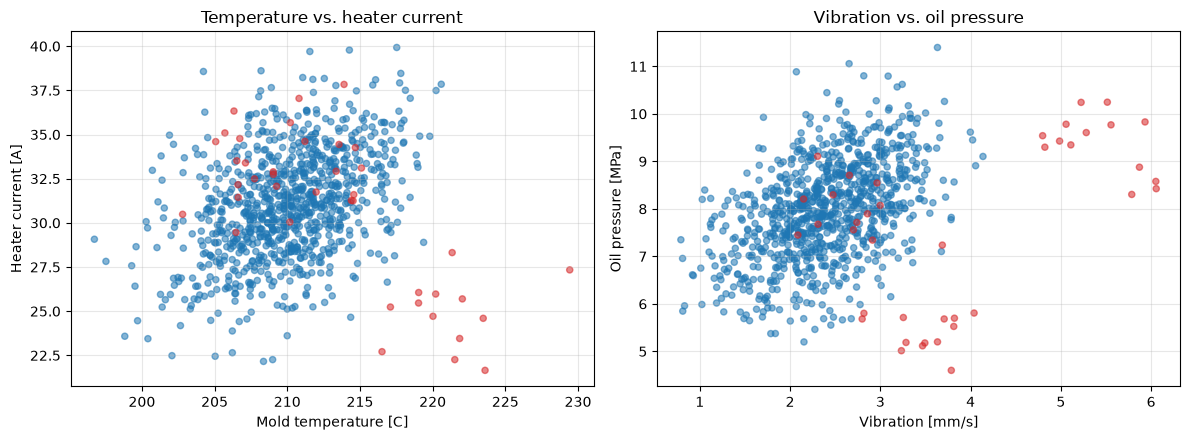
No.051: Using Isolation Forest
Meaning in Practice
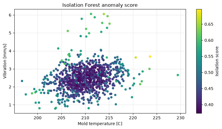
Isolation Forest considers points where features are isolated with few splits when randomly partitioned as anomalies. Because it does not assume a strict distribution of normal states, it is suitable for early PoCs that quickly extract candidates from complex regions created by multiple sensors.
Approach to Analysis and Modeling
If the average path length of point is and the criterion for average path length at sample size is , the typical anomalies are as follows.
The closer is to 1, the more likely it is to isolate. contamination=0.05 is the operational hypothesis that “about 5% is always abnormal,” and is not an estimated failure rate.
Check with Python
iso = IsolationForest(n_estimators=300, contamination=.05, random_state=SEED)
df["score_iso"] = -iso.fit(X_scaled).score_samples(X_scaled)
df["pred_iso"] = (iso.predict(X_scaled) == -1).astype(int)
display(df.nlargest(8, "score_iso")[["shot_id", *columns, "score_iso", "known_issue"]].round(3))

plt.figure(figsize=(8, 4.5))
plt.scatter(df["mold_temp_c"], df["vibration_mm_s"], c=df["score_iso"], cmap="viridis", s=22)
plt.colorbar(label="Isolation score")
plt.title("Isolation Forest anomaly score")
plt.xlabel("Mold temperature [C]")
plt.ylabel("Vibration [mm/s]")
plt.grid(True, alpha=.3)
plt.tight_layout()
plt.show()| shot_id | mold_temp_c | vibration_mm_s | heater_current_a | oil_pressure_mpa | score_iso | known_issue | |
|---|---|---|---|---|---|---|---|
| 918 | S0919 | 223.604 | 3.687 | 21.653 | 7.238 | 0.696 | 1 |
| 126 | S0127 | 220.592 | 3.633 | 37.847 | 11.397 | 0.672 | 0 |
| 900 | S0901 | 213.905 | 6.052 | 37.836 | 8.578 | 0.651 | 1 |
| 912 | S0913 | 215.102 | 5.515 | 33.103 | 10.246 | 0.630 | 1 |
| 907 | S0908 | 214.681 | 5.932 | 34.262 | 9.830 | 0.629 | 1 |
| 910 | S0911 | 206.332 | 5.110 | 36.330 | 9.347 | 0.621 | 1 |
| 916 | S0917 | 221.522 | 2.150 | 22.260 | 8.207 | 0.620 | 1 |
| 926 | S0927 | 223.477 | 2.998 | 24.598 | 8.074 | 0.620 | 1 |
Reading the results
The upper ranks include shots with high vibration or those whose temperature-current relationship is far from the normal group. Since the overall score based solely on tree branching cannot determine the cause, the original sensor values from the top row are also recorded so that maintenance personnel can compare them with equipment history.
No.052: Using the Local Outlier Factor
Meaning in Practice
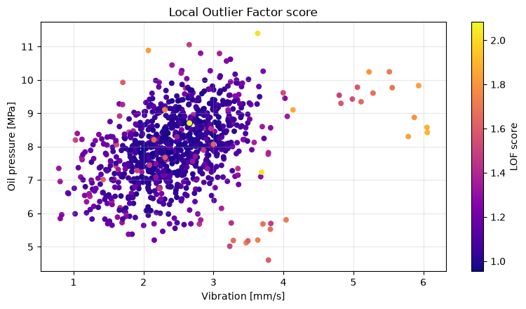
LOF evaluates ‘neglect compared to nearby operating points,’ rather than the overall evaluation. It is effective for finding shots that float only within a single driving group in sites with multiple normal groups depending on the type and load.
Approach to Analysis and Modeling
If the locally reachable density of point is , then LOF can be expressed as the density ratio to neighbors.
If it’s roughly 1, it’s about the same as the neighborhood, and if it’s well greater than 1, it’s a local outlier. Sensitivity analysis is performed based on process continuity and lot size.
Check with Python
lof = LocalOutlierFactor(n_neighbors=25, contamination=.05)
df["pred_lof"] = (lof.fit_predict(X_scaled) == -1).astype(int)
df["score_lof"] = -lof.negative_outlier_factor_
display(df.nlargest(8, "score_lof")[["shot_id", *columns, "score_lof", "known_issue"]].round(3))

plt.figure(figsize=(8, 4.5))
plt.scatter(df["vibration_mm_s"], df["oil_pressure_mpa"], c=df["score_lof"], cmap="plasma", s=22)
plt.colorbar(label="LOF score")
plt.title("Local Outlier Factor score")
plt.xlabel("Vibration [mm/s]")
plt.ylabel("Oil pressure [MPa]")
plt.grid(True, alpha=.3)
plt.tight_layout()
plt.show()| shot_id | mold_temp_c | vibration_mm_s | heater_current_a | oil_pressure_mpa | score_lof | known_issue | |
|---|---|---|---|---|---|---|---|
| 922 | S0923 | 229.429 | 2.657 | 27.339 | 8.708 | 2.082 | 1 |
| 918 | S0919 | 223.604 | 3.687 | 21.653 | 7.238 | 2.026 | 1 |
| 126 | S0127 | 220.592 | 3.633 | 37.847 | 11.397 | 2.018 | 0 |
| 901 | S0902 | 211.210 | 6.057 | 34.612 | 8.425 | 1.901 | 1 |
| 900 | S0901 | 213.905 | 6.052 | 37.836 | 8.578 | 1.887 | 1 |
| 478 | S0479 | 204.327 | 4.137 | 36.266 | 9.103 | 1.858 | 0 |
| 903 | S0904 | 209.262 | 5.785 | 32.073 | 8.304 | 1.836 | 1 |
| 907 | S0908 | 214.681 | 5.932 | 34.262 | 9.830 | 1.832 | 1 |
Reading the results
Candidates with high LOF density are those with a large difference in surrounding density. Since it is also easy to pick up the normal points at the boundary, check whether the ranking remains stable even when changing n_neighbors. Also, since LOF is generally suitable for outlier search within training data, a separate design using novelty=True is required for scoring new data.
No.053: Using One-Class SVM
Meaning in Practice
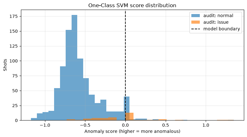
One-Class SVM learns boundaries surrounding the majority of conventional data. Using the RBF kernel, it is possible to represent nonlinear normal regions and detect relationship breakdowns that are difficult to detect with simple upper and lower limits.
Approach to Analysis and Modeling
We obtain a hyperplane that separates normal data from the origin in feature space. The conceptual optimization problem is as follows.
relates to the upper limit of the proportion of outbound points and the lower limit of the proportion of support vectors. Because it is sensitive to scale, standardization is essential.
Check with Python
ocsvm = OneClassSVM(kernel="rbf", gamma="scale", nu=.05)
df["score_ocsvm"] = -ocsvm.fit(X_scaled).decision_function(X_scaled)
df["pred_ocsvm"] = (ocsvm.predict(X_scaled) == -1).astype(int)
display(df.nlargest(8, "score_ocsvm")[["shot_id", *columns, "score_ocsvm", "known_issue"]].round(3))

plt.figure(figsize=(8, 4.5))
plt.hist(df.loc[df.known_issue.eq(0), "score_ocsvm"], bins=35, alpha=.65, label="audit: normal")
plt.hist(df.loc[df.known_issue.eq(1), "score_ocsvm"], bins=20, alpha=.65, label="audit: issue")
plt.axvline(0, color="black", linestyle="--", label="model boundary")
plt.title("One-Class SVM score distribution")
plt.xlabel("Anomaly score (higher = more anomalous)")
plt.ylabel("Shots")
plt.grid(True, alpha=.3)
plt.legend()
plt.tight_layout()
plt.show()| shot_id | mold_temp_c | vibration_mm_s | heater_current_a | oil_pressure_mpa | score_ocsvm | known_issue | |
|---|---|---|---|---|---|---|---|
| 126 | S0127 | 220.592 | 3.633 | 37.847 | 11.397 | 1.347 | 0 |
| 922 | S0923 | 229.429 | 2.657 | 27.339 | 8.708 | 1.345 | 1 |
| 918 | S0919 | 223.604 | 3.687 | 21.653 | 7.238 | 1.174 | 1 |
| 157 | S0158 | 211.063 | 2.070 | 38.227 | 10.885 | 0.730 | 0 |
| 900 | S0901 | 213.905 | 6.052 | 37.836 | 8.578 | 0.668 | 1 |
| 939 | S0940 | 206.474 | 3.786 | 29.456 | 4.601 | 0.452 | 1 |
| 933 | S0934 | 214.528 | 3.633 | 31.250 | 5.200 | 0.419 | 1 |
| 34 | S0035 | 209.778 | 1.705 | 28.220 | 9.928 | 0.408 | 0 |
Reading the results
Score 0 is the model boundary, so the front side requires further confirmation. There is overlap in the distribution of normal and need-to-confirm in audits, and it is also clear that models alone cannot be completely separated. Be careful not to make the gamma too large, as the boundary will become finer and will react to normal fluctuations.
No.054: Using Elliptic Envelope
Meaning in Practice
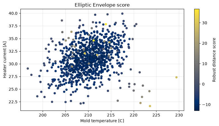
Elliptic Envelope is suitable for processes where normal data is generally distributed in a single-peak, elliptical pattern. To account for covariance, even when temperature and current are within their respective ranges, it can detect states that deviate from normal correlation.
Approach to Analysis and Modeling
Mahalanobis distance using center and covariance matrix
and points with large distances as abnormal candidates. In highly multimodal processes, the assumption of a single ellipse is broken.
Check with Python
ell = EllipticEnvelope(contamination=.05, random_state=SEED)
df["score_elliptic"] = -ell.fit(X_scaled).decision_function(X_scaled)
df["pred_elliptic"] = (ell.predict(X_scaled) == -1).astype(int)
display(df.nlargest(8, "score_elliptic")[["shot_id", *columns, "score_elliptic", "known_issue"]].round(3))

plt.figure(figsize=(8, 4.5))
plt.scatter(df["mold_temp_c"], df["heater_current_a"], c=df["score_elliptic"], cmap="cividis", s=22)
plt.colorbar(label="Robust distance score")
plt.title("Elliptic Envelope score")
plt.xlabel("Mold temperature [C]")
plt.ylabel("Heater current [A]")
plt.grid(True, alpha=.3)
plt.tight_layout()
plt.show()| shot_id | mold_temp_c | vibration_mm_s | heater_current_a | oil_pressure_mpa | score_elliptic | known_issue | |
|---|---|---|---|---|---|---|---|
| 900 | S0901 | 213.905 | 6.052 | 37.836 | 8.578 | 36.750 | 1 |
| 901 | S0902 | 211.210 | 6.057 | 34.612 | 8.425 | 36.431 | 1 |
| 903 | S0904 | 209.262 | 5.785 | 32.073 | 8.304 | 30.518 | 1 |
| 918 | S0919 | 223.604 | 3.687 | 21.653 | 7.238 | 28.626 | 1 |
| 922 | S0923 | 229.429 | 2.657 | 27.339 | 8.708 | 28.577 | 1 |
| 905 | S0906 | 211.985 | 5.871 | 31.745 | 8.877 | 27.169 | 1 |
| 907 | S0908 | 214.681 | 5.932 | 34.262 | 9.830 | 24.147 | 1 |
| 916 | S0917 | 221.522 | 2.150 | 22.260 | 8.207 | 20.851 | 1 |
Reading the results
Candidates whose temperature and current combinations deviate from the usual band score high. While the assumptions are clear and easy to explain, if the focus is divided by product type, the model is divided by product type or alternative methods are considered.
No.055: Calculating Anomaly Using the k-Neighborhood Method
Meaning in Practice
k Neighborhood distance directly shows how close a similar past shot is. The algorithm is relatively transparent, making it easy to present similar shots to maintenance personnel.
Approach to Analysis and Modeling
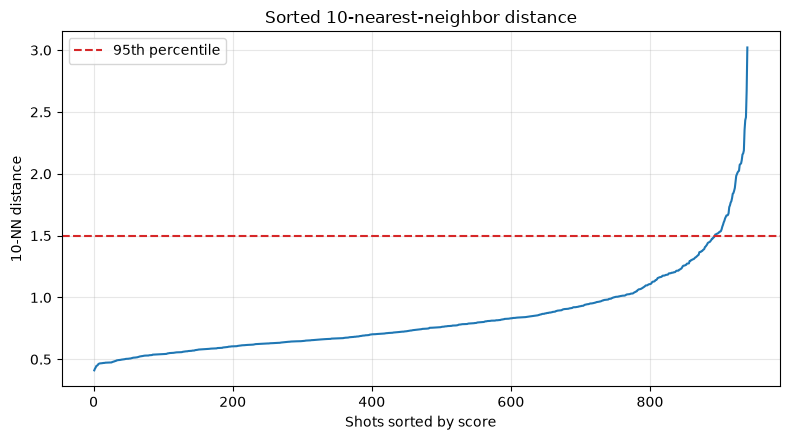
The normalized point and the Euclidean distance near th are considered anomalies.
When the is small, it is sensitive to local noise, and when large, it is easier to handle abnormalities even in small normal groups. Here, we use the 10th Nearest Neighbor Distance and consider the top 5% as candidates.
Check with Python
knn = NearestNeighbors(n_neighbors=11).fit(X_scaled)
distances, _ = knn.kneighbors(X_scaled)
df["score_knn"] = distances[:, -1]
knn_threshold = df["score_knn"].quantile(.95)
df["pred_knn"] = (df["score_knn"] >= knn_threshold).astype(int)
display(df.nlargest(8, "score_knn")[["shot_id", *columns, "score_knn", "known_issue"]].round(3))

sorted_score = np.sort(df["score_knn"])
plt.figure(figsize=(8, 4.5))
plt.plot(np.arange(1, len(df) + 1), sorted_score)
plt.axhline(knn_threshold, color="tab:red", linestyle="--", label="95th percentile")
plt.title("Sorted 10-nearest-neighbor distance")
plt.xlabel("Shots sorted by score")
plt.ylabel("10-NN distance")
plt.grid(True, alpha=.3)
plt.legend()
plt.tight_layout()
plt.show()| shot_id | mold_temp_c | vibration_mm_s | heater_current_a | oil_pressure_mpa | score_knn | known_issue | |
|---|---|---|---|---|---|---|---|
| 922 | S0923 | 229.429 | 2.657 | 27.339 | 8.708 | 3.021 | 1 |
| 918 | S0919 | 223.604 | 3.687 | 21.653 | 7.238 | 2.670 | 1 |
| 900 | S0901 | 213.905 | 6.052 | 37.836 | 8.578 | 2.457 | 1 |
| 126 | S0127 | 220.592 | 3.633 | 37.847 | 11.397 | 2.433 | 0 |
| 910 | S0911 | 206.332 | 5.110 | 36.330 | 9.347 | 2.355 | 1 |
| 903 | S0904 | 209.262 | 5.785 | 32.073 | 8.304 | 2.189 | 1 |
| 912 | S0913 | 215.102 | 5.515 | 33.103 | 10.246 | 2.164 | 1 |
| 911 | S0912 | 210.178 | 5.224 | 30.045 | 10.242 | 2.156 | 1 |
Reading the results
The point where the distance suddenly increases at the far right is a candidate with few similar histories. While quantile thresholds make it easier to control the number of inspection items, they extract a certain number even if all processes are normal. First, it is positioned as the purpose of creating a candidate list.
No.056: Detecting Data Lost Through Clustering
Meaning in Practice
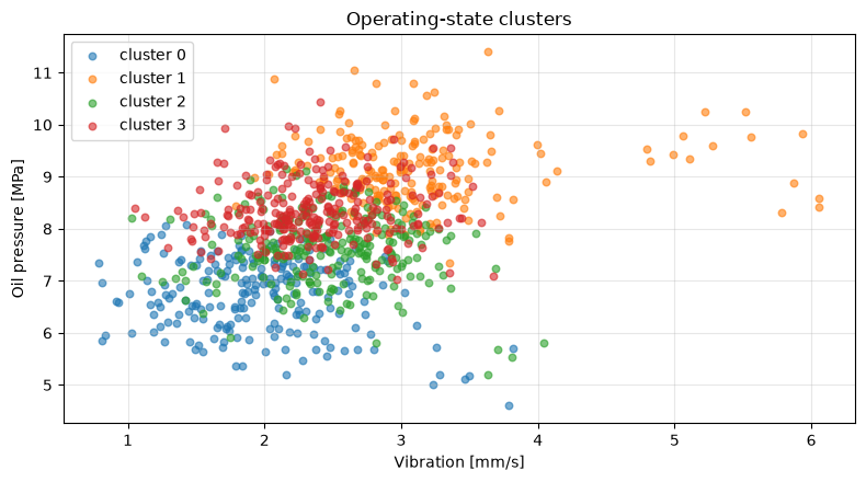
By using clustering, you can organize major operating states into groups and investigate points far from the center or extremely small groups. However, a small group does not necessarily mean abnormality; it may be a small variety or a legitimate operating condition right after setup.
Approach to Analysis and Modeling
There are mainly two ways to use it for anomaly detection.
- Set the anomaly level as the distance from each point to the center of the affiliated cluster
- Review clusters with small affiliation scores as rare operating conditions
Clustering is not a fault detector but a tool for organizing data structures. It is necessary to assign meanings including process conditions.
Check with Python
kmeans_review = KMeans(n_clusters=4, n_init=20, random_state=SEED).fit(X_scaled)
df["cluster_review"] = kmeans_review.labels_
cluster_review = df.groupby("cluster_review").agg(
    shots=("shot_id", "size"),
    issue_rate=("known_issue", "mean"),
    temp_mean=("mold_temp_c", "mean"),
    vibration_mean=("vibration_mm_s", "mean"),
    pressure_mean=("oil_pressure_mpa", "mean"),
).round(3)
display(cluster_review)

plt.figure(figsize=(8, 4.5))
for c in sorted(df["cluster_review"].unique()):
    part = df[df["cluster_review"].eq(c)]
    plt.scatter(part["vibration_mm_s"], part["oil_pressure_mpa"], s=22, alpha=.6, label=f"cluster {c}")
plt.title("Operating-state clusters")
plt.xlabel("Vibration [mm/s]")
plt.ylabel("Oil pressure [MPa]")
plt.grid(True, alpha=.3)
plt.legend()
plt.tight_layout()
plt.show()| shots | issue_rate | temp_mean | vibration_mean | pressure_mean | |
|---|---|---|---|---|---|
| cluster_review | |||||
| 0 | 213 | 0.038 | 207.104 | 1.957 | 6.738 |
| 1 | 211 | 0.066 | 212.647 | 3.125 | 9.144 |
| 2 | 254 | 0.071 | 213.386 | 2.451 | 7.632 |
| 3 | 262 | 0.000 | 207.592 | 2.367 | 8.339 |
Reading the results
By looking at the number of cases by cluster and the rate requiring audit confirmation, you can organize which driving groups should be prioritized for review. However, instead of making the group with a high confirmation rate the stop condition as is, we first check whether the product type, mold, and working conditions are uneven.
No.057: Extracting anomalous candidates with KMeans
Meaning in Practice
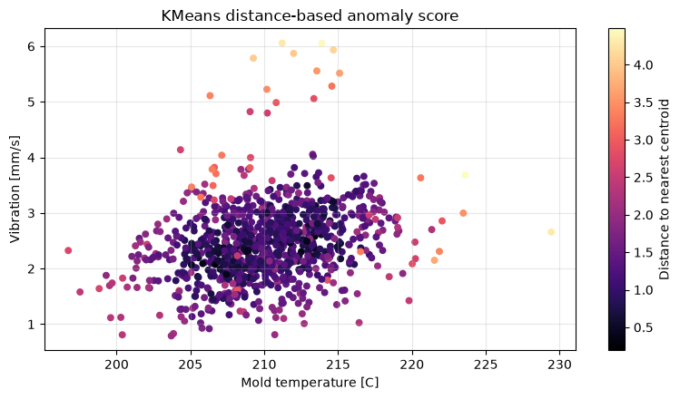
KMeans creates a representative driving center of gravity and extracts shots far from any center of gravity. Even if there are multiple steady operation modes, the distance from the overall average may match the actual conditions.
Approach to Analysis and Modeling
KMeans sum of squares within the cluster
Minimize it. After learning, is considered abnormal. The number of clusters and quantile thresholds are determined based on the number of operating modes and inspection capability.
Check with Python
kmeans = KMeans(n_clusters=4, n_init=20, random_state=SEED).fit(X_scaled)
distance_matrix = kmeans.transform(X_scaled)
df["score_kmeans"] = distance_matrix.min(axis=1)
kmeans_threshold = df["score_kmeans"].quantile(.95)
df["pred_kmeans"] = (df["score_kmeans"] >= kmeans_threshold).astype(int)
display(df.nlargest(8, "score_kmeans")[["shot_id", *columns, "score_kmeans", "known_issue"]].round(3))

plt.figure(figsize=(8, 4.5))
plt.scatter(df["mold_temp_c"], df["vibration_mm_s"], c=df["score_kmeans"], cmap="magma", s=22)
plt.colorbar(label="Distance to nearest centroid")
plt.title("KMeans distance-based anomaly score")
plt.xlabel("Mold temperature [C]")
plt.ylabel("Vibration [mm/s]")
plt.grid(True, alpha=.3)
plt.tight_layout()
plt.show()| shot_id | mold_temp_c | vibration_mm_s | heater_current_a | oil_pressure_mpa | score_kmeans | known_issue | |
|---|---|---|---|---|---|---|---|
| 918 | S0919 | 223.604 | 3.687 | 21.653 | 7.238 | 4.484 | 1 |
| 900 | S0901 | 213.905 | 6.052 | 37.836 | 8.578 | 4.456 | 1 |
| 922 | S0923 | 229.429 | 2.657 | 27.339 | 8.708 | 4.304 | 1 |
| 901 | S0902 | 211.210 | 6.057 | 34.612 | 8.425 | 4.285 | 1 |
| 907 | S0908 | 214.681 | 5.932 | 34.262 | 9.830 | 4.114 | 1 |
| 903 | S0904 | 209.262 | 5.785 | 32.073 | 8.304 | 4.020 | 1 |
| 905 | S0906 | 211.985 | 5.871 | 31.745 | 8.877 | 4.001 | 1 |
| 916 | S0917 | 221.522 | 2.150 | 22.260 | 8.207 | 3.709 | 1 |
Reading the results
Recently, shots farther from the center of gravity have been ranked higher. Since the center of gravity is average, it is affected by outliers. In production, obvious sensor failures are excluded through pretreatment, and if the product composition changes, a reassessment of the center of gravity is necessary.
No.058: Detecting Noise Points with DBSCAN
Meaning in Practice
DBSCAN classifies clusters of sufficiently dense areas and judges them as noise if they do not belong to any densely packed area. It is characterized by the ability to handle non-spherical operating areas without pre-deciding on the number of clusters.
Approach to Analysis and Modeling
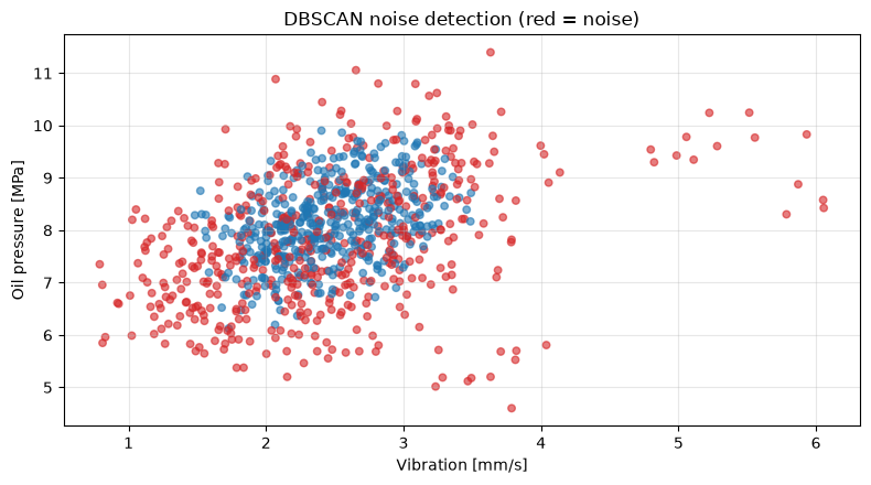
Points with min_samples or more points within radius are considered core points, and density-reachable points are grouped into the same cluster. If the eps is too small, it triggers excessive alerts; if too large, abnormalities are absorbed into the normal group. Set at the standardized distance.
Check with Python
dbscan = DBSCAN(eps=.62, min_samples=12).fit(X_scaled)
df["dbscan_label"] = dbscan.labels_
df["pred_dbscan"] = (df["dbscan_label"] == -1).astype(int)
dbscan_summary = df.groupby("dbscan_label").agg(shots=("shot_id", "size"), issue_rate=("known_issue", "mean")).round(3)
display(dbscan_summary)

plt.figure(figsize=(8, 4.5))
plot_colors = np.where(df["pred_dbscan"].eq(1), "tab:red", "tab:blue")
plt.scatter(df["vibration_mm_s"], df["oil_pressure_mpa"], c=plot_colors, alpha=.6, s=22)
plt.title("DBSCAN noise detection (red = noise)")
plt.xlabel("Vibration [mm/s]")
plt.ylabel("Oil pressure [MPa]")
plt.grid(True, alpha=.3)
plt.tight_layout()
plt.show()| shots | issue_rate | |
|---|---|---|
| dbscan_label | ||
| -1 | 503 | 0.08 |
| 0 | 398 | 0.00 |
| 1 | 26 | 0.00 |
| 2 | 8 | 0.00 |
| 3 | 5 | 0.00 |
Reading the results
The red noise point is outside the dense normal area. DBSCAN does not return direct continuous scores and has high parameter sensitivity, allowing it to check whether the number of noise incidents meets the on-site inspection capacity and whether known rare normal operations are involved.
No.059: Comparing Anomaly Detection Results by Model
Meaning in Practice
Model selection compares not only accuracy but also the number of alerts, missed cases, agreement between models, and ease of explanation. When evaluation labels are limited, it is practical to prioritize auditing candidates commonly cited by multiple models rather than treating numerical rankings as absolute.
Approach to Analysis and Modeling
For audited data, we will check the following:
\mathrm{Recall}=\frac{TP}{TP+FN},\quad F_1=\frac{2PR}{P+R}$$ Since there are few anomalies, Accuracy is not a reference. Also, even models with the same number of cases may not always match the candidates. ### Check with Python ```python pred_cols = { "Isolation Forest": "pred_iso", "LOF": "pred_lof", "One-Class SVM": "pred_ocsvm", "Elliptic Envelope": "pred_elliptic", "kNN distance": "pred_knn", "KMeans distance": "pred_kmeans", "DBSCAN": "pred_dbscan", } rows = [] for name, col in pred_cols.items(): rows.append({ "model": name, "alerts": int(df[col].sum()), "precision": precision_score(df["known_issue"], df[col], zero_division=0), "recall": recall_score(df["known_issue"], df[col], zero_division=0), "f1": f1_score(df["known_issue"], df[col], zero_division=0), }) comparison = pd.DataFrame(rows).set_index("model").sort_values("f1", ascending=False) display(comparison.round(3)) comparison[["precision", "recall", "f1"]].plot(kind="bar", figsize=(10, 4.8), ylim=(0, 1)) plt.title("Model comparison on audited labels") plt.xlabel("Model") plt.ylabel("Metric") plt.grid(True, axis="y", alpha=.3) plt.legend(loc="lower right") plt.tight_layout() plt.show() ``` <style scoped> .dataframe tbody tr th:only-of-type { vertical-align: middle; } .dataframe tbody tr th { vertical-align: top; } .dataframe thead th { text-align: right; } </style> <table border="1" class="dataframe"> <thead> <tr style="text-align: right;"> <th></th> <th>alerts</th> <th>precision</th> <th>recall</th> <th>f1</th> </tr> <tr> <th>model</th> <th></th> <th></th> <th></th> <th></th> </tr> </thead> <tbody> <tr> <th>Elliptic Envelope</th> <td>47</td> <td>0.830</td> <td>0.975</td> <td>0.897</td> </tr> <tr> <th>KMeans distance</th> <td>47</td> <td>0.745</td> <td>0.875</td> <td>0.805</td> </tr> <tr> <th>LOF</th> <td>47</td> <td>0.702</td> <td>0.825</td> <td>0.759</td> </tr> <tr> <th>kNN distance</th> <td>47</td> <td>0.660</td> <td>0.775</td> <td>0.713</td> </tr> <tr> <th>Isolation Forest</th> <td>47</td> <td>0.638</td> <td>0.750</td> <td>0.690</td> </tr> <tr> <th>One-Class SVM</th> <td>50</td> <td>0.340</td> <td>0.425</td> <td>0.378</td> </tr> <tr> <th>DBSCAN</th> <td>503</td> <td>0.080</td> <td>1.000</td> <td>0.147</td> </tr> </tbody> </table> 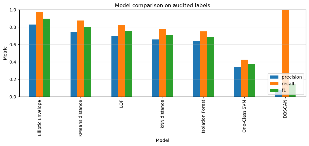 ```python df["model_votes"] = df[list(pred_cols.values())].sum(axis=1) vote_summary = df.groupby("model_votes").agg( shots=("shot_id", "size"), audited_issues=("known_issue", "sum"), issue_rate=("known_issue", "mean"), ).round(3) display(vote_summary) display(df.nlargest(10, "model_votes")[["shot_id", "model_votes", *columns, "known_issue"]].round(3)) ``` <style scoped> .dataframe tbody tr th:only-of-type { vertical-align: middle; } .dataframe tbody tr th { vertical-align: top; } .dataframe thead th { text-align: right; } </style> <table border="1" class="dataframe"> <thead> <tr style="text-align: right;"> <th></th> <th>shots</th> <th>audited_issues</th> <th>issue_rate</th> </tr> <tr> <th>model_votes</th> <th></th> <th></th> <th></th> </tr> </thead> <tbody> <tr> <th>0</th> <td>437</td> <td>0</td> <td>0.000</td> </tr> <tr> <th>1</th> <td>421</td> <td>1</td> <td>0.002</td> </tr> <tr> <th>2</th> <td>20</td> <td>2</td> <td>0.100</td> </tr> <tr> <th>3</th> <td>16</td> <td>4</td> <td>0.250</td> </tr> <tr> <th>4</th> <td>4</td> <td>1</td> <td>0.250</td> </tr> <tr> <th>5</th> <td>7</td> <td>3</td> <td>0.429</td> </tr> <tr> <th>6</th> <td>17</td> <td>14</td> <td>0.824</td> </tr> <tr> <th>7</th> <td>18</td> <td>15</td> <td>0.833</td> </tr> </tbody> </table> <style scoped> .dataframe tbody tr th:only-of-type { vertical-align: middle; } .dataframe tbody tr th { vertical-align: top; } .dataframe thead th { text-align: right; } </style> <table border="1" class="dataframe"> <thead> <tr style="text-align: right;"> <th></th> <th>shot_id</th> <th>model_votes</th> <th>mold_temp_c</th> <th>vibration_mm_s</th> <th>heater_current_a</th> <th>oil_pressure_mpa</th> <th>known_issue</th> </tr> </thead> <tbody> <tr> <th>126</th> <td>S0127</td> <td>7</td> <td>220.592</td> <td>3.633</td> <td>37.847</td> <td>11.397</td> <td>0</td> </tr> <tr> <th>157</th> <td>S0158</td> <td>7</td> <td>211.063</td> <td>2.070</td> <td>38.227</td> <td>10.885</td> <td>0</td> </tr> <tr> <th>478</th> <td>S0479</td> <td>7</td> <td>204.327</td> <td>4.137</td> <td>36.266</td> <td>9.103</td> <td>0</td> </tr> <tr> <th>900</th> <td>S0901</td> <td>7</td> <td>213.905</td> <td>6.052</td> <td>37.836</td> <td>8.578</td> <td>1</td> </tr> <tr> <th>901</th> <td>S0902</td> <td>7</td> <td>211.210</td> <td>6.057</td> <td>34.612</td> <td>8.425</td> <td>1</td> </tr> <tr> <th>903</th> <td>S0904</td> <td>7</td> <td>209.262</td> <td>5.785</td> <td>32.073</td> <td>8.304</td> <td>1</td> </tr> <tr> <th>910</th> <td>S0911</td> <td>7</td> <td>206.332</td> <td>5.110</td> <td>36.330</td> <td>9.347</td> <td>1</td> </tr> <tr> <th>911</th> <td>S0912</td> <td>7</td> <td>210.178</td> <td>5.224</td> <td>30.045</td> <td>10.242</td> <td>1</td> </tr> <tr> <th>912</th> <td>S0913</td> <td>7</td> <td>215.102</td> <td>5.515</td> <td>33.103</td> <td>10.246</td> <td>1</td> </tr> <tr> <th>916</th> <td>S0917</td> <td>7</td> <td>221.522</td> <td>2.150</td> <td>22.260</td> <td>8.207</td> <td>1</td> </tr> </tbody> </table> ### Reading the results The comparison table is a relative comparison of limited audit labels. By using high-profile F1 models as candidates and prioritizing shots with high votes, you can mitigate the model's unique quirks. However, it is important to note that the model group shares the same features and biases. ## No.060: Using abnormal scores to adjust thresholds ### Meaning in Practice Thresholds are not determined by statistics alone; they reflect the number of inspections you can inspect in a day and the losses missed in a day. Lowering the value increases Recall but also increases false positives; raising it reduces inspection load but increases missed detections. ### Approach to Analysis and Modeling For example, let's set the cost of confirming one false positive case at 2,000 yen, and the expected loss per missed case requiring confirmation at 50,000 yen. $$C(t)=2{,}000\,FP(t)+50{,}000\,FN(t)$$ This is an explanatory assumption. During production, we estimate stoppage losses, defect outflows, maintenance workload, and safety impacts across departments. Also, the threshold values optimized with evaluation labels are not used directly in production but are verified during separate periods. ### Check with Python ```python score = df["score_iso"] quantiles = np.arange(.85, .996, .005) threshold_rows = [] for q in quantiles: threshold = score.quantile(q) pred = (score >= threshold).astype(int) fp = int(((pred == 1) & (df["known_issue"] == 0)).sum()) fn = int(((pred == 0) & (df["known_issue"] == 1)).sum()) threshold_rows.append({ "quantile": q, "threshold": threshold, "alerts": int(pred.sum()), "precision": precision_score(df["known_issue"], pred, zero_division=0), "recall": recall_score(df["known_issue"], pred, zero_division=0), "expected_cost_yen": 2_000 * fp + 50_000 * fn, }) threshold_table = pd.DataFrame(threshold_rows) best = threshold_table.loc[threshold_table["expected_cost_yen"].idxmin()] display(threshold_table.sort_values("expected_cost_yen").head(8).round(3)) print(f"Lowest Cost Quantile: {best['quantile']:.3f}") print(f"Number of alerts: {int(best['alerts'])} / Expected Costs: {best['expected_cost_yen']:,.0f}jpy") fig, ax1 = plt.subplots(figsize=(9, 4.8)) ax1.plot(threshold_table["alerts"], threshold_table["expected_cost_yen"], marker="o", label="Expected cost") ax1.scatter([best["alerts"]], [best["expected_cost_yen"]], color="tab:red", s=80, zorder=3, label="Minimum cost") ax1.set_title("Threshold trade-off: workload and expected cost") ax1.set_xlabel("Number of alerts") ax1.set_ylabel("Expected cost [JPY]") ax1.grid(True, alpha=.3) ax1.legend() fig.tight_layout() plt.show() ``` <style scoped> .dataframe tbody tr th:only-of-type { vertical-align: middle; } .dataframe tbody tr th { vertical-align: top; } .dataframe thead th { text-align: right; } </style> <table border="1" class="dataframe"> <thead> <tr style="text-align: right;"> <th></th> <th>quantile</th> <th>threshold</th> <th>alerts</th> <th>precision</th> <th>recall</th> <th>expected_cost_yen</th> </tr> </thead> <tbody> <tr> <th>4</th> <td>0.870</td> <td>0.507</td> <td>123</td> <td>0.317</td> <td>0.975</td> <td>218000</td> </tr> <tr> <th>3</th> <td>0.865</td> <td>0.506</td> <td>127</td> <td>0.307</td> <td>0.975</td> <td>226000</td> </tr> <tr> <th>2</th> <td>0.860</td> <td>0.504</td> <td>132</td> <td>0.295</td> <td>0.975</td> <td>236000</td> </tr> <tr> <th>1</th> <td>0.855</td> <td>0.503</td> <td>137</td> <td>0.285</td> <td>0.975</td> <td>246000</td> </tr> <tr> <th>12</th> <td>0.910</td> <td>0.526</td> <td>85</td> <td>0.435</td> <td>0.925</td> <td>246000</td> </tr> <tr> <th>0</th> <td>0.850</td> <td>0.501</td> <td>141</td> <td>0.277</td> <td>0.975</td> <td>254000</td> </tr> <tr> <th>11</th> <td>0.905</td> <td>0.523</td> <td>90</td> <td>0.411</td> <td>0.925</td> <td>256000</td> </tr> <tr> <th>5</th> <td>0.875</td> <td>0.508</td> <td>118</td> <td>0.322</td> <td>0.950</td> <td>260000</td> </tr> </tbody> </table> Minimum cost percentile: 0.870 Number of alerts: 123 / Estimated cost: 218,000 yen 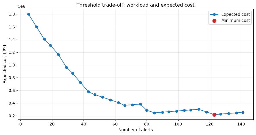 ### Reading the results In this assumption, since missed losses outweigh the cost of false positives, the side that issues a certain number of alerts is chosen. However, if the minimum cost point exceeds the on-site inspection limit, priority is determined by two-stage judgment or by votes. Sensitivity analysis with varying cost factors is also presented at the decision-making meeting. ## Practical Implications Seen Through Target Exercise 1. **Defining decision-making before methods**: The required Recall and explanation granularity changes depending on whether the output is used for stop decisions, inspection candidates, or quality checks. 2. **Abnormality rate is a prerequisite for the model**: Just because you extracted 5% doesn't mean the failure rate is 5%. Updates are made based on inspection capabilities and audit results. 3. **Using multiple methodologies for audits**: Model voting is not true, but it can streamline early label collection. 4. **Separation of standardization and operating conditions is important**: When varieties and equipment are mixed, mere differences in conditions are detected as abnormalities. 5. **Show both scores and supporting values simultaneously**: Present not only rankings but also which sensors have deviated from their usual range. ## What is necessary for practical implementation - Combine equipment ID, type, mold, startup/regular operation, and maintenance history to the analysis unit - Monitor sensor shortages, sticking, and calibration misalignment at the front end of the model - Establish a timeline verification period to prevent the mixing of future information. - Record the "confirmation results, causes, and responses" for each alert and accumulate audit labels - Number of alerts, confirmation rate, missed detection, average detection time, and distribution changes as operational KPIs - Manage the model, standardizer, feature definitions, thresholds, and reasons for change - For safety-related equipment, the model is used as auxiliary information rather than replacing existing protection circuits. ## Conclusion In No.051 to No.060, multivariate anomalies were viewed from different perspectives: isolation, local density, boundary, covariance, near-neighborhood distance, and cluster density. In practice, it is important not to blindly trust the score of a single model, but to compare it with audit labels and adjust thresholds to match inspection capability and loss structure. For small-scale PoCs, starting with short cycles of candidate selection→ on-site inspection→ label accumulation→ and re-evaluation can bring you closer to equipment-specific "operational anomalies." ## Consultations for Corporations At Suri Kobo, we support everything from organizing manufacturing data, anomaly detection PoC, evaluation design, to alert design tailored to on-site operations. From stages such as "data available but few fault labels" or "high false positives making operation unsustainable," challenges and decision-making can be organized. > 📩 **Contact Us**: [surikobo.co.jp/contact](https://surikobo.co.jp/contact) > Please feel free to consult us first.